Media Rules
Overview
Media rules enable users to create responsive charts that can be viewed on various desktop and mobile devices. They share similarities with ZingChart rules and media queries, but media rules are based specifically on the width and/or height of the chart.
Try adjusting the size of the above chart. Media rules were used to create breakpoints at chart widths of 300 and 500 pixels. For better illustration, the green background and blue plotarea, title, and legend are set to progressively lighter shades at each breakpoint.
Setup
Specify where you want media rules applied by creating mediaRules arrays. In the array, create an object for each breakpoint, or the chart dimensions, you want new changes applied. You can create breakpoints based on the chart's:
maxWidthminWidthmaxHeightminHeight
For each breakpoint, add the formatting and/or styling attributes you want applied.
Note: How attributes are applied inside of media rules are the same as how they're applied in the chart. The only exception is the visible attribute. When set to false, the object is removed from the chart completely. This allows you to save space at smaller breakpoints by removing objects such as titles and legends that take up significant space on the screen.
mediaRules: [
  {
    maxWidth: 500,
    ... //Provide formatting/styling attributes.
  },
  {
    maxWidth: 300,
    ... //Provide formatting/styling attributes.
  }
]
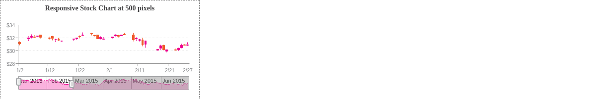
In the below stock chart, media rules were used to display a responsive title, preview chart, scales, and crosshairs. Try modifying the chart size to observe the formatting and styling changes at 300 and 500 pixels.
See the following sections for examples on how media rules can be used. You can also refer to the Media Rules JSON page for a full attribute list.
Responsive Scales
To add responsive breakpoints to the scales, create a mediaRules array in the scaleX and/or scaleY object(s). In the following chart, media rules were used to adjust the font size of the scale items and labels. Refer to the Scales Tutorial for further information on the different scale elements and x/y-axis scale features.

{
  ... //Omitted for brevity.
  scaleX: {
    minValue: 1457101800000,
    maxValue: 1457125200000,
    step: '30minute',
    transform: {
      type: 'date',
      all: '%g:%i'
    },
    label: {
      text: 'Trading Day',
      fontSize: 16
    },
    item: {
      fontSize: 12
    },
    itemsOverlap: true,
    maxItems: 14,
    mediaRules: [
      {
        maxWidth: 500,
        maxItems: 3,
        label: {
          fontSize: 12
        },
        item: {
          fontSize: 9
        }
      },
      {
        maxWidth: 300,
        label: {
          visible: false
        }
      }
    ]
  },
  scaleY: {
    values: '30:34:1',
    format: '$%v',
    label: {
      text: 'Price',
      fontSize: 16
    },
    item: {
      fontSize: 12
    },
    guide: {
      lineStyle: 'solid'
    },
    mediaRules: [
      {
        maxWidth: 500,
        values: '30:34:2',
        label: {
          fontSize: 12
        },
        item: {
          fontSize: 9
        }
      },
      {
        maxWidth: 300,
        label: {
          visible: false
        }
      }
    ]
  },
  ... //Omitted for brevity.
}
Responsive Tooltips
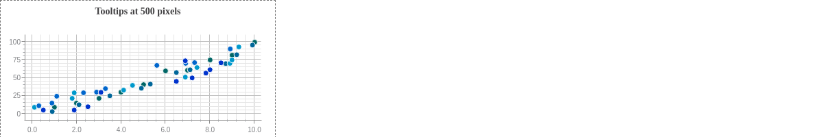
To add responsive breakpoints to the tooltips, create a mediaRules array in the tooltip object. In the following chart, media rules were used to change the font sizing and border colors. Refer to the Tooltips Tutorial for more information on the various tooltip types.
{
  ... //Omitted for brevity.
  plot: {
    tooltip: {
      text: '%t:<br>%v particles',
      fontFamily: 'Georgia',
      fontColor: '#333333',
      fontAlpha: 1,
      backgroundColor: 'white',
      alpha: 0.8,
      borderWidth: 1,
      borderColor: '#ff6600',
      borderRadius: '3px',
      lineStyle: 'dashdot',
      mediaRules: [
        {
          maxWidth: 500,
          fontSize: 11,
          borderColor: '#ff66cc',
          lineStyle: 'dotted'
        },
        {
          maxWidth: 300,
          fontSize: 10,
          fontFamily: 'Arial',
          borderColor: '#9933ff',
          lineStyle: 'solid'
        }
      ]
    },
    ... //Omitted for brevity.
  },
  ... //Omitted for brevity.
}
Responsive Crosshairs
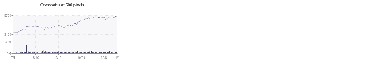
To add responsive breakpoints to the crosshairs, create a mediaRules array in the crosshairX object. When making series-specific changes, you can also create mediaRules arrays in each series' guideLabel objects. See the following chart. Refer to the Crosshairs Tutorial for more information on how to customize the crosshairs.
{
  ... //Omitted for brevity.
  crosshairX: {
    plotLabel: {
      multiple: true,
      fontFamily: 'Georgia',
      backgroundColor: 'white',
      alpha: 0.8,
      padding: '5%',
      borderRadius: '3px',
    },
    scaleLabel: {
      fontFamily: 'Georgia',
      borderRadius: '3px'
    },
    mediaRules: [
      {
        maxWidth: 500,
        plotLabel: {
          fontFamily: 'Arial'
        },
        scaleLabel: {
          fontFamily: 'Arial'
        }
      },
      {
        maxWidth: 300,
        plotLabel: {
          fontColor: 'black',
          fontSize: 10,
          padding: 2
        },
        scaleLabel: {
          fontSize: 10,
          padding: 2
        }
      }
    ]
  },
  ... //Omitted for brevity.
  series: [
    {
      type: 'line',
      ... //Omitted for brevity.
      guideLabel: {
        text: 'Stock: $%v',
        decimals: 2,
        borderColor: '#666699',
        mediaRules: [
          {
            maxWidth: 500,
            text: 'Stock:<br>$%v',
            textAlign: 'center'
          },
          {
            maxWidth: 300,
            text: '$%v'
          }
        ]
      },
      values: [
        ... //Omitted for brevity.
      ]
    },
    {
      type: 'bar',
      ... //Omitted for brevity.
      guideLabel: {
        text: 'Volume: %vM',
        borderColor: '#3d3d5c',
        mediaRules: [
          {
            maxWidth: 500,
            text: 'Volume:<br>%vM',
            textAlign: 'center'
          },
          {
            maxWidth: 300,
            text: '%vM'
          }
        ]
      },
      values: [
        ... //Omitted for brevity.
      ]
    }
  ]
}
Responsive Legend
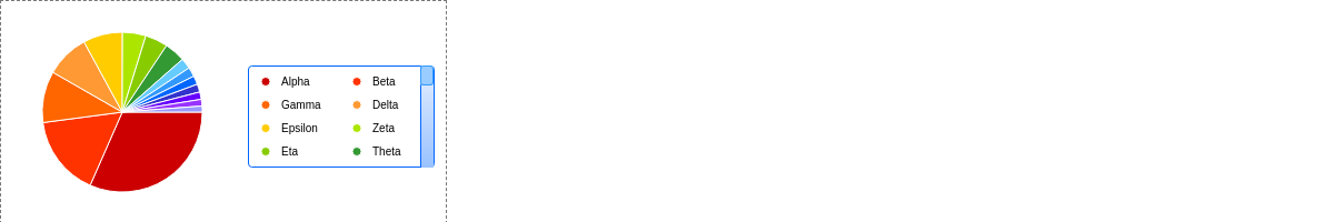
To add responsive breakpoints to the legend, create a mediaRules array in the legend object. In the following chart, media rules were used to modify the sizing and change the appearance of the legend scrollbar. Refer to the Legend Tutorial for further information on the various legend elements and interactive legend features.
{
  ... //Omitted for brevity.
  legend: {
    align: 'right',
    verticalAlign: 'middle',
    toggleAction: 'remove',
    maxItems: 8,
    overflow: 'scroll',
    scroll: {
      bar: {
        backgroundColor: '#bbff33 #99e600',
        borderLeft: '1px solid #88cc00'
      },
      handle: {
        backgroundColor: '#66cc66',
        borderLeft: '1px solid #339933',
        borderRight: '1px solid #339933',
        borderTop: '1px solid #339933',
        borderBottom: '1px solid #339933',
        borderRadius: '2px'
      }
    },
    borderWidth: 1,
    borderColor: '#88cc00',
    borderRadius: '3px',
    marker: {
      type: 'circle'
    },
    mediaRules: [
      {
        maxWidth: 500,
        item: {
          fontSize: 10
        },
        scroll: {
          bar: {
            backgroundColor: '#e6f0ff #99c2ff',
            borderLeft: '1px solid #0066ff'
          },
          handle: {
            backgroundColor: '#99ccff',
            borderLeft: '1px solid #3399ff',
            borderRight: '1px solid #3399ff',
            borderTop: '1px solid #3399ff',
            borderBottom: '1px solid #3399ff',
            borderRadius: '2px'
          }
        },
        borderColor: '#0066ff',
        marker: {
          size: 4
        }
      },
      {
        maxWidth: 300,
        maxItems: 6,
        item: {
          fontSize: 9,
          margin: 1
        },
        scroll: {
          bar: {
            width: '50%',
            backgroundColor: '#e6e6ff #b3b3ff',
            borderLeft: '1px solid #9999ff'
          },
          handle: {
            width: '50%',
            backgroundColor: '#cc99ff',
            borderLeft: '1px solid #9933ff',
            borderRight: '1px solid #9933ff',
            borderTop: '1px solid #9933ff',
            borderBottom: '1px solid #9933ff',
            borderRadius: '2px'
          }
        },
        borderColor: '#9999ff',
        marker: {
          size: 3
        }
      }
    ]
  },
  ... //Omitted for brevity.
}
Responsive Styling
To create responsive styling, add a mediaRules array to the plot and/or series object(s). You can change the appearance of the markers, lines, and backgrounds, as well as incorporate animation. See the following chart. Refer to the Plot/Series Styling Tutorial for further information on how to style your data.
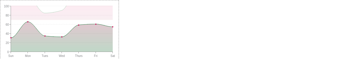
{
  ... //Omitted for brevity.
  series: [
    {
      values: [31,66,35,33,59,61,55],
      lineColor: '#cc0052',
      backgroundColor: '#cc0052',
      marker: {
        backgroundColor: '#cc0052'
      },
      mediaRules: [
        {
          maxWidth: 500,
          lineWidth: 1,
          lineColor: '#006622',
          backgroundColor: '#cc0052 #006622',
          marker: {
            size: 2,
            backgroundColor: '#cc0052'
          },
          tooltip: {
            text: '%t:<br>%v'
          }
        },
        {
          maxWidth: 300,
          lineColor: '#006622',
          backgroundColor: '#006622',
          marker: {
            visible: false
          },
          tooltip: {
            text: '%v'
          }
        }
      ]
    },
    ... //Remaining series omitted for brevity.
  ]
}
Summary
Media rules allow you to make your charts responsive by changing chart settings based on the width/height. Note that media rules only apply to the chart's height/width, not the window height/width.
For a full list of media-rules attributes, see the JSON configuration page.