Pictograph Charts
Overview
The pictograph chart is a pictorial representation of data. The chart is accompanied with a key explaining what each image represents and the frequency of it.
Zingchart supports the following pictograph chart types:
- Column / Vertical
- Horizontal
- Image
- Multiple Image
- Size
Pictograph Chart Types
To specify your chart type, use the type attribute. We support the following different pictograph chart types: column (bar or vbar), horizontal (hbar), image (null), multiple image (scatter), and size (bar or vbar).
Continue reading to determine what to set type and data.
{
  type: 'scatter',   // or 'bar' or 'null' or 'vbar'
}
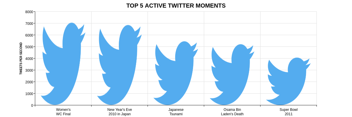
Column Pictograph Chart
The column pictograph chart essentially is a column chart that compares the size of data by the frequency of images rather than the length of the column. The chart is supported by a legend which describes what each individual image represents.
Specify the type attribute to either bar or vbar.
{
  type: 'bar',  // or `vbar`
}
Assign the values attribute to an array to represent a single dataset.
Then use styles to assign an image for each column. Specific to the column pictograph chart, set backgroundFit: 'x' and backgroundRepeat: 'repeat-y' to at least the first styles element (this repeats the image to the height of the bar).
Also, set plot.barWidth and series.styles.backgroundScale to set the size of the image in the column.
Altogether, your demo should look this this:
{
  type: 'bar',
  plot: {
    // Sets the width of the bar
    barWidth: '40px',
  },
  series: [{
    // Column values
    values:  [7100, 6900, 5500, 5250, 4100],
    styles: [
      {
        // Sets the size of the image (which applies to every column)
        backgroundFit: 'x',             // Stretch image to fit column's width (defined by `plot.barWidth`)
        backgroundRepeat: 'repeat-y',   // Repeats image to fill column
        backgroundScale: 1.17           // Scale the image to make it represent ~1k tweets
        // Sets image for first column (must set for each column)
        backgroundColor: 'white',
        backgroundImage: '//www.zingchart.com/images/chartTwitter.png',
      },
      {
        // Sets image for second column
        backgroundColor: 'white',
        backgroundImage: '//www.zingchart.com/images/chartTwitter.png',
      },
      {
        // Sets image for third column
        backgroundColor: 'white',
        backgroundImage: '//www.zingchart.com/images/chartTwitter.png',
      },
      {
        // Sets image for fourth column
        backgroundColor: 'white',
        backgroundImage: '//www.zingchart.com/images/chartTwitter.png',
      },
      {
        // Sets image for fifth column
        backgroundColor: 'white',
        backgroundImage: '//www.zingchart.com/images/chartTwitter.png',
      },
    ],
  }],
}
Create a legend to show what each image represents using the labels attribute.
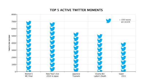
{
  type: 'bar',
  ...
  labels: [{
    // Description of what each image represents
    text: ' = 1000 tweets<br> per second',
    // Sets image and its dimension and position
    backgroundImage: '//www.zingchart.com/images/chartTwitter.png',
    backgroundPosition: '0 50%',
    backgroundRepeat: 'no-repeat',
    width: '170px',
    height: '10%',
    x: '70%',
    y: '14%',
  }]
}
Horizontal Pictograph Chart
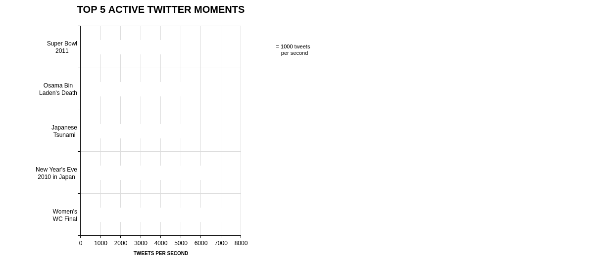
The horizontal pictograph is very similar to the column pictograph chart. The only difference is that the images are placed horizontally.
Check out the Column Pictograph Chart section above, while taking note of the differences:
typeis set tohbarbarWidthmust be adjusted to the width of the image (as opposed to the width of the bar)backgroundFitis set toybackgroundRepeatis set torepeat-x
The final demo should look like this:
{
  // Type is set to horizontal bar
  type: 'hbar',
  plot: {
    // Adjust to width of image
    barWidth: '29px',
  },
  series: [{
    values:  [7100, 6900, 5500, 5250, 4100],
    styles: [
      {
        backgroundFit: 'y',             // Stretch image to fit bar's height
        backgroundRepeat: 'repeat-x',   // Repeats image to fill horizontal bar
        backgroundScale: 1.17
        backgroundColor: 'white',
        backgroundImage: '//www.zingchart.com/images/chartTwitter.png',
      },
      {
        backgroundColor: 'white',
        backgroundImage: '//www.zingchart.com/images/chartTwitter.png',
      },
      {
        backgroundColor: 'white',
        backgroundImage: '//www.zingchart.com/images/chartTwitter.png',
      },
      {
        backgroundColor: 'white',
        backgroundImage: '//www.zingchart.com/images/chartTwitter.png',
      },
      {
        backgroundColor: 'white',
        backgroundImage: '//www.zingchart.com/images/chartTwitter.png',
      },
    ],
  }],
}
Image Pictograph Chart
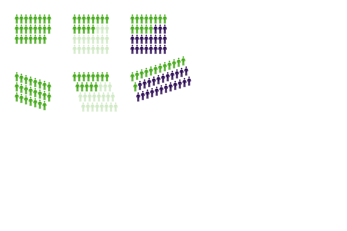
The image pictograph chart represents data by the number of images displayed. This type is more customizable with the layout of the images. It also has the ability to display both active and inactive images.
Specify the type attribute to null.
{
  type: 'null'
}
The following attributes are the minimum required to render a simple pictograph chart.
items: set to number of images to display (or if used withinactive, this is the number of "active" images)src: set to the image to usebackgroundRepeat: set to'no-repeat'so that the image source is not repeatedrepeat: set totrueto enable the chart to repeat the imagewidth: set to the width of the specified image insrcspaceX: sets the horizontal spacing between imagesspaceY: sets the vertical spacing between images
Check out the Chart-Specific Properties to further customize the chart.
Below is an example of an image pictograph:
{
  type: 'null',
  images: [{
    // Active picograms (number of picograms to display)
    items: 23,
    // Image
    src: 'https://app.zingsoft.com/api/file/1NJRAA52/user-sprite.png',
    // Configure image
    backgroundRepeat: 'no-repeat',
    backgroundPosition: '0 0',
    repeat: true,
    width: 16,
    // Horizontal spacing between picograms
    spaceX: 20,
    spaceY: 35,
  }]
}

Multiple Image Pictograph Chart
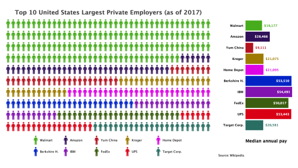
The multiple image pictograph chart is similar to the image one above. The difference is that it accepts multiple images to visually compare different data values and does not offer "inactive" images.
The type attribute should be set to scatter, since this chart renderes over a scatter chart.
{
  type: 'scatter'
}
The accepted data format is:
{
  series: [
    // Object for each dataset
    {
      // Define an image for each scatter node (image in pictograph chart)
      marker: {
        backgroundRepeat: 'no-repeat',
        backgroundImage: --IMAGE SRC--
      },
      // Define an image for legend (key to what each image represents)
      legendMarker: {
        backgroundRepeat: 'no-repeat',
        backgroundImage: --IMAGE SRC--
      },
      // Array of number arrays, where each number array is the coordinates of a single image
      values: [[--X POSITION or COLUMN NUMBER--, --Y POSITION or ROW NUMBER--], ...]
    },
    ...
  ]
}
In our multiple image pictograph demo, we want to visualize which company has the largest amount of employees. Our dataset originally only contains the total number of employees and the median pay for each company. Using the code below, we calculated the total number of employees to determine the number of images used for each company.
// Define the number of columns and rows to layout images
let cols = 40, rows = 10;
// Calculate the total number of employees from all the companies
let total_employees = 0;
for (let p = 0; p < plots.length; p++) {
  total_employees += plots[p].employees;
}
// Calculate the number of images for each company (save in `plots[p].items`)
let total_items = 0
for (let p = 0; p < plots.length; p++) {
  let pc = (plots[p].employees / total_employees);
  let items = Math.round((cols * rows) * pc);
  if (p === plots.length - 1) {
    // avoid rounding conflicts
    plots[p].items = (cols * rows) - total_items;
  } else {
    plots[p].items = items;
  }
  plots[p].dataPercent = (100 * pc).toFixed(2);
  total_items += items;
}
After calculating the number of images used for each company, determine the position of each scatter node (or image).
Use the marker and legendMarker properties to define an image for the nodes and legend for each image.
The demo also includes a horizontal bar chart to compare the median pay.
Below, the code pushes the median pay to the series attribute for the horizontal bar chart.
It also calculates the position of each node/image and pushes it into the series attribute for the pictograph chart.
// Counter to determine the position of nodes (or marker/image)
let col = 0, row = 0;
// For each dataset, setup the `series` data for the scatter/pictograph and horizontal bar charts
for (let p = 0; p < plots.length; p++) {
  // Median pay data for horizontal bar chart
  chartConfig.graphset[1].series.push({
    text: plots[p].text,
    values: [plots[p].medianpay],
    backgroundColor: plots[p].color
  });
  // Percentage of employees for each company data for scatter/pictograph chart
  chartConfig.graphset[0].series.push({
    // Label for dataset (used in legend)
    text: plots[p].text,
    // Calculated percentage and original data
    dataPercent: plots[p].dataPercent,
    dataEmployees: plots[p].employees,
    // Customize tooltip color to match marker/image color
    tooltip: {
      color: plots[p].color
    },
    // Define image as the marker used for each scatter node
    marker: {
      backgroundRepeat: 'no-repeat',
      backgroundImage: img,
      backgroundPosition: -p * 16 + 'px 0px'
    },
    // Define image marker used in legend
    legendMarker: {
      backgroundRepeat: 'no-repeat',
      backgroundImage: img,
      backgroundPosition: -p * 16 + 'px 0px'
    },
    // Define empty array which wil contain the position of each image
    values: []
  });
  // For each image, determine the position
  for (let n = 0; n < plots[p].items; n++) {
    chartConfig.graphset[0].series[p].values.push([col, row]);
    col++;
    if (col === cols) {
      col = 0;
      row++;
    }
  }
}
Size Pictograph Chart
The size pictograph is set up similarly to the column pictograph chart, except a single image is used to represent each column. The sizes of the image is used to compare the size of the data.
Check out the Column Pictograph Chart section above, while taking note of the differences:
barWidthis omittedbackgroundFitis set toxybackgroundRepeatis set tono-repeatbackgroundColoris set totransparentso grid lines behind are visible
Also, backgroundFit and backgroundRepeat must be defined for each column in this case.
Altogether, the size pictograph chart looks like this:
{
  type: 'bar',
  plot: {
    // Adjust to width of image
    barWidth: '29px',
  },
  series: [{
    values:  [7100, 6900, 5500, 5250, 4100],
    styles: [
      {
        backgroundFit: 'xy',                // Stretch image to fit bar
        backgroundRepeat: 'no-repeat',      // Image is not repeated
        // Define for each column
        backgroundColor: 'transparent',   // Allow gridlines behind image to be visible
        backgroundImage: 'https://app.zingsoft.com/api/file/ILR5R87P/neaV71UQxuvi2ypjSGAN_twitter.png',
      },
      {
        backgroundColor: 'transparent',
        backgroundImage: 'https://app.zingsoft.com/api/file/ILR5R87P/neaV71UQxuvi2ypjSGAN_twitter.png',
      },
      {
        backgroundColor: 'transparent',
        backgroundImage: 'https://app.zingsoft.com/api/file/ILR5R87P/neaV71UQxuvi2ypjSGAN_twitter.png',
      },
      {
        backgroundColor: 'transparent',
        backgroundImage: 'https://app.zingsoft.com/api/file/ILR5R87P/neaV71UQxuvi2ypjSGAN_twitter.png',
      },
      {
        backgroundColor: 'transparent',
        backgroundImage: 'https://app.zingsoft.com/api/file/ILR5R87P/neaV71UQxuvi2ypjSGAN_twitter.png',
      },
    ],
  }],
}
Chart-Specific Properties
The following attributes are used to change the appearance of the pictograph chart. Note that the attributes only applies to the Image Pictograph.
Images
The images attribute accepts an array of objects, where each object represents an image pictograph chart.
Continue through this section for pictograph-related attributes. Otherwise check out Images JSON Configuration Docs for a full list of accepted attributes.
{
  type: 'null',
  images: [
    {
      x: 50,
      y: 50,
      width: 16,
      backgroundRepeat: 'no-repeat',
      backgroundPosition: '0 0',
      src: 'https://app.zingsoft.com/api/file/1NJRAA52/user-sprite.png',
      repeat: true,
      items: 23,
      cols: 8,
      rows: 4,
      spaceX: 16,
      spaceY: 35
    },
    ...
  ]
}
BackgroundRepeat
The backgroundRepeat attributes should be set to 'no-repeat'.
This is to configure the image so that a single instance of it will be used to represent data.
Cols and Rows
The cols and rows attribute sets the number of columns and rows, respectively. This determines the layout of images in the chart.
{
  type: 'null',
  images: [
    {
      cols: 8,
      rows: 4,
      ...
    },
  ]
}

Inactive
Setting the inactive object will display inactive images.
The attribute accepts an object containing style-related attributes to style inactive images.
Any images that exceed the value of items but under the product of the cols and rows are considered inactive.
{
  type: 'null',
  images: [
    {
      inactive: {
        alpha: 0.25
      }
      ...
    },
  ]
}
Items
Set items to the number of images to display. This number represent the "active" images when used with the inactive attribute.
OffsetCol and OffsetRow
The offsetCol and offsetRow attributes sets the offset spacing for each column and row respectively.
This allows customizing the layout of the pictograph chart.
{
  type: 'null',
  images: [
    {
      offsetCol: -5,
      offsetRow: 10,
      ...
    },
  ]
}

Repeat
It is required to set repeat attribute to true to allow the images in the chart to be repeated when rendering a pictograph chart.
Src
The src attribute sets the image to be used in the chart to represent the data.
SpaceX and SpaceY

Width
The width attribute should be set to the actual width of the image.