Range Charts
Note: See our Range Chart Gallery for inspiration on all the different range chart possibilities.
Range Chart Type
In your chart object, add a type attribute and set the chart type to range for a standard range chart or vrange for a vertical range chart. Without further modification, a basic range chart with a single dataset looks like this:
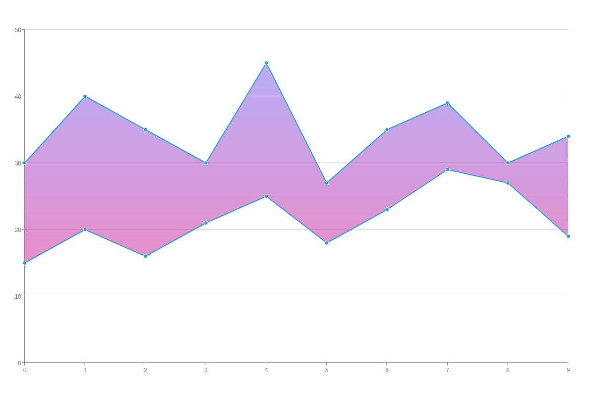
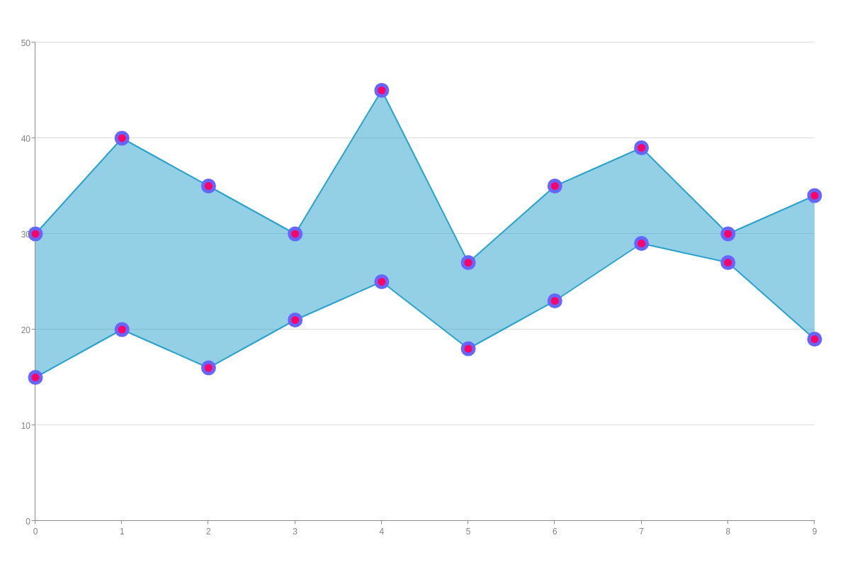
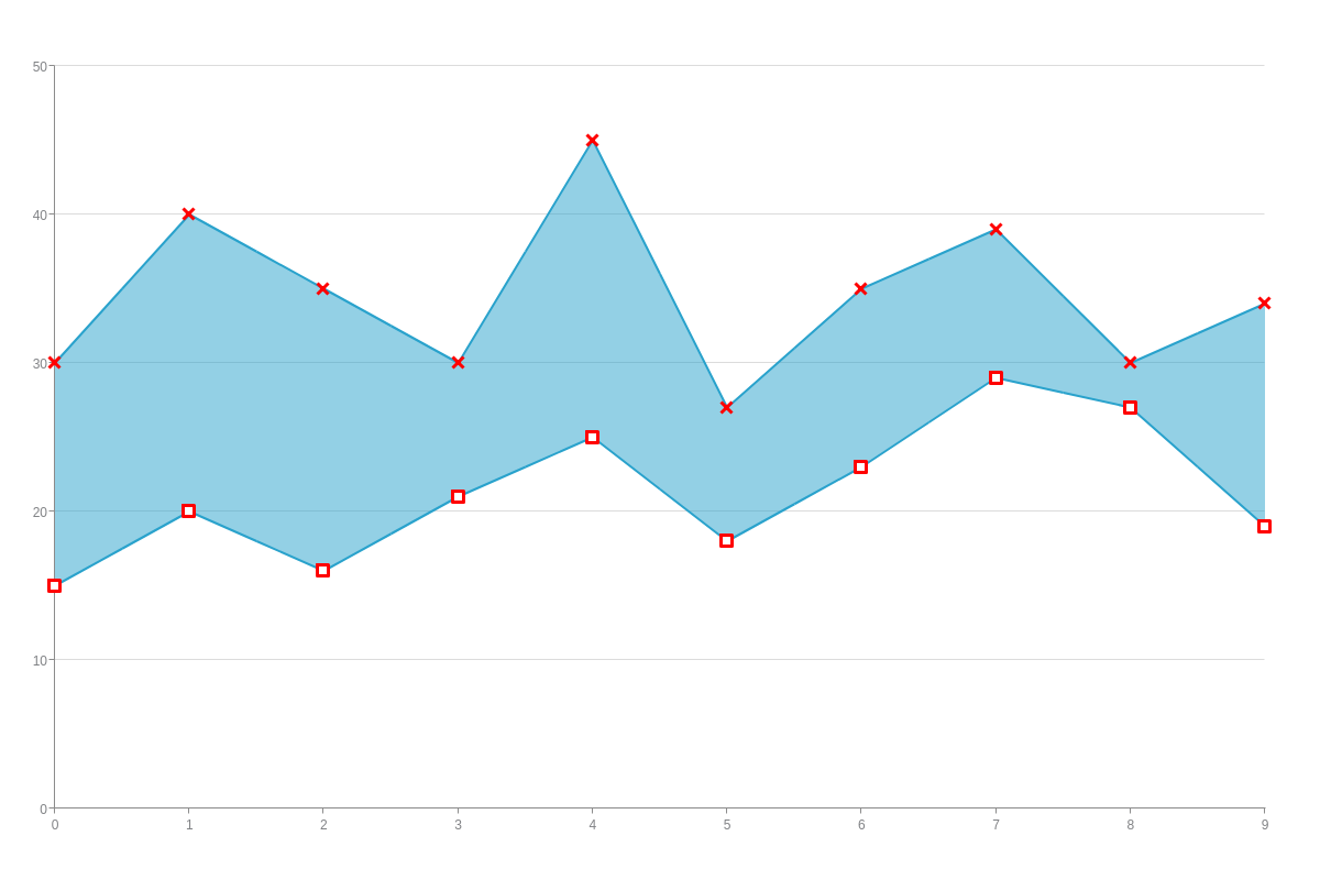
{
  type: "range", // or "vrange"
  series: [
    {
      values:
        [
          [15,30],
          [20,40],
          [16,35],
          [21,30],
          [25,45],
          [18,27],
          [23,35],
          [29,39],
          [27,30],
          [19,34]
        ]
    }
  ]
}

Data
Range charts support a series array containing single or multiple datasets as objects. In each object, add a values array of arrays. For each data element, specify your lower (left) and upper (right) values.
{ // shortened for brevity- click on following range chart demo for full configuration
  series: [
    {
      values:
      [
        [15,30],
        [20,40],
        [16,35],
      ]
      },
    {
      values:
      [
        [25,35],
        [12,40],
        [19,30],
        ]
    },
  ]
}
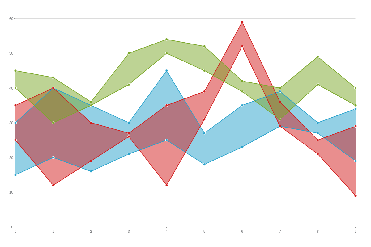
Chart-Specific Properties
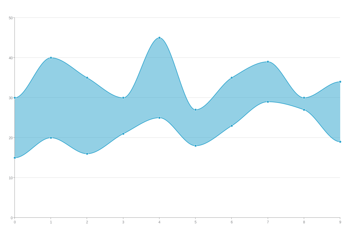
You can further modify your range chart with the aspect attribute. This allows you to choose between straight (segmented) or curved (spline) lines to connect your data points.
Aspect
Range charts support two types of aspects: segmented (default) and spline. They can be applied globally to affect all plots or locally to affect specific plots.
To apply aspects globally, create a plot object and insert your aspect attribute.
plot: {
    aspect: "segmented" /* or "spline" */
  }
To apply aspects locally, add them to the chart data object you want the change to apply to.
Note: If you specify an aspect value in the plot object and an aspect value in a chart data object, the latter will overwrite the former.
{
  series: [
    {
      aspect: "segmented", /* or "spline" */
    }
  ]
}
Segmented Range Chart

Spline Range Chart
Maximum Line and Marker
Use the maxLine attribute to configure the style of the line representing the maximum values.
The maxMarker attribute configures the markers.
Minimum Line and Marker
Use the minLine attribute to configure the style of the line representing the minimum values.
The minMarker attribute configures the markers.
Further Customization
Once you have your basic range chart, you can next customize and style it. This section explains how to add a category or time-series scale to your range chart, as well as how to style your lines, markers, and backgrounds (the shaded region between your lower and upper values).
Scales
By default, ZingChart’s scales for both the x- and y-axis start as a quantitative (or numeric) one. Users generally want to modify their horizontal axis to display a category or time-series scale. We explain how to incorporate these scale types below.
Note: Learn more about scales with our Scales Tutorial.
Note: While scale modification changes in the examples below are made to the x-axis (scale-x object), the same changes can be made to the y-axis (scale-y object) as well.
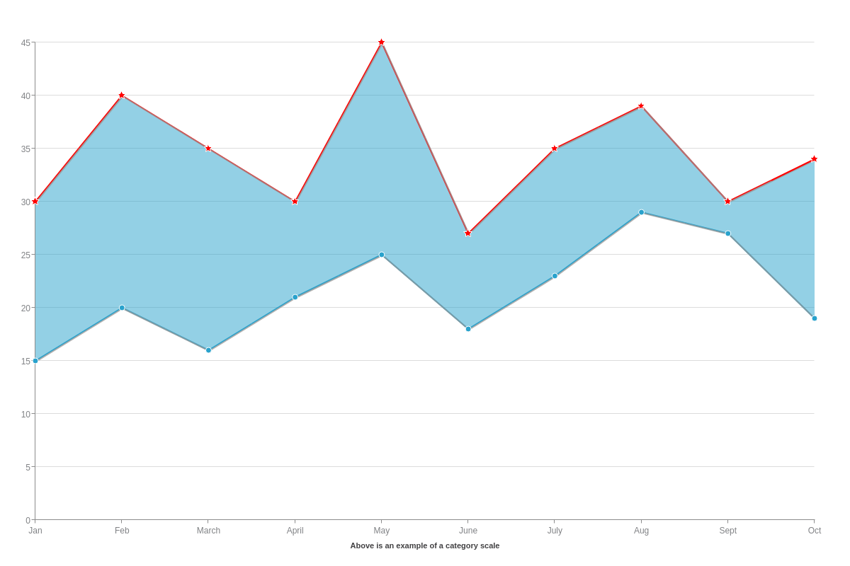
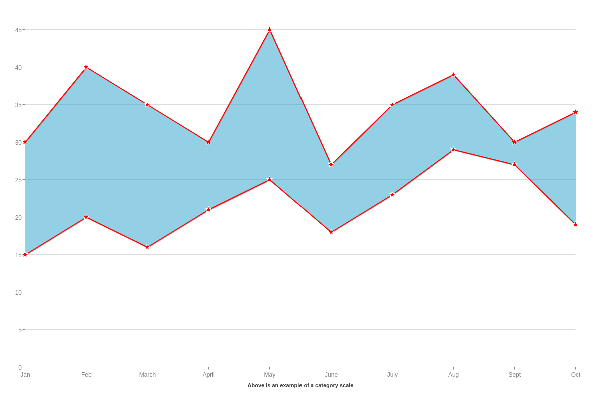
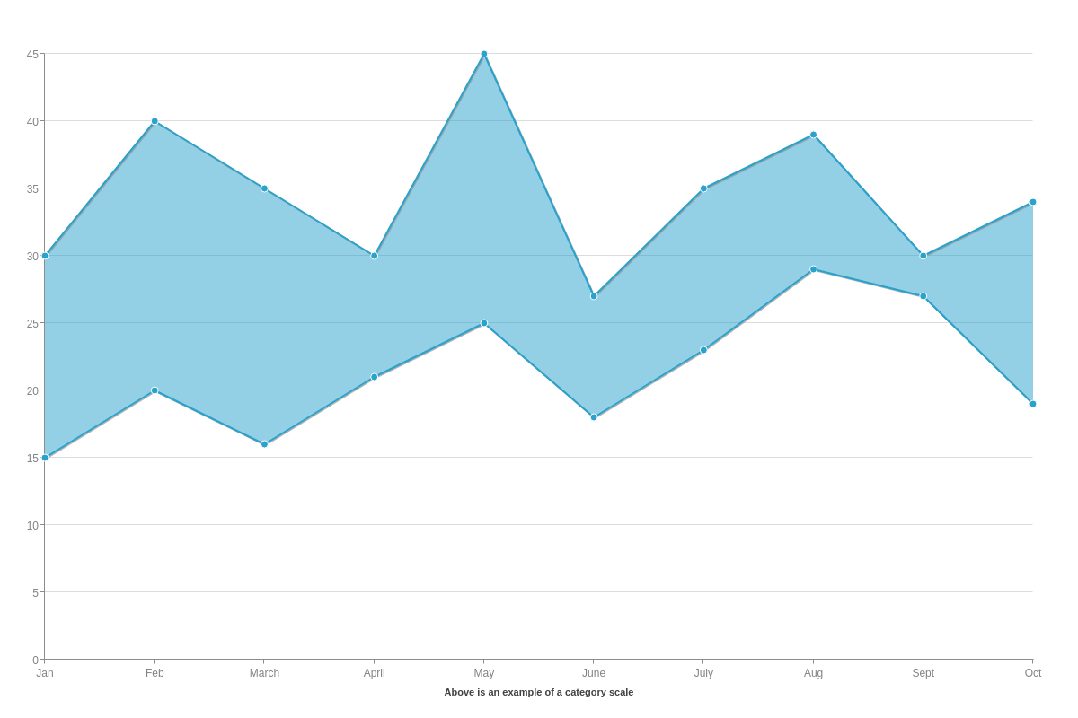
Category Scale
A category (or qualitative) scale can consist of words and/or numbers, such as time periods (months, years, dates), categories, names, etc. To add one to your chart, create a scale-x object and insert a labels array. Provide your scale labels as string values separated by commas.
Note: Be careful not to confuse the labels array, which adds scale labels, with the label object, which allows you to specify your scale title.
{
  type: "range",
  'scale-x': {
    label: {    /* Scale Title */
      text: "Above is an example of a category scale",
    },
    labels: [ "Jan", "Feb", "March", "April", "May", "June", "July", "Aug", "Sept", "Oct" ] /* Scale Labels */
  },
}
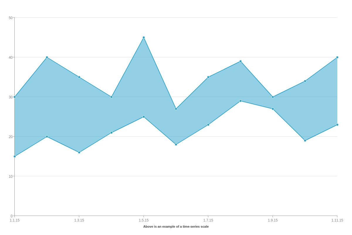
Time-Series Scale
A time-series scale is used to represent increments of time and can be formatted to display anything from years down to milliseconds. Create a scale-x object and add a min-value attribute, step attribute, and transform object inside it.
For min-value and step, you'll need to specify your minimum and step scale values in Unix time. Unix time (also known as Epoch time) is measured by the number of milliseconds that have elapsed since January 1, 1970, UTC time. To calculate your timestamps, you can use an online conversion tool such as Epoch Converter.
Note: Make sure to provide your Unix time in milliseconds. You can convert seconds to milliseconds by multiplying by 1000.
The transform object will convert your Unix timestamps into a more readable date and/or time. In the object, add a type attribute and set the value to date. Next, add an all attribute. You can specify how you want your time-series scale formatted by using our tokens.
Note: To ensure your time-series scale reads in UTC time (ZingChart currently defaults to local time), add a utc attribute, and set the value to true.
{
  type: "range",
  utc: true, /* Force UTC time. */
  'scale-x': {
    label: { /* Add a scale title with a label object. */
      text: "Above is an example of a time-series scale",
    },
    'min-value':1420070400000, /* Unix timestamp for Jan 1, 2015. */
    step: "day",
    transform: { /* Converts your Unix timestamp to a human readable format. */
      type: "date", /* Set your transform type to "date". */
      all: "%m.%d.%y" /* Specify your date/time format, using tokens. */
    }
  },
}
Tokens
Range chart-specific tokens include:
| Token | Description |
|---|---|
%node-max-value |
The upper node value |
%node-min-value |
The lower node value |
Note: Refer to the ZingChart Tokens Tutorial for a full list of available tokens.
Styling
Next, you can style your range chart’s lines, markers, and backgrounds.
Note: For even more styling and customization options, see our JSON Attributes/Syntax page.
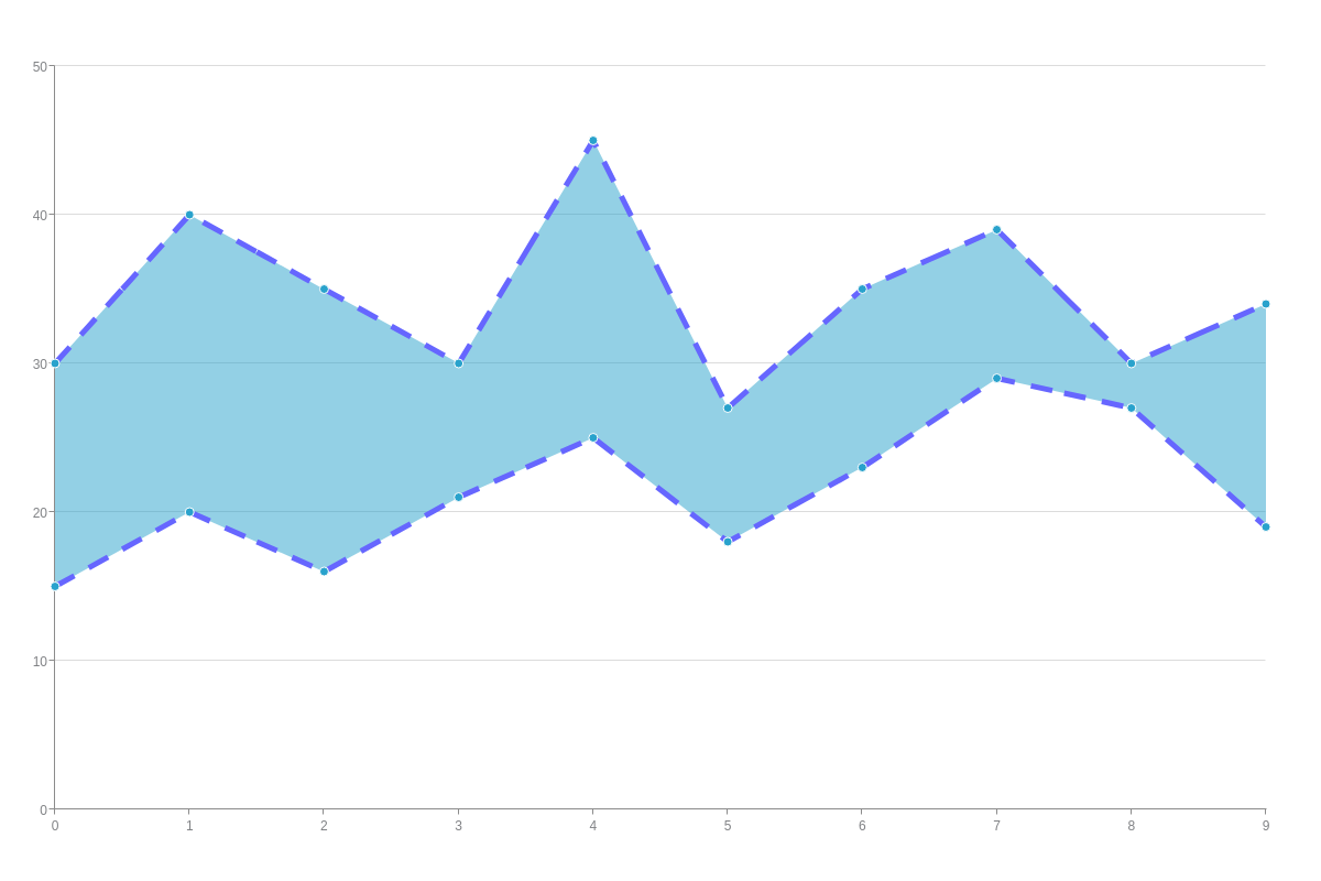
Line Color, Style, and Width
Start in the chart data object of the plot you want to style. To specify your line color, add a line-color attribute and provide your color as a hexadecimal or RGB value.
To change your line style, add a line-style attribute, and then specify your choice of solid (default), dashed, or dotted line. You can also change your line's width by inserting a line-width attribute and providing a pixel value.
{
  series: [
    {
      'line-color': "#6666FF",
      'line-style': "dashed",
      'line-width':5
    }
  ]
}
Marker Color, Size, and Width
To enable markers, add a marker object to the chart data object of the plot you want your changes to apply to. Modify your marker's fill color by adding a background-color attribute and specifying your fill size with a size attribute.
For border color, use a border-color attribute and specify your border width with a border-width attribute.
Note: Learn more about markers with our Markers Tutorial.
{
  series: [
    {
      marker: { /* Marker object */
        'background-color': "#FF0066",
        size:8,
        'border-color': "#6666FF",
        'border-width':5
      }
    }
  ]
}
You can also use the maxMarker and minMarker objects in the plot object to style the upper node and lower node markers, respectively.
{
  plot: {
    maxMarker: {
      type: 'cross',
      size: 5,
      lineColor: 'red',
      lineWidth: 3
    },
    minMarker: {
      type: 'square',
      size: 5,
      backgroundColor: 'white',
      borderColor: 'red',
      borderWidth: 3
    }
  }
}
Background Color and Transparency
You can change the color (single color or gradient) and transparency of the shaded area between your upper and lower range values. To change your background color, add a background-color attribute to your chart object. For a single color, add one hexadecimal or RGB value. For a gradient (two color) background, add two values separated by a space.
You can adjust your color’s transparency by adding an alpha-area attribute. Transparency ranges from 0 (clear) to 1 (solid). Provide a value between 0-1 and make sure to insert a zero before your decimal point.
{
  series: [
    {
      'background-color': "#6666FF #FF0066",
      'alpha-area':0.5
    }
  ]
}