Choropleth Maps
Choropleth maps are a specific kind of interactive map. Refer to the Interactive Maps tutorial to see how to load and style a ZingChart map before reading this tutorial.
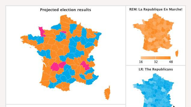
Note: See our Maps Gallery for inspiration on all the different map possibilities.
Load Maps Modules
The choropleth module is built into the maps module. In addition to the core library, the maps modules must be explicitly loaded in order to render your map(s). Make sure to include the main maps module as well as each map by module name (e.g., maps-world-continents).
zingchart.loadModules('maps, maps-world-continents', function(e) {
  zingchart.render ({
    id: 'myChart',
    data: {
      ... //Use the chart object to configure your map.
    },
    height: 400,
    width: '100%'
  });
});
Refer to the Maps List on the Interactive Maps page for a full list of available maps by module name.
Adding the Choropleth Module
As mentioned above, the choropleth module is built into the maps module, so no additional steps are required to load it. To use the module, add a choropleth object to the options object in your JSON.
{
  options: {
    // ...
    choropleth: {
      // Add choropleth configuration options here
    }
  ]
}
Choropleth-specific Properties
Use the choropleth object to configure how the map is colored with the following properties.
Aspect
Use the aspect attribute to set the coloring algorithm used to color the map. The options are gradient (for using a gradient of a single color across the map) or intervals (for setting a custom color palette).
{
  options: {
    // ...
    choropleth: {
      aspect: "gradient" // or "intervals"
    }
  }
}
Gradient Aspect
When using the gradient aspect, there are a number of attributes to be aware of. The first is color, which sets the base color for the choropleth. Next, set the effect attribute to either "lighten" or "darken" to lighten or darken the base color, respectively.
{
  options: {
    // ...
    choropleth: {
      aspect: "gradient",
      color: "#FF0000",
      effect: "darken"
    }
  }
}
Intervals Aspect
When using the intervals aspect, there are a number of additional attributes required for configuration. To manually set the intervals and colors, use the steps array to set the steps for the choropleth intervals, and then use the colors array to set the color for each interval. To have ZingChart automatically calculate the intervals the maximum and minimum chart values, omit the steps attribute and set the progression attribute (discussed below). If the colors array is omitted, use the color and effect attributes to set the colors used.
{
  options: {
    // ...
    choropleth: {
      aspect: "intervals",
      steps: [100, 1000, 10000, 100000, 1000000],
      colors: ["F00", "F0F", "FF0", "0FF", "00F"]
    }
  }
}
Progression
Set the progression attribute to lin for a linear progression between choropleth intervals, or log for a logarithmic progression between intervals.
{
  options:
    {
      // ...
      choropleth: {
        aspect: "intervals",
        intervals: 5,
        progression: "lin",
        colors: ["F00", "F0F", "FF0", "0FF", "00F"]
      }
    }
}
Max Percent
By default, ZingChart will only lighten or darken a single color by 50% for the interval colors. To change the maximum percent that a color should be lightened/darkened, set the maxPercent attribute.
{
  options:
    {
      // ...
      choropleth: {
        aspect: "intervals",
        intervals: 5,
        progression: "lin",
        color: "F00",
        effect: "lighten",
        maxPercent: 75,
      }
    }
}
Mirrored
To mirror the interval colors, set the mirrored attribute to true.
{
  options:
    {
      // ...
      choropleth: {
        aspect: "intervals",
        intervals: 5,
        progression: "lin",
        color: "F00",
        effect: "lighten",
        maxPercent: 75,
        mirrored: true,
      }
    }
}
Labels
Labels can be added to the map just like the can at the root level. Create a labels array containing any label objects you want to add to your map. Refer to the Labels tutorial for more information.
{
  options: {
    choropleth: {
      labels: [
        {
          // label configuration
        }
      ]
    }
}
Color Scale
Once you have your choropleth map configured, you are able to use the color-scale module if desired. The color-scale module adds a scale to your chart to show the choropleth colors and their respective intervals.
Loading the Module
In addition to the maps module, the color-scale module must be explicitly loaded in order to apply it to your map. It must also be included as a module in you render function.
zingchart.loadModules('maps, maps-world-continents, color-scale', function(e) {
  zingchart.render ({
    id: 'myChart',
    data: {
      ... //Use the chart object to configure your map.
    },
    height: 400,
    width: '100%'
  });
});

// ...

zingchart.render({
  id : chartId,
  width : 600,
  height : 600,
  data : cdata,
  modules : 'color-scale'
});
Color Scale Usage
Once the module is loaded, add a color-scale to your chart by adding a colorScale object to the root chart object. Then, in your map options, add colorScale: true.
{
  // chart configuration
  colorScale: {
    // color scale configuration
  },
  shapes: [
    type: 'zingchart.maps',
    options: {
      colorScale: true, // enable color scale for map
      choropleth: {},
    }
  ]
}
Color Scale Configuration
There are a number of attributes to be aware of when configuring a color scale. See below for different options.
Map
The color-scale module has the same basic choropleth attributes: aspect, intervals, color, maxPercent, effect, progression, steps, colors, and mirrored. For details on what each of these attributes do, refer to the above choropleth configuration options. These attributes be set within the colorScale object, or can be automatically imported using the map attribute. To automatically copy over the configuration from the choropleth object, add map: true to the colorScale object.
{
  // ...
  colorScale: {
    map: true, // automatically import choropleth attributes
  },
}
Layout
There are two options for the color scale layout: horizontal ('h') and vertical ('v'). Width and height can be set with the width and height attributes, and a margin can be added with the margin attribute.
{
  // ...
  colorScale: {
    layout: 'h', // or 'v'
    width: 100,
    height: 10,
    margin: 'auto auto 20 auto'
  },
}
Color Scale Items
In addition to the above attributes, you can style any of the following:
| Value | Description |
|---|---|
| cursor | Styles the cursor that appears on the color scale when hovering over a map item |
| guide | Styles the guide lines on the scale (on the ends and at the midpoint) |
| item | Styles the scale item values |
Summary
Have questions about how choropleth maps work? We're happy to help! Email support@zingchart.com or start a chat right here on this page for support.