Scorecard Charts
Scorecard Chart Type and Options
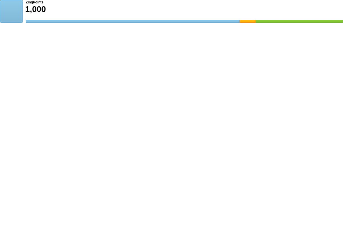
ZingChart scorecard charts use the type attribute and the options object. In your chart object, add a type attribute and set the value to scorecard. Next, create an options object. To give the chart some data to display, we will be modifying the value and title attributes. Without further modification, here is how the default scorecard chart appears:
{
      type: 'scorecard',
      options: {
        value: {
          text: '1,000'
        },
        title: {
          text: 'ZingPoints'
        }
      }
}

Multiple Scorecards in a Single Chart
To create multiple scorecards in a single chart, add a layout attribute. Include a value of nxn to represent the number of rows by columns that you want your scorecard to display as. Add a graphset object array and then add each dataset as its own object. The following demo is an example of a 2x2 scorecard:
{
  layout: '2x2',
  graphset: [
    {
      type: 'scorecard',
    },
    {
      type: 'scorecard',
    },
    {
      type: 'scorecard',
    },
    {
      type: 'scorecard',
    }
  ]
}

Data
Use the options object to configure the scorecard chart. Within a value object, include a text attribute with your data as its string value.
{
  options: {
    value: {
      text: '1,000' //scorecard data
    }
  }
}
Chart-Specific Properties
Horizontal Space
The hSpace attribute sets the width of the space between the icon and the rest of the elements.
{
  options: {
    hSpace: 100,
  }
}
Value
The value object is used to configure what and how the value of the scorecard displays. Use color to specify the color of the value that will be displayed. Provide a color or HEX value.
{
  options: {
    value: {
      text: '1,000',
      color: "#0AD3F1"
    }
  }
}
Title
The title object is used to configure what and how the title of the scorecard displays. Within the title object, use these attributes to change the configuration: text and color. Use the text attribute to add a title to the scorecard. color specifies the color of the title that will be displayed. Provide a color or HEX value.
{
  type: 'scorecard',
  options: {
    title: {
      text: 'ZingPoints'
      // color: red
    }
  }
}
Bars
Use the bars attribute to modify the built-in bar at the bottom of the scorecard. You are able to have the bar represent one value or multiple value using ratios. This is accomplished by setting bars equal to an array of objects. Each object in this array has a text and value attribute that directly affects the lower bar. Order matters as the first object will directly affect the leftmost section of the bar if multiple objects are present.
{
  options: {
    bars: [
      {
        text: 'Christopher',
        value: '675'
      },
      {
        text: 'Aaron',
        value: '50'
      },
      {
        text: 'Nick',
        value: '275'
      }
    ]
  }
}
Icon
Use the icon object to display an image on the scorecard, and configure its scale. Within the icon object, use these attributes to change the configuration: backgroundImage and backgroundScale. Use backgroundImage to display the image and backgroundScale to scale the size of the image on the scorecard.
{
  options: {
    icon: {
      backgroundImage: 'https://app.zingsoft.com/api/file/73CNKMOJ/clock.png',
      backgroundScale: 0.95
    }
  }
}

Further Customization
Further customize your scorecard chart by configuring a few important features that will make it easier to highlight exactly what you want to display.
Palette
Use the palette array to specify colors to be used by the bars and the bar's associated tooltip. Provide the color values as array of string arrays.
Each string array represents [backgroundColor1, backgroundColor2, borderColor].

{
  options: {
    palette: [['#2196F3', '#3F51B5', '#42A5F5'], ['#5C6BC0', '#64B5F6', '#7986CB'], ['#90CAF9', '#9FA8DA', '#BBDEFB']],
  },
}
Plot Area
With scorecard charts, you may want to decrease the size of the plot area for better visualization. The plotarea object allows adjustments to be made to the entire plot.
Note: For more information on the plotarea object, refer to our plotarea JSON Configuration page.

{
  plotarea: {
    margin: '10px'
  }
}