Bullet Charts
Overview
ZingChart supports two bullet chart types:
- Standard
- Horizontal
These chart types can then be modified to display bars as:
- Bars
- Cones
- Histograms
- Stacked (Standard or 100%)
Note: See our Bullet Chart Gallery for inspiration on all the different bullet chart possibilities.
Bullet Chart Types
Use the type attribute to specify your chart type. We have two bullet chart types: bullet or hbullet. Using a graphset array, you can also create trellis charts.
Create your own custom bullet charts using our mixed and hmixedchart types (by combining different chart types, such as bar/bullet or bar/scatter) and bar and hbar chart types (by overlapping and stacking your bars).
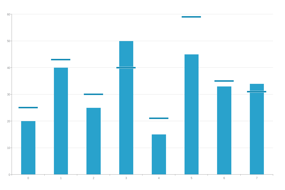
Bullet Chart
Add a type attribute to your chart object and set the value to bullet or vbullet. Without further modification, a bullet chart with a single dataset looks like this:
{
  type: "bullet",
  series: [
    {
      values: [20,40,25,50,15,45,33,34],
      goals: [25,43,30,40,21,59,35,31]
    }
  ]
}
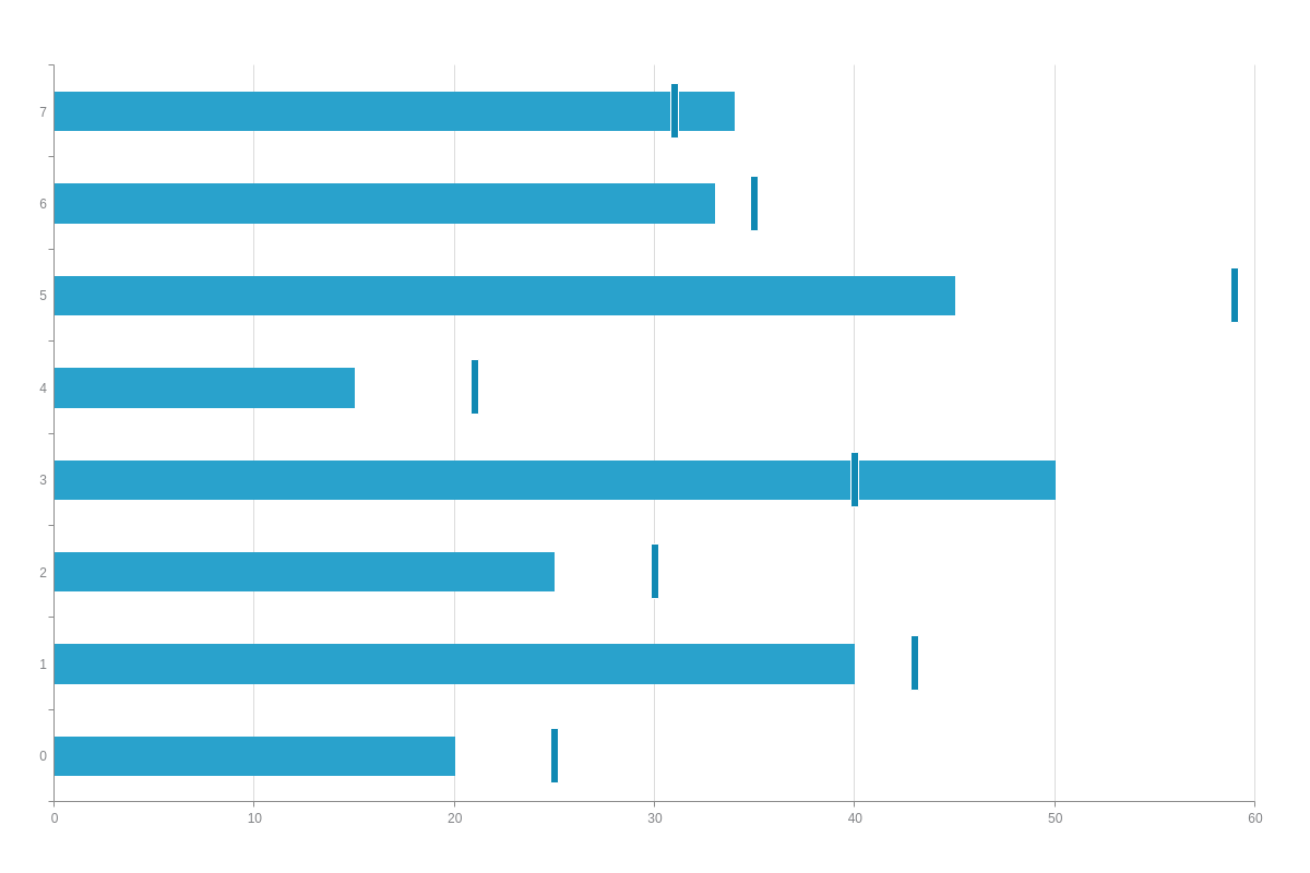
Horizontal Bullet Chart
Horizontal bullets are specified by the hbullet value. With this chart type, the axes are switched so that the x-axis runs vertically and the y-axis runs horizontally.
{
  type: "hbullet",
  series: [
    {
      values: [20,40,25,50,15,45,33,34],
      goals: [25,43,30,40,21,59,35,31]
    }
  ]
}
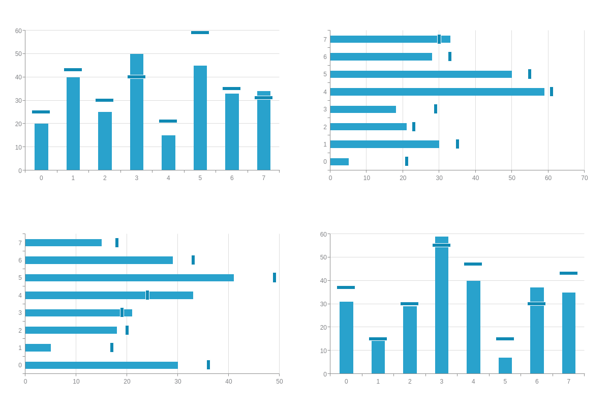
Trellis Bullet Chart
To create a trellis chart, add a graphset array and place each of your individual chart objects inside it. You can size and position each bullet chart to achieve your desired look.
Note: Read our Adding Additional Charts page for more information on graphset arrays and trellis charts.
{
  graphset: [
    {
      type: "bullet"
    },
    {
      type: "hbullet"
    }
  ]
}
Custom Bullet Charts
You can create your own custom bullet charts by using several of our other chart types: mixed, hmixed, bar, and hbar. With Mixed Charts, you create a bullet chart by combining two or more chart types into a single chart. With Bar Charts, you achieve a bullet chart's appearance by overlapping and stacking multiple bars.
Note: See our Mixed Chart Gallery for inspiration on all the different mixed chart possibilities.
//shortened for brevity- click following mixed chart demos to view full configurations
{
  type: "mixed",
  plot: {
    'bars-overlap': "100%",
    stacked: true
  },
  series: [
    {
      type: 'bar'
    },
    {
      type: "bullet"
    }
  ]
}
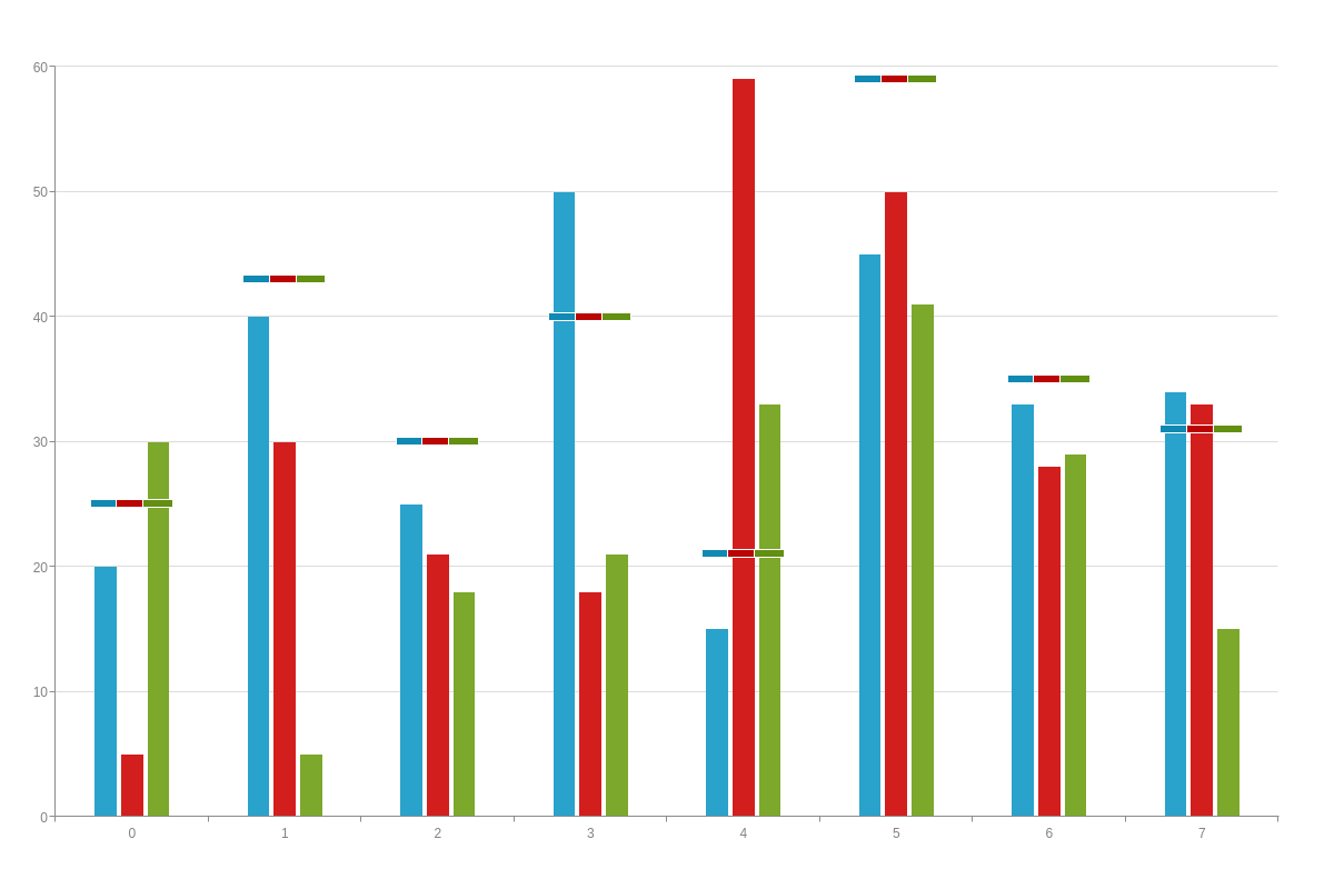
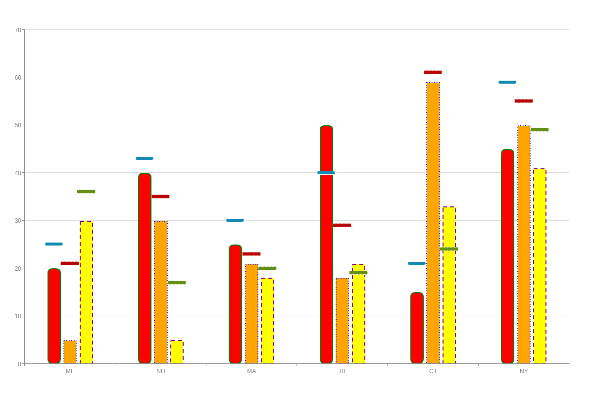
Bar/Bullet Mixed Chart
This is a mixed chart containing three stacked bar charts and one bullet chart:
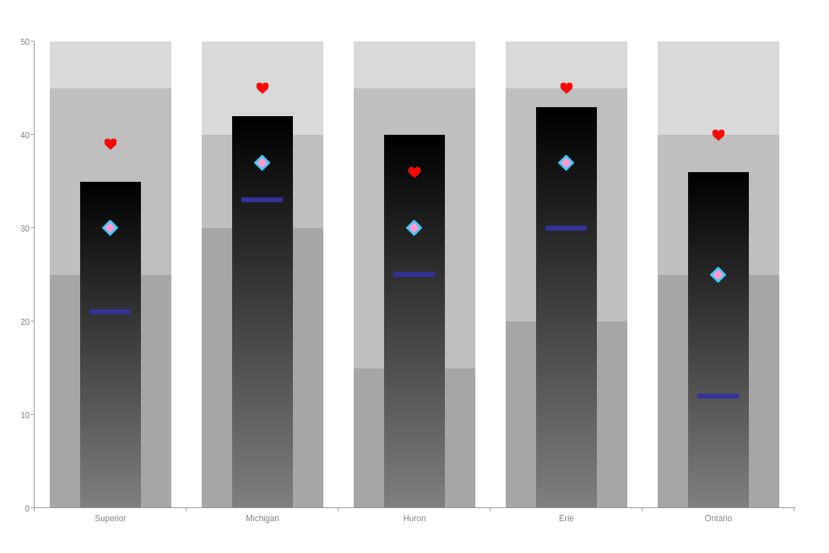
Bar/Scatter Mixed Chart
This is a mixed chart containing three stacked bar charts, an overlapping bar chart (to represent the "bar" portion of the bullet chart), and three scatter charts with rectangle, diamond, and heart-shaped markers, respectively:
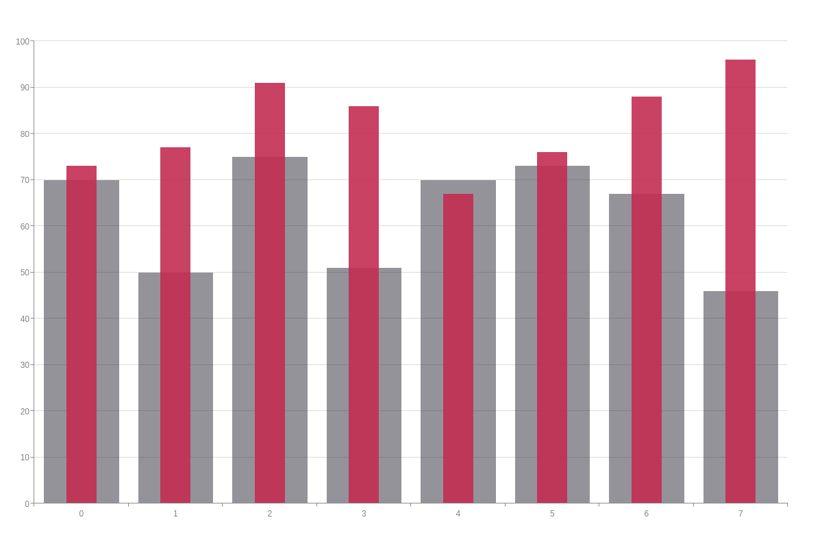
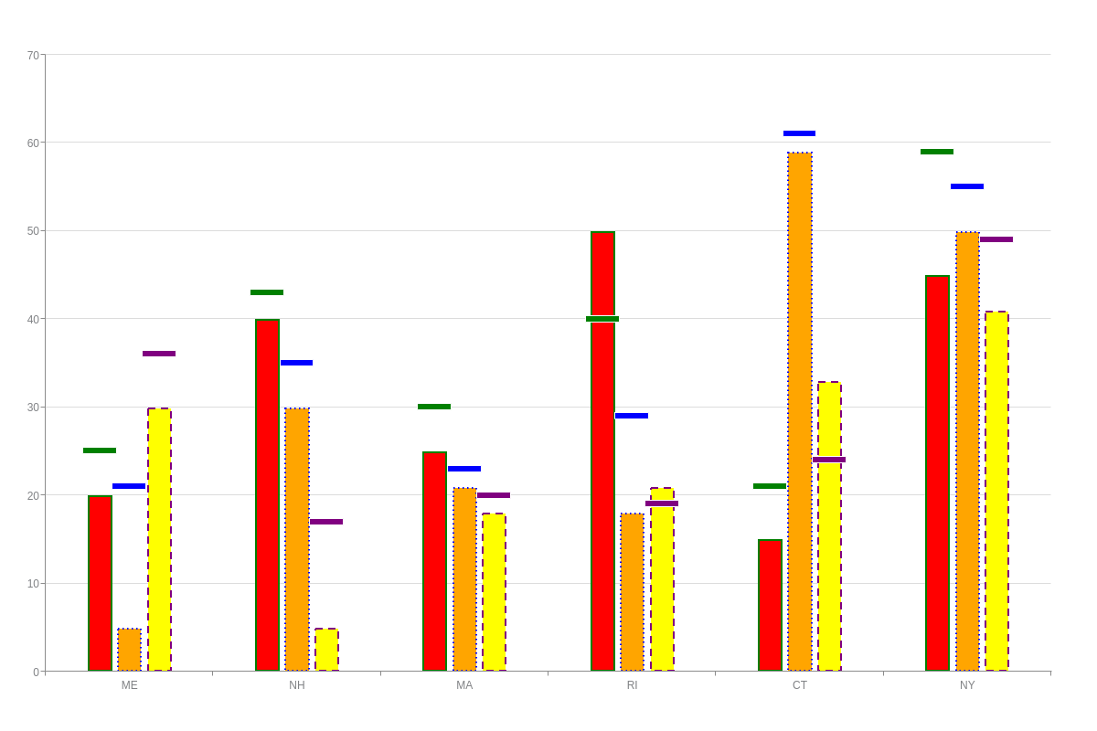
Overlapping Bar Chart
Here is a bullet chart that was created using overlapping bars set to varying widths:
Data
Bullet charts support single or multiple datasets, and all data is contained inside the series array. In addition to your values, you need to provide corresponding goals. This can be done in a plot object or in individual series objects depending on whether you want your goals to apply globally or locally.
Global Goal
In your plot object, add a goals array. Provide your goal values, making sure that the number of goals matches the number of values in each of your datasets. The bullet chart below has a single goals array with three datasets:
{
  type: "bullet",
  plot: {
    goals: [25,43,30,40,21,59,35,31]
  },
  series: [
    {
      values: [20,40,25,50,15,45,33,34]
    }
  ]
}
Local Goals
Add a goals array to each of your series objects. Provide your goal values, making sure that the number of goals matches the number of values in each of your datasets.
{
  type: "bullet",
  series: [
    {
      values: [20,40,25,50,15,45,33,34],
      goals: [25,43,30,40,21,59,35,31]
    }
  ]
}
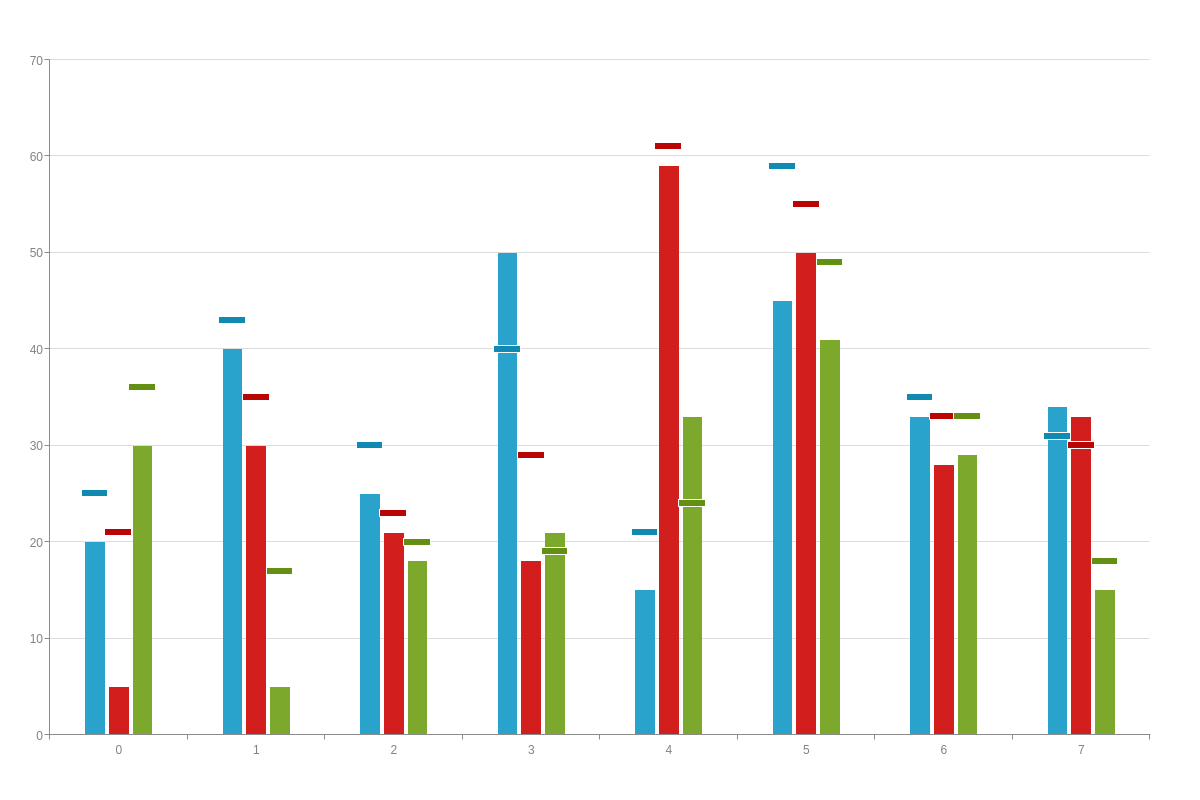
Chart-Specific Properties
In addition to their default rectangular shape, bullet chart bars can display as cones or histograms. You can also stack datasets on top of each other to create standard stacked or 100% stacked charts, as well as group data into two or more stacks.
The following demo illustrates the different options available for the bullet chart modifications discussed below:
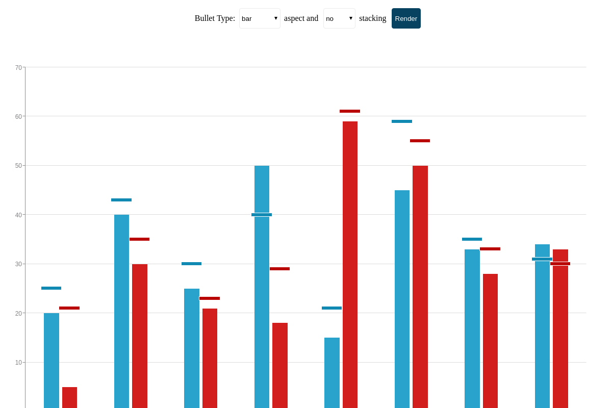
Aspect
The aspect attribute allows you to change the appearance of your bars and they can be applied globally to affect all plots or locally to affect specific plots. The aspect value options for bullet charts are:
| Value | Description |
|---|---|
bar (default) |
Data is presented as rectangular bars. Since it is the default aspect, specifying its type is optional. |
cone |
Data is presented as cones |
histogram |
Data is presented as a series of joined bars. Sometimes called a joined or stepped bar chart, this chart type is useful for emphasizing abrupt changes in your data. |
To apply aspects globally, create a plot object. Insert your aspect attribute.
plot: {                /* Plot object */
    aspect: 'bar'        /* "cone" | "histogram" */
}
To apply aspects locally, add them to the chart data object you want the change to apply to.
series: [
    {    /* Chart data object */
        aspect: "bar", /* "cone" | "histogram" */
        values: [y0, y1, y2, y3, ..., yN]
    }
]
Stacked
The stacked attribute allows you to stack two or more datasets on top of each other. You can display standard stacked, 100% stacked, or multiple stacked bullet charts.
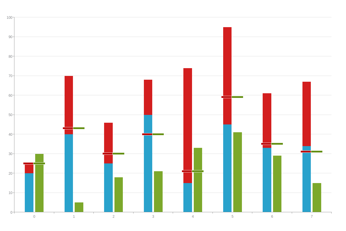
Standard Stacked Bullet Chart
In your plot object, add a stacked attribute and set the value to true. Your datasets will be placed on top of each other so that the top line represents the sum total for all of your stacked data. (By default, the value is set to false.) Optionally, you can add a stack-type attribute with a value of normal.
Note: When working with stacked bullet charts, take into consideration your goals array. Your goal values may need to be adjusted accordingly.
{
  type: "bullet",
  plot: {
    goals: [25,43,30,40,21,59,35,31],
    stacked: true
  }
}
100% Stacked Bullet Chart
With a 100% stacked bullet chart, each data layer is represented as a percentage of the whole so that the entire stack totals to 100%. In your plot object, add a stacked attribute and set the value to true. Next, add a stack-type attribute and set the value to 100%.
You'll also need to specify your minimum and maximum y-axis values. You can do so by creating a scale-y object and setting your min-value attribute to 0 and your max-value attribute to 100. Alternatively, you can add a values attribute and include your min and max value as string separated by colons- values: "0:100".
Note: Learn more about min/max scales with our Scales Tutorial.
{
  type: "bullet",
  plot: {
    goals: [25,43,30,40,21,59,35,31],
    stacked: true,
    'stack-type': "100%"
  },
  'scale-y': {
    values: "0:100:25",
    format: "%v%"
  }
}
Bullet Charts and Multiple Stacks
In your plot object, add a stacked attribute and set the value to true. To separate your datasets into multiple stacks, you'll next go to your series array. In each series object, add a stack attribute. For datasets you want included in the first stack, set the value to 1. For datasets you want included in the second stack, set the value to 2, and so on.
In the following chart, the first two datasets were assigned to stack one and the third dataset was assigned to stack two:
{
  type: "bullet",
  plot: {
    goals: [25,43,30,40,21,59,35,31],
    stacked: true
  },
  series: [
    {
      values: [20,40,25,50,15,45,33,34],
      stack: 1
    },
    {
      values: [5,30,21,18,59,50,28,33],
      stack: 1
    },
    {
      values: [30,5,18,21,33,41,29,15],
      stack: 2
    }
  ]
}
Further Customization
Further customize your bullet chart by configuring your scales, styling your bars and goals, adding scale markers, modifying your tooltips, and incorporating a legend.
Scales
Our Configuring Your X/Y-Axis Scales Tutorial provides detailed information on how to set up and customize your scales. We provide a brief introduction to linear and category scales here, since they are the most commonly used when it comes to bullet charts.
Note: While the following sections display scale configurations on the more commonly used axis (scale-x or scale-y), you can generally make the same changes to either axis.
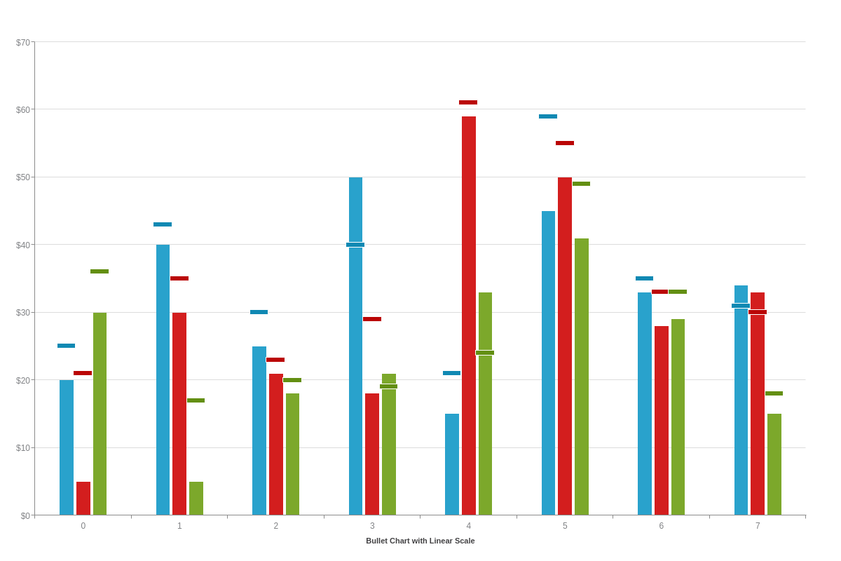
Linear Scale
Linear scales are our default scale type. You'll want to specify your minimum, maximum, and step scale values by adding a values attribute to your scale-x and/or scale-y object. Provide your min/max/step inside a string separated by colons.
You can format and style your scale to display currencies, percentages, abbreviated numbers, and much more.
{
  type: "bullet",
  'scale-x': {
    label: {
      text: "Bullet Chart with Linear Scale"
    }
  },
  'scale-y': {
    format: "$%v"
  }
}
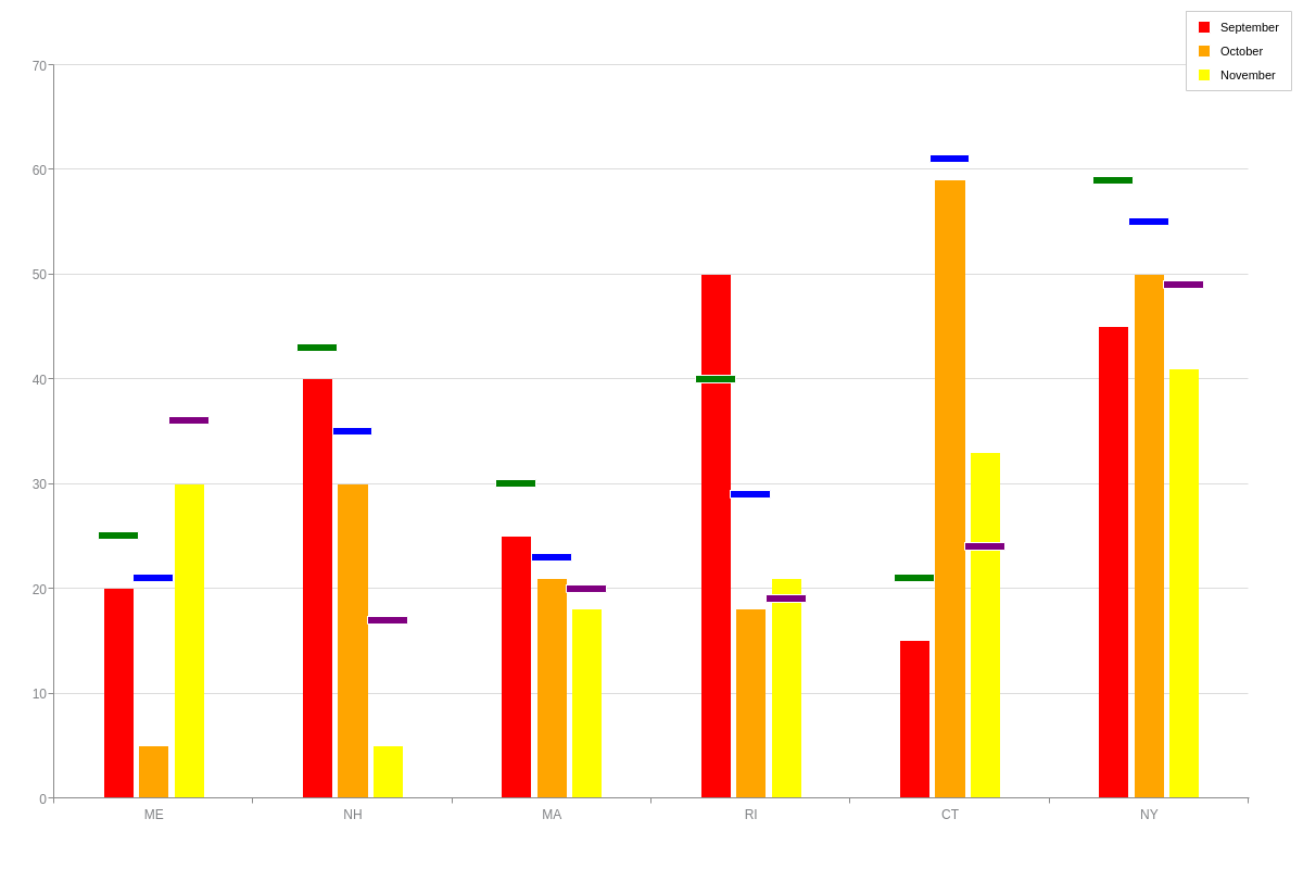
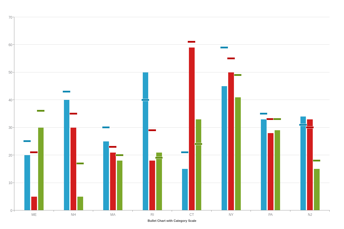
Category Scale
Category scales allow you to display any word and/or number combination, such as names, dates, places, events, and more. Generally used on the x-axis, you'll want to add a labels array to your scale-x object. Add your scale labels as string values separated by commas.
{
  type: "bullet",
  'scale-x': {
    label: {
      text: "Bullet Chart with Category Scale"
    },
    labels: [ "ME", "NH", "MA", "RI", "CT", "NY", "PA", "NJ" ]
  }
}
Bar Styling
To style your bullet chart's bars, start in the applicable series object. You can change your bar fill color with a background-color attribute. For a single color fill, add one hexadecimal or RGB value. For a gradient (two color) fill, add two values separated by a space. To adjust your transparency levels, add an alpha attribute. Provide a value between 0-1, with the former being clear and the latter being opaque. Make sure to place a zero before your decimal point.
You can style your borders with border-color, border-width, border-radius (rounded corners), and/or line-style attributes. line-style accepts these values: solid (default), dotted, dashed.
Note: Browse our Plot/Series JSON Attributes/Syntax page for additional styling options.
{
  series: [
    {
      values: [20,40,25,50,15,45,33,34],
      goals: [25,43,30,40,21,59,35,31],
      'background-color': "red",
      alpha: 1,
      'border-color': "green",
      'border-width': 2,
      'border-radius': "9px",
      'line-style': "solid" // "dotted" | "dashed"
    }
  ]
}
Goal Styling
By default, your goals will inherit whatever styles you specify for your bars. To provide goal-specific styling, start in your applicable series object, and create a goal object. Place your styling attributes inside.
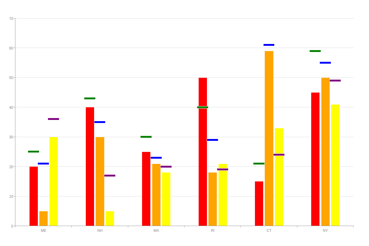
{
  type: "bullet",
  'scale-x': {
    labels: [ "ME", "NH", "MA", "RI", "CT", "NY" ]
  },
  series: [
    {
      values: [20,40,25,50,15,45,33,34],
      goals: [25,43,30,40,21,59,35,31],
      'background-color': "red",
      'border-color': "green",
      'border-width': 2,
      'line-style': "solid",
      goal: {
        'background-color': "green",
        'line-style': "solid" // "dotted" | "dashed"
      }
    }
  ]
}
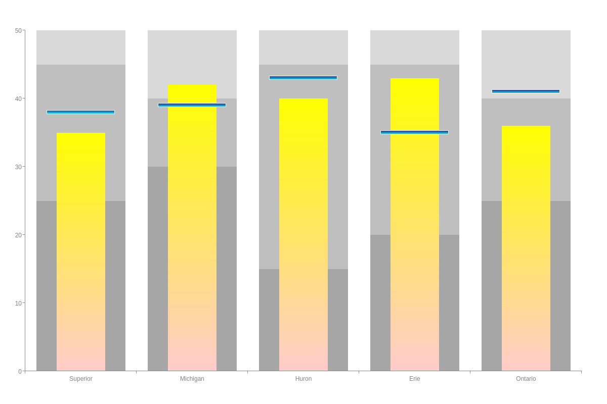
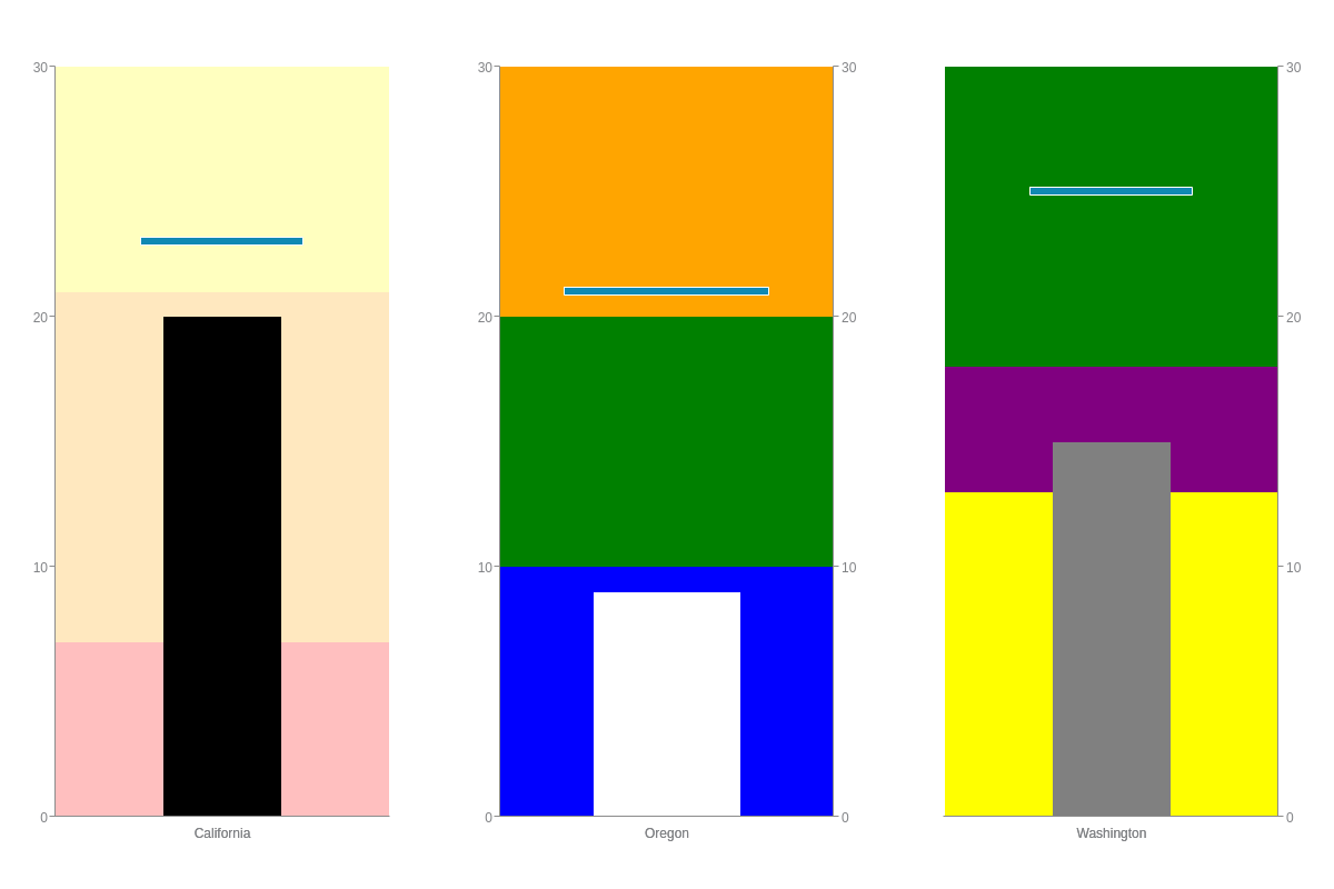
Scale Markers
When working with individual bullet charts, you can use scale markers to set the ranges that would typically be achieved by stacking bars in a mixed chart.
In the below example, each chart was assigned its own chart object, and then the objects were placed into a graphset array.
Scale markers (typically used to highlight or emphasize specific data ranges in your chart) were used to create the range bars that appear in each bullet chart. Start by adding a markers array into your scale-y object. Inside the array, create an object for each of your range bands. Add a type attribute, and set the value to area. Next, add a range attribute, and specify your values in an array (e.g., [0,7]).
Finally, you'll want to style your scale markers using attributes such as background-color.
Note: For a more comprehensive list of related attributes, see our JSON Attributes/Syntax pages for scale-x marker attributes and scale-y marker attributes.
Tooltips
You can customize your tooltips to specify how the text and styling appear. First, add a tooltip object to your chart object. Next, add a text attribute, and provide your desired text inside a string. You can use tokens such as %v to represent your series values and %g to represent your goals.
For tooltip styling, common attributes used include: font-color, font-family, background-color, border-color, border-width, and line-style.
Note: See our Tooltips JSON Attributes/Syntax page for additional styling options.
{
  type: "bullet",
  tooltip: {
    text: "Value: %v<br>Goal: %g",
    'font-color': "purple",
    'font-family': "Verdana, Geneva, sans-serif",
    'background-color': "white",
    'border-color': "yellow",
    'border-width': 2,
    'line-style': "dotted"
  }
}
Legend
To include a legend on your chart, place a legend object in your chart object. You can include attributes to specify your legend's layout, positioning, styling, headers/footers, and more.
Note: Learn more about legends with our Legends Tutorial and Legends JSON Attributes/Syntax page.
{
  type: "bullet",
  legend: {}
}