Context Menu
Overview
The context menu is what appears when you right-click on an area of the chart. It allows for further chart interactions such as reloading the chart, viewing it as an image, printing the chart, and more. You can enable or disable various context menu items, as well as create your own custom items. You also have the option to display a context menu button so that mobile users can access the menu by tapping the icon.
Note: If you are building JavaScript charts that will be primarily viewed on mobile devices, you should use our mobile charts plugin. Built using ZingTouch, the plugin supports touch gestures and displays charts with mobile-specific features, including a custom context menu. Refer to the Mobile Charts Tutorial for more information.
Setup
The gui object should be placed before the graphset array because it is a loader object. In the object, you can enable or disable existing context menu items with the behaviors array or create custom menu items and/or display a context menu button with the contextMenu object.
{
  gui: {
    //Context Menu Customization Here
  },
  graphset: [
    {
      //Chart JSON Here
    }
  ]
}
Refer to the GUI JSON page for a full list of objects and attributes.
Context Menu Items
You can style the appearance of the context menu, as well as choose what menu items to display by using our behavior IDs or by creating your own custom menu items.
Styling Menu Items
To style the context menu, add a contextMenu object to the gui object. You can change the background color of the context menu object with a backgroundColor attribute. You can fix the menu to a specific position with the docked (true or false) and position (left or right) attributes. To style the context menu items, create an item object. You can style the background and font colors, as well as how the items appear when hovered over. Refer to the Context Menu Item JSON page for a full attribute list.
{
  gui: {
    contextMenu: {
      backgroundColor: 'red',
      item: {
        backgroundColor: 'pink',
        fontColor: 'black',
        hoverState: {
          backgroundColor: 'black',
          fontColor: 'white'
        }
      }
    }
  },
  graphset: [
    {
      //Chart JSON omitted for brevity.
    }
  ]
}
Enabling/Disabling Menu Items
In the gui object, use the behaviors array to enable or disable various context menu behaviors.
Refer to the list of context menu behavior IDs below. In the following chart, the Download PDF behavior was disabled and the Crosshair Hiding/Showing behavior was enabled. Right-click on the chart to interact with the context menu.
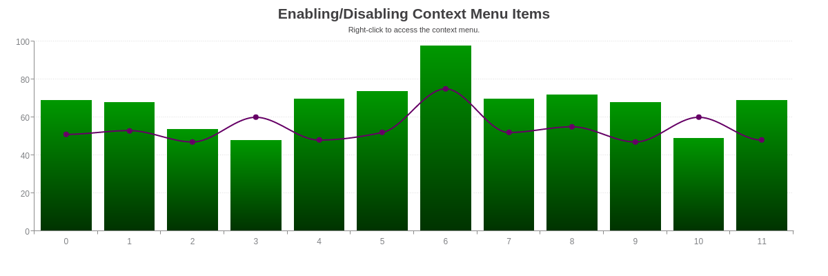
{
  gui: {
    behaviors: [
      {
        id: 'DownloadPDF',
        enabled: 'none'
      },
      {
        id: 'CrosshairHide',
        enabled: 'all'
      }
    ]
  },
  graphset: [
    {
      //Chart JSON omitted for brevity.
    }
  ]
}
Behavior IDs
Below is a list of behavior IDs that can be used in the behaviors array.
| Built-In IDs | |
|---|---|
| About | BugReport |
| BuyLicense | CrosshairShow |
| CrosshairHide | 2D |
| 3D | DownloadPDF |
| DownloadCSV | DownloadXLS |
| DownloadSVG | EnterEdit |
| ExitEdit | ExportData |
| FeedClear | FeedFaster |
| FeedPause | FeedSlower |
| FeedStart | FullScreen |
| ShowGuide | HideGuide |
| HistoryBack | HistoryForward |
| LinScale | LogScale |
| LoupeHide | LoupeShow |
| MaximizeLegend | MinimizeLegend |
| NormalScreen | |
| Reload | SaveAsImage |
| ShowAll | ViewSource |
| ZoomIn | ZoomOut |
| SaveAsImagePNG (toggles "View as PNG") |
Refer to the Behaviors JSON page for more information.
Creating Custom Items
To create your own custom context menu item, you'll need to first create the JavaScript function you want executed when clicked on. Next, add a customItems array to the contextMenu object to define the custom context menu item. Each object must contain:
Finally, in the behaviors array, enable your custom context menu item by specifying the id and enabled attributes in their own object.
In the following chart, a Show Alert custom context menu item was created. Right-click on the chart to interact with the context menu.
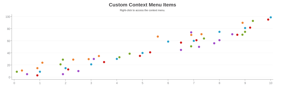
window.zingAlert= function(){
  window.alert("ZingChart is great for making interactive and stylish charts!")
}

var myConfig = {
  gui: {
    contextMenu: {
      customItems: [
        {
          text: 'Show Alert',
          function: 'zingAlert()',
          id: 'showAlert'
        }
      ]
    },
    behaviors: [
      {
        id: 'showAlert',
        enabled: 'all'
      }
    ]
  },
  graphset: [
    {
      //Chart JSON omitted for brevity.
    }
  ]
}
Context Menu Button
You can add a context menu button to your chart. This allows mobile users to tap on the icon to access the context menu. In the contextMenu object, create a button object. Add a visible attribute, and set the value to true. The context menu button will appear in the upper-left corner of the chart.
Note: Alternatively, you can use the mobile charts plugin, which is recommended for use on web pages that will be primarily viewed on mobile devices. Built using ZingTouch, the plugin supports touch gestures and includes a mobile context menu and other mobile-specific features. Refer to the Mobile Charts Tutorial for more information.
{
  gui: {
    contextMenu: {
      button: {
        visible: true
      }
    }
  },
  graphset: [
    {
      //Chart JSON omitted for brevity.
    }
  ]
}
Styling the Menu Button
To style the context menu button, add a gear object to the contextMenu object. You can change the color and transparency level of the icon using the backgroundColor and alpha attributes. Refer to the Gear JSON page for a full attribute list.
{
  gui: {
    contextMenu: {
      button: {
        visible: true
      },
      gear: {
        backgroundColor: 'red',
        alpha: 1
      }
    }
  },
  graphset: [
    {
      //Chart JSON omitted for brevity.
    }
  ]
}
Creating a Custom Button
You can create your own custom context menu button using ZingChart shapes and the shape_click API event. See the following chart.
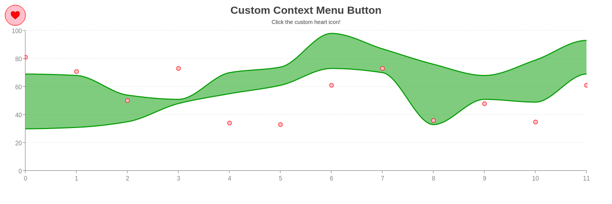
var myConfig = {
  graphset: [
    {
      type: 'mixed',
      shapes: [
        {
          id: 'custom-cm-button',
          type: 'circle',
          backgroundImage: 'https://www.zingchart.com/resources/heart.png',
          backgroundRepeat: 'no-repeat',
          size: 20,
          backgroundColor: "pink",
          borderWidth: 1,
          borderColor: 'red',
          x: 30,
          y: 30,
          cursor: 'hand'
        }
      ],
      //Remaining chart JSON omitted for brevity.
    }
  ]
};

zingchart.bind('myChart', 'shape_click', function(e){
  if(e.shapeid === 'custom-cm-button') {
    zingchart.exec('myChart', 'showmenu', {
      x: 55,
      y: 35
    });
  }

})
Summary
The ZingChart context menu, accessed on a right click, allows you to use built in ZingChart functions to export your chart, view the JSON source, and more. With features automatically added, such as zoom in/out capability from the context menu when zooming is enabled on your chart, the context menu is an easy way to allow users to interact with your chart by pressing a clearly labeled button. Context Menu items can be customized, hidden, and more!
For a full list of context menu attributes, see the JSON configuration page.