JavaScript Grids
ZingChart has a basic grid type built in to display your chart data as a table. For more interactive tables and grids with data visualization features, check out ZingGrid!

ZingGrid is a JavaScript library for rendering grids and data tables. ZingGrid's main focus is on fast, responsive, and customizable grids utilizing ES6 and native web components. The goal is to solve the problem of creating a CRUD grid in under five minutes. With an appropriate REST endpoint, this is easily achievable. Download ZingGrid for free here.

Note: See our Grid Chart Gallery for inspiration on all the different grid chart possibilities.
Grid Chart Type
Add a type attribute to your chart object and set the value to grid.
{
  type: "grid"
}
Data
Grid charts support a series array of objects.
String/Number Array
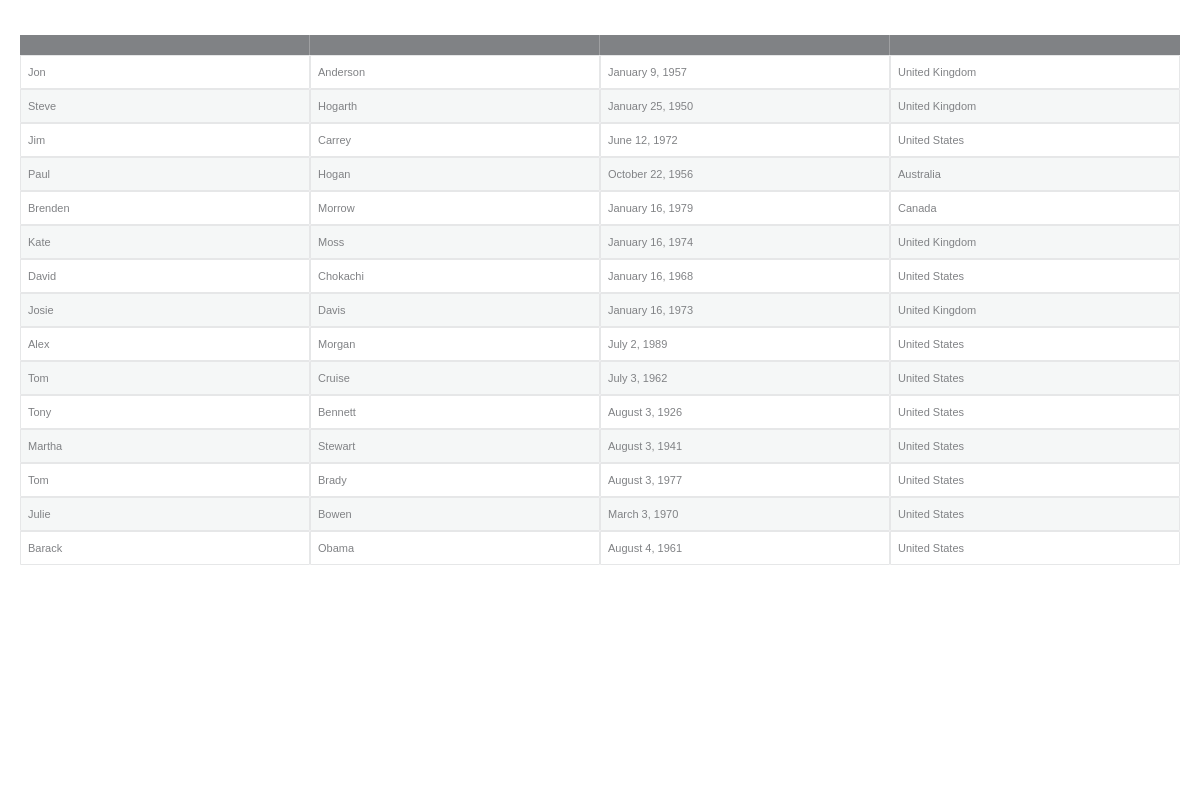
Create a series object array. Each object corresponds to a row in the grid. Within each object, create a values array of numbers and/or strings to populate each cell of a row.
{
  type: 'grid',
  series: [ // Array of objects
    {
      values: [ // Array of numbers | strings
        (Row 1-Col 1),
        (Row 1-Col 2),
        ...,
        (Row 1-Col N)
      ]
    },
    {
      values: [
        (Row 2-Col 1),
        (Row 2-Col 2),
        ...,
        (Row 2-Col N)
      ]
    },
    ...,
    {
      values: [
        (Row N-Col 1),
        (Row N-Col 2),
        ...,
        (Row N-Col N)
      ]
    }
  ]
}
Grid-Specific Properties
JavaScript grids include a number of unique chart-specific properties that allow you to manipulate the appearance and behaviors of your HTML5 grid. They can be implemented into your chart by placing them within an options object.
Header Column
The headerCol attribute sets whether the grid has a header column or not. It can be added by setting the headerCol attribute to true, or by creating an empty headerCol object.
{
  options: {
    headerCol: true
  }
}

Header Row
The headerRow attribute sets whether the grid has a header row or not. It can be added by setting the headerRow attribute to true, or by creating an empty headerRow object.
{
  options: {
    headerRow: true
  }
}
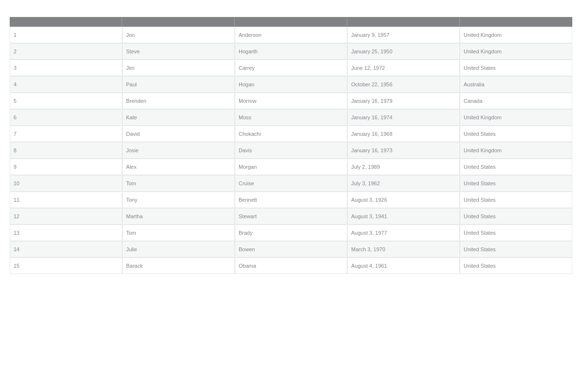
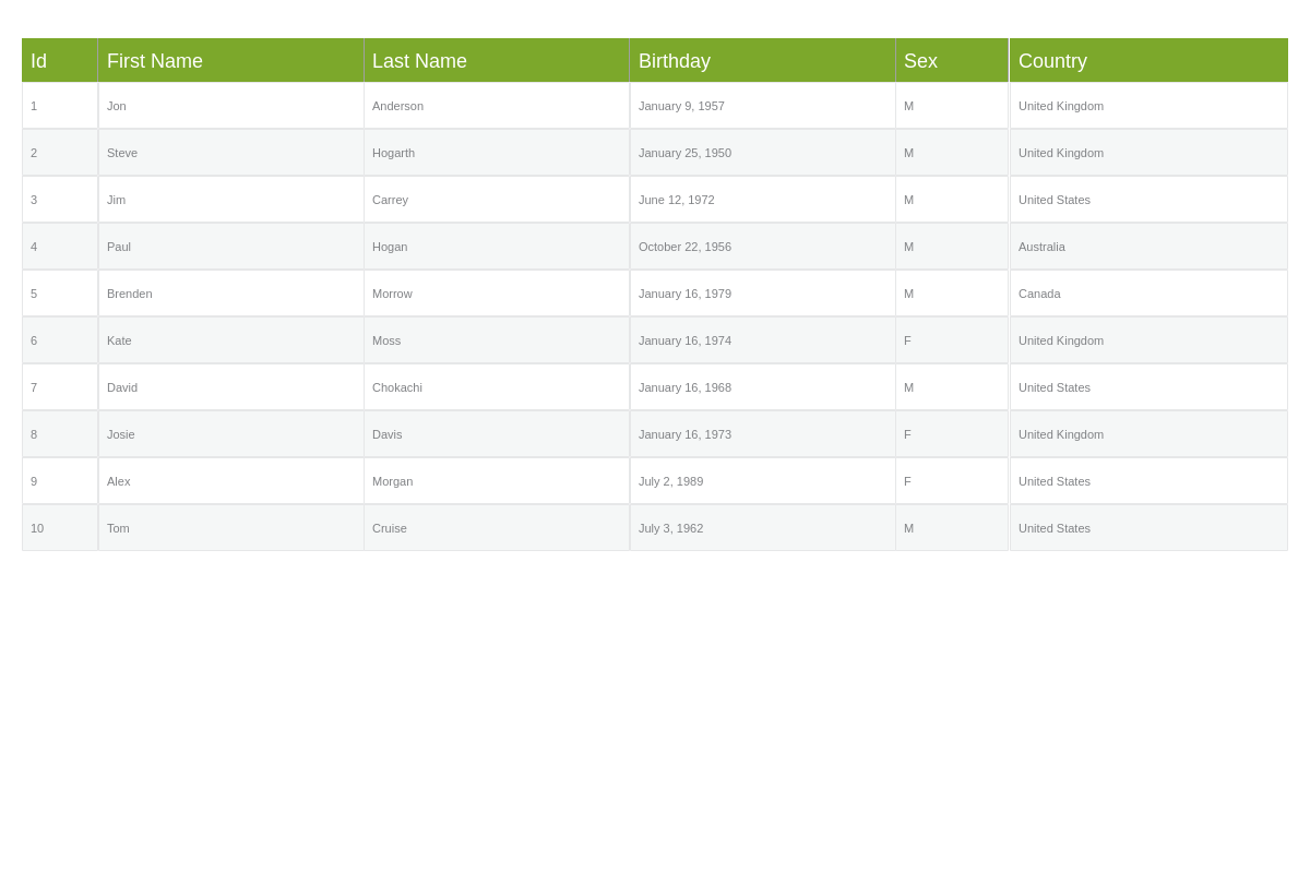
Header Row Labels
The rowLabels attribute defines the labels of the grid rows. To display the row labels, also set headerCol to true.
{
  options: {
    headerCol: true,
    rowLabels: ['1', '2', '3', '4', '5', '6', '7', '8', '9', '10', '11', '12', '13', '14', '15'],
  }
}
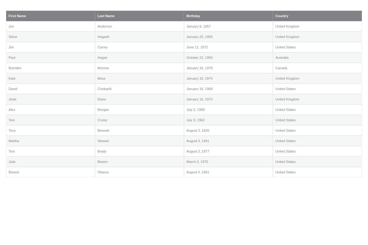
Column Labels
The colLabels attribute defines the labels of the grid columns. To display the column labels, also set headerRow to true.
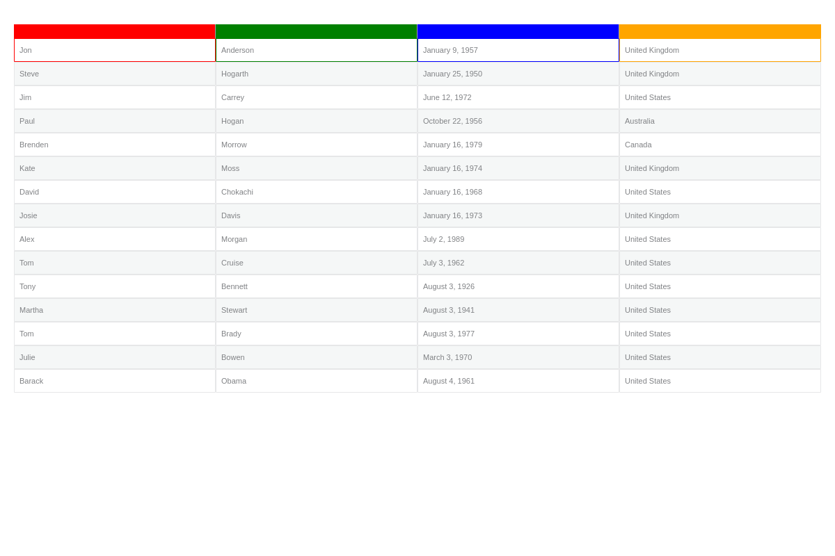
{
  options: {
    headerRow: true,
    colLabels: ['First Name', 'Last Name', 'Birthday', 'Country'],
  }
}
Column Widths
The colWidths attribute defines the widths of the grid columns, specified either in fixed values or as a percentage.
{
  options: {
    colWidths: [ '5%', '25%', '25%', '15%', '5%', '25%' ],
  }
}
Classes
The dataClass attribute sets an array of class names which will be applied on each column.
If the attribute appears on the series object, the style will be applied on the data cells, otherwise, on the header cells.
{
  options: {
    dataClass: ['fillRed', 'fillGreen', 'fillBlue', 'fillOrange']
  },
  series: [
    {
      values: ['Jon', 'Anderson', 'January 9, 1957', 'United Kingdom'],
      dataClass: ['strokeRed', 'strokeGreen', 'strokeBlue', 'strokeOrange']
    },
}
Flat
The flat attribute sets whether the grid cells are clickable or not. Enter a boolean value.
{
  options: {
    flat: true
  }
}
Force Height
The forceHeight attribute forces the grid to fill the entire height of the plotarea.
{
  options: {
    forceHeight: true
  }
}
Using Data Sources
Graph
Set the graph attribute to the ID of chart that the grid is being linked with.
Note that the graph and grid has to be within the same graphset and the chart must by assigned the id attribute.
{
  options: {
    dataSource: {
      graph: '...'
    }
  }
}
Scale
Set the scale attribute to the name of the scale from which the column labels are being imported.
{
  options: {
    dataSource: {
      scale: '...'
    }
  }
}
Further Customization
Once you have your basic grid, you can customize and style it to fit your data visualization needs.
Styling Attributes
The following attributes can be used to style grid charts:
| Attribute | Description |
|---|---|
.td |
Defines the style for grid cells |
.td_3 |
Defines the style for grid cells on column 3 |
.td_2_3 |
Defines the style for grid cells on row 2, column 3 |
.td_even |
Defines the style for the even grid cells |
.td_odd |
Defines the style for the odd grid cells |
.td_first |
Defines the style for the first grid cells |
.td_last |
Defines the style for the last grid cells |
.th |
Defines the style for the header cells |
.th_3 |
Defines the style for the header cells on column 3 |
.th_even |
Defines the style for the even header cells |
.th_odd |
Defines the style for the odd header cells |
.th_first |
Defines the style for the first header cells |
.th_last |
Defines the style for the last header cells |
.tr |
Defines the style for the grid rows |
.tr_3 |
Defines the style for the grid rows on row 3 |
.tr_even |
Defines the style for the even grid rows |
.tr_odd |
Defines the style for the odd grid rows |
.tr_first |
Defines the style for the first grid rows |
.tr_last |
Defines the style for the last grid rows |