Mixed Charts
Overview
ZingChart supports three area chart types:
- Vertical
- Mixed 3D
- Horizontal
Note: See our Mixed Chart Gallery for inspiration on all the different mixed chart possibilities.
Mixed Chart Types
To specify your chart type, add the type attribute to your chart object. With mixed charts, we have three type values based on the chart's orientation: mixed (vertical), hmixed (horizontal), and mixed3d (three-dimensional).
Once you provide your mixed chart type, you'll need to add a series array. In each series object, specify which horizontal, vertical, or three-dimensional chart type you want applied to that dataset.
Note: Learn more about how to create 3D charts with our 3D Charts Tutorial.
Mixed Chart
Our vertically-oriented mixed chart is specified by the mixed value. The chart types that can be used with our default mixed chart are: area, bar, line, bullet, scatter, bubble, stock, and range. Below is a mixed chart containing area, bar, and line chart types:
{
  type: "mixed", // 1. Specify your mixed chart type.
  plot: {
    tooltip: {
      text: "%t"
    }
  },
  series: [ // 2. Specify the chart type for each series object.
    {
      type: "area",
      values: [34, 70, 40, 75, 33, 50, 65],
      aspect: "stepped",
      'contour-on-top': false,
      text: "Area Chart"
    },
    {
      type: 'bar',
      values: [49, 30, 21, 15, 59, 51, 69],
      'bar-width': "50%",
      text: "Bar Chart"
    },
    {
      type: "line",
      values: [5, 9, 3, 19, 7, 15, 14],
      aspect: "spline",
      text: "Line Chart"
    }
  ]
}
Horizontal Mixed Chart
The horizontally-oriented mixed chart is specified by the hmixed value. The axes are switched so that the x-axis is vertical and the y-axis is horizontal. The following chart types can be used with horizontal mixed charts: varea, hbar, vline, hbullet, hscatter, and hbubble. The chart below contains horizontal area, bar, and line chart types:
{
  type: "hmixed", // 1. Specify your mixed chart type.
  plot: {
    tooltip: {
      text: "%t"
    }
  },
  series: [ // 2. Specify the chart type for each series object.
    {
      type: "varea",
      values: [34, 70, 40, 75, 33, 50, 65],
      aspect: "stepped",
      'contour-on-top': false,
      text: "Area Chart"
    },
    {
      type: "hbar",
      values: [49, 30, 21, 15, 59, 51, 69],
      'bar-width': "50%",
      text: "Bar Chart"
    },
    {
      type: "vline",
      values: [5, 9, 3, 19, 7, 15, 14],
      aspect: "spline",
      text: "Line Chart"
    }
  ]
}
Small Multiple Mixed Chart
You can create a small multiple mixed chart (also known as a trellis or grid chart) using a graphset array. In the array, add a chart object for each of your mixed charts.
Note: Our Adding Additional Charts page explains in greater detail how to create a graphset array, as well as how to insert multiple charts throughout your webpage.
{
  graphset: [
    {
      type: "mixed",
      series: [
        {
          type: 'bar',
          values: [59, 70, 40, 75, 33, 50, 65],
          'bar-width': "50%"
        },
        {
          type: "line",
          values: [49, 30, 21, 15, 59, 51, 69],
          aspect: "spline"
        }
      ]
    },
    {
      type: "mixed",
      series: [
        {
          type: 'bar',
          values: [55, 71, 45, 77, 29, 40, 59],
          'bar-width': "50%"
        },
        {
          type: "line",
          values: [40, 29, 33, 19, 50, 61, 66],
          aspect: "spline"
        }
      ]
    },
    {
      type: "mixed",
      series: [
        {
          type: 'bar',
          values: [49, 55, 70, 60, 55, 43, 55],
          'bar-width': "50%"
        },
        {
          type: "line",
          values: [60, 34, 67, 27, 64, 71, 54],
          aspect: "spline"
        }
      ]
    },
    {
      type: "mixed",
      series: [
        {
          type: 'bar',
          values: [50, 41, 59, 79, 70, 61, 53],
          'bar-width': "50%"
        },
        {
          type: "line",
          values: [59, 15, 29, 34, 51, 66, 75],
          aspect: "spline"
        }
      ]
    }
  ]
}

Data
After specifying your mixed chart type, add a series array. In each series object, first add a type attribute. Provide the chart type you want applied, but remember that it must match the mixed chart type it falls under. You cannot, for example, set your mixed chart type to mixed and then add a bar3d or hscatter chart type to one of the series objects.
Next, provide your chart data. Remember that it must be formatted in accordance with that chart type. Refer to the applicable chart types page for the correct data format, or browse through the reference code block below:
{
  type: "mixed",  // 1. Specify your mixed chart type.
  series: [  // 2. In each series object, provide your chart type with corresponding data.
    {
      type: "area",  //Area Chart
      values: [y0, y1, y2, y3, ..., yN]
    },
    {
      type: 'bar',  //Bar Chart
      values: [y0, y1, y2, y3, ..., yN]
    },
    {
      type: "line",  //Line Chart
      values: [y0, y1, y2, y3, ..., yN]
    },
    {
      type: "bullet",  //Bullet Chart
      values: [y0, y1, y2, y3, ..., yN],
      goals: [goal0, goal1, goal2, goal3, ..., goalN]
    },
    {
      type: "scatter",  //Scatter Plot
      values: [
        [x0, y0],
        [x1, y1],
        [x2, y2],
        ...,
        [xN, yN]
      ]
    },
    {
      type: "bubble",  //Bubble Chart
      values: [
        [x0, y0, bubble0],
        [x1, y1, bubble1],
        [x2, y2, bubble2],
        ...,
        [xN, yN, bubbleN]
      ]
    },
    {
      type: "stock",  //Stock Chart
      values: [
        [open0, high0, low0, close0],
        [open1, high1, low1, close1],
        [open2, high2, low2, close2],
        ...,
        [openN, highN, lowN, closeN]
      ]
    },
    {
      type: "range",  //Range Chart
      values: [
        [lower-y0, upper-y0],
        [lower-y1, upper-y1],
        [lower-y2, upper-y2],
        ...,
        [lower-yN, upper-yN]
      ]
    }
  ]
}
Further Customization
Next, you'll want to configure your mixed chart scales and perhaps incorporate additional scales. You can also style your charts; which attributes to apply depends on the chart type being used. See examples of various stylings in the More Mixed Chart Combinations section below.
Scales
Our mixed charts support linear (default), category, time-series, and logarithmic scales.
Note: Read our Configuring Your Scales Tutorial for more in-depth information on how to set up and customize each scale type. You can also refer to the JSON Attributes/Syntax pages for scale-x and scale-y.
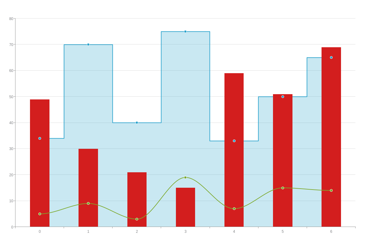
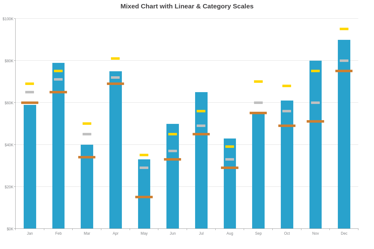
Linear and Category Scale
The following bullet and scatter mixed chart has a category scale on the x-axis and a linear scale on the y-axis.
To create category scale labels, use a labels array and provide your labels as string values separated by commas. To specify the minimum, maximum, and step scale values on linear scales, use a values attribute. Provide your min/max/step inside a string separated by colons.
{//shortened for brevity-click on following bullet/scatter mixed chart demo for full configuration
  type: "mixed",
  title: {
    text: "Mixed Chart with Linear & Category Scales"
  },
  'scale-x': {
    labels: [ "Jan", "Feb", "Mar", "Apr", "May", "Jun", "Jul", "Aug", "Sep", "Oct", "Nov", "Dec" ]
  },
  'scale-y': {
    values: "0:100:20",
    format: "$%vK"
  }
}
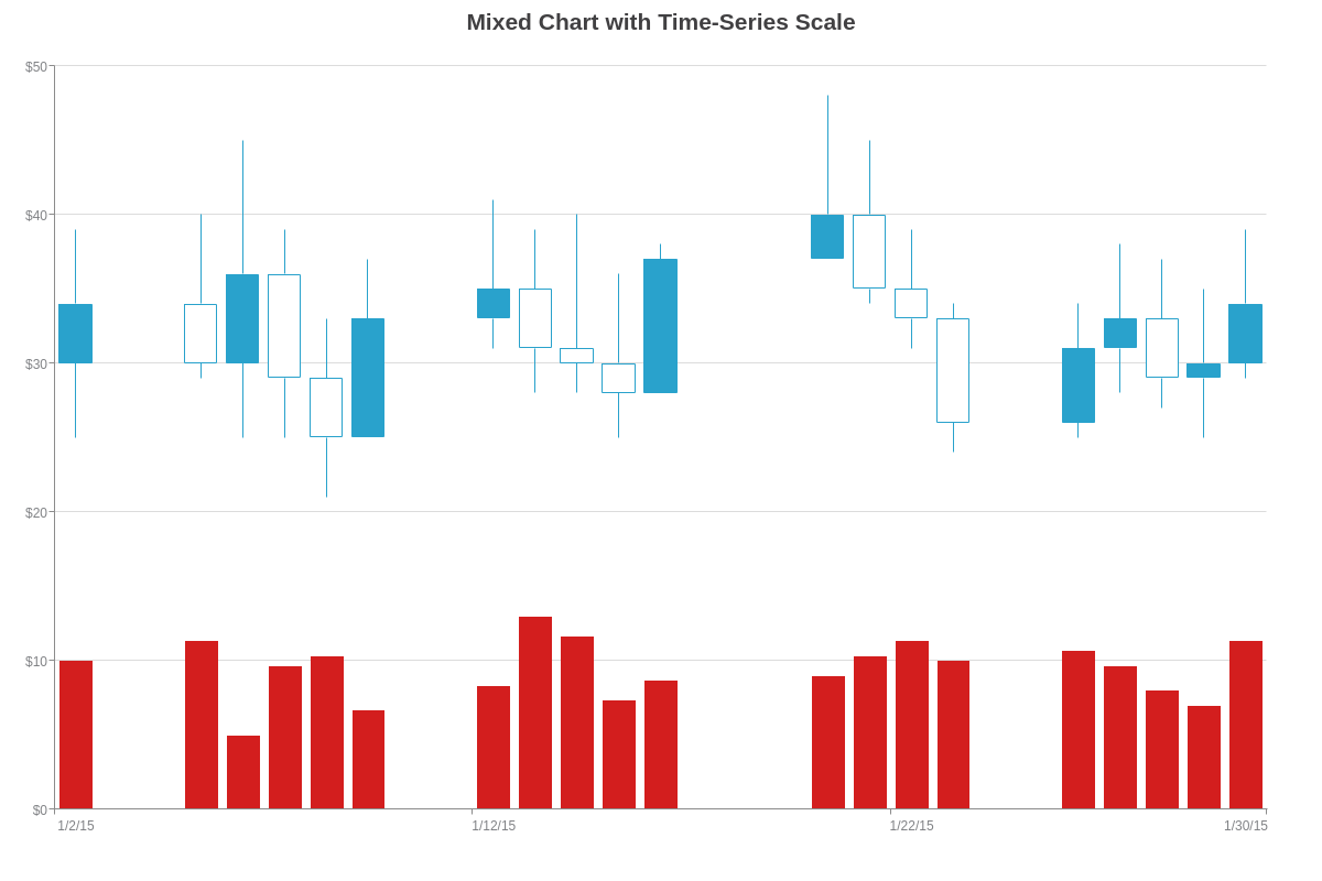
Time-Series Scale
The following stock and bar mixed chart displays a time-series scale on the x-axis. With this scale type, you need to add a min-valueattribute, step attribute, and transform object to your scale object.
For the min-value and step, provide your scale values in Unix time in milliseconds. In the transform object, add a type attribute and set the value to date. Next, add an all attribute and specify how you want your scale values formatted. You can use a combination of ZingChart tokens, alphanumeric, and special characters.
Note: This chart also has two y-axis scales: scale-y is linked to the stock chart data (showing open, high, low, and close values) and scale-y-2 is linked to the bar chart data (showing volume values). Adding secondary scales is discussed in the Multiple Scales section below.
{//shortened for brevity-click on following stock/bar mixed chart demo for full configuration
  type: "mixed",
  title: {
    text: "Mixed Chart with Time-Series Scale"
  },
  'scale-x': {
    'min-value': 1420218000000,
    step: "day",
    transform: {
      type: "date",
      all: "%m/%d/%y"
    },
    'items-overlap': true,
    'max-items': 5
  },
  'scale-y': {
    values: "0:50:10",
    format: "$%v"
  },
  'scale-y-2': {
    values: "0:15000:3000",
    visible: false
  },
  series: [
    {
      type: "stock",
      scales: "scale-x,scale-y",
    },
    {
      type: 'bar',
      scales: "scale-x,scale-y-2",
    }
  ]
}
Logarithmic Scale
The following line and bar mixed chart uses a logarithmic scale on the y-axis to better display the extreme sales growth of Stores A, B, and C over a six-month period.
To create a logarithmic scale, add a progression attribute to your scale object and set the value to log. Next, add a log-base attribute and provide your base value (e.g., 10 or Math.E).
{//shortened for brevity-click on following line/bar mixed chart demo for full configuration
  type: "mixed",
  'scale-x': {
    labels: [ "Aug", "Sep", "Oct", "Nov", "Dec" ]
  },
  'scale-y': {
    progression: "log",
    'log-base': 10,
    'thousands-separator': ", ",
    short: true
  }
}

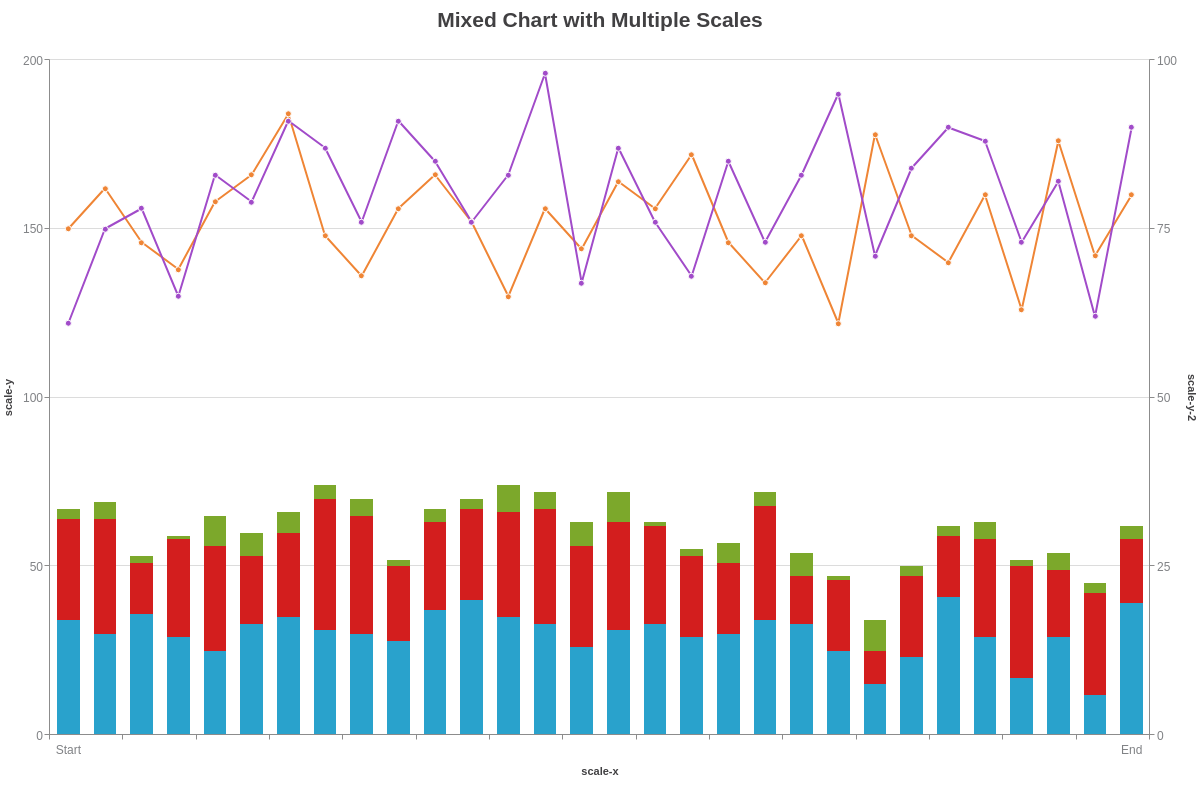
Multiple Scales
With mixed charts, you may want to have different datasets chart to different scales (multiple scales). In the chart below, for example, the three stacked bar charts are assigned to scale-y and the two line charts are assigned to scale-y-2. All of the charts share scale-x. (ZingChart supports additional scales up to scale-x-9 and scale-y-9.)
You'll need to specify which scales you want each dataset to chart to. In your series objects, add a scales attribute, and provide your scale values (e.g., scale-x,scale-y-2). (Without specification, your data will chart to scale-x and -y by default.)
{//shortened for brevity-click on following mixed chart demo for full configuration
  type: "mixed",
  title: {
    text: "Mixed Chart with Multiple Scales"
  },
  'scale-x': {
    labels: [ "Start", '', '', '', '', '', '', '', '', '', '', '', '', '', '', '', '', '', '', '', '', '', '', '', '', '', '', '', '', "End" ],
    label: {
      text: "scale-x"
    }
  },
  'scale-y': {
    values: "0:200:50",
    label: {
      text: "scale-y"
    }
  },
  'scale-y-2': {
    values: "0:100:25",
    label: {
      text: "scale-y-2"
    }
  },
  series: [
    {
      type: 'bar',
      scales: "scale-x,scale-y",
    },
    {
      type: 'bar',
      scales: "scale-x,scale-y",
    },
    {
      type: 'bar',
      scales: "scale-x,scale-y",
    },
    {
      type: "line",
      scales: "scale-x,scale-y-2",
    },
    {
      type: "line",
      scales: "scale-x,scale-y-2",
    }
  ]
}
More Mixed Chart Combinations
When styling your mixed charts, use the underlying chart types as a guide for what styling attributes apply. Commonly used styling attributes include: background-color, line-color, line-width, marker objects, and more.
You can also customize and/or add value boxes, tooltips, legends, and more.
Note: For more styling options, see our JSON Attributes/Syntax page.
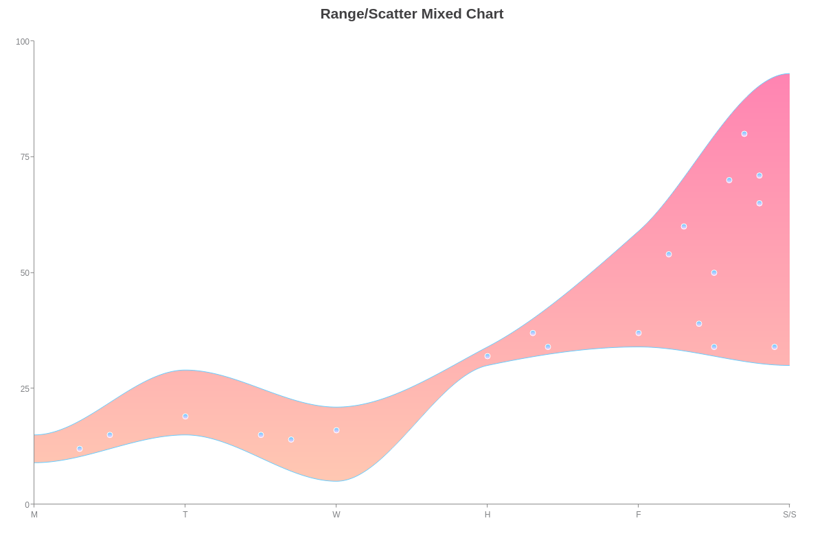
Range/Scatter
Here is a sample range chart and scatter plot mixed chart.
{
  type: "mixed",
  title: {
    text: "Range/Scatter Mixed Chart"
  },
  'scale-x': {
    labels: [ "M", "T", "W", "H", "F", "S/S" ]
  },
  'scale-y': {
    values: "0:100:25",
    guide: {
      visible: false
    }
  },
  series: [
    {
      type: "range",
      aspect: "spline",
      'background-color': "#ff0066 #ff9966",
      'line-color': "#66CCFF",
      'line-width': 1,
      marker: {
        type: "none"
      }
    },
    {
      type: "scatter",
      marker: {
        size: 4,
        'background-color': "#66CCFF #FFCCFF",
        'border-color': "white"
      }
    }
  ]
}
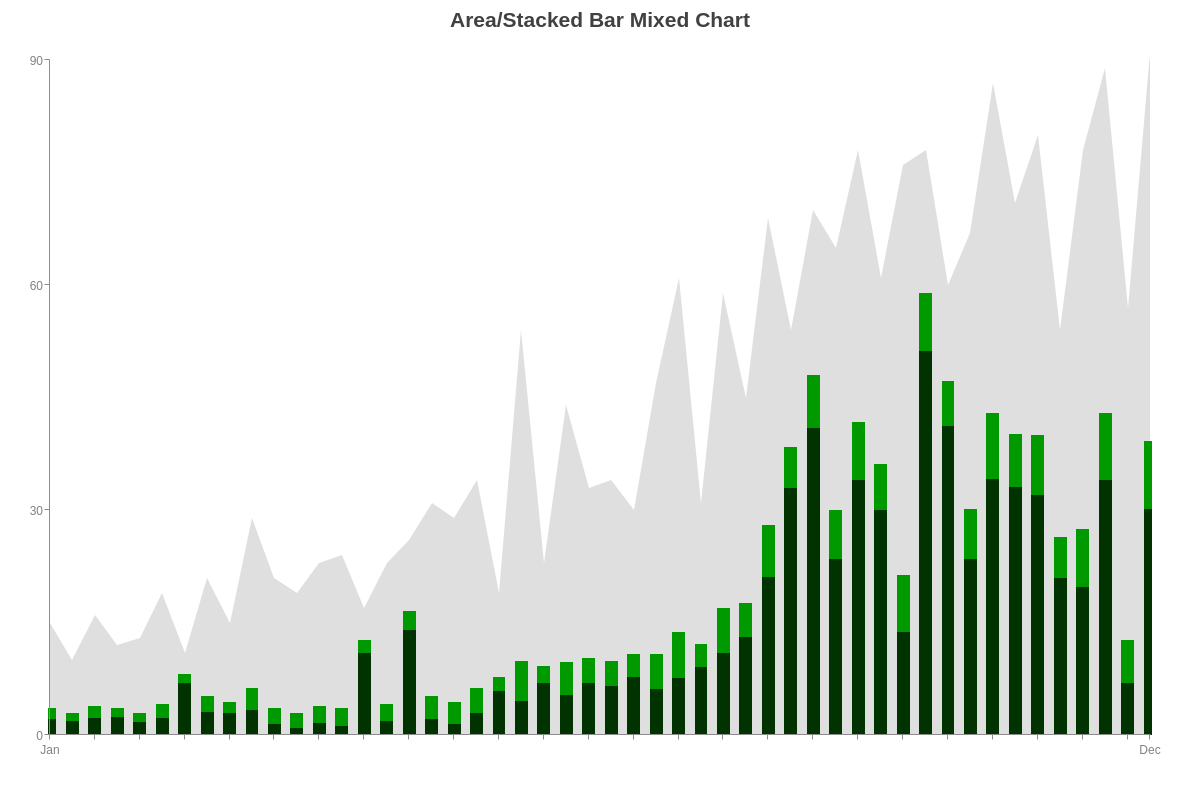
Area/Stacked Bar
Here is an area and stacked bar mixed chart. You can create stacked bars in a mixed chart by adding a stacked attribute to each applicable series object and setting the value to true. Next, add a stack attribute and specify which stack you want that series object assigned to. In the following chart, all three bar charts were assigned to the same stack, i.e. 1.
Note: When working with mixed charts, you'll notice that different charts have different default offsets. To adjust the spacing between your axis lines and plotted data, add an offset attribute to your scale-x and/or scale-y object(s). Provide a pixel value.
{
  type: "mixed",
  title: {
    text: "Area/Stacked Bar Mixed Chart"
  },
  'scale-x': {
    labels: [ "Jan", '', '', '', '', '', '', '', '', '', '', '', '', '', '', '', '', '', '', '', '', '', '', '', '', '', '', '', '', '', '', '', '', '', '', '', '', '', '', '', '', '', '', '', '', '', '', '', '', "Dec" ],
    offset: 0
  },
  'scale-y': {
    values: "0:90:30",
    guide: {
      visible: false
    }
  },
  series: [
    {
      type: "area",
      'background-color': "gray",
      'line-color': "none",
      marker: {
        type: "none"
      }
    },
    {
      type: 'bar',
      stacked: true,
      stack: 1,
      'bar-width': "70%",
      'background-color': "#003300"
    },
    {
      type: 'bar',
      stacked: true,
      stack: 1,
      'bar-width': "70%",
      'background-color': "#009900"
    }
  ]
}