Crosshairs
Overview
Crosshairs are interactive labels that appear when users hover over data points on your chart. They are an alternative to standard tooltips, which appear by default across ZingChart chart types. Highly customizable, crosshairs can display any combination of tokens and text. They can be shared across multiple charts in a graphset and be set to display under different exact and trigger modes. Refer to the Crosshairs JSON page for a full list of attribute options.
Note: You can use the multiGuide object to pin crosshair guides to a chart on a click. Learn more about our multiGuide JSON configuration here.
X-Axis Crosshairs
Users generally start with crosshairs on the x-axis. Create a crosshair-x object. Without further modification, plot and scale labels will appear, connected by vertical lines, when you move your mouse over the chart.
Note: When working with crosshairs, it is best to disable the tooltips, which appear across our charting library by default. In the plot object, create a tooltip object. Add a visible attribute, and set the value to false.
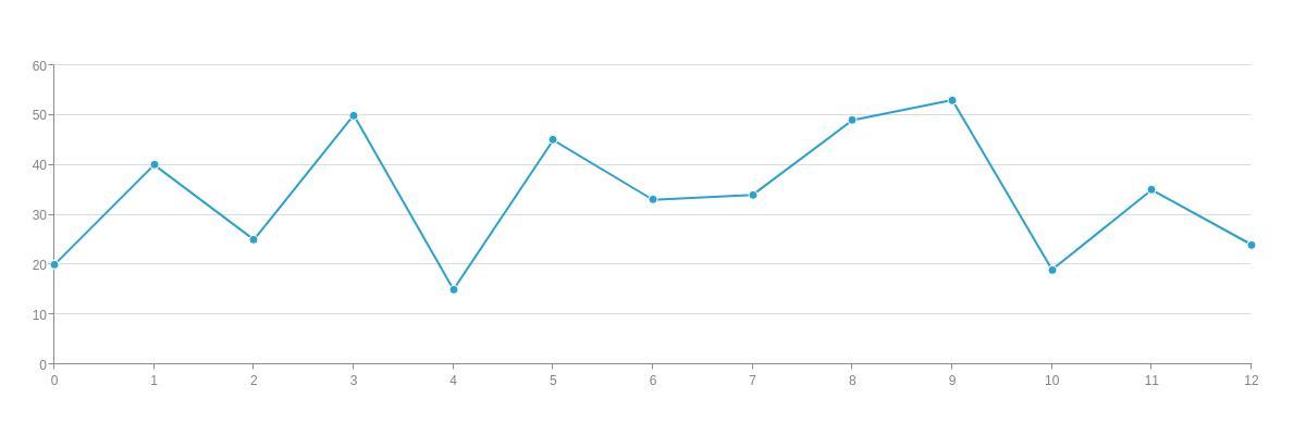
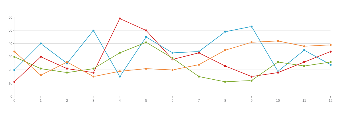
{
  type: "line",
  'crosshair-x': {

  },
  plot: {
    tooltip: {
        visible: false
    }
  },
  series: [{
    values: [20, 40, 25, 50, 15, 45, 33, 34, 49, 53, 19, 35, 24],
    text: "Blueberries"
  }, {
    values: [11, 30, 21, 18, 59, 50, 28, 33, 23, 15, 18, 26, 34],
    text: "Cherries"
  }, {
    values: [30, 21, 18, 21, 33, 41, 29, 15, 11, 12, 26, 23, 26],
    text: "Kiwis"
  }, {
    values: [34, 16, 26, 15, 19, 21, 20, 24, 35, 41, 42, 38, 39],
    text: "Kumquats"
  }]
}
With x-axis crosshairs, you can customize the text and appearance of the plot and scale labels. You can also style the crosshair lines, add crosshair markers, share crosshairs across two or more charts in a graphset array, and utilize different exact and trigger modes. You can browse our Crosshairs JSON page for a full list of attribute options.
Plot Labels
To customize the plot labels, create a plot-label object in crosshair-x. You'll place applicable attributes in this object. Refer to the Crosshair Plot Labels JSON page for more information.
Note: You can also turn off the visibility of the plot labels by adding a visible attribute to the plot-label object and setting the value to false.
'crosshair-x': {
  'plot-label': {
    //Place applicable attributes here.
  },
  ...
}
Text and Tokens
To change the default plot label text, add a text attribute to the plot-label object. You can provide any combination of alphanumeric characters and/or ZingChart tokens. Refer to the Tokens Tutorial for a full list of available tokens.
Here is how the text appears in a single series chart, or a chart with a single dataset.
{
  type: "line",
  'crosshair-x': {
    'plot-label': {
      text: "The %t Series has a value of %v."
    }
  },
  plot: {
    tooltip: {
      visible: false
    }
  },
  series: [{
    values: [20, 40, 25, 50, 15, 45, 33, 34, 49, 53, 19, 35, 24],
    text: "Blueberry"
  }]
}
Here is how the text appears in a chart with multiple series. Notice how the text repeats for each series. You can break apart this text and/or provide custom text for each individual series, as explained in the following Multiple Plot Labels section.
{
  type: "line",
  'crosshair-x': {
    'plot-label': {
      text: "The %t Series has a value of %v."
    }
  },
  plot: {
    tooltip: {
      visible: false
    }
  },
  series: [{
    values: [20, 40, 25, 50, 15, 45, 33, 34, 49, 53, 19, 35, 24],
    text: "Blueberry"
  }, {
    values: [11, 30, 21, 18, 59, 50, 28, 33, 23, 15, 18, 26, 34],
    text: "Cherry"
  }, {
    values: [30, 21, 18, 21, 33, 41, 29, 15, 11, 12, 26, 23, 26],
    text: "Kiwi"
  }, {
    values: [34, 16, 26, 15, 19, 21, 20, 24, 35, 41, 42, 38, 39],
    text: "Kumquat"
  }]
}
Multiple Plot Labels
When you have multiple series (or datasets), you may want to break apart the plot labels so that a label appears for each series. To do this, add a multiple attribute to the plot-label object. Set the value to true. Note that each series displays the same text. However, you can specify unique text for each series, as shown in the next chart.

{
  type: "line",
  'crosshair-x': {
    'plot-label': {
      text: "The %t Series has a value of %v.",
      multiple: true
    }
  },
  plot: {
    tooltip: {
      visible: false
    }
  },
  series: [{
    values: [20, 40, 25, 50, 15, 45, 33, 34, 49, 53, 19, 35, 24],
    text: "Blueberry"
  }, {
    values: [11, 30, 21, 18, 59, 50, 28, 33, 23, 15, 18, 26, 34],
    text: "Cherry"
  }, {
    values: [30, 21, 18, 21, 33, 41, 29, 15, 11, 12, 26, 23, 26],
    text: "Kiwi"
  }, {
    values: [34, 16, 26, 15, 19, 21, 20, 24, 35, 41, 42, 38, 39],
    text: "Kumquat"
  }]
}
For series-specific text, first make sure that the multiple attribute is set to true in the plot-label object. Next, go to the series array. In each series object, create a guide-label object. Add a text attribute, and provide your desired text and/or tokens.

{
  type: "line",
  'crosshair-x': {
    'plot-label': {
      multiple: true
    }
  },
  plot: {
    tooltip: {
      visible: false
    }
  },
  series: [{
    values: [20, 40, 25, 50, 15, 45, 33, 34, 49, 53, 19, 35, 24],
    text: "Blueberries",
    'guide-label': {
      text: "%t are like pearls."
    }
  }, {
    values: [11, 30, 21, 18, 59, 50, 28, 33, 23, 15, 18, 26, 34],
    text: "Cherries",
    'guide-label': {
      text: "%t often come in twos and threes."
    }
  }, {
    values: [30, 21, 18, 21, 33, 41, 29, 15, 11, 12, 26, 23, 26],
    text: "Kiwis",
    'guide-label': {
      text: "%t have lots of seeds that look like freckles."
    }
  }, {
    values: [34, 16, 26, 15, 19, 21, 20, 24, 35, 41, 42, 38, 39],
    text: "Kumquats",
    'guide-label': {
      text: "%t are like tiny, oval oranges."
    }
  }]
}
Styling
When styling your plot labels, you can provide attributes such as font-color, font-family, font-size, background-color, border-width, border-color, line-style, border-radius, padding, callout, and more. See the Crosshair Plot Labels JSON page for a full list of available attributes.
To apply styling globally (or to all series), add the attributes to the plot-label object.

{
  type: "line",
  'crosshair-x': {
    'plot-label': {
      text: "The %t Series has a value of %v.",
      'font-color': "#6600ff",
      'font-family': "Georgia",
      'font-size': 12,
      'background-color': "pink yellow",
      'border-width': 1,
      'border-color': "#6600ff",
      'line-style': "dashdot",
      'border-radius': "10px",
      padding: "10%",
      callout: true
    }
  },
  plot: {
    tooltip: {
      visible: false
    }
  },
  series: [{
    values: [20, 40, 25, 50, 15, 45, 33, 34, 49, 53, 19, 35, 24],
    text: "Blueberry"
  }, {
    values: [11, 30, 21, 18, 59, 50, 28, 33, 23, 15, 18, 26, 34],
    text: "Cherry"
  }, {
    values: [30, 21, 18, 21, 33, 41, 29, 15, 11, 12, 26, 23, 26],
    text: "Kiwi"
  }, {
    values: [34, 16, 26, 15, 19, 21, 20, 24, 35, 41, 42, 38, 39],
    text: "Kumquat"
  }]
}
To apply styling locally (or to individual series), add the attributes to the applicable guide-label object(s) in the series array. Note that you can make both global and local changes by providing attributes for the former in the plot-label object and attributes for the latter in the applicable guide-label object(s).

{
  type: "line",
  'crosshair-x': {
    'plot-label': {
      multiple: true,
      'font-family': "Georgia",
      'border-width': 2,
      'border-radius': "5px",
      padding: "5%"
    }
  },
  plot: {
    tooltip: {
      visible: false
    }
  },
  series: [{
    values: [20, 40, 25, 50, 15, 45, 33, 34, 49, 53, 19, 35, 24],
    text: "Blueberries",
    'guide-label': {
      text: "%t are like pearls.",
      'font-color': "#009933",
      'border-color': "#9966ff",
      'line-style': "dotted"
    }
  }, {
    values: [11, 30, 21, 18, 59, 50, 28, 33, 23, 15, 18, 26, 34],
    text: "Cherries",
    'guide-label': {
      text: "%t often come in twos and threes.",
      'font-color': "#000099",
      'border-color': "#ff00ff",
      'line-style': "dashed"
    }
  }, {
    values: [30, 21, 18, 21, 33, 41, 29, 15, 11, 12, 26, 23, 26],
    text: "Kiwis",
    'guide-label': {
      text: "%t have lots of seeds that look like freckles.",
      'font-color': "#6666ff",
      'border-color': "#00ffff",
      'line-style': "solid"
    }
  }, {
    values: [34, 16, 26, 15, 19, 21, 20, 24, 35, 41, 42, 38, 39],
    text: "Kumquats",
    'guide-label': {
      text: "%t are like tiny, oval oranges.",
      'font-color': "#ff3300",
      'border-color': "#99cc00",
      'line-style': "dashdot"
    }
  }]
}
Scale Labels
To customize the scale labels, create a scale-label object in crosshair-x. You'll place applicable attributes in this object. Refer to the Crosshair Scale Labels JSON page for more information.
Note: You can also turn off the visibility of the scale labels by adding a visible attribute to the scale-label object and setting the value to false.
'crosshair-x': {
  'scale-label': {
    //Place applicable attributes here.
  },
  ...
}
Text and Tokens
How you modify the appearance of the scale label text will most likely depend on whether you have a category or time-series scale on the x-axis.
Here is a chart with a category scale. You can use the text attribute to add additional verbiage to the %l token (which displays the scale labels provided in the scale-x object). Refer to the Configuring Your Scales Tutorial for more information on category scales.

{
  type: "line",
  'crosshair-x': {
    'scale-label': {
      text: "%l 2016"
    }
  },
  'scale-x': {
    labels: [ "January", "February", "March", "April", "May", "June", "July", "August", "September", "October", "November", "December" ],
    item: {
      'max-chars': 3
    }
  },
  plot: {
    tooltip: {
      visible: false
    }
  },
  series: [{
    values: [20, 40, 25, 50, 15, 45, 33, 34, 49, 53, 19, 35],
    text: "Blueberries"
  }, {
    values: [11, 30, 21, 18, 59, 50, 28, 33, 23, 15, 18, 26],
    text: "Cherries"
  }, {
    values: [30, 21, 18, 21, 33, 41, 29, 15, 11, 12, 26, 23],
    text: "Kiwis"
  }, {
    values: [34, 16, 26, 15, 19, 21, 20, 24, 35, 41, 42, 38],
    text: "Kumquats"
  }]
}
On a time-series scale, you can use a text attribute in the scale-label object to add additional verbiage to your scale labels. You can also change the time-series formatting by adding a transform object. Add a type attribute and set the value to date. Add an all attribute and specify how you want the time-series values formatted. Refer to the Configuring Your Scales Tutorial for more information on time-series scales.
{
  type: "line",
  'crosshair-x': {
    'scale-label': {
      text: "%v<br>at 12 p.m.",
      transform: {
        type: "date",
        all: "%D,<br>%M %d, %Y"
      }
    }
  },
  'scale-x': {
    'min-value': 1451649600000,
    step: "day",
    transform: {
      type: "date",
      all: "%m/%d"
    },
    'max-items': 12
  },
  plot: {
    tooltip: {
      visible: false
    }
  },
  series: [{
    values: [
      //Omitted for brevity.
    ],
    text: "Blueberries"
  }, {
    values: [
      //Omitted for brevity.
    ],
    text: "Cherries"
  }, {
    values: [
      //Omitted for brevity.
    ],
    text: "Kiwis"
  }, {
    values: [
      //Omitted for brevity.
    ],
    text: "Kumquats"
  }]
}
Styling
Customize the styling of your scale labels with attributes such as font-color, font-family, font-size, background-color, border-width, border-color, line-style, border-radius, padding, and more. See the Crosshair Scale Labels JSON page for a full attribute list.
{
  type: "line",
  'crosshair-x': {
    'scale-label': {
      'font-color': "#6600ff",
      'font-family': "Georgia",
      'font-size': 12,
      'background-color': "pink yellow",
      'border-width': 1,
      'border-color': "#6600ff",
      'line-style': "dashdot",
      'border-radius': "10px",
      padding: "10%"
    }
  },
  'scale-x': {
    labels: [ "Jan", "Feb", "Mar", "Apr", "May", "Jun", "Jul", "Aug", "Sep", "Oct", "Nov", "Dec" ]
  },
  plot: {
    tooltip: {
      visible: false
    }
  },
  series: [{
    values: [20, 40, 25, 50, 15, 45, 33, 34, 49, 53, 19, 35],
    text: "Blueberries"
  }, {
    values: [11, 30, 21, 18, 59, 50, 28, 33, 23, 15, 18, 26],
    text: "Cherries"
  }, {
    values: [30, 21, 18, 21, 33, 41, 29, 15, 11, 12, 26, 23],
    text: "Kiwis"
  }, {
    values: [34, 16, 26, 15, 19, 21, 20, 24, 35, 41, 42, 38],
    text: "Kumquats"
  }]
}
Crosshair Lines
You can style the appearance of the crosshair lines, which appear gray by default. Add attributes such as line-color, line-width, and line-style (dotted, dashed, dashdot, solid) to the crosshair-x object.

{
  type: "line",
  'crosshair-x': {
    'line-color': "#6600ff",
    'line-width': 2,
    'line-style': "dashdot"
  },
  plot: {
    tooltip: {
      visible: false
    }
  },
  series: [{
    values: [20, 40, 25, 50, 15, 45, 33, 34, 49, 53, 19, 35, 24],
    text: "Blueberries"
  }, {
    values: [11, 30, 21, 18, 59, 50, 28, 33, 23, 15, 18, 26, 34],
    text: "Cherries"
  }, {
    values: [30, 21, 18, 21, 33, 41, 29, 15, 11, 12, 26, 23, 26],
    text: "Kiwis"
  }, {
    values: [34, 16, 26, 15, 19, 21, 20, 24, 35, 41, 42, 38, 39],
    text: "Kumquats"
  }]
}
You can also make full width crosshair lines. This can be accomplished through lineWidth: '100%'
crosshairX: {
  lineWidth: "100%",
  lineColor: '#ccc',
  alpha: 0.5,
  plotLabel: {
    visible: false
  }
}
Crosshair Markers
You have the option of adding crosshair markers, which will activate when users hover over the applicable node index. In the crosshair-x object, create a marker object. Make sure to specify the marker size with the size attribute. You can also add attributes such as type, background-color, border-width, and border-color. Refer to the Crosshair Markers JSON page for more information.

{
  type: "line",
  'crosshair-x': {
    marker: {
      type: "star5",
      size: 5, //Make sure to specify size.
      'background-color': "yellow",
      'border-width': 1,
      'border-color': "gray"
    }
  },
  plot: {
    tooltip: {
      visible: false
    }
  },
  series: [{
    values: [20, 40, 25, 50, 15, 45, 33, 34, 49, 53, 19, 35, 24],
    text: "Blueberries"
  }, {
    values: [11, 30, 21, 18, 59, 50, 28, 33, 23, 15, 18, 26, 34],
    text: "Cherries"
  }, {
    values: [30, 21, 18, 21, 33, 41, 29, 15, 11, 12, 26, 23, 26],
    text: "Kiwis"
  }, {
    values: [34, 16, 26, 15, 19, 21, 20, 24, 35, 41, 42, 38, 39],
    text: "Kumquats"
  }]
}
Shared Mode
You can share crosshairs between two or more charts in a graphset array by adding a shared attribute to the applicable crosshair-x objects and setting the value to true. To learn how to create a graphset array (used to make dashboards, trellis/small multiple charts, and more), see our Adding Additional Charts Tutorial. For more on shared interactions between different charts in a graphset array, see our Shared Interactions Tutorial, which explains how to utilize shared zooming, scrollbars, preview charts, and legends.
Note: Depending on what you are trying to create, using mixed charts and blended scales is another way to display shared crosshairs between two or more charts.
{
  graphset: [{
    type: "line",
    x: "0%",
    y: "0%",
    height: "50%",
    width: "100%",
    'crosshair-x': {
      shared: true
    },
    plot: {
      tooltip: {
        visible: false
      }
    },
    plotarea: {
      'adjust-layout': true
    },
    'scale-x': {
      item: {
        'font-size': 10
      }
    },
    'scale-y': {
      item: {
        'font-size': 10
      }
    },
    series: [{
      values: [20, 40, 25, 50, 15, 45, 33, 34, 49, 53, 19, 35, 24]
    }, {
      values: [11, 30, 21, 18, 59, 50, 28, 33, 23, 15, 18, 26, 34]
    }]
  }, {
    type: "line",
    x: "0%",
    y: "50%",
    height: "50%",
    width: "100%",
    'crosshair-x': {
      shared: true
    },
    plot: {
      tooltip: {
        visible: false
      }
    },
    plotarea: {
      'adjust-layout': true
    },
    'scale-x': {
      item: {
        'font-size': 10
      }
    },
    'scale-y': {
      item: {
        'font-size': 10
      }
    },
    series: [{
      values: [30, 21, 18, 21, 33, 41, 29, 15, 11, 12, 26, 23, 26]
    }, {
      values: [34, 16, 26, 15, 19, 21, 20, 24, 35, 41, 42, 38, 39]
    }]
  }]
}
Here is a stock and volume chart, along with a stacked bar chart that breaks down the fund by sector type. The crosshairs between the stock and volume chart are shared.
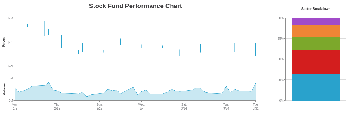
{
  graphset: [{
    title: {
      text: "Stock Fund Performance Chart"
    },
    type: "stock",
    height: "60%",
    width: "75%",
    x: "0%",
    y: "0%",
    'crosshair-x': {
      'plot-label': {
        text: "Open: $%open<br>High: $%high<br>Low: $%low<br>Close: $%close",
        decimals: 2
      },
      'scale-label': {
        visible: false
      },
      shared: true
    },
    'scale-x': {
      visible: false
    },
    'scale-y': {
      values: "29:33:2",
      format: "$%v",
      label: {
        text: "Prices"
      },
      item: {
        'font-size': 10
      },
      guide: {
        'line-style': "solid"
      }
    },
    plot: {
      aspect: "whisker",
      tooltip: {
        visible: false
      },
      'trend-up': {

      },
      'trend-down': {
        alpha: 0.5
      }
    },
    plotarea: {
      'margin-bottom': "dynamic"
    },
    series: [{
      values: [
        //Omitted for brevity.
      ]
    }]
  }, {
    type: "area",
    height: "40%",
    width: "75%",
    x: "0%",
    y: "60%",
    'crosshair-x': {
      'plot-label': {
        text: "Volume: %vM",
        decimals: 2
      },
      'scale-label': {
        text: "%v"
      },
      shared: true
    },
    'scale-x': {
      'min-value': 1422910800000,
      step: "day",
      transform: {
        type: "date",
        all: "%D,<br>%m/%d"
      },
      'max-items': 6,
      item: {
        'font-size': 10
      }
    },
    'scale-y': {
      values: "0:3:3",
      format: "%vM",
      label: {
        text: "Volume"
      },
      item: {
        'font-size': 10
      },
      guide: {
        'line-style': "solid"
      }
    },
    plot: {
      tooltip: {
        visible: false
      },
      'line-width': 1,
      marker: {
        visible: false
      }
    },
    plotarea: {
      'margin-top': "dynamic"
    },
    series: [{
      values: [
        //Omitted for brevity.
      ]
    }]
  }, {
    type: 'bar',
    height: "100%",
    width: "25%",
    x: "75%",
    y: "0%",
    'scale-x': {
      placement: "opposite",
      label: {
        text: "Sector Breakdown"
      },
      labels: [ '' ],
      tick: {
        visible: false
      }
    },
    'scale-y': {
      format: "%v%",
      values: "0:100:25",
      guide: {
        'line-style': "solid"
      },
      item: {
        'font-size': 10
      },
    },
    plot: {
      stacked: true,
      'stack-type': "100%",
      tooltip: {
        text: "%t"
      }
    },
    series: [{
      values: [59],
      text: "Consumer Goods"
    }, {
      values: [55],
      text: "Information Technology"
    }, {
      values: [30],
      text: "Financials"
    }, {
      values: [28],
      text: "Healthcare"
    }, {
      values: [15],
      text: "Industrials"
    }]
  }]
}
Here are three candlestick charts displayed as a small multiple or trellis chart. The crosshairs between all three charts are shared.
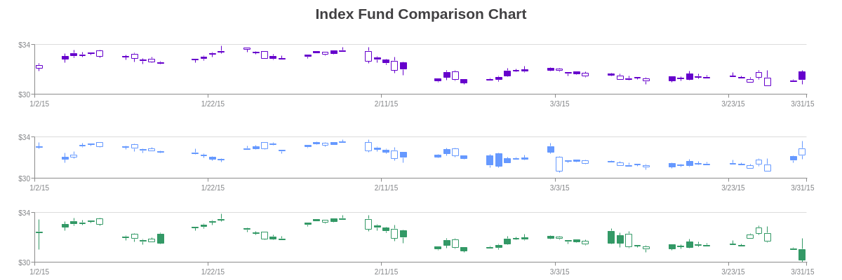
{
  graphset: [{
    title: {
      text: "Index Fund Comparison Chart"
    },
    type: "stock",
    x: "0%",
    y: "0%",
    height: "40%",
    width: "100%",
    'crosshair-x': {
      'plot-label': {
        text: "Open: $%open<br>High: $%high<br>Low: $%low<br>Close: $%close",
        'border-color': "#6600cc"
      },
      'scale-label': {
        visible: false
      },
      shared: true
    },
    'scale-x': {
      'min-value': 1420232400000,
      step: "day",
      transform: {
        type: "date",
        all: "%m/%d/%y"
      },
      'max-items': 6,
      item: {
        'font-size': 10
      }
    },
    'scale-y': {
      values: "30:34:4",
      format: "$%v",
      guide: {
        'line-style': "solid"
      },
      item: {
        'font-size': 10
      }
    },
    plot: {
      aspect: "candlestick",
        tooltip: {
        visible: false
      },
      'trend-up': {
        'background-color': "#6600cc",
        'line-color': "#6600cc",
        'border-color': "#6600cc"
      },
      'trend-down': {
        'background-color': "none",
        'line-color': "#6600cc",
        'border-color': "#6600cc"
      }
    },
    plotarea: {
      'margin-bottom': "dynamic",
      'margin-top': "40%"
    },
    series: [{
      values: [
        //Omitted for brevity.
      ]
    }]
  }, {
    type: "stock",
    x: "0%",
    y: "40%",
    height: "30%",
    width: "100%",
    'crosshair-x': {
      'plot-label': {
        text: "Open: $%open<br>High: $%high<br>Low: $%low<br>Close: $%close",
        'border-color': "#6699ff"
      },
      'scale-label': {
        visible: false
      },
      shared: true
    },
    'scale-x': {
      'min-value': 1420232400000,
      step: "day",
      transform: {
        type: "date",
        all: "%m/%d/%y"
      },
      'max-items': 6,
      item: {
        'font-size': 10
      }
    },
    'scale-y': {
      values: "30:34:4",
      format: "$%v",
      guide: {
        'line-style': "solid"
      },
      item: {
        'font-size': 10
      }
    },
    plot: {
      aspect: "candlestick",
      tooltip: {
        visible: false
      },
      'trend-up': {
        'background-color': "#6699ff",
        'line-color': "#6699ff",
        'border-color': "#6699ff"
      },
      'trend-down': {
        'background-color': "none",
        'line-color': "#6699ff",
        'border-color': "#6699ff"
      }
    },
    plotarea: {
      'margin-bottom': "dynamic",
      'margin-top': "30%"
    },
    series: [{
      values: [
        //Omitted for brevity.
      ]
    }]
  }, {
    type: "stock",
    x: "0%",
    y: "70%",
    height: "30%",
    width: "100%",
    'crosshair-x': {
      'plot-label': {
        text: "Open: $%open<br>High: $%high<br>Low: $%low<br>Close: $%close",
        'border-color': "#339966"
      },
      'scale-label': {

      },
      shared: true
    },
    'scale-x': {
      'min-value': 1420232400000,
      step: "day",
      transform: {
        type: "date",
        all: "%m/%d/%y"
      },
      'max-items': 6,
      item: {
        'font-size': 10
      }
    },
    'scale-y': {
      values: "30:34:4",
      format: "$%v",
      guide: {
        'line-style': "solid"
      },
      item: {
        'font-size': 10
      }
    },
    plot: {
      aspect: "candlestick",
      tooltip: {
        visible: false
      },
      'trend-up': {
        'background-color': "#339966",
        'line-color': "#339966",
        'border-color': "#339966"
      },
      'trend-down': {
        'background-color': "none",
        'line-color': "#339966",
        'border-color': "#339966"
      }
    },
    plotarea: {
      'margin-bottom': "dynamic",
      'margin-top': "20%"
    },
    series: [{
      values: [
        //Omitted for brevity.
      ]
    }]
  }]
}
Exact Mode
By adding an exact attribute and setting the value to true, the crosshairs won't activate until the user's mouse hovers near a node index that contains a data point (or node value). In the following chart, if you enter the plotarea at node index 6 or 7, no crosshairs appear. Start moving toward node index 4 or 9 (where there are data points), and the crosshairs will display. Users can "reset" this mode by moving their mouse out of the plotarea, and then re-entering the chart.

{
  type: "area",
  title: {
    text: "Exact Mode"
  },
  'crosshair-x': {
    exact: true, //false (default) or true
    'plot-label': {
      text: "X: %kv<br>Y: %vv"
    }
  },
  plot: {
    tooltip: {
      visible: false
    },
    rules: [{
      rule: "%v < 20",
      'line-color': "red",
      'background-color': "red"
    }, {
      rule: "%v >= 20 && %v <= 40",
      'line-color': "orange",
      'background-color': "orange"
    }, {
      rule: "%v >= 40 && %v <= 50",
      'line-color': "orange",
      'background-color': "yellow"
    }, {
      rule: "%v >= 50 && %v <= 60",
      'line-color': "blue",
      'background-color': "green"
    }, {
      rule: "%v >= 60 && %v <= 80",
      'line-color': "blue",
      'background-color': "blue"
    }, {
      rule: "%v > 80",
      'line-color': "purple",
      'background-color': "purple"
    }],
    marker: {
      rules: [{
        rule: "%v < 20",
        'background-color': "red"
      }, {
        rule: "%v >= 20 && %v <= 50",
        'background-color': "orange"
      }, {
        rule: "%v >= 50 && %v <= 80",
        'background-color': "blue"
      }, {
        rule: "%v > 80",
        'background-color': "purple"
      }]
    }
  },
  series: [{
    values: [
      //Omitted for brevity.
    ]
  }]
}
The exact mode is most useful (and visibly obvious) on charts that have breaks or gaps in their data, as often occurs with array of arrays (above example) and time-series (below example) data. Since it is activated by the user hovering near the node index that contains a data point (rather than the data point itself), it may be more useful on charts such as column and bar.
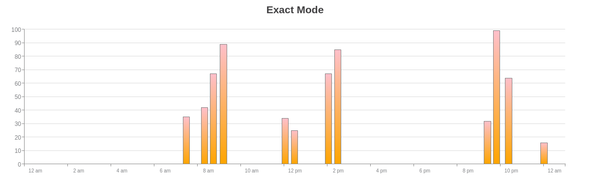
{
  type: 'bar',
  title: {
    text: "Exact Mode"
  },
  'crosshair-x': {
    exact: true, //false (default) or true
    'plot-label': {
      text: "%vv bars at %kv",
      transform: {
        type: "date",
        all: "%g:%i %a"
      }
    }
  },
  'scale-x': {
    'min-value': 1451606436000,
    'max-value': 1451692836000,
    step: "hour",
    transform: {
      type: "date",
      all: "%g %a"
    },
    'max-items': 9,
    item: {
      'font-size': 10
    }
  },
  utc: true,
  plot: {
    tooltip: {
      visible: false
    },
    'bar-width': "40%",
    'background-color': "pink orange",
    'border-width': 1,
    'border-color': "gray"
  },
  series: [{
    values: [
      //Omitted for brevity.
    ]
  }]
}
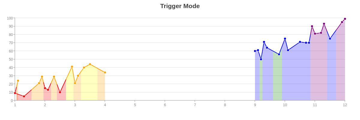
Trigger Mode
By adding a trigger attribute and setting the value to hover, the crosshairs won't activate until the user's mouse hovers over a data point (or node value). In the following chart, if you hover over the empty areas of the chart, no crosshairs appear. Hover over an actual data point, and the crosshairs will display. Users can "reset" this mode by moving their mouse out of the plotarea, and then re-entering the chart.
{
  type: "area",
  title: {
    text: "Trigger Mode"
  },
  'crosshair-x': {
    trigger: "hover", //"move" (default) or "hover"
    'plot-label': {
      text: "X: %kv<br>Y: %vv"
    }
  },
  plot: {
    tooltip: {
      visible: false
    },
    rules: [{
      rule: "%v < 20",
      'line-color': "red",
      'background-color': "red"
    }, {
      rule: "%v >= 20 && %v <= 40",
      'line-color': "orange",
      'background-color': "orange"
    }, {
      rule: "%v >= 40 && %v <= 50",
      'line-color': "orange",
      'background-color': "yellow"
    }, {
      rule: "%v >= 50 && %v <= 60",
      'line-color': "blue",
      'background-color': "green"
    }, {
      rule: "%v >= 60 && %v <= 80",
      'line-color': "blue",
      'background-color': "blue"
    }, {
      rule: "%v > 80",
      'line-color': "purple",
      'background-color': "purple"
    }],
    marker: {
      rules: [{
        rule: "%v < 20",
        'background-color': "red"
      }, {
        rule: "%v >= 20 && %v <= 50",
        'background-color': "orange"
      }, {
        rule: "%v >= 50 && %v <= 80",
        'background-color': "blue"
      }, {
        rule: "%v > 80",
        'background-color': "purple"
      }]
    }
  },
  series: [{
    values: [
      //Omitted for brevity.
    ]
  }]
}
The trigger mode is most useful (and visibly obvious) on charts that have breaks or gaps in their data, as often occurs with array of arrays (above example) or time-series (below example) data. Since it is activated by the user hovering over the actual data point (and not the node index that contains it), it may be more useful on charts such as scatter plots.
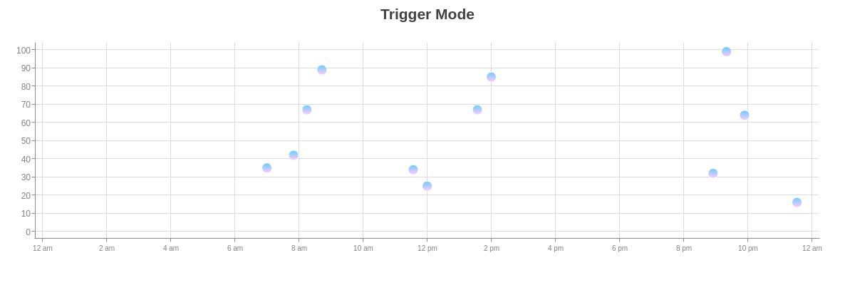
{
  type: "scatter",
  title: {
    text: "Trigger Mode"
  },
  'crosshair-x': {
    trigger: "hover", //"move" (default) or "hover"
    'plot-label': {
      text: "%vv bubbles at %kv",
      transform: {
        type: "date",
        all: "%g:%i %a"
      }
    }
  },
  'scale-x': {
    'min-value': 1451606436000,
    'max-value': 1451692836000,
    step: "hour",
    transform: {
      type: "date",
      all: "%g %a"
    },
    'max-items': 9,
    item: {
      'font-size': 10
    }
  },
  utc: true,
  plot: {
    tooltip: {
      visible: false
    },
    marker: {
      'background-color': "#66CCFF #FFCCFF",
      size: 7
    }
  },
  series: [{
    values: [
      //Omitted for brevity.
    ]
  }]
}
Y-Axis Crosshairs
You can also add crosshairs on the y-axis, to be used alone or in conjunction with x-axis crosshairs. Create a crosshair-y object. This will cause scale labels to appear, with horizontal lines that span the plot area.
Note: When working with crosshairs, it is best to disable the tooltips, which appear across our charting library by default. In the plot object, create a tooltip object. Add a visible attribute, and set the value to false.

{
  type: "line",
  'crosshair-y': {

  },
  plot: {
    tooltip: {
      visible: false
    }
  },
  series: [{
    values: [20, 40, 25, 50, 15, 45, 33, 34, 49, 53, 19, 35, 24],
    text: "Blueberries"
  }, {
    values: [11, 30, 21, 18, 59, 50, 28, 33, 23, 15, 18, 26, 34],
    text: "Cherries"
  }, {
    values: [30, 21, 18, 21, 33, 41, 29, 15, 11, 12, 26, 23, 26],
    text: "Kiwis"
  }, {
    values: [34, 16, 26, 15, 19, 21, 20, 24, 35, 41, 42, 38, 39],
    text: "Kumquats"
  }]
}
With y-axis crosshairs, you can customize the appearance of the scale labels and crosshair lines. You can also change the type mode to show single (default) or multiple (to correspond to the number of series in the chart) y-axis crosshairs. (The multiple option is especially useful to pinpoint data points using simultaneous x- and y-axis crosshairs.) You can browse our Crosshairs JSON page for a full list of attribute options.
Scale Labels
To customize the scale labels, create a scale-label object in crosshair-y. You'll place applicable attributes in this object. Refer to the Crosshair Scale Labels JSON page for more information.
Note: You can also turn off the visibility of the scale labels by adding a visible attribute to the scale-label object and setting the value to false.
'crosshair-y': {
  'scale-label': {
    //Place applicable attributes here.
  },
  ...
}
Styling
When styling your scale labels, use attributes such as font-color, font-family, font-size, background-color, border-width, border-color, line-style, border-radius, padding, and more. See the Crosshair Scale Labels JSON page for a full attribute list.

{
  type: "line",
  'crosshair-y': {
    'scale-label': {
      'font-color': "#6600ff",
      'font-family': "Georgia",
      'font-size': 12,
      'background-color': "pink yellow",
      'border-width': 1,
      'border-color': "#6600ff",
      'line-style': "dashdot",
      'border-radius': "10px",
      padding: "10%"
    }
  },
  plot: {
    tooltip: {
      visible: false
    }
  },
  series: [{
    values: [20, 40, 25, 50, 15, 45, 33, 34, 49, 53, 19, 35, 24],
    text: "Blueberries"
  }, {
    values: [11, 30, 21, 18, 59, 50, 28, 33, 23, 15, 18, 26, 34],
    text: "Cherries"
  }, {
    values: [30, 21, 18, 21, 33, 41, 29, 15, 11, 12, 26, 23, 26],
    text: "Kiwis"
  }, {
    values: [34, 16, 26, 15, 19, 21, 20, 24, 35, 41, 42, 38, 39],
    text: "Kumquats"
  }]
}
Crosshair Lines
When styling the crosshair lines, use attributes such as line-color, line-width, and line-style (dotted, dashed, dashdot, solid) to the crosshair-y object.

{
  type: "line",
  'crosshair-y': {
    'line-color': "#6600ff",
    'line-width': 2,
    'line-style': "dashdot"
  },
  plot: {
    tooltip: {
      visible: false
    }
  },
  series: [{
    values: [20, 40, 25, 50, 15, 45, 33, 34, 49, 53, 19, 35, 24],
    text: "Blueberries"
  }, {
    values: [11, 30, 21, 18, 59, 50, 28, 33, 23, 15, 18, 26, 34],
    text: "Cherries"
  }, {
    values: [30, 21, 18, 21, 33, 41, 29, 15, 11, 12, 26, 23, 26],
    text: "Kiwis"
  }, {
    values: [34, 16, 26, 15, 19, 21, 20, 24, 35, 41, 42, 38, 39],
    text: "Kumquats"
  }]
}
Type Mode
By default, y-axis crosshairs appear as a sliding ruler, following the user's mouse movements. You can change the type mode so that it acts as a precise pinpoint, meeting with the corresponding x-axis crosshairs at the nearest data points (or node values). In the crosshair-y object, add a type attribute. Set the value to multiple. See the following examples.
Note: Both crosshair-x and crosshair-y objects must be included in your chart object for the multiple type mode to properly activate.

{
  type: "line",
  'crosshair-x': {

  },
  'crosshair-y': {
    type: "multiple" //"single" (default) or "multiple"
  },
  plot: {
    tooltip: {
      visible: false
    }
  },
  series: [{
    values: [20, 40, 25, 50, 15, 45, 33, 34, 49, 53, 19, 35, 24],
    text: "Blueberries"
  }, {
    values: [11, 30, 21, 18, 59, 50, 28, 33, 23, 15, 18, 26, 34],
    text: "Cherries"
  }, {
    values: [30, 21, 18, 21, 33, 41, 29, 15, 11, 12, 26, 23, 26],
    text: "Kiwis"
  }, {
    values: [34, 16, 26, 15, 19, 21, 20, 24, 35, 41, 42, 38, 39],
    text: "Kumquats"
  }]
}
This chart consists of a single series, using array of arrays data. Notice how the visibility of both the x- and y-axis crosshair scale labels was turned off.
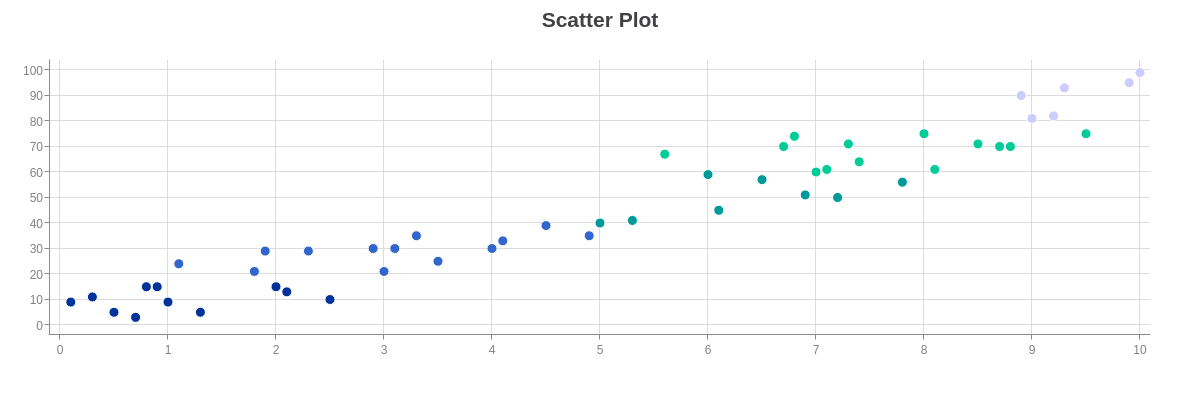
{
  type: "scatter",
  title: {
    text: "Scatter Plot"
  },
  'crosshair-x': {
    'plot-label': {
      text: "X: %kv<br>Y: %vv",
      multiple: true,
      padding: "10%",
      'border-radius': "5px"
    },
    'scale-label': {
      visible: false
    }
  },
  'crosshair-y': {
    type: "multiple", //"single" (default) or "multiple"
    'scale-label': {
      visible: false
    }
  },
  plot: {
    tooltip: {
      visible: false
    },
    marker: {
      rules: [{
        rule: "%v < 20",
        'background-color': "#003399"
      }, {
        rule: "%v >= 20 && %v <= 40",
        'background-color': "#3366cc"
      }, {
        rule: "%v >= 40 && %v <= 60",
        'background-color': "#009999"
      }, {
        rule: "%v >= 60 && %v <= 80",
        'background-color': "#00cc99"
      }, {
        rule: "%v > 80",
        'background-color': "#ccccff"
      }]
    }
  },
  series: [{
    values: [
      //Omitted for brevity.
    ]
  }]
}
This chart consists of a single series, using time-series data. Notice how the visibility of both the x- and y-axis crosshair scale labels was turned off.
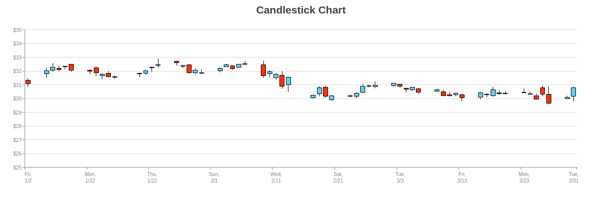
{
  type: "stock",
  title: {
    text: "Candlestick Chart"
  },
  'crosshair-x': {
    'plot-label': {
      text: "%kv:<br><br>Open: $%open<br>High: $%high<br>Low: $%low<br>Close: $%close",
      decimals: 2,
      transform: {
        type: "date",
        all: "%M %d, %Y"
      },
      multiple: true,
      padding: "10%",
      'border-radius': "5px"
    },
    'scale-label': {
      visible: false
    }
  },
  'crosshair-y': {
    type: "multiple", //"single" (default) or "multiple"
    'scale-label': {
      visible: false
    }
  },
  'scale-x': {
    'min-value': 1420232400000,
    step: "day",
    transform: {
      type: "date",
      all: "%D,<br>%m/%d"
    },
    'max-items': 10,
    item: {
      'font-size': 10
    }
  },
  'scale-y': {
    values: "25:35:1",
    format: "$%v",
    guide: {
      'line-style': "solid"
    },
    item: {
      'font-size': 10
    }
  },
  plot: {
    aspect: "candlestick",
    tooltip: {
      visible: false
    },
    'trend-up': {
      'background-color': "#66ccff",
      'line-color': "black",
      'border-color': "black"
    },
    'trend-down': {
      'background-color': "#ff3300",
      'line-color': "black",
      'border-color': "black"
    }
  },
  series: [{
    values: [
      //Omitted for brevity.
    ]
  }]
}
Positioning with Top Layer
By default, when crosshair(s) and legend are both enabled the crosshairs are painted over the legend.
To have the crosshair lines appear behind the legend, set the topLayer attribute to 'legend'.
{
  type: 'bar',
  topLayer: 'legend',
  ...
}
Summary
Crosshairs appear when hovering on a chart. Similar to a tooltip, the crosshair displays data for a specific point, but unlike tooltips, you don't need to hover directly over the node to display it. Additionally, crosshairs highlight the scale value attached to the node with both a scale label and a line marker drawn from the "hovered" node to the scale. They are useful for continuous values.
For a full list of crosshair attributes, see the JSON configuration page.