Labels
Overview
Standalone chart labels can be placed anywhere on the chart to display text, URLs, images, and more. They can utilize tokens or be paired with fixed tooltips/crosshairs to create dynamic labels. Refer to the Labels JSON Attributes/Syntax page for a full list of attribute options.
Standalone Labels
Get started by creating a labels array. The array will act as a container for all of your labels. Create an object for each label you want to appear on the chart.
labels: [
  {}, // Label 1
  {}, // Label 2
  {} // Label 3
  ...
]
At a minimum, you'll want to provide the label text with a text attribute. You can specify the positioning of the label with the x and y attributes (provide percentage or pixel values). You can also specify the label height and width with the height and width attributes (provide percentage or pixel values).
Text
Use the text attribute in one or multiple label objects for your chart. In the below example, multiple label objects were used to create labels with variously sized text, placement, and color.
{
  type: 'pie',
  labels: [
    // Label 1
    {
      text: "35%",
      'font-family': "Georgia",
      'font-size': "50",
      x: "60%",
      y: "20%"
    },
    // Label 2
    {
      text: "of surveyed users prefer the color",
      'font-family': "Georgia",
      'font-size': "12",
      x: "60%",
      y: "40%"
    },
    // Label 3
    {
      text: "blue",
      'font-color': "#29A2CC",
      'font-family': "Georgia",
      'font-size': "40",
      x: "60%",
      y: "45%"
    },
    // Label 4
    {
      text: "over other colors.",
      'font-family': "Georgia",
      'font-size': "12",
      x: "60%",
      y: "60%"
    }
  ],
  plot: {
    'value-box': {
      placement: "out",
      'offset-r': "-10",
      'font-family': "Georgia",
      'font-size':10,
      'font-weight': "normal"
    }
  },
  plotarea: {
    'margin-right': '45%',
    'margin-top': '20%',
    'margin-bottom': "20%"
  },
  series: [
    { values: [34]},
    { values: [30]},
    { values: [15]},
    { values: [14]},
    { values: [5]}
  ]
}
URLs
You can incorporate links into your standalone labels with the url attribute. Provide a link to the site you want the user directed to. In the below example, users can click the blue label to learn more about the color blue.
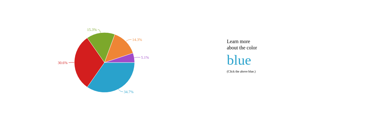
{
  type: 'pie',
  labels: [
    {
      text: "Learn more",
      'font-family': "Georgia",
      'font-size': "16",
      x: "60%",
      y: "30%"
    },
    {
      text: "about the color",
      'font-family': "Georgia",
      'font-size': "16",
      x: "60%",
      y: "35%"
    },
    {
      text: "blue",
      url: "https://en.wikipedia.org/wiki/Blue",
      target: "_blank",
      'font-color': "#29A2CC",
      'font-family': "Georgia",
      'font-size': "45",
      x: "60%",
      y: "40%"
    },
    {
      text: "(Click the above blue.)",
      'font-family': "Georgia",
      'font-size': "10",
      x: "60%",
      y: "55%"
    }
  ],
  plot: {
    'value-box': {
      placement: "out",
      'offset-r': "-10",
      'font-family': "Georgia",
      'font-size':12,
      'font-weight': "normal"
    }
  },
  plotarea: {
    'margin-right': '45%',
    'margin-top': '20%',
    'margin-bottom': "20%"
  },
  series: [
    { values: [34]},
    { values: [30]},
    { values: [15]},
    { values: [14]},
    { values: [5]}
  ]
}
Images
To create image labels, use the background-image attribute and provide an image link. You can make sure the image fits within the label's specified height and width by adding a background-fit attribute and setting the value to xy. In the below example, an image of a blueberry was added. Users can also click on the image to be directed to a site where they can learn more about the nutritional benefits of blueberries.
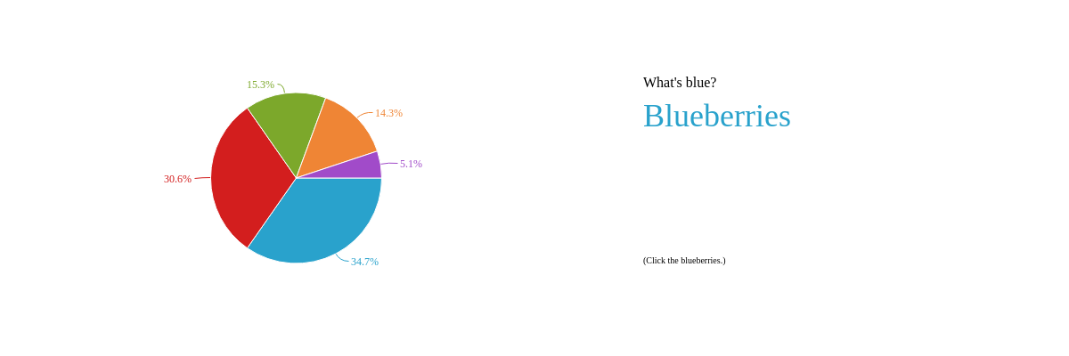
{
  type: 'pie',
  labels: [
    {
      text: "What's blue?",
      'font-family': "Georgia",
      'font-size': "16",
      x: "60%",
      y: "20%"
    },
    {
      text: "Blueberries",
      'font-color': "#29A2CC",
      'font-family': "Georgia",
      'font-size': "36",
      x: "60%",
      y: "26%"
    },
    {
      'background-image': "https://www.zingchart.com/images/blueberry.jpg",
      'background-fit': 'xy',
      url: "http://www.whfoods.com/genpage.php?tname=foodspice&dbid=8",
      target: "_blank",
      x: "60%",
      y: "40%",
      height: "30%",
      width: "30%"
    },
    {
      text: "(Click the blueberries.)",
      'font-family': "Georgia",
      'font-size':10,
      x: "60%",
      y: "71%",
    }
  ],
  plot: {
    'value-box': {
      placement: "out",
      'offset-r': "-10",
      'font-family': "Georgia",
      'font-size':12,
      'font-weight': "normal"
    }
  },
  plotarea: {
    'margin-right': '45%',
    'margin-top': '20%',
    'margin-bottom': "20%"
  },
  series: [
    { values: [34]},
    { values: [30]},
    { values: [15]},
    { values: [14]},
    { values: [5]}
  ]
}
Styling
When styling your labels, you can customize the fonts, backgrounds, borders, and more. Here is a line chart with custom styling, including gradient backgrounds and rounded borders. Refer to the Labels JSON Attributes/Syntax page for a full list of available attributes.
Note: The chart also utilizes the %plot-#-value token so that when users hover over a node index, the corresponding values appear in the labels. Tokens are further discussed in the Dynamic Labels section below.

{
  type: "line",
  labels: [
    {
      text: "Blue:<br>%plot-0-value",
      'default-value': "__",
      x: "15%",
      y: "7%",
      'background-color': "blue #29A2CC",
      'font-family': "Georgia",
      'font-color': "white",
      'font-size':14,
      height: "15%",
      width: "10%",
      'border-radius': "5px"
    },
    {
      text: "Red:<br>%plot-1-value",
      'default-value': "__",
      x: "30%",
      y: "7%",
      'background-color': "red #D31E1E",
      'font-family': "Georgia",
      'font-color': "white",
      'font-size':14,
      height: "15%",
      width: "10%",
      'border-radius': "5px"
    },
    {
      text: "Green:<br>%plot-2-value",
      'default-value': "__",
      x: "45%",
      y: "7%",
      'background-color': "green #7CA82B",
      'font-family': "Georgia",
      'font-color': "white",
      'font-size':14,
      height: "15%",
      width: "10%",
      'border-radius': "5px"
    },
    {
      text: "Orange:<br>%plot-3-value",
      'default-value': "__",
      x: "60%",
      y: "7%",
      'background-color': "orange #EF8535",
      'font-family': "Georgia",
      'font-color': "white",
      'font-size':14,
      height: "15%",
      width: "10%",
      'border-radius': "5px"
    },
    {
      text: "Purple:<br>%plot-4-value",
      'default-value': "__",
      x: "75%",
      y: "7%",
      'background-color': "purple #A14BC9",
      'font-family': "Georgia",
      'font-color': "white",
      'font-size':14,
      height: "15%",
      width: "10%",
      'border-radius': "5px"
    }
  ],
  'crosshair-x': {
    'plot-label': {
      visible: false
    },
    'scale-label': {
      visible: false
    }
  },
  plot: {
    tooltip: {
      visible: false
    }
  },
  plotarea: {
    'margin-top': "25%"
  },
  series: [
    { values: [3,4,11,5,19,7]},
    { values: [9,19,15,25,12,14]},
    { values: [15,29,19,21,25,36]},
    { values: [19,15,21,29,31,20]},
    { values: [33,23,39,34,5,31]}
  ]
}
Dynamic Labels
Dynamic labels respond to the user's movement over the node values (or data points) on the chart. There are several label-specific tokens that allow you to create these interactive labels. You can also combine standalone labels with fixed tooltips or crosshairs to create dynamic labels.
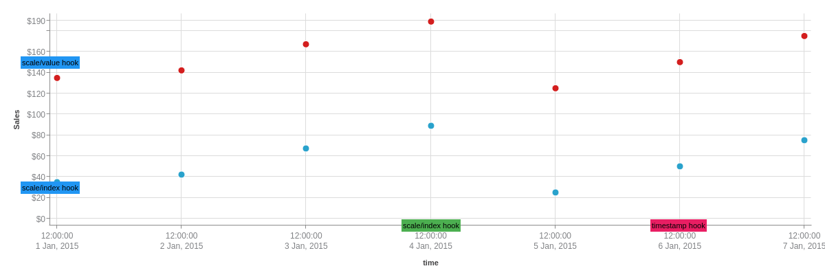
Placement
As you have seen, you can place labels based on x/y positions. But what about something a bit more dynamic? You have the ability to hook labels to nodes and scales. Check out the labels doc for more information.
Static labels hooked to nodes.
Dynamic labels hooked to nodes.
Static labels hooked to scales.
Tokens
The following tokens can be used with standalone labels. Because they are not tied to the nodes, standalone labels differ from other label types such as value boxes, tooltips, and crosshairs in that they cannot utilize many of the node-tied tokens.
| Token | Description |
|---|---|
| (%node-value)(#)(#) | Node value of a specified plot and node index, provided in the following format: (%node-value)(plot number)(node index number), e.g., (%node-value)(0)(0)). Note: Plot and node index numbering begins at zero. |
| %node-percent-value %npv | Percentage value of the hovered over node relative to the sum of all nodes. Demo |
| %plot-#-value | Node value of a specified plot, provided in the following format: %plot-plot number-value, e.g., %plot-0-value. This token is best used with crosshairs. Note: Plot numbering begins at zero. Demo |
| %plot-value | Node value of the hovered over value. This token is best used with tooltips. Demo |
Here is a pie chart using the %plot-value token. When users hover over a pie slice, the corresponding value appears in the label.
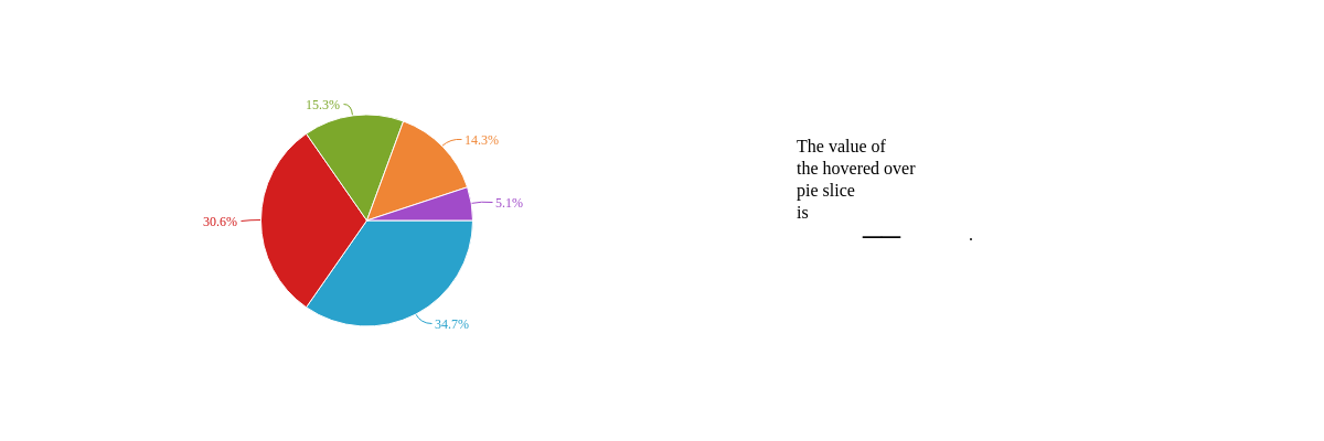
{
  type: 'pie',
  labels: [
    {
      text: "The value of<br>the hovered over<br>pie slice<br>is",
      'text-align': "left",
      'font-family': "Georgia",
      'font-size':16,
      x: "60%",
      y: "30%"
    },
    {
      text: "%plot-value",
      'default-value': "__",
      'font-family': "Georgia",
      'font-size':34,
      x: "65%",
      y: "44%"
    },
    {
      text: ".",
      'font-family': "Georgia",
      'font-size':16,
      x: "73%",
      y: "50%"
    }
  ],
  plot: {
    'value-box': {
      placement: "out",
      'offset-r': "-10",
      'font-family': "Georgia",
      'font-size':12,
      'font-weight': "normal"
    }
  },
  plotarea: {
    'margin-right': '45%',
    'margin-top': '20%',
    'margin-bottom': "20%"
  },
  series: [
    { values: [34]},
    { values: [30]},
    { values: [15]},
    { values: [14]},
    { values: [5]}
  ]
};
Fixed Tooltips
You can place fixed tooltips on top of standalone labels to create dynamic labels that utilize the full range of available node tokens. Refer to our documentation on ZingChart tokens to browse a full tokens list. Use the x and y attributes to specify where the tooltips appear on the chart. You can use the sticky (set to true) and timeout (provide a value in milliseconds) attributes to specify how long the tooltips stay on the screen. Refer to the Tooltips Tutorial for more information. Here is a calendar chart that displays dynamic labels via fixed tooltips and standalone labels.
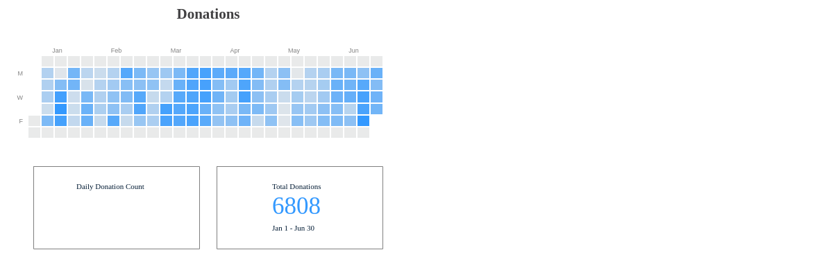
{
  type: "calendar",
  title: {
    text: "Donations",
    'font-family': "Georgia",
  },
  options: {
    'year': {
      text: "2016",
      visible: false,
    },
    'start-month': 1, //January
    'end-month': 6, //March
    'firstday': "s", //Sunday,
    palette: [ "black", "#3399ff", "#e6f2ff" ], //Negative, positive, and optional zero value
    'weekday': {
      values: [ '', "M", '', "W", '', "F", '' ],
      item: {
        'font-color': "gray",
        'font-size':9
      }
    },
    'month': {
      item: {
        'font-color': "gray",
        'font-size':9
      }
    },
    values: [
      //Omitted for brevity.
    ]
  },
  tooltip: {   //Fixed Tooltip
    text: "%data-day",
    'font-family': "Georgia",
    'font-color': "#001a33",
    'background-color': "none",
    'border-color': "none",
    sticky: true,
    timeout:30000,
    x: "20%",
    y: "78%"
  },
  labels: [
    {
      'border-width': 1,
      'border-color': "gray",
      width: "40%",
      height: "30%",
      x: "8%",
      y: "60%",
    },
    {
      text: "Daily Donation Count",
      'font-family': "Georgia",
      'font-color': "#001a33",
      x: "18%",
      y: "65%"
    },
    { //Dynamic Label with Token
      text: "%plot-value",
      'font-color': "#3399ff",
      'font-size':35,
      'font-family': "Georgia",
      x: "23%",
      y: "68%"
    },
    {
      'border-width': 1,
      'border-color': "gray",
      width: "40%",
      height: "30%",
      x: "52%",
      y: "60%"
    },
    {
      text: "Total Donations",
      'font-family': "Georgia",
      'font-color': "#001a33",
      x: "65%",
      y: "65%"
    },
    {
      text: "6808",
      'font-color': "#3399ff",
      'font-size':35,
      'font-family': "Georgia",
      x: "65%",
      y: "68%"
    },
    {
      text: "Jan 1 - Jun 30",
      'font-family': "Georgia",
      'font-color': "#001a33",
      x: "65%",
      y: "80%"
    }
  ],
  plotarea: {
    'margin-top': '20%',
    'margin-bottom': "50%",
    'margin-left': "8%",
    'margin-right': "8%"
  }
}
Fixed Crosshairs
You can layer fixed crosshairs on top of standalone labels to create dynamic labels that utilize the full range of available node tokens. Refer to our documentation on ZingChart tokens to browse a full tokens list. Use the x and y attributes to specify where the crosshair labels appear. You can use the sticky (set to true) and timeout (provide a value in milliseconds) attributes to specify how long the labels stay on the screen. Refer to the Crosshairs Tutorial for more information. Here is a stock and volume chart created via a mixed chart and blended scales.
Note: On crosshairs, the x and y attributes are relative to the plotarea, and not the entire chart area. The provided percentage values may thus be below or over 0 or 100%.
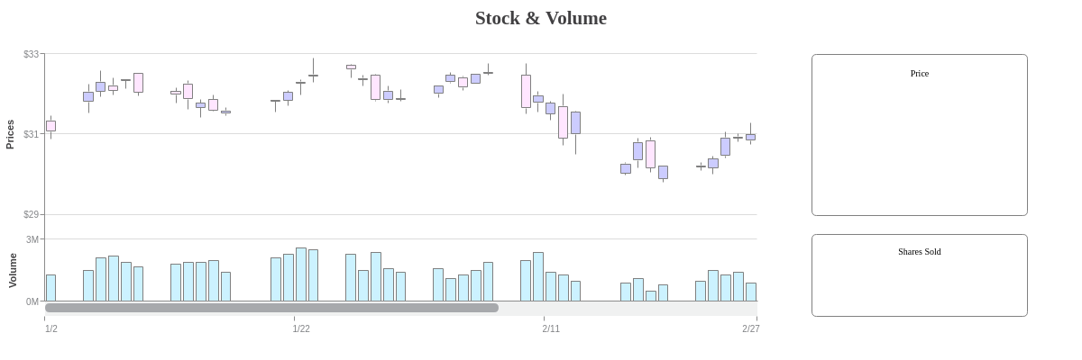
{
  type: "mixed",
  title: {
    text: "Stock & Volume",
    'font-family': "Georgia"
  },
  labels: [
    {
      text: "Price",
      'font-family': "Georgia",
      'font-size':10,
      'vertical-align': "top",
      'background-color': "white",
      'border-width': 1,
      'border-color': "gray",
      'border-radius': "5px",
      x: "75%",
      y: "15%",
      height: "45%",
      width: "20%",
      padding: "15%"
    },
    {
      text: "Shares Sold",
      'font-family': "Georgia",
      'font-size':10,
      'vertical-align': "top",
      'background-color': "white",
      'border-width': 1,
      'border-color': "gray",
      'border-radius': "5px",
      x: "75%",
      y: "65%",
      height: "23%",
      width: "20%",
      padding: "13%"
    }
  ],
  plot: {
    tooltip: {
      visible: false
    }
  },
  plotarea: {
    'margin-right': "30%"
  },
  'scale-x': {
    'min-value':1420232400000,
    step: "day",
    transform: {
      type: "date",
      all: "%m/%d"
    },
    'max-items': 4,
    item: {
      'font-size': 10
    },
    zooming: true,
    'zoom-to-values': [1420232400000,1425070800000]
  },
  'scroll-x': {},
  'scale-y': {
    'offset-start': "35%",
    values: "29:33:2",
    format: "$%v",
    label: {
      text: "Prices"
    },
    guide: {
      'line-style': "solid"
    },
    item: {
      'font-size':10
    }
  },
  'scale-y-2': {
    blended: true,
    'offset-end': "75%",
    placement: "default",
    values: "0:3:3",
    format: "%vM",
    label: {
      text: "Volume"
    },
    guide: {
      'line-style': "solid"
    },
    item: {
      'font-size':10
    }
  },
  'crosshair-x': {
    'plot-label': {
      multiple: true
    },
    'scale-label': {
      text: "%v",
      transform: {
        type: "date",
        all: "%D, %m/%d/%y"
      }
    }
  },
  series: [
    {
      type: "stock",
      scales: "scale-x,scale-y",
      aspect: "candlestick",
      'guide-label': {
        text: "Open: $%open<br>High: $%high<br>Low: $%low<br>Close: $%close",
        transform: {
          type: "date",
          all: "%D, %m/%d/%y"
        },
        'font-color': "#0099cc",
        'font-family': "Georgia",
        'font-size':16,
        'text-align': "center",
        'background-color': "none",
        'border-color': "none",
        height: "40%",
        width: "25%",
        x: "125%", //relative to the plotarea
        y: "36%", //relative to the plotarea
        sticky: true,
        timeout: 20000,
        callout: false
      },
      'trend-up': {
        'background-color': "#ccccff",
        'line-color': "gray",
        'border-color': "gray"
      },
      'trend-down': {
        'background-color': "#ffe6ff",
        'line-color': "gray",
        'border-color': "gray"
      },
      values: [...]
    },
    {
      type: 'bar',
      scales: "scale-x,scale-y-2",
      'guide-label': {
        text: "%vM",
        'font-color': "#0099cc",
        'font-family': "Georgia",
        'font-size':26,
        'text-align': "center",
        'background-color': "none",
        'border-color': "none",
        height: "10%",
        width: "25%",
        x: "125%", //relative to the plotarea
        y: "110%", //relative to the plotarea
        sticky: true,
        timeout: 20000,
        callout: false
      },
      'background-color': "#ccf2ff",
      'border-width': 1,
      'border-color': "gray",
      values: [...]
    }
  ]
}
Summary
Labels allow you to add any text or image, anywhere on your chart. They're great for calling attention to additional data or annotating your chart. For a full list of label attributes, see the JSON configuration page.