Radar Charts
Overview
ZingChart supports these radar chart types:
- Standard Radar
- Polar
These chart types can then be modified to display:
- Area
- Columns (Rose)
- Lines
- Scatter Points
- Mixed Aspects
- Stacked
Note: See our Radar Chart Gallery for inspiration on all the different radar chart possibilities.
Radar Chart Types
Get started by specifying your chart type. Add a type attribute to your chart object, and set the value to radar. With this chart type, you can create standard radar, polar, and small multiple radar charts.
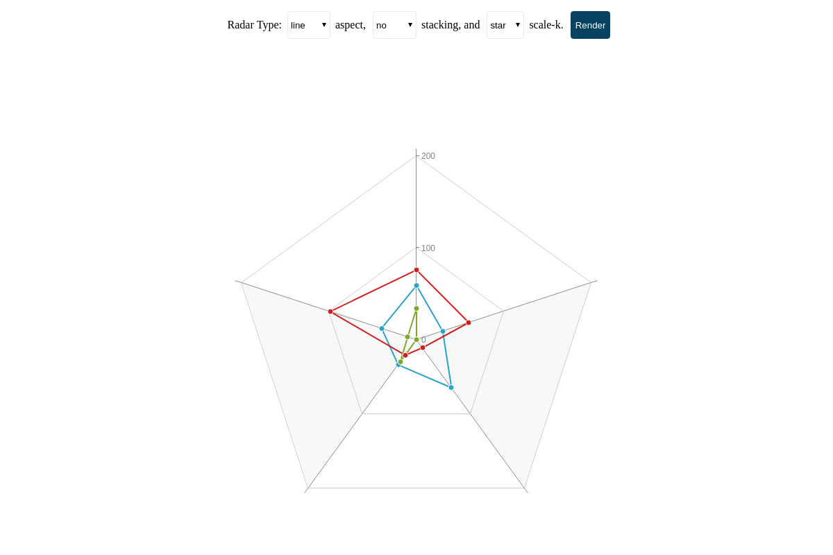
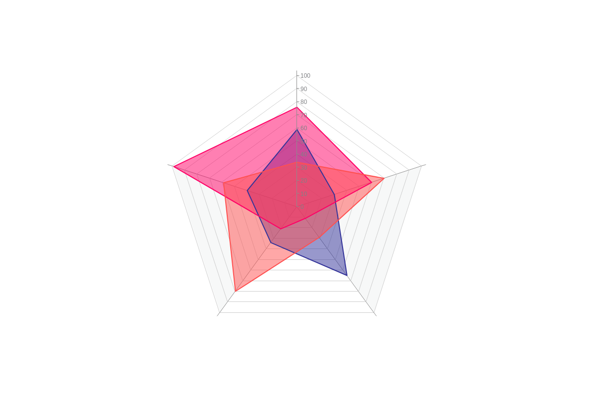
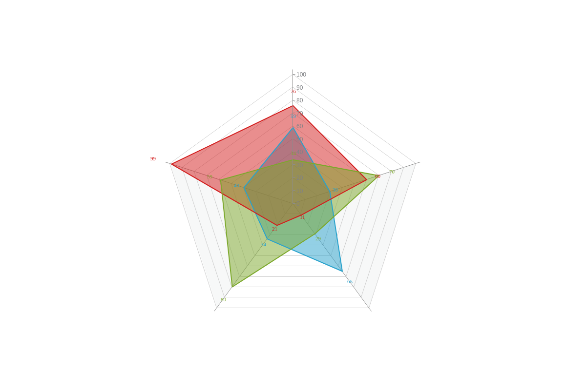
Radar Chart
Our default standard radar chart is displayed below, shown with three datasets. This chart type has two scales: scale-v (the vertical axis that displays values) and scale-k (the circular axis that wraps around the chart and displays variables/factors). Both scale types are further discussed in the Scale Configuration section below.
{
  type: "radar",
  series: [{
    values: [59, 30, 65, 34, 40]
  }, {
    values: [76, 60, 11, 21, 99]
  }, {
    values: [34, 0, 0, 30, 10]
  }]
}
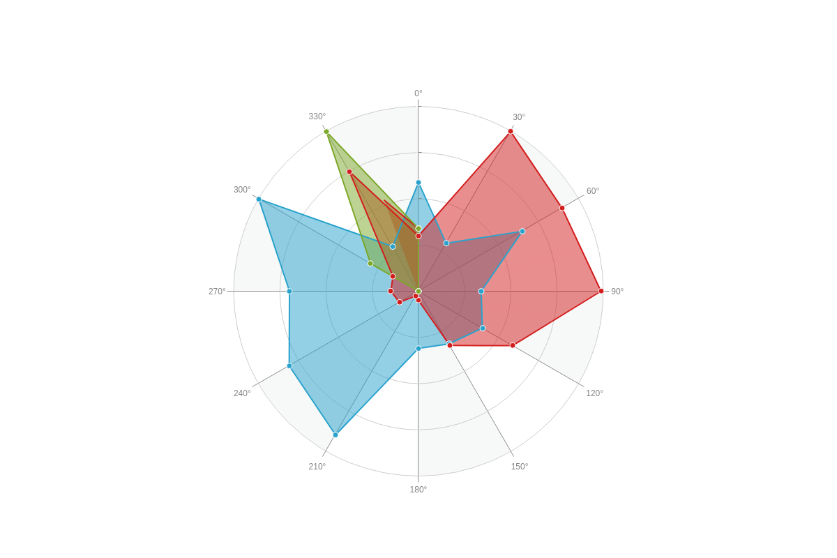
Polar Chart
Polar charts appear similar to radars, but their data is displayed in relation to angles rather than variables. Specifically, this affects the circular outer scale, scale-k, where you'll need to specify your minimum, maximum, and step scale values with a values attribute, and then use the format attribute or labels array to display your desired scale labels.
You can also add an aspect attribute and set the value to circle, which will change your chart from a star/spider to circle shape. See the polar chart example below.
Note: Make sure the number of values in your values array(s) matches the number of scale steps on scale-k. Otherwise, your chart will not properly display.
{
  type: "radar",
  plot: {
    aspect: "area"
  },
  'scale-v': {
    values: "0:100:25",
    labels: [ '', '', '', '', '' ],
    'ref-line': {
      'line-color': "none"
    },
    guide: {
      'line-style': "solid"
    }
  },
  'scale-k': {
    values: "0:330:30",
    format: "%v°",
    aspect: "circle", //To set the chart shape to circular.
    guide: {
      'line-style': "solid"
    }
  },
  series: [{
    values: [59, 30, 65, 34, 40, 33, 31, 90, 81, 70, 100, 28]
  }, {
    values: [30, 100, 90, 99, 59, 34, 5, 3, 12, 15, 16, 75, 34]
  }, {
    values: [34, 0, 0, 0, 0, 0, 0, 0, 0, 0, 30, 100]
  }]
}
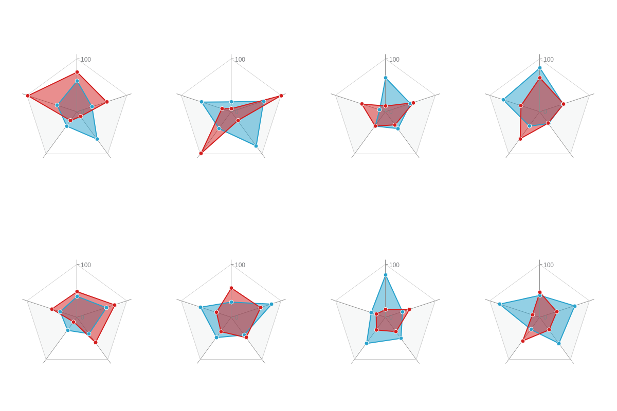
Small Multiple Radar Chart
Create a chart with multiple small radars (also known as a trellis or lattice chart) using a graphset array. Place each chart in its own object in the graphset array. You can specify where the chart is placed by using the height, width, x, and y attributes.
Note: Learn more about trellis charts with our Adding Additional Charts Tutorial.
{ //shortened for brevity- click on following radar trellis chart for full configuration
  graphset: [{
    type: "radar",
    height: "50%",
    width: "25%",
    x: "0%",
    y: "0%",
    plot: {
      aspect: "area"
    },
    'scale-v': {
      values: "0:100:100"
    },
    series: [{
      values: [59, 30, 65, 34, 40]
    }, {
      values: [76, 60, 11, 21, 99]
    }]
  }, {
    type: "radar",
    height: "50%",
    width: "25%",
    x: "25%",
    y: "0%",
    plot: {
      aspect: "area"
    },
    'scale-v': {
      values: "0:100:100"
    },
    series: [{
      values: [19, 65, 81, 40, 60]
    }, {
      values: [6, 100, 21, 99, 19]
    }]
  },
}
Data
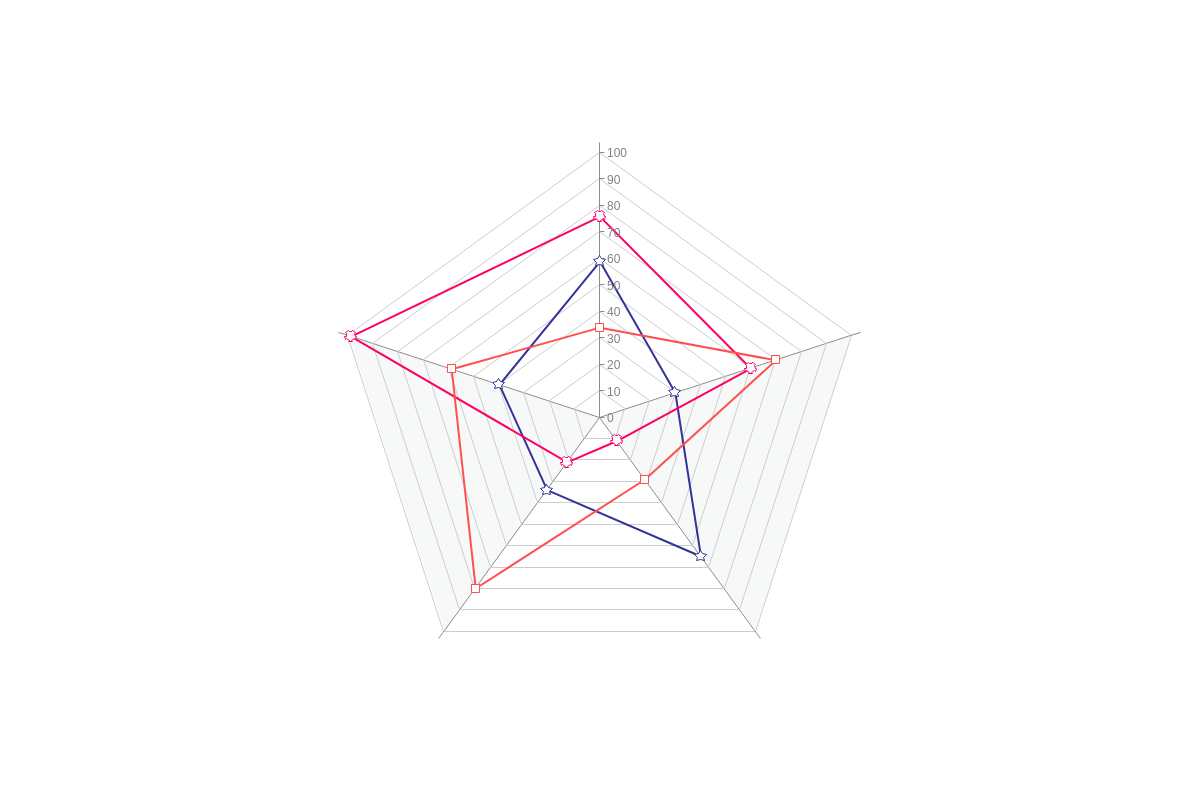
Radar charts support series arrays containing single or multiple datasets.
Values Array
For each dataset, provide your values in a values array in the following format:
series: [
  { values: [v0, v1, v2, ..., vN]},
  { values: [v0, v1, v2, ..., vN]},
  { values: [v0, v1, v2, ..., vN]}
]
Chart-Specific Properties
ZingChart allows you to customize the appearance of your radar chart by changing its aspects so that data displays as lines, polygons, columns/bars, scatter markers, or a combination of aspects. You can also change the chart's shape from a star to a circle and stack datasets on top of each other.
The following demo illustrates the different options available for the radar chart modifications discussed below:
Active Area
For area aspect, activeArea attribute extends the activation area by allowing tooltips and API events to be triggered by the area under the line.
{
  type: 'radar',
  plot: {
    aspect: 'area',
    activeArea: true, // default is false
  },
}

Angle Space
For rose aspect, angleSpace attribute modifies the aperture of the pie section relative to the entire space of the scale interval.
{
  type: 'radar',
  plot: {
    aspect: 'rose',
    angleSpace: 20,
  },
}

Aspect
The aspect attribute allows you to change the appearance of your series data so that they appear as lines (default), polygons (area), columns/bars (rose), scatter markers, or a combination of any of the aspect options. Place the attribute in your plotobject.
The aspect of a radar chart can be changed using the aspect attribute in the plot object. The aspect value options for population pyramids are:
| Value | Description |
|---|---|
line (default) |
Data displays as markers connected by straight lines. Makes a polygon shape. |
area |
Data displays as points connected by straight lines with the area between them and the center filled in. Makes a polygon shape. |
rose, column, bar |
Data displays as columns/ bars |
scatter |
Data displays as scatter markers |
mixed |
Combines any of the above aspects into a single chart. Specify an aspect attribute value on individual datasets in series array. |
{
  type: "radar",
  plot: {
    aspect: "line" // "area" | "rose" | "column" | "bar" | "scatter" | "mixed"
  },
  // if using "mixed" aspect, specify your desired aspect on individual datasets
  series: [{
    values: [59, 30, 65, 34, 40],
    // aspect: "area",
  },
  {
    values: [76, 60, 11, 21, 99],
    //aspect: "rose"
  }]
}
Stacked Radar Chart
To create a stacked radar chart, use the stacked attribute.
Stacking can be combined with any of the above radar chart aspects, but is probably most useful with the area and rose values.
{
  type: 'radar',
  plot: {
    aspect: 'area', // or 'rose',
    stacked: true,
  },
}

scale-k Aspect
Our radar charts are star- or spider-shaped by default, but you can change it to a circular-shaped chart (which is especially useful when creating polar charts). Create a scale-k object, and add an aspect attribute. Set the value to circle (the default value is star).
{
  type: "radar",
  'scale-k': {
    aspect: "circle" //For "star" or "circle" chart shape.
  }
}
Further Customization
Next, you'll want to configure your scales and customize the styling and appearance of your radar charts. You can also add value boxes, tooltips, and a legend.
Scale Configuration
Our radar charts have two scales: the key scale (scale-k object), which wraps around the chart, and the value scale (scale-v object), which is the vertical axis at the 12 o'clock position.
Note: Learn more about scales with our Scales Tutorial.
Key Scale ("scale-k")
With scale-k, category labels are generally used (with the exception of polar charts which can use quantitative values). Add a labels array, and provide your scale labels as strings separated by commas. Use an item object to style your scale labels. Commonly used attributes include: font-color, font-family, font-size, font-weight, and font-style.
You can also style your tick marks and guides (both the lines and background colors) with the tick and guide objects.
Note: See the JSON Attributes/Syntax page for scale-k for more information and styling options.
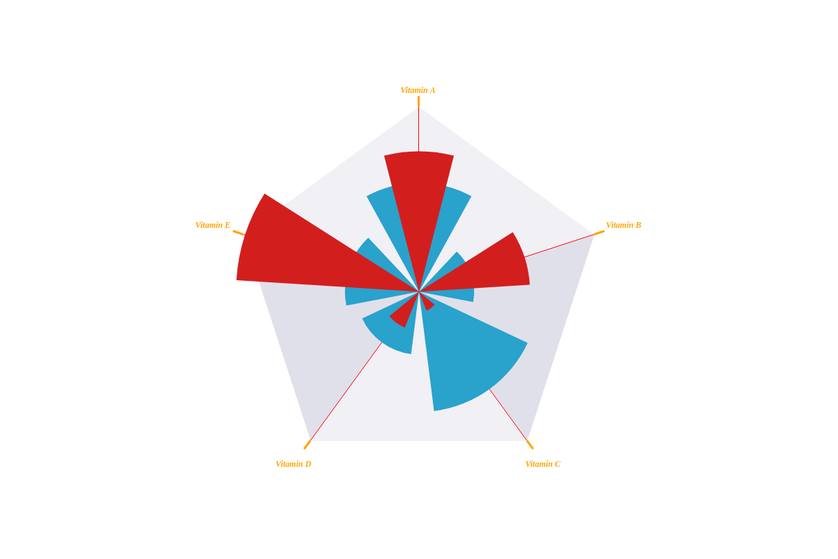
{
  'scale-k': {
    labels: [ "Vitamin A", "Vitamin B", "Vitamin C", "Vitamin D", "Vitamin E" ], //Scale Labels
    item: { //To style your scale labels.
      'font-color': "orange",
      'font-family': "Georgia",
      'font-size': 12,
      'font-weight': "bold",
      'font-style': "italic"
    },
    tick: { //Tick Marks
      'line-color': "orange",
      'line-width': 3,
      size: 15,
      placement: "outer"
    },
    guide: { //Guides (both lines and background colors)
      'line-color': "red",
      'line-width': 1,
      'line-style': "solid",
      'background-color': "#f0f0f5 #e0e0eb"
    }
  },
}
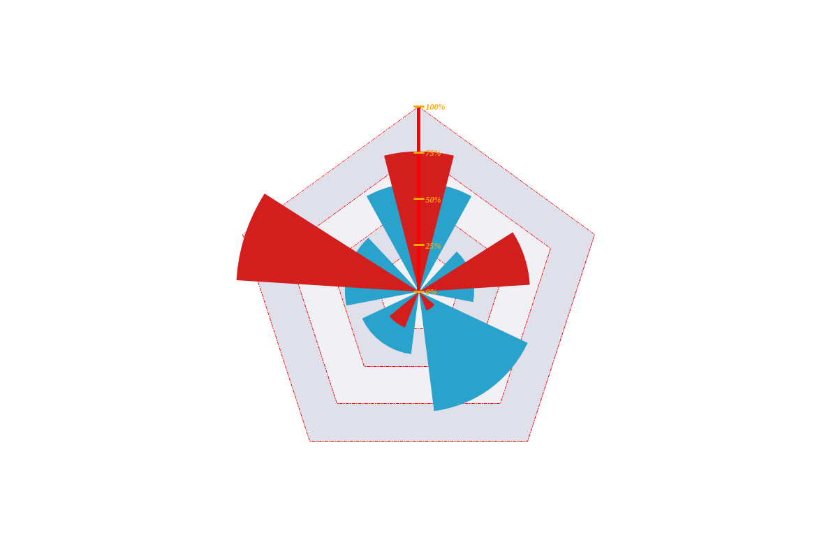
Value Scale ("scale-v")
Generally, scale-v displays quantitative values. You can set its minimum, maximum, and step scale values with the values attribute. To format how those values appear (e.g., as percentages or currency), add the format attribute. Scale label styling is done inside the item object. Use attributes such as font-color, font-family, and font-size.
This scale also has an axis line that you can style (e.g., line-color and line-width). Place the applicable attributes inside a ref-line object. Style your tick marks and guides (both lines and background colors) inside the tick and guide objects, respectively.
Note: See the JSON Attributes/Syntax page for scale-v.
{
  'scale-v': {
    values: "0:100:25", //To set your min/max/step.
    format: "%v%", //To format your scale labels.
    item: { //To style your scale labels.
      'font-color': "orange",
      'font-family': "Georgia",
      'font-size':12,
      'font-weight': "bold",
      'font-style': "italic"
    },
    'ref-line': { //Axis Line
      'line-color': "red",
      'line-width':5
    },
    tick: { //Tick Marks
      'line-color': "orange",
      'line-width':3,
      size:15,
      placement: "cross"
    },
    guide: { //Guides (both lines and background colors)
      'line-color': "red",
      'line-width':1,
      'line-style': "dashdot",
      'background-color': "#f0f0f5 #e0e0eb"
    }
  }
}
Styling
When styling your radar chart, the attributes you need depend on what aspect your chart is set to. The styling attributes most commonly used are: line-color, background-color, and the marker object (with applicable attributes placed inside). Place the attributes in the plot object for global changes and in a specific series object for local changes.
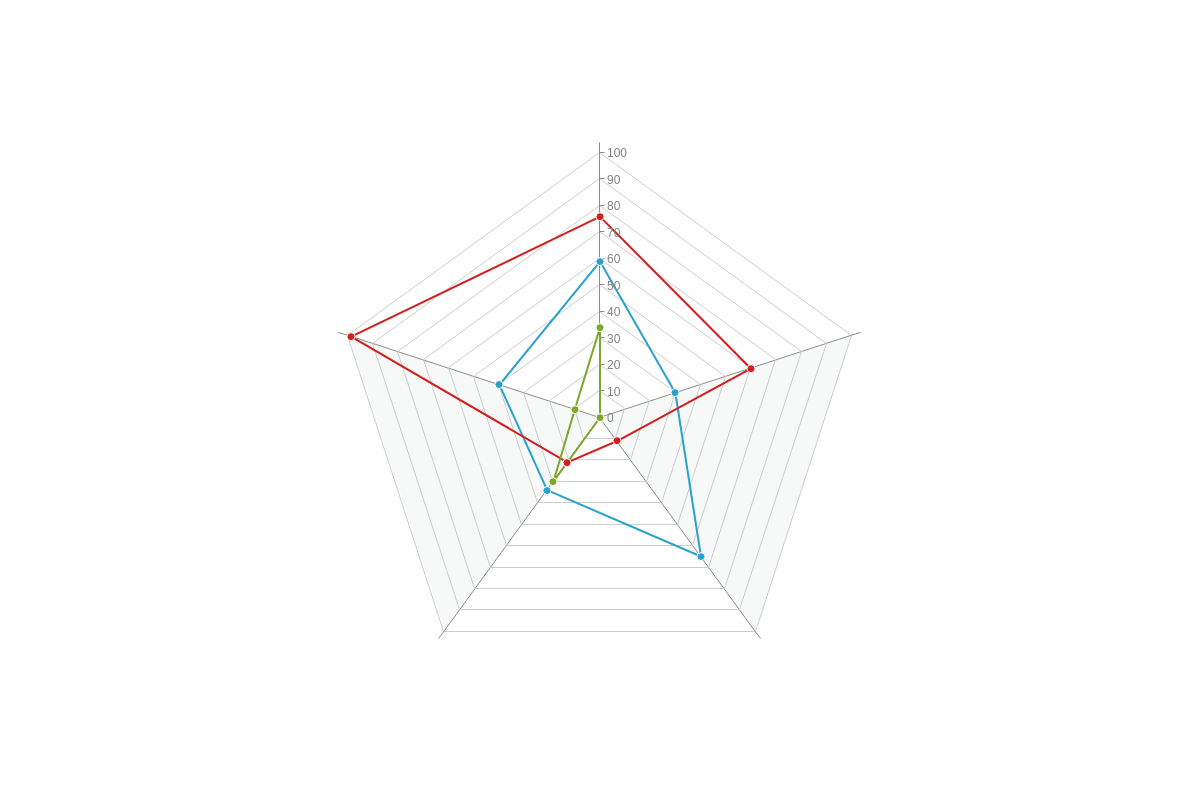
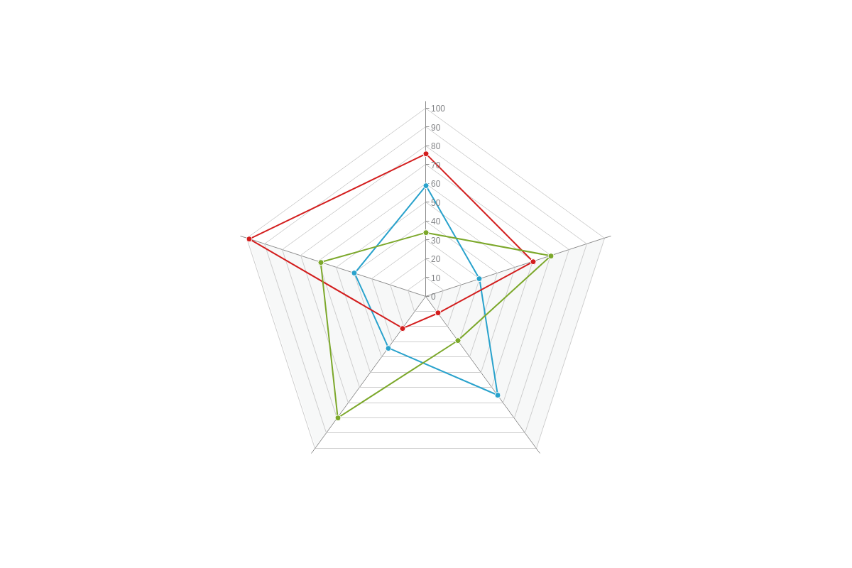
Line Radar Chart
Like line charts, the same styling attributes apply when styling the lines in your radar chart. Use the line-color attribute to specify your line color. Use the marker object to style your markers, using attributes like type, background-color, and border-color.
{
  plot: {
    aspect: "line"
  },
  series: [
    {
      values: [59,30,65,34,40],
      'line-color': "#333399",
      marker: {
        type: "star5",
        'background-color': "white",
        'border-color': "#333399"
      }
    }
  ]
}
Area Radar Chart
The styling for area radar charts is similar to area charts. Style the lines with the line-color attribute and specify the color of the shaded region (the area between the lines and center, and what forms the polygon) with the background-color attribute.
{
  plot: {
    aspect: "area"
  },
  series: [
    {
      values: [59,30,65,34,40],
      'line-color': "#333399",
      'background-color': "#333399"
    }
  ]
}
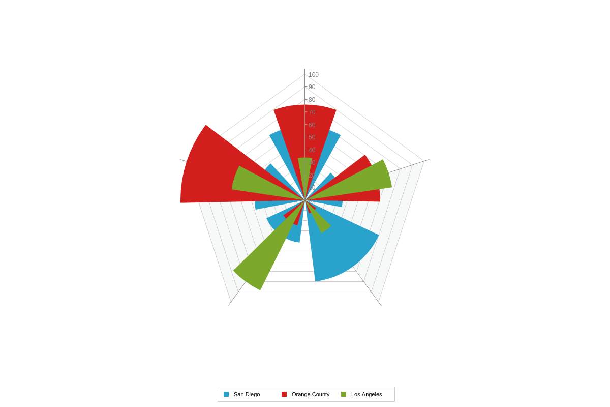
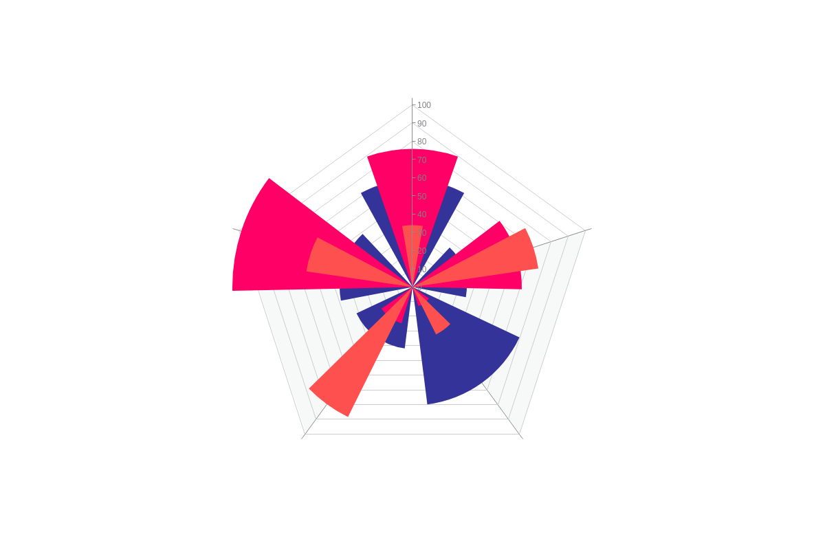
Rose Radar Chart
Rose radar charts are styled similarly to column and bar charts. Color the bars with the background-color attribute.
{
  plot: {
    aspect: "rose" //or "column" or "bar"
  },
  series: [
    {
      values: [59,30,65,34,40],
      'background-color': "#333399"
    }
  ]
}
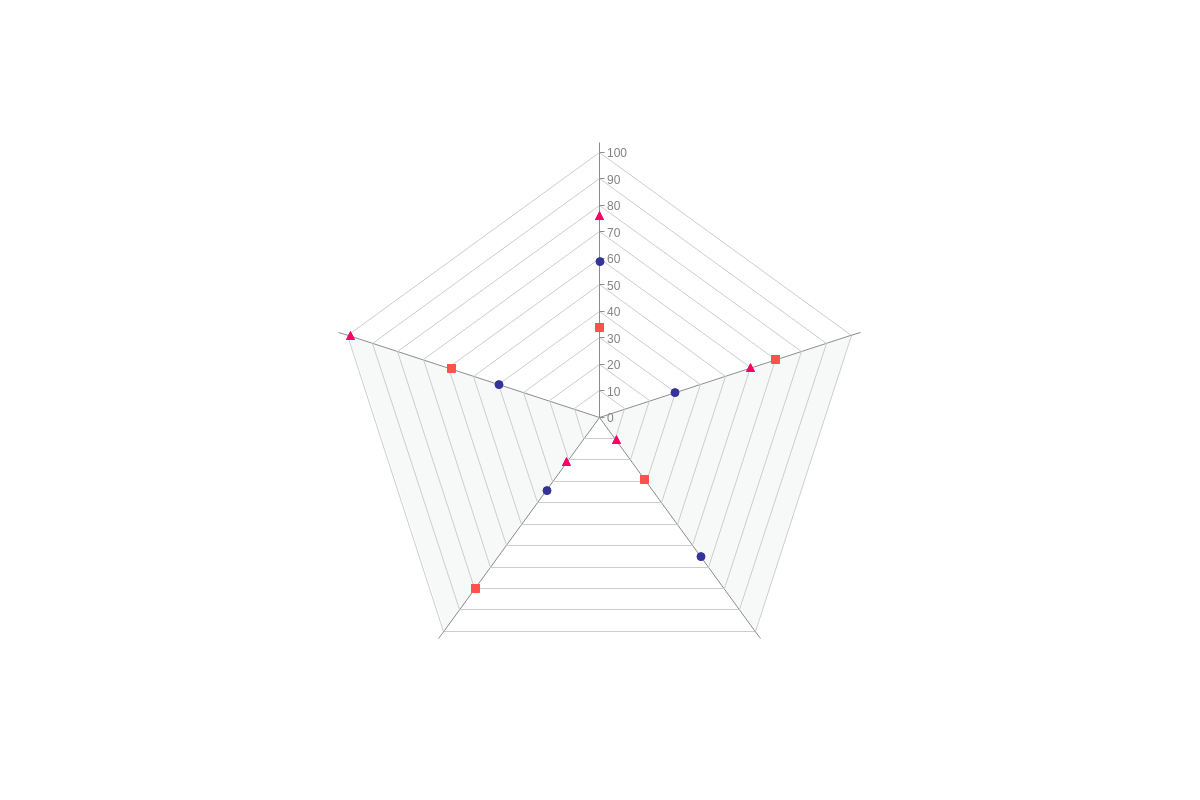
Scatter Radar Chart**
Scatter radar charts are styled just like the markers in scatter charts. Create a marker object, and place your styling attributes inside. You can change the shape of your markers with the type attribute and change the colors and borders with the background-color and border-color attributes.
{
  plot: {
    aspect: "scatter"
  },
  series: [
    {
      values: [59,30,65,34,40],
      marker: {
        type: "circle",
        'background-color': "#333399",
        'border-color': "#333399"
      }
    }
  ]
}
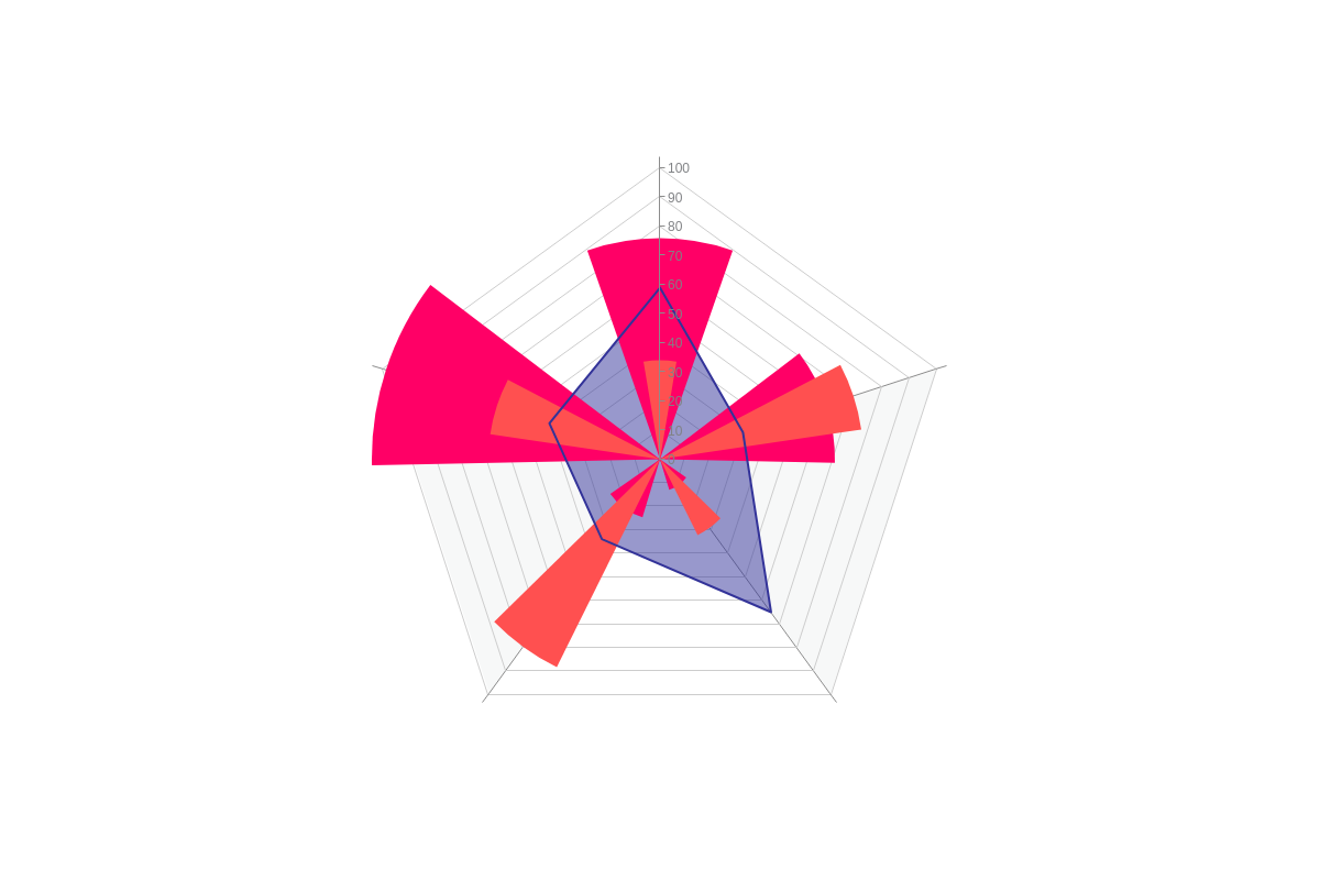
Mixed Radar Chart
Mixed radar charts are like mixed charts in that you can use two or more aspects in the same chart. Simply use the styling attributes that apply to the particular aspect in the applicable series object.
{
  plot: {
    aspect: "mixed"
  },
  series: [
    {
      values: [59,30,65,34,40],
      aspect: "area",
      'line-color': "#333399",
      'background-color': "#333399",
      marker: {
        type: "none"
      }
    },
    {
      values: [76,60,11,21,99],
      aspect: "rose",
      'line-color': "#ff0066",
      'background-color': "#ff0066",
      marker: {
        type: "none"
      }
    }
  ]
}
Value Boxes
You can include value boxes in your radar chart. In the plot object, create a value-box object. Place all text specification and styling attributes inside.
Note: Learn more about value boxes with our [Value Boxes Tutorial] (https://www.zingchart.com/docs/tutorials/elements/value-boxes). See the Value Boxes JSON Attributes/Syntax page for a full list of available attributes.
{
  plot: {
    aspect: "area",
    'value-box': { //Value Boxes
      'font-family': "Georgia",
      'font-weight': "normal"
    }
  }
}
Tooltips
Tooltips appear by default on our radars, but you can modify the text and incorporate styling. In the plot object, add a tooltip object. Use the text attribute to specify what text to display. You can use both text and tokens contained in a string.
Note: Learn more about tooltips with our Tooltips Tutorial. See the Tooltips JSON Attributes/Syntax page for further attribute options.
{
  plot: {
    aspect: "line",
    tooltip: {
      text: "%t: %v"
    }
  }
}
Legend
To enable and style a chart legend, add a legend object to your chart object. Specify where the legend is placed by using the align (left, center, or right) and vertical-align (top, middle, or bottom) attributes.
Note: Learn more about legends with our Legend Tutorial and Legend JSON Attributes/Syntax page.
{
  type: "radar",
  legend: {
    align: "center",
    'vertical-align': "bottom"
  },
}