Pareto Charts
Note: See our Pareto Chart Gallery for inspiration on all the different pareto chart possibilities.
Pareto Chart Type
Specify the chart type by adding a type attribute to the chart object and setting the value to pareto.
{
  type: "pareto",
}
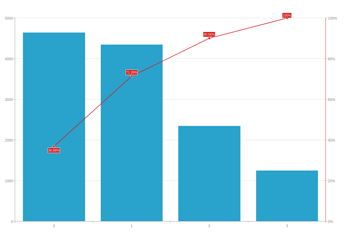
Data
To enter data into the pareto chart, use the series array. Each object in the series array requires a values array to function properly. ZingChart will automatically calculate the percentage values for the line plot from this array.
Note: Learn more about the series array with our series JSON Configuration page.
{
  type: "pareto",
  series: [
    {
      values: [464200,434500,235000,125100]
    }
  ]
}
Chart-Specific Properties
Pareto charts include a number of unique chart-specific properties that allow you to manipulate the appearance and behaviors of your HTML5 pareto chart. Add these properties within an options object.
Pareto Line Plot
The line-plot object sets the definition for the auto-generated line plot.
{
  type: "pareto",
  options: {
    'line-plot': {
      'line-color': "#f00",
      'line-width':4
    }
  }
}
Scale-Y-2
The scale-y-2 object sets the definition for the second y-scale (the one associated with the auto-generated line).
{
  type: "pareto",
  options: {
    'scale-y-2': {
      'line-color': "red",
      label: {
        text: "Percentage",
        'font-color': "red"
      },
      tick: {
        'line-color': "red"
      },
      item: {
        color: "red"
      }
    }
  }
}