Heat Maps
Overview
Heat maps can be modified to display as:
- Vertical Bars
- Horizontal Bars
- Solid Colors
- Squares/Rectangles
- Custom Images
Note: See our Heat Map Gallery for inspiration on all the different heat map possibilities.
Heat Map Chart Type
In your chart object, add a type attribute and set the value to heatmap. Without further modification, a basic heat map with three datasets looks like this:
{
  type: 'heatmap',
  series: [
    { values: [59,15,5,30,60,99,28]},
    { values: [34,32,87,65,9,17,40]},
    { values: [90,19,50,39,12,49,14]}
  ]
}

Data
Heat map charts support single or multiple datasets. Each values array corresponds to a heat map row, provided in the following format:
{
  series: [
    {
      values: [val1, val2, ..., valN]
    }
  ]
}
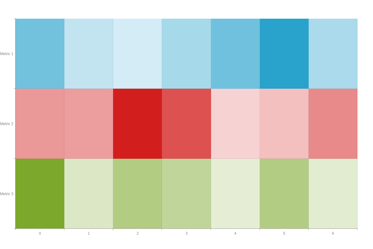
By default, the rows appear on your chart ordered from bottom to top (similar to stacking). However, you can reverse this so that your rows appear from top to bottom. Create a scaleY object. Add a mirrored attribute, and set the value to true.
Compare the following chart to the chart in the above section to see the difference. This attribute is useful in that it allows your heat map and series array to visually match each other.
{
  type: 'heatmap',
  scaleY': {
    mirrored: true    //Flips data so that rows appear from top to bottom.
  },
  series: [
    { values: [59,15,5,30,60,99,28]},
    { values: [34,32,87,65,9,17,40]},
    { values: [90,19,50,39,12,49,14]}
  ]
}
Heat Map-Specific Properties
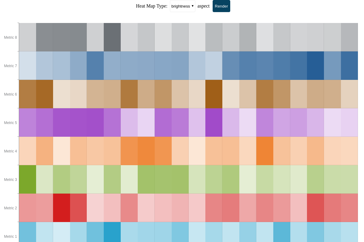
You can modify how your heat map displays data. Using aspects, data can be displayed according to color brightness, size, vertical bars, horizontal bars, or background images. You can also specify your aspect ratios and what scale your heat map values are drawn against.
Aspect
Use the aspect attribute to modify your heat map's appearance. Create a plot object, and place your aspect attribute inside it.
{
  type: 'heatmap',
  plot: {
    aspect: 'brightness'
  }
}
The aspect value options for heat maps are:
| Value | Description |
|---|---|
brightness (default) |
Data displays according to color brightness/ intensity. Since it is the default aspect, specifying its type is optional. |
size |
Data displays as squares/rectangles to show size variance |
vertical |
Data displays as a series of vertical bars. This can create a small multiple or trellis chart effect. |
horizontal |
Data displays as a series of horizontal bars. This can create a small multiple or trellis chart effect. |
none |
Turns off all aspects. Data displays as a series of solid colors. |
Note: For the vertical and horizontal aspects, you can use the minRatio, maxRatio, and/or reference attributes, discussed further below, to adjust the sizing and appearance of your bars.
The following demo illustrates the different aspect options available:
You can also use the none aspect value to display background images in lieu of solid colors. In the chart below, a rules array (discussed further below) were used to sort data values and assign them ratings images for Best, Good, Average, Not So Good, and Worst.
{
  plot: {
    aspect: 'none',
    backgroundColor: 'none',
    backgroundRepeat: false,
    rules: [
      {
        rule: '%v >= 80',
        backgroundImage: 'https://www.zingchart.com/package/examples/images/icon-best.png'
      },
      {
        rule: '%v < 80 && %v >= 60',
        backgroundImage: 'https://www.zingchart.com/package/examples/images/icon-good.png'
      }
      //shortened for brevity- click on following custom background heat map demo for full configuration
    ]
}
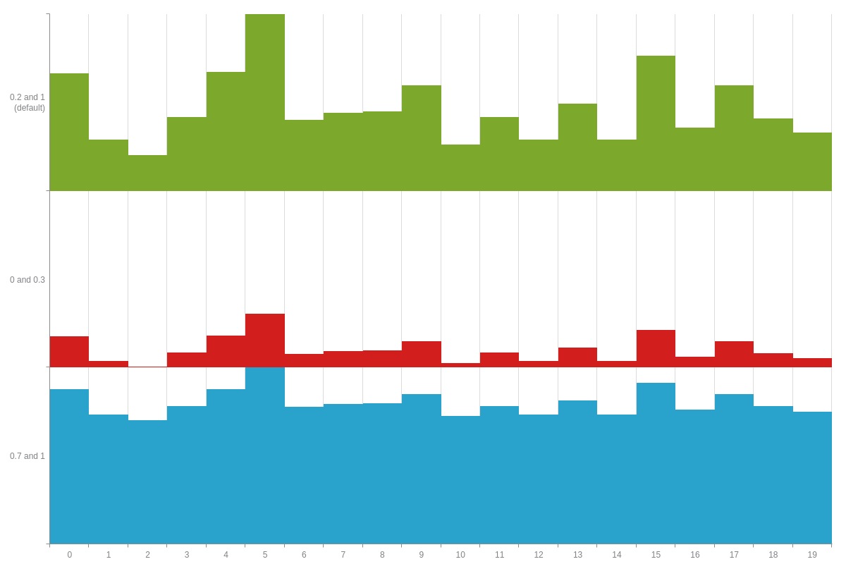
Minimum and Maximum Ratios
Depending on your data type, you can change the minimum and/or maximum ratios (between 0-1) that your heat map aspect operates within. In your plot object, add the minRatio and/or maxRatio attribute(s). Alternatively, you can apply them locally to specific data objects. The default values for the minimum and maximum ratios are 0.2 and 1, respectively. Changing the values affects the appearance of your data.
To illustrate the difference, the chart below displays three rows in vertical aspect with varying ratios:
{
  series: [
    {
      values: [59,15,5,30,60,99,28,33,34,51,12,30,15,39,15,71,23,51,29,20],
      minRatio: 0.7,
      maxRatio: 1
    },
    {
      values: [59,15,5,30,60,99,28,33,34,51,12,30,15,39,15,71,23,51,29,20],
      minRatio: 0.2,   //default
      maxRatio: 1      //default
    }
    //shortened for brevity- click on following min/max ratio heat map demo for full configuration
  ]
}
Minimum and Maximum Values
Sets a minimum or maximum reference value. If not set, the minimum/maximum value found in the data is used.
{
  options: {
    minValue: 0,
    maxValue: 150,
  },
}
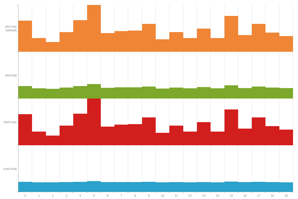
Scale Reference
The reference attribute is another way to adjust the scaling and appearance of your heat map data. To apply globally, add the attribute to your plot object. Alternatively, you can apply it locally to specific data objects.
The reference value options for heat maps are:
| Value | Description |
|---|---|
plot-max(default) |
Displays values in relation to the largest value in that particular plot. Since it is the default aspect, specifying its type is optional. |
plot-total |
Displays values in relation to the sum of all values in that particular plot |
chart-max |
Displays values in relation to the largest value in your total chart |
chart-total |
Takes into consideration the sum of all values |
To illustrate the difference, the following chart displays all four reference values applied to the same data figures:
{
  series: [
    {
      values: [59,15,5,30,60,99,28,33,34,51,12,30,15,39,15,71,23,51,29,20],
      reference: 'chart-total' // 'plot-max' | 'plot-total' | 'chart-max'
    }
    //shortened for brevity- click on following heat map reference attribute demo for full configuration
  ]
}
Further Customization
Further customize your heat map chart by configuring your scales, styling your background colors and borders, and adding value boxes and tooltips.
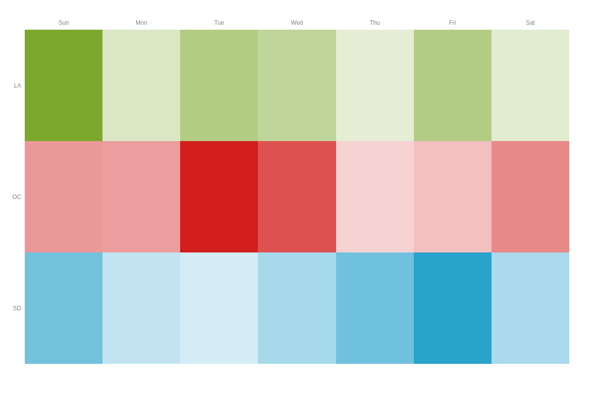
Scale Configuration
With heat map charts, you'll most likely want to provide scale labels for both axes, as well as adjust the visibility of your axis lines, plot lines, and tick marks. In your scaleX and/or scaleY objects, use the labels array to specify your scale labels.
Note: Learn more about labels with our Labels Tutorial.
You can turn off the visibility of your axis lines by adding a lineColor attribute and setting the value to none. Plot lines and tick marks are styled in a guide object and tick object, respectively. Inside, add a visible attribute and set the value to false.
You can also change your axis placement by applying the placement attribute and by setting the value to opposite.
Note: Learn more about scales with our Scales Tutorial. Also browse the JSON Attributes/Syntax pages for scale-x and scale-y for more styling options.
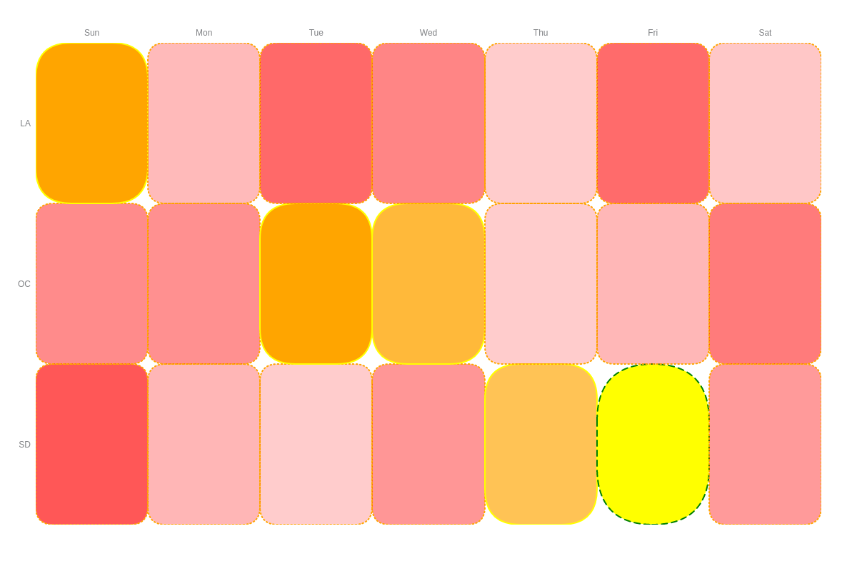
{
  scaleX: {
    labels: [ 'Sun', 'Mon', 'Tue', 'Wed', 'Thu', 'Fri', 'Sat' ],  // X-Axis Scale Labels
    lineColor: 'none',   // Axis Lines
    guide: {              // Plot Lines
      visible: false
    },
    tick: {               // Tick Marks
      visible: false
    },
    placement: 'opposite' // To change the placement of your axis.
  },
  scaleY: {
    labels: [ 'SD', 'OC', 'LA' ], // Y-Axis Scale Labels
    lineColor: 'none',   // Axis Lines
    guide: {              // Plot Lines
      visible: false
    },
    tick: {               // Tick Marks
      visible: false
    }
  }
}
Styling
Heat map chart styling can be applied to background colors, borders, rounded corners, hover states, and more. Place all styling attributes inside your plot object. Alternatively, you can apply styling to a specific plot by placing the attributes inside the applicable series object.
Change your heat map value colors with the backgroundColor attribute and a RGB or hexadecimal color value. Include and style value borders with the borderWidth, borderColor, and lineStyle attributes. To create rounded corners, use a borderRadius attribute and provide a pixel value.
You can also specify how values appear when you hover over them with a hoverState object. Place your desired styling attributes inside the object.
Note: For additional styling and customization options, see our Plot/Series JSON Attributes/Syntax page.
{
  plot: {
    backgroundColor: 'red',  // Provide a RGB or hexadecimal color value.
    borderColor: 'orange',   // Provide a RGB or hexadecimal color value.
    borderRadius: '25px',    // Provide a pixel value for rounded corners.
    borderWidth: 2,          // Provide a pixel value.
    lineStyle: 'dotted',     // or 'solid' or 'dashed'.
    hoverState: {    // How values appear when hovered over.
      backgroundColor: 'purple',
      borderColor: 'green',
      borderRadius: '100px',
      borderWidth: 2,
      lineStyle: 'dashed',
    }
  }
}
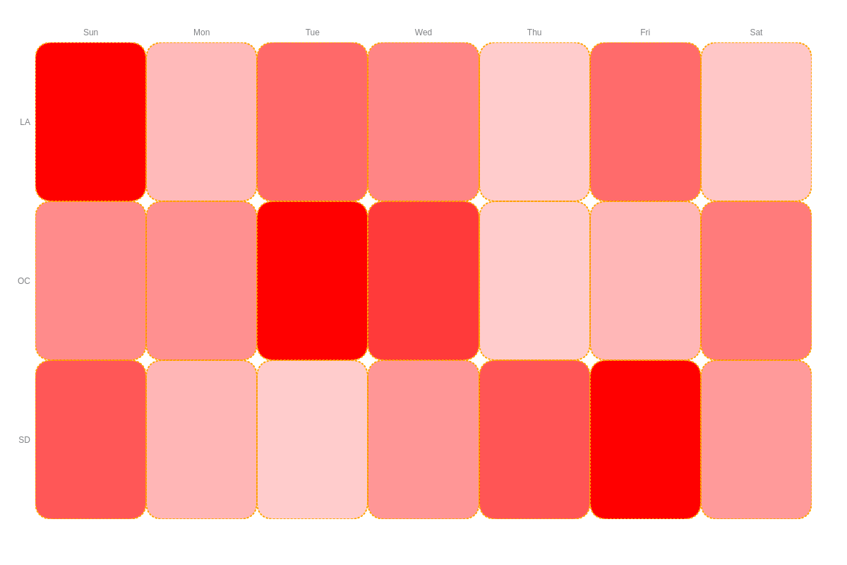
Rules
Add rules to your chart by including a rules array in your plot object. Inside the array, each rule is contained inside its own object. Use the rule attribute to provide your condition (e.g., %v >= 60). The styling attributes you provide in that object will be what appears when that condition is met.
Note: Learn more about rules with our Logic Rules Tutorial.
{
  plot: {
    rules: [
      {
        rule: '%v >= 60',
        backgroundColor: 'orange',
        borderColor: 'yellow',
        borderRadius: '50px',
        borderWidth: 2,
        lineStyle: 'solid',
      },
      {
        rule: '%v == 99',
        backgroundColor: 'yellow',
        borderColor: 'green',
        borderRadius: '100px',
        borderWidth: 2,
        lineStyle: 'dashed',
      }
    ]
  }
}

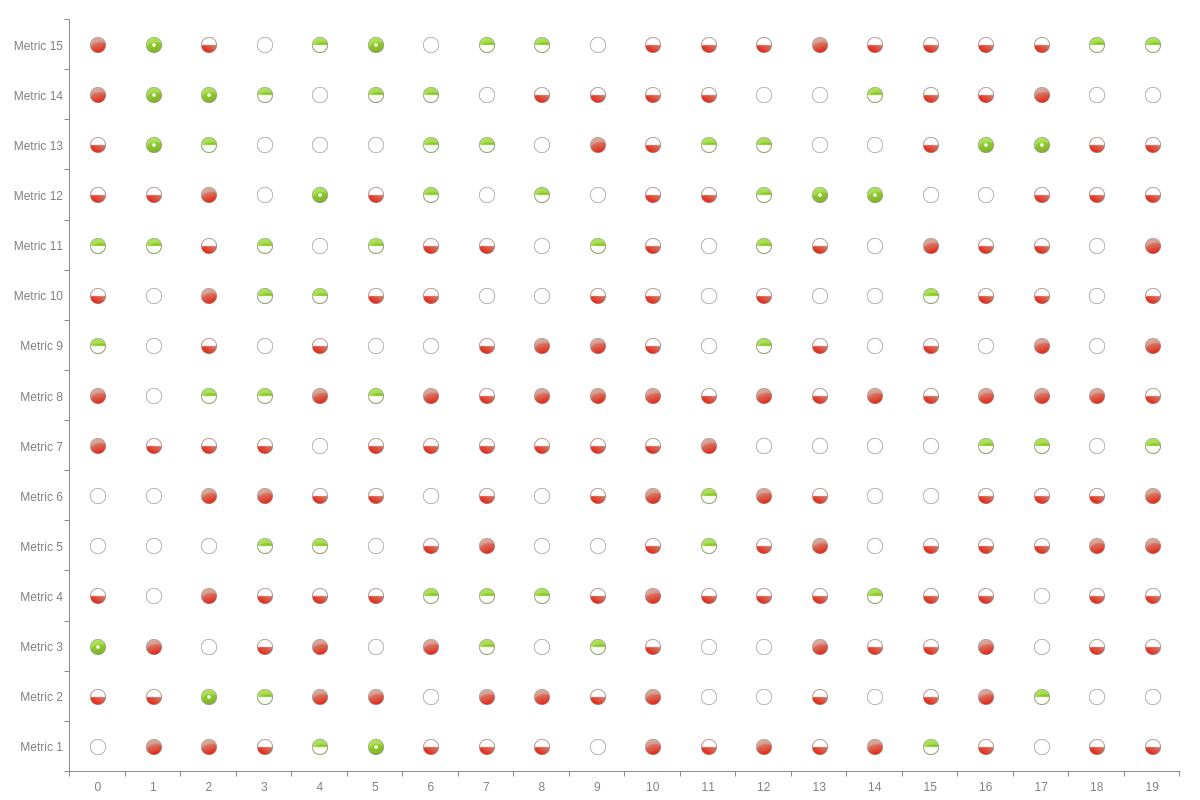
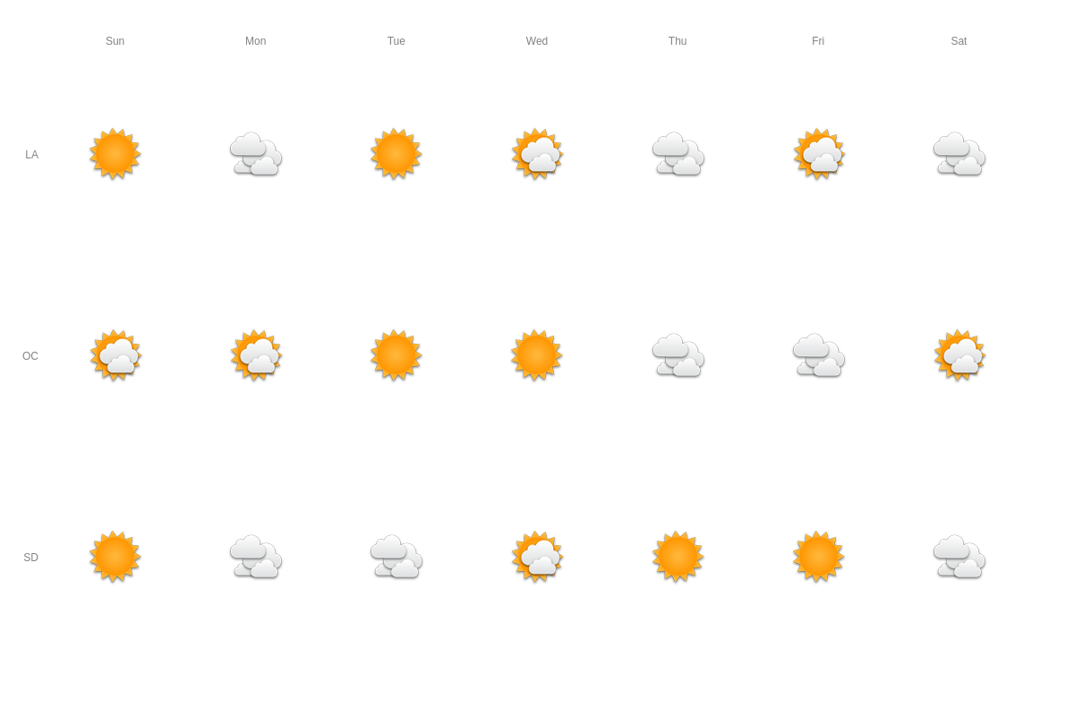
Background Images
In lieu of colors, you can use images to represent data values in your heat map. Use the same rules array and rule attributes in your plot object. Include a background-image attribute and provide an image link contained in quotes as your value. In the following chart, images for sunny, partly cloudy, and cloudy weather were used.
Note: You'll need to set aspect: 'none' in order to use images to represent data values.
{
  plot: {
    aspect: 'none',
    backgroundColor: 'none',
    backgroundRepeat: false,
    rules: [
      {
        rule: '%v >= 50',
        backgroundImage: 'https://www.zingchart.com/package/examples/images/sunny.png'
      },
      {
        rule: '%v < 50 && %v >= 30',
        backgroundImage: 'https://www.zingchart.com/package/examples/images/partly-cloudy.png'
      }
      // shortened for brevity- click on following custom background heat map demo for full configuration
    ]
  }
}
Value Boxes
Value boxes are not visible on heat map charts by default. To include them, add a value-box object to your plot object. You can place any value box-specific styling attributes inside.
Note: Learn more about value boxes with out Value Boxes Tutorial. For a full list of styling options, see our Value Box JSON Attributes/Syntax page.
{
  plot: {
    valueBox: {}
  }
}

Tooltips
Style and customize how tooltips appear by adding a tooltip object to your chart object. Change the tooltip's text with the tooltipText attribute, which you'll place inside your plot object and individual rule objects.
Note: Learn more about tooltips with our Tooltips Tutorial. For more styling options, see our tooltip JSON Attributes/Syntax page.
{
  plot: {
    tooltipText: "%v Apples",
    rules: [
      {
        rule: "%v >= 60",
        backgroundColor: "orange",
        borderColor: "yellow",
        borderRadius: "50px",
        borderWidth: 2,
        lineStyle: "solid",
        tooltipText: "%v Oranges"
      }
    ]
  }
}