Calendar Charts
Note: See our Calendar Chart Gallery for inspiration on all the different calendar chart possibilities.
Calendar Chart Type
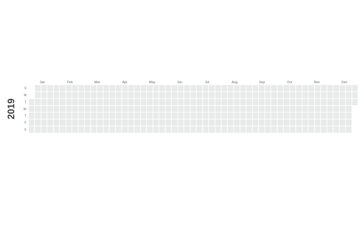
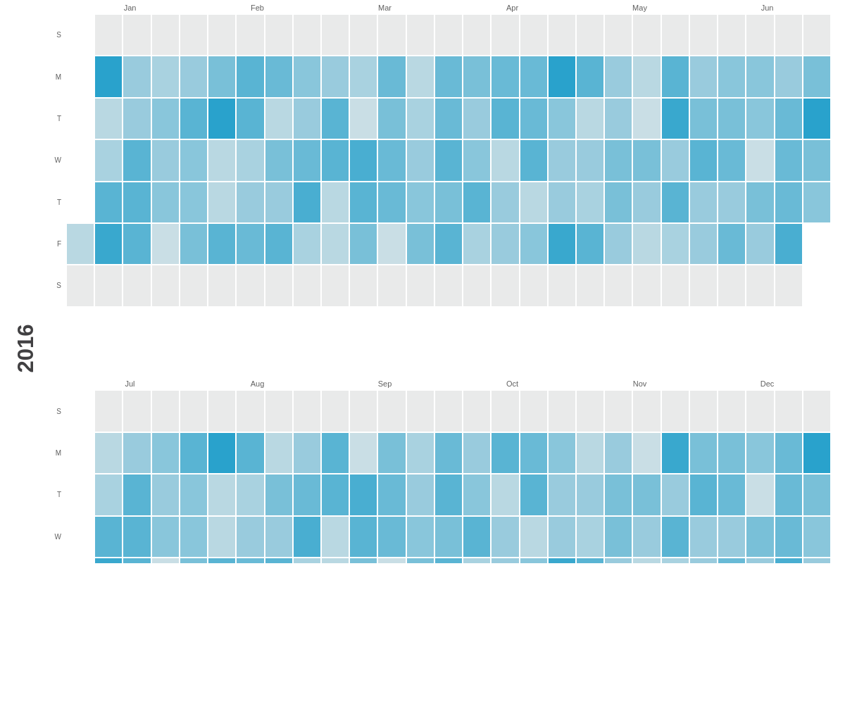
Our default chart displays as a 12 month calendar of the current year. To create one, add a type property to your chart object and set the value to calendar.
Note: Calendar charts display only one calendar year (January-December of any given year). To display a 12-month period over 2 years (e.g., November 2020- October 2021), you can create a trellis chart. Learn more with our Adding Additional Charts Tutorial.
{
  type: "calendar"
}
Data
Calendar charts support data in the form of an array of arrays. Create an options object and then add a values array.
Calendar Values
In each array, provide the calendar dates with corresponding number values in the following format:
options: {
  values: [
    [ 'YYYY-MM-DD', val1],
    [ 'YYYY-MM-DD', val2],
    ...,
    [ 'YYYY-MM-DD', valN]
  ]
}
To return the values, call the %data-day and %v tokens, respectively.
Additional Values
You can also provide optional string values in the following format:
options: {
  values: [
    [ 'YYYY-MM-DD', val1, 'info0', 'info1', ..., 'infoN' ],
    [ 'YYYY-MM-DD', val2, 'info0', 'info1', ..., 'infoN' ],
    ...,
    [ 'YYYY-MM-DD', valN, 'info0', 'info1', ..., 'infoN' ]
  ]
}
To return the values, call the tokens as %data-info0, %data-info1, and so on.
Chart-Specific Properties
Use the options object to define and configure the calendar chart. Customize further with additional objects and properties.
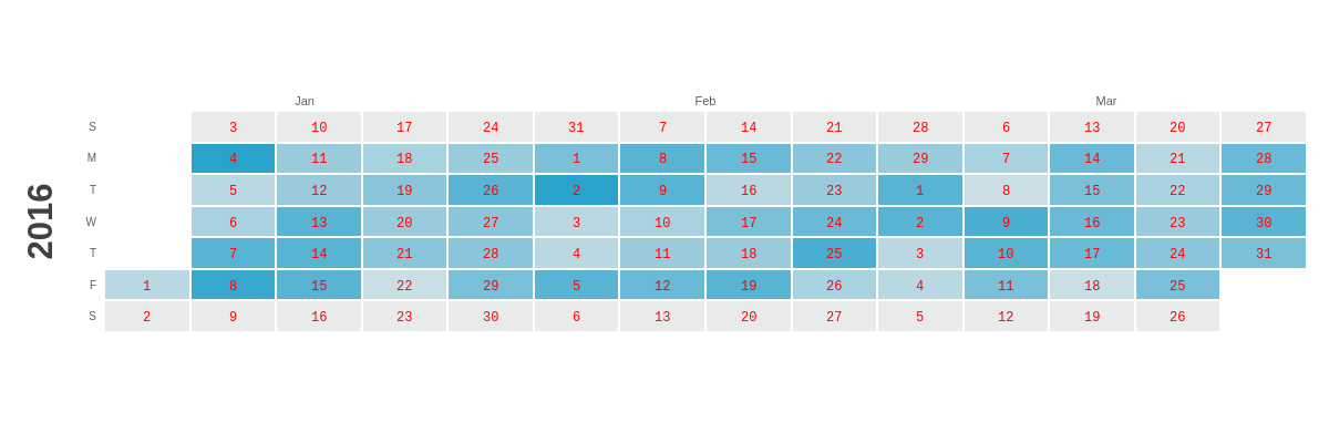
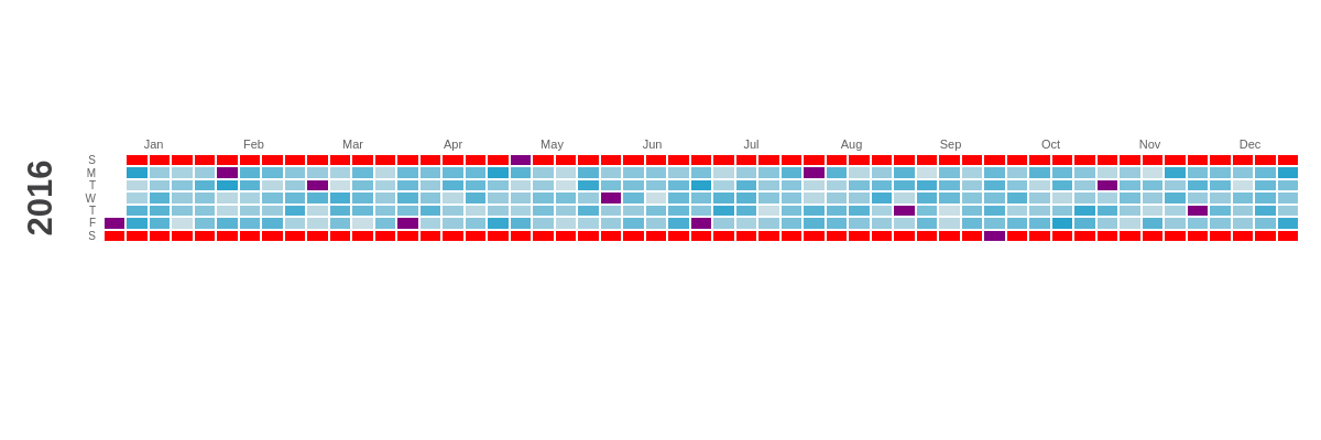
Calendar Year
To configure the calendar year, add a year object within the options object. Include a text property, and provide the calendar year as the value. Without specification, the calendar will default to the current year. You can style the year using inherited background, border, and font/text properties.
{
  options: {
    year: {
      text: '2016' //Set the calendar year.
    }
  }
}
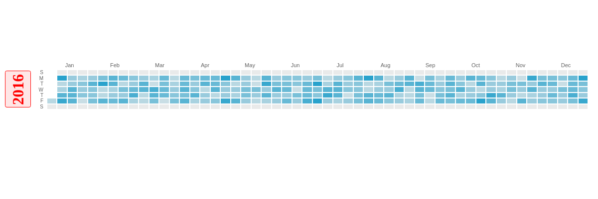
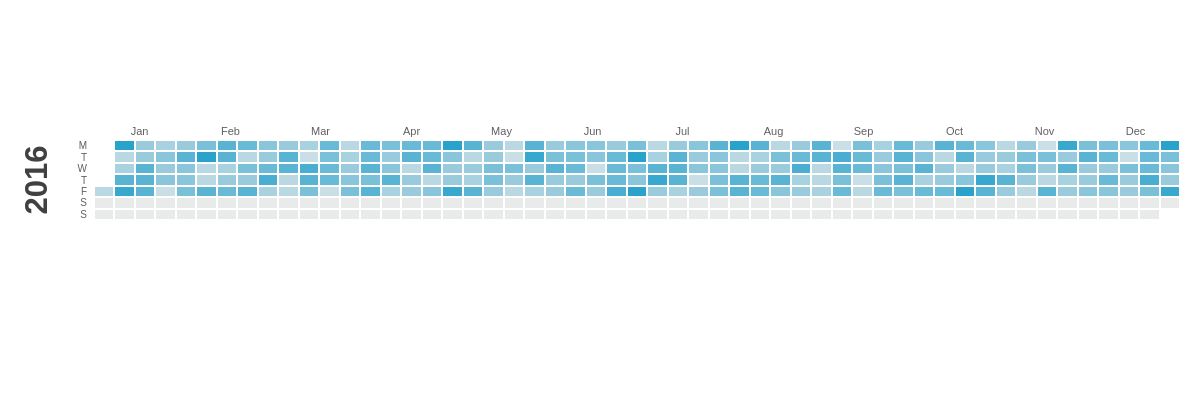
Starting Month
Use the startMonth property to set the month that the calendar chart begins on. By default, the calendar will start in January. Provide a value between 1-12, with 1 indicating January and 12 indicating December.
{
  options: {
    startMonth: 9 //Set the starting month (1-12).
  }
}
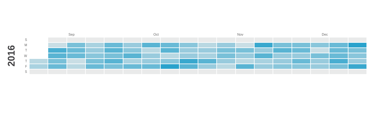
Ending Month
Use the endMonth property to set the month the calendar chart ends on. By default, the calendar will end in December. Provide a value between 1-12, with 1 indicating January and 12 indicating December.
{
  options: {
    endMonth: 4 //Set the ending month (1-12).
  }
}
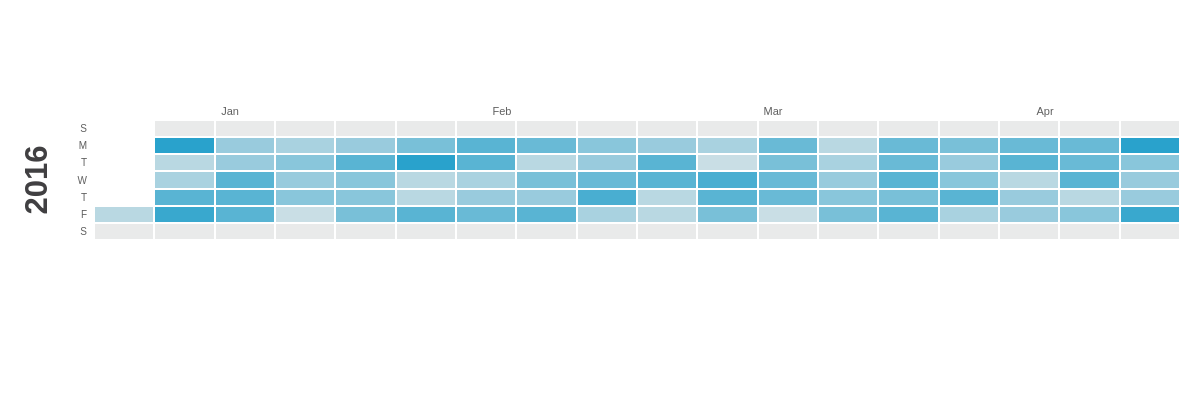
First Day of the Week
Use the firstday property to set the day of the week the calendar begins on: Sunday ('s') or Monday ('m'). By default, Sunday is set as the first day of the week, which is the norm in most North American countries. In most of Europe, however, Monday is considered the first day of the week.
{
    options: {
      firstday: 'm', //Set the first day of the week: 's' (Sunday) or 'm' (Monday).
    }
}
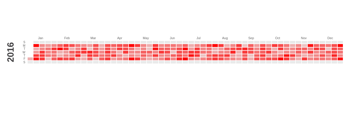
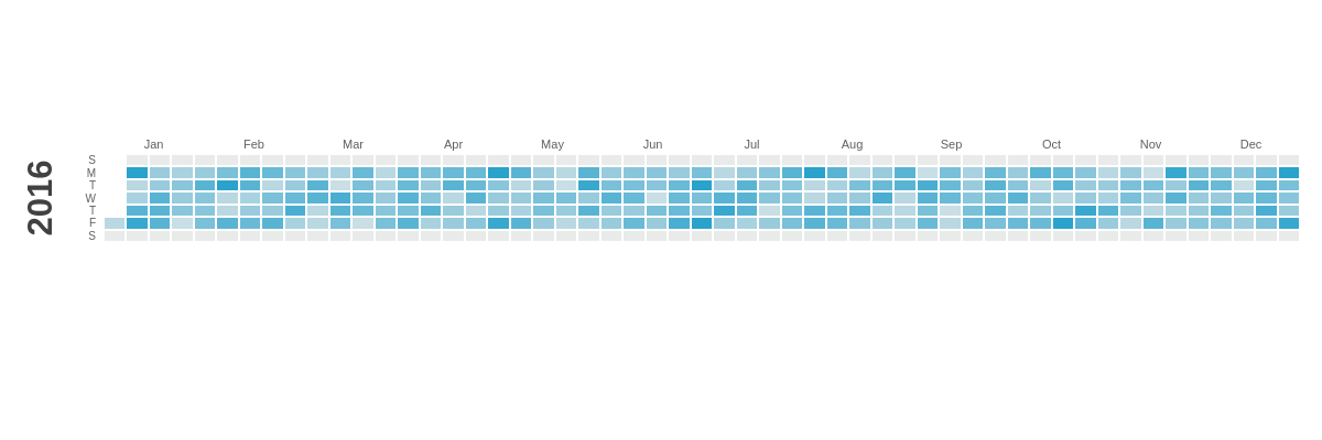
Color Palette
Use the palette array to set the color palette for the calendar and scale indicator (more below). Provide two color, HEX, or RGB values separated by commas to represent the negative and positive values.
palette: [ 'negativeColor', 'positiveColor' ]
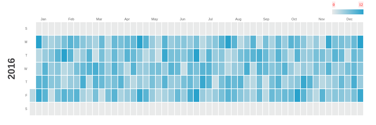
Scale Indicator
On calendar charts, the scale indicator acts as the chart's legend and provides details about how the chart's range of color correlates with the data.
To configure the scale indicator, use the scale object. Set the scale indicator's direction with the direction attribute and a value of h for horizontal or v for vertical. Add and style a scale indicator label with the label object. Add and style the scale indicator's pointer with a pointer object, which accepts any of ZingChart's built-in shapes as a type.
Note: Learn more about available shapes with our Shapes Tutorial.
{
  options: {
    scale: { // Configure the scale indicator
      direction: 'h', // Set the scale direction: 'h' (horizontal) or 'v' (vertical).
      label: { // Styles the indicator labels.
        backgroundColor: '#ffe6e6',
        fontColor: 'red',
        fontFamily: 'Georgia',
        fontSize: 12
      },
      pointer: { // Styles the scale pointer.
        type: 'star3', // Set to any shape type.
        backgroundColor: 'red',
        size: 4
      }
    }
  }
}
Row Configuration
To set how many rows your calendar displays as, use the rows property and set the layout to 1, 2, 3, 4, 6, or 12. The default is 1.
Note: To properly display your calendar as 6 or 12 rows, you will need to adjust the height of your chart.
{
  options: {
    rows: 2, // Set the row layout: 1, 2, 3, 4, 6, or 12.
  }
}
Month (1-12)
Use the month object to configure the calendar's months. To manually set the month labels, add a values array and include your labels as comma separated strings. By default, the library will automatically add month labels to your calendar, either starting at January or from the startMonth value you indicate. You can then style these labels with an item object.
Note: If you choose to manually add month labels, you will still need to include all 12 months, starting at January, even if you set startMonth at a later month.
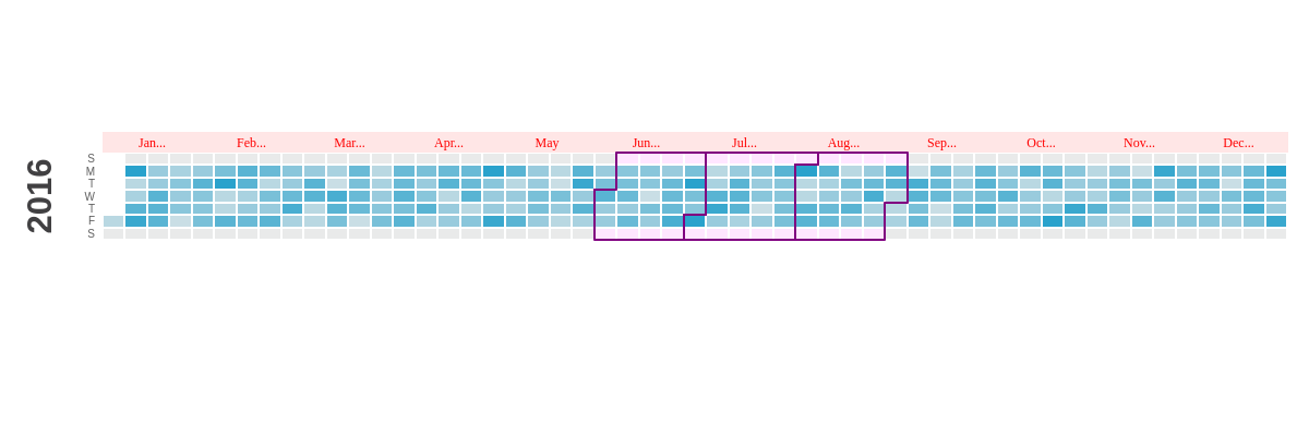
To style the cells for a specific month, add an items object. Inside, add an object called m-n, where n is the number 1-12 of the month you'd like to style. m-1 always refers to the first label in your values array, which is why it is important that you include all 12 months if you manually add month labels.
Note: Be careful not to mix up the item object, which styles month labels, with the items object, which styles the cells of specified months.
Use the active object to only style months containing data. Months are considered active if they have at least 1 data point.
Note: See more styling options on our JSON Configuration page.
{
  options: {
    month: { // Configure the month labels and styling by month.
      values: ['January', 'February', 'March', 'April', 'May', 'June', 'July', 'August', 'September', 'October', 'November', 'December'], // Set the month labels.
      item: { // Use this object to style the month labels.
        backgroundColor: '#ffe6e6',
        fontColor: 'red',
        fontFamily: 'Georgia',
        fontSize: 12,
        maxChars: 3
      },
      items: { // Use this object to style the cells by specified  month (1-12).
        'm-6': {
          backgroundColor: '#ffe6ff',
          outline: {
            borderColor: 'purple',
            borderWidth: 2
          }
        }
      },
      outline: {
        active: { // Use this object to style the borders of active months.
          borderColor: 'red',
          borderWidth: 2
        }
      }
    }
  }
}
Weekday (1-7)
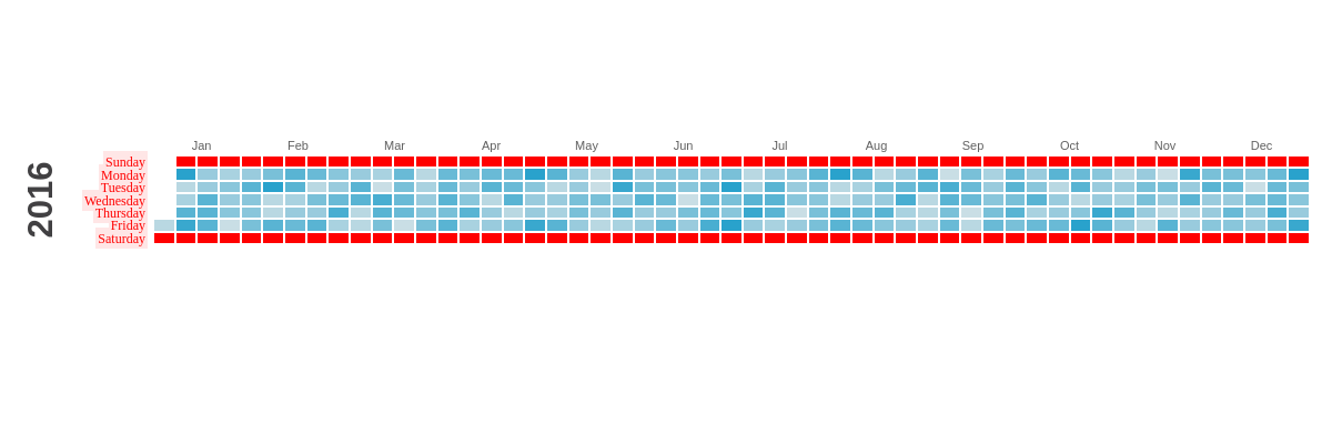
Use the weekday object to configure the calendar's weekdays. To set the weekday labels, add a values array and include your labels as comma separated strings. You can then style these labels with an item object.
To style the cells by row (weekday), add an items object. Inside, add an object called wd-n, where n is the number 1-7 of the day you'd like to style. wd-1 will always refer to the first label in your values array.
Note: Be careful not to mix up the item object, which styles weekday labels, with the items object, which styles the cells of specified days.
{
  options: {
    weekday: { // Configure the weekday labels and styling by row.
      values: ['Sunday', 'Monday', 'Tuesday', 'Wednesday', 'Thursday', 'Friday', 'Saturday'], // Set the weekday labels.
      item: { // Use this object to style the weekday labels.
        backgroundColor: '#ffe6e6',
        fontColor: 'red',
        fontFamily: 'Georgia',
        fontSize: 12
      },

      items: { // Use this object to style the cells by row/weekday (1-7).
        'wd-1': {
          backgroundColor: 'red'
        }
      }
    }
  }
}
Week (1-54)
Use the week object to style your calendar by columns. Add an items object and inside that, add an object called w-n, where n is the number 1-54 of the column (week) you'd like to style.
{
  options: {
    week: { // Configure the styling by column.
      items: { // Use this object to style the cells by column (1-54).
        'w-1': {
          backgroundColor: 'red'
        }
      }
    }
  }
}
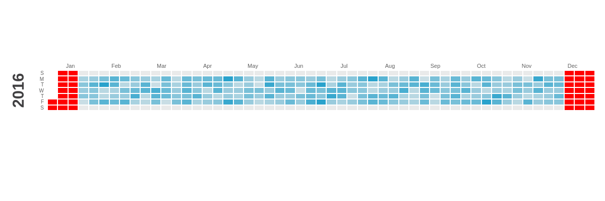
Individual Day
Use the day object to style your calendar by individual days. Add an items object and inside that, add an object called d-YYYY-MM-DD, where YYYY-MM-DD is the date you'd like to style. To style all dates that don't have data, use the inactive object.
{
  options: {
    day: { // Configure the styling by day.
      items: { // Use this object to style the cells by individual calendar day.
        'd-2016-01-01': {
          backgroundColor: 'purple',
        }
      },
      inactive: { // Use this object to style the cells of all inactive days.
        backgroundColor: 'red'
      }
    }
  }
}
Further Customization
Use the plot object to configure the tooltips and value boxes.
Tokens
Calendar charts use the following tokens:
| Token | Description |
|---|---|
%data-day |
The calendar date |
%v |
The calendar value |
%data-info0, %data-info1, etc. |
(Optional) Additional calendar string values |
Note: Refer to the Tokens Tutorial for a full list of available tokens.
Tooltips
Use the tooltip object to enable and configure tooltips. Add a text attribute, and then provide your desired combination of text and tokens inside a string.
{
  plot: {
    tooltip: { // Use this object to to configure the tooltips.
      text: '%v contributions<br>by<br>%data-info0<br>on<br>%data-day'
    }
  }
}
Note: Refer to the tooltip JSON page for a full list of properties.
Value Boxes
Use the valueBox object to enable and configure value boxes.
{
  plot: {
    valueBox: { // Use this object to configure the value boxes.
    }
  }
}
Note: Refer to the valueBox JSON page for a full list of properties.