Bar Charts
Overview
ZingChart supports four bar chart types:
- Column (Vertical)
- Horizontal
- 3D Column
- 3D Horizontal
These chart types can then be modified to display bars as:
- Floating
- Cylinders
- Cones
- Pyramids
- Histograms
- Stacked (Standard or 100%)
Note: See our Bar Chart Gallery for inspiration on all the different bar chart possibilities.
Bar Chart Types
To specify your chart type, use the type attribute. We have four different bar chart types: column charts (bar or vbar), 3D column charts (bar3d or vbar3d), horizontal (hbar), and 3D horizontal bars (hbar3d). You can also create trellis and floating bar charts.
Note: Learn how to create 3D charts with our 3D Charts Tutorial.
Column Chart
Column charts (aka vertical bar charts) are our default bar chart type. They are specified by the bar or vbar value.
{
  type: 'bar' /* or "vbar" */
}
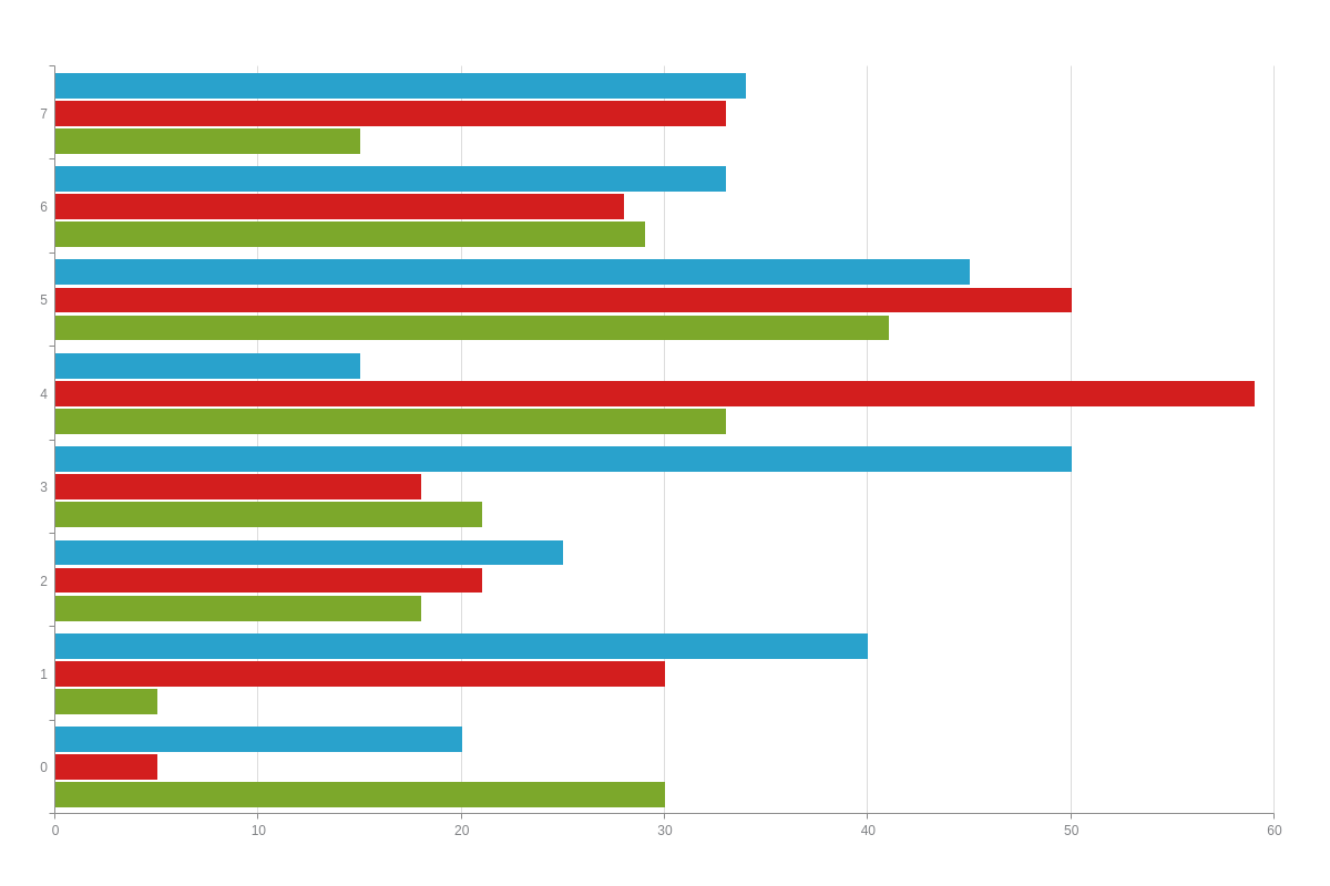
Horizontal Bar Chart
Horizontal bar charts are specified by the hbar value. With this chart type, the axes are switched so that the x-axis runs vertically and the y-axis runs horizontally.
{
  type: "hbar"
}
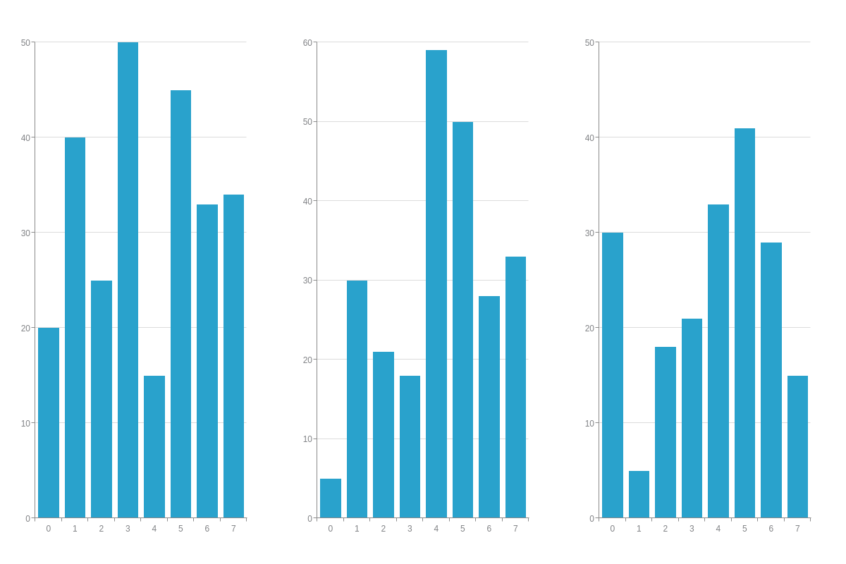
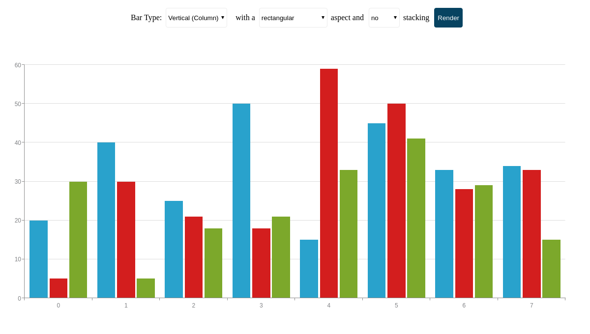
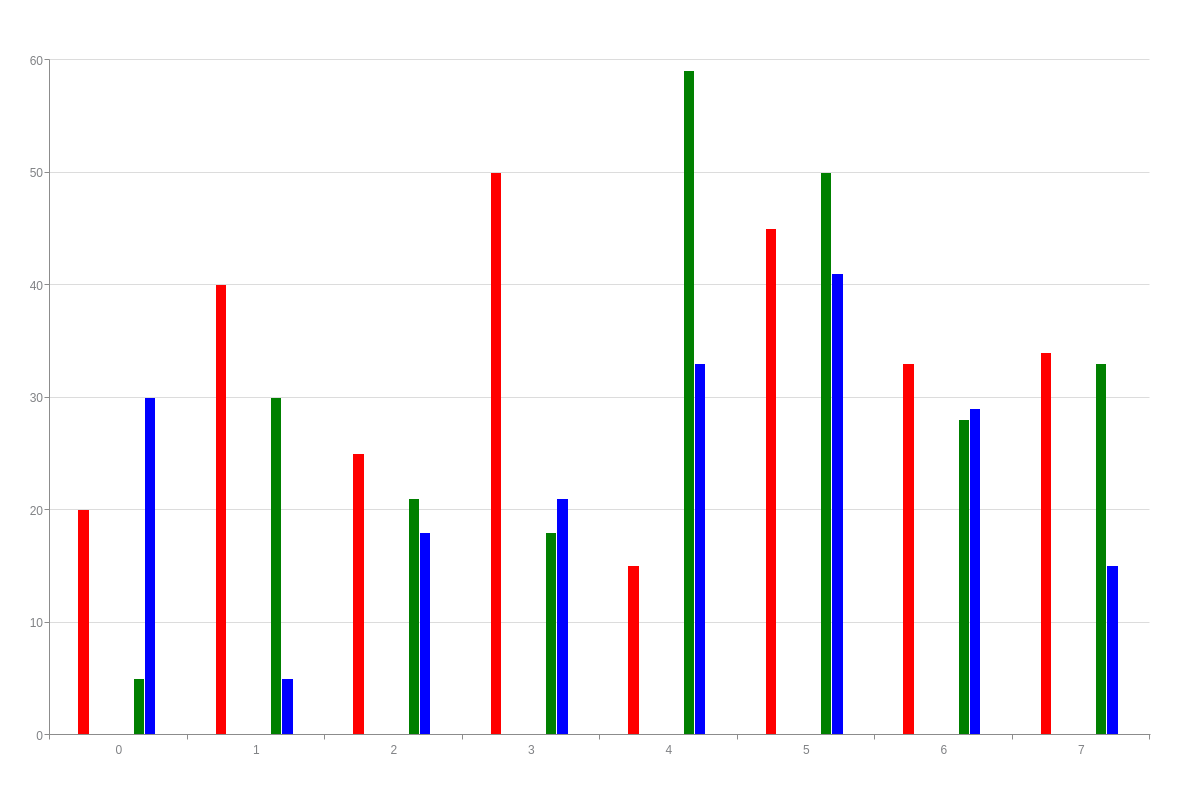
Trellis Bar Chart
To create a trellis column or bar chart, insert individual chart objects into a graphset array.
Note: Read our Adding Additional Charts page for a more in-depth explanation on trellis charts.
{
  graphset: [
    {
      type: 'bar', /* Specify your chart type. */
      height: "100%",
      width: "33.33%",
      x: "0%",
      y: "0%",
      series: [{ values: [20,40,25,50,15,45,33,34]}]
    },
    {
      type: 'bar',
      height: "100%",
      width: "33.33%",
      x: "33.33%",
      y: "0%",
      series: [{ values: [5,30,21,18,59,50,28,33]}]
    },
    {
      type: 'bar',
      height: "100%",
      width: "33.33%",
      x: "66.66%",
      y: "0%",
      series: [{ values: [30,5,18,21,33,41,29,15]}]
    }
  ]
}
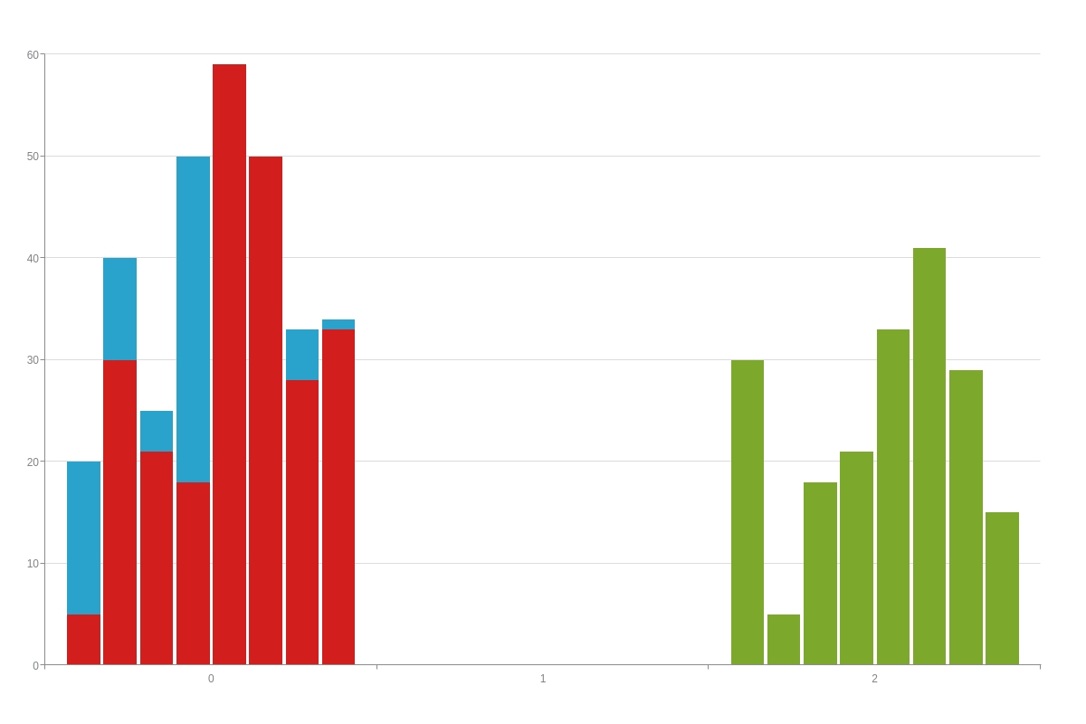
Floating Bar Chart
While not its own chart type, ZingChart provides the functionality to create floating bar charts that can be vertically or horizontally oriented. First, specify your chart type (bar, bar3d, hbar, hbar3d). Next, you’ll need to specify your offset values your series array; this will allow you to control the starting points of your bars. In each data object, add an offset-values array and provide your values.
{
  type: 'bar', /* Specify your chart type. */
  series: [
    {
      values: [20,40,25,50,15,45,33,34],
      'offset-values': [0,3,5,15,28,30,4,9] /* Specify your offset values. */
    }
  ]
}
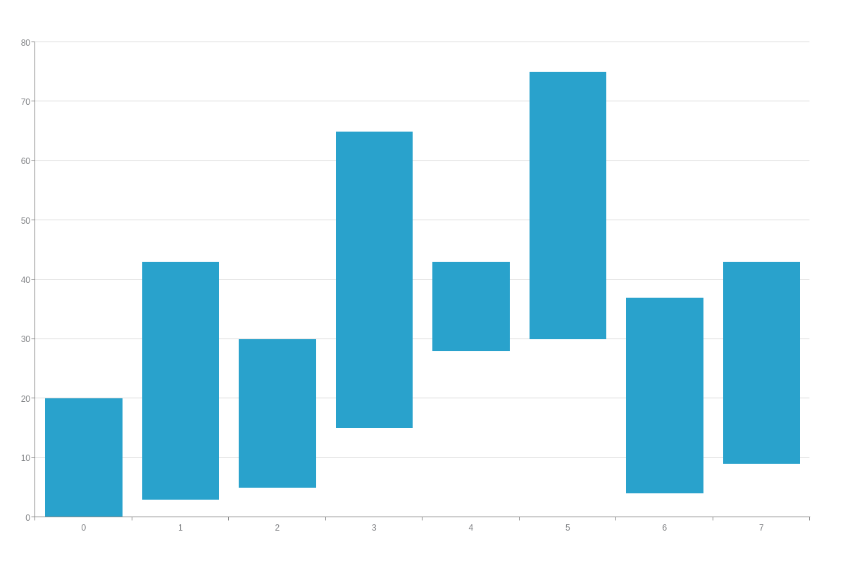
You can access the offset-values through the %offset-values token.
{
  ...
  tooltip: {
    text: 'offset: %offset-values
 value: %v',
    textAlign: 'left'
  },
  ...
}
Data
Bar charts support single or multiple datasets. You can also use null values to indicate missing or unavailable data, as well as an array of arrays to represent time-series data.
Single Dataset
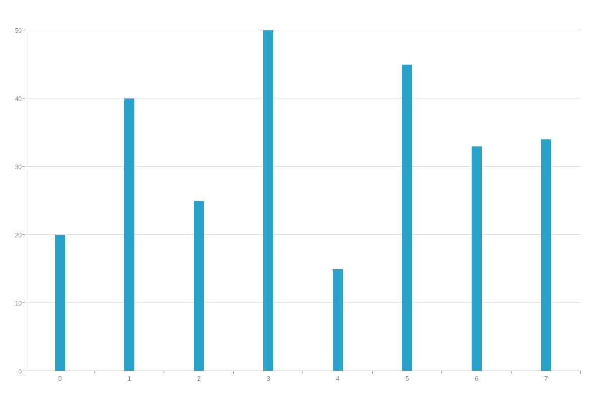
Single dataset charts are sometimes referred to as a simple column or bar chart.
series: [    /* Simple Bar Chart */
    { values: [y0, y1, y2, y3, ..., yN]}
]
Note: When working with single dataset column and bar charts, you may find that typical styling methods (like bar fill) won’t result in the appearance that you want. You'll need to color by node, which we explain in our Bar Fill by Node section below.
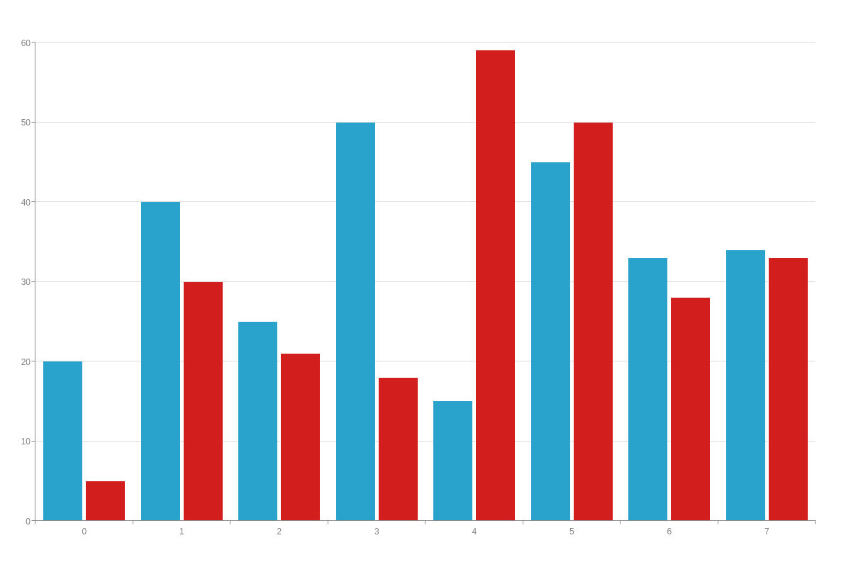
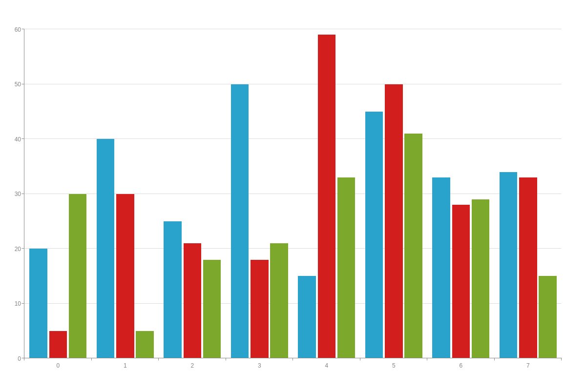
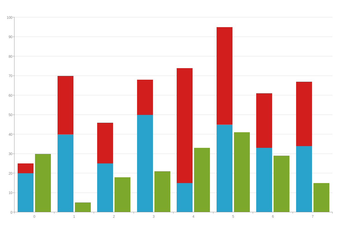
Multiple Datasets
Multiple dataset charts are sometimes referred to as a grouped column or a grouped bar chart.
series: [    /* Grouped Bar Chart */
    { values: [y0, y1, y2, y3, ..., yN]},
    { values: [y0, y1, y2, y3, ..., yN]},
    { values: [y0, y1, y2, y3, ..., yN]},
]
Array with Null Values
When you have missing or unavailable data, you can use an array with null values.
series: [
    { values: [20,40,25,50,15,45,0,0]}, /* Dataset with zero values */
    { values: [null,null,21,18,59,50,28,33]} /* Dataset with null values */
]
Note: Using zero values (instead of null) results in a similarly appearing chart. The difference is that zero values come with tooltips and null values do not. In the chart below, hover over the x-axis line at plot indices 0 and 1 (null values with no tooltips) and 6 and 7 (values set to 0 with tooltips) to see the difference.

Array of Arrays
An array of arrays can be useful, especially when working with time-series data. For your data, you need to specify your x-axis values in Unix time (in milliseconds). In the time-series bar chart below, the Unix timestamps dictate where values are placed along the x-axis.
Note: In addition to your data, you need to configure your time-series scale. See our Time-Series Scale section further below to learn more.
{
    type: 'bar',
    utc: true, /* Set to UTC time. */
    'scale-x': { /* Scale object, set up to display as a time-series scale. Read our Time-Series Scale section further below for more information. */
        'min-value': 1420070400000,
        step: "day",
        transform: {
            type: "date",
            all: "%M %d, %Y"
        }
    },
    series: [
        { values: [    /* Array of arrays, with Unix timestamps */
                [1420089129000,20],
                [1420103703000,40],
                [1420146903000,25],
                [1420175525000,50],
                [1420200725000,15],
                [1420315925000,45],
                [1420326312000,33],
                [1420329030000,34]
        ]},
        { values: [    /* Array of arrays, with Unix timestamps */
                [1420501830000,5],
                [1420523430000,30],
                [1420588230000,21],
                [1420671905000,18],
                [1420700705000,59],
                [1420747505000,50],
                [1420797905000,28],
                [1420921800000,33]
        ]}
    ]
}
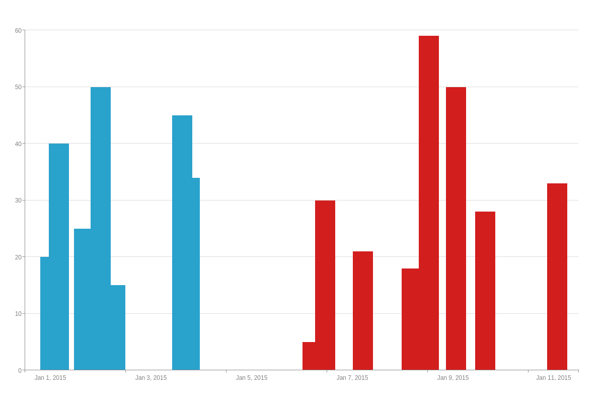
Chart-Specific Properties
ZingChart allows you to change the appearance of your bars so that they display as histograms, cones, cylinders (3D only), or pyramids (3D only). You can also stack two or more datasets on top of each other to create a standard stacked or 100% stacked bar, as well as separate out data into multiple stacks.
The following demo illustrates the different options available for the bar chart modifications discussed below:
Aspect
Aspects can be applied globally to affect all plots or locally to affect specific plots. The aspect value options for bar charts are:
| Value | Description |
|---|---|
bar (default) |
Data is presented as rectangular bars. Since it is the default aspect, specifying its type is optional. |
cone |
Data is presented as cones |
histogram |
Data is presented as a series of joined bars. Sometimes called a joined or stepped bar chart, this chart type is useful for emphasizing abrupt changes in your data. |
cylinder (3D only) |
Data is presented as cylinders. Can be used for 3D vertical or horizontal bar charts. |
pyramid (3D only) |
Data is presented as pyramids. Can be used for 3D vertical or horizontal bar charts. |
To apply aspects globally, create a plot object. Insert your aspect attribute.
plot: {                /* Plot object */
    aspect: 'bar',        /* "cone" | "cylinder" | "pyramid" | "histogram" */
    stacked: false        /* or true */
}
To apply aspects locally, add them to the chart data object you want the change to apply to.
series: [
    {    /* Chart data object */
        aspect: "bar", /* "cone" | "cylinder" | "pyramid" | "histogram" */
        values: [y0, y1, y2, y3, ..., yN]
    }
]
Note: If you specify an aspect value in the plot object and an aspect value in a chart data object, the latter will overwrite the former.
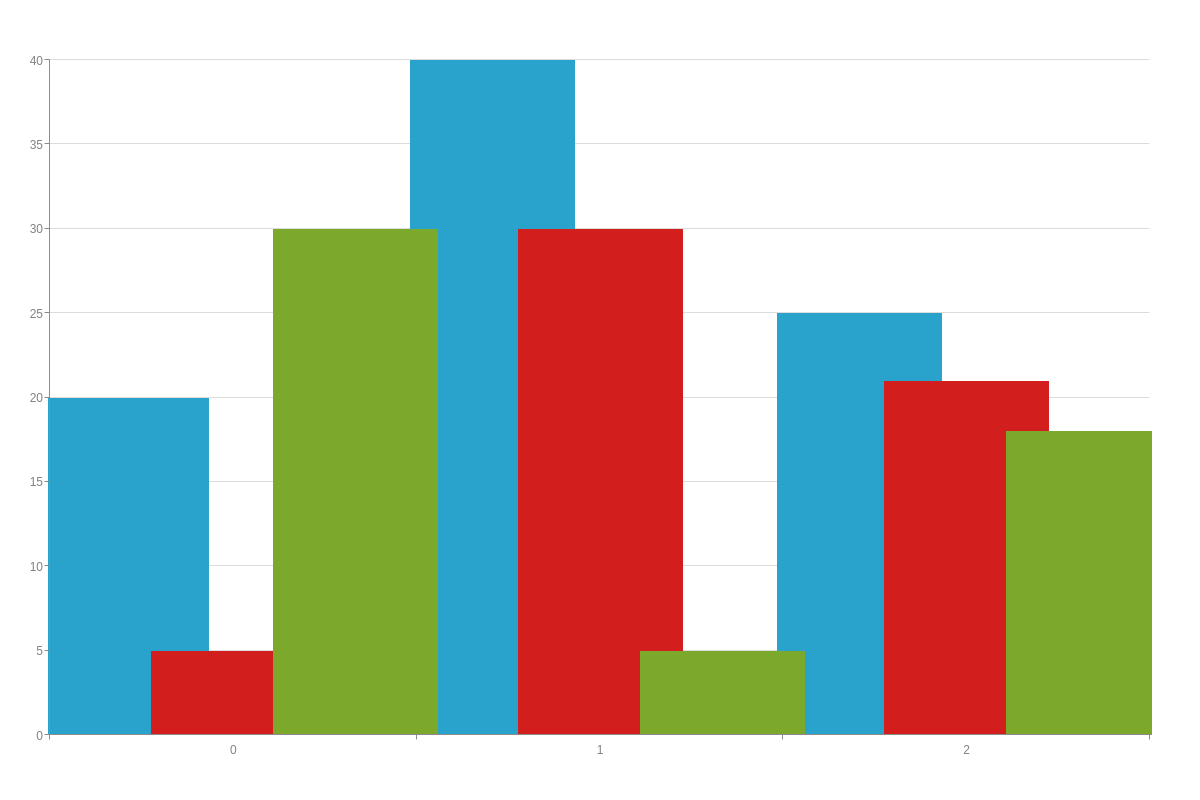
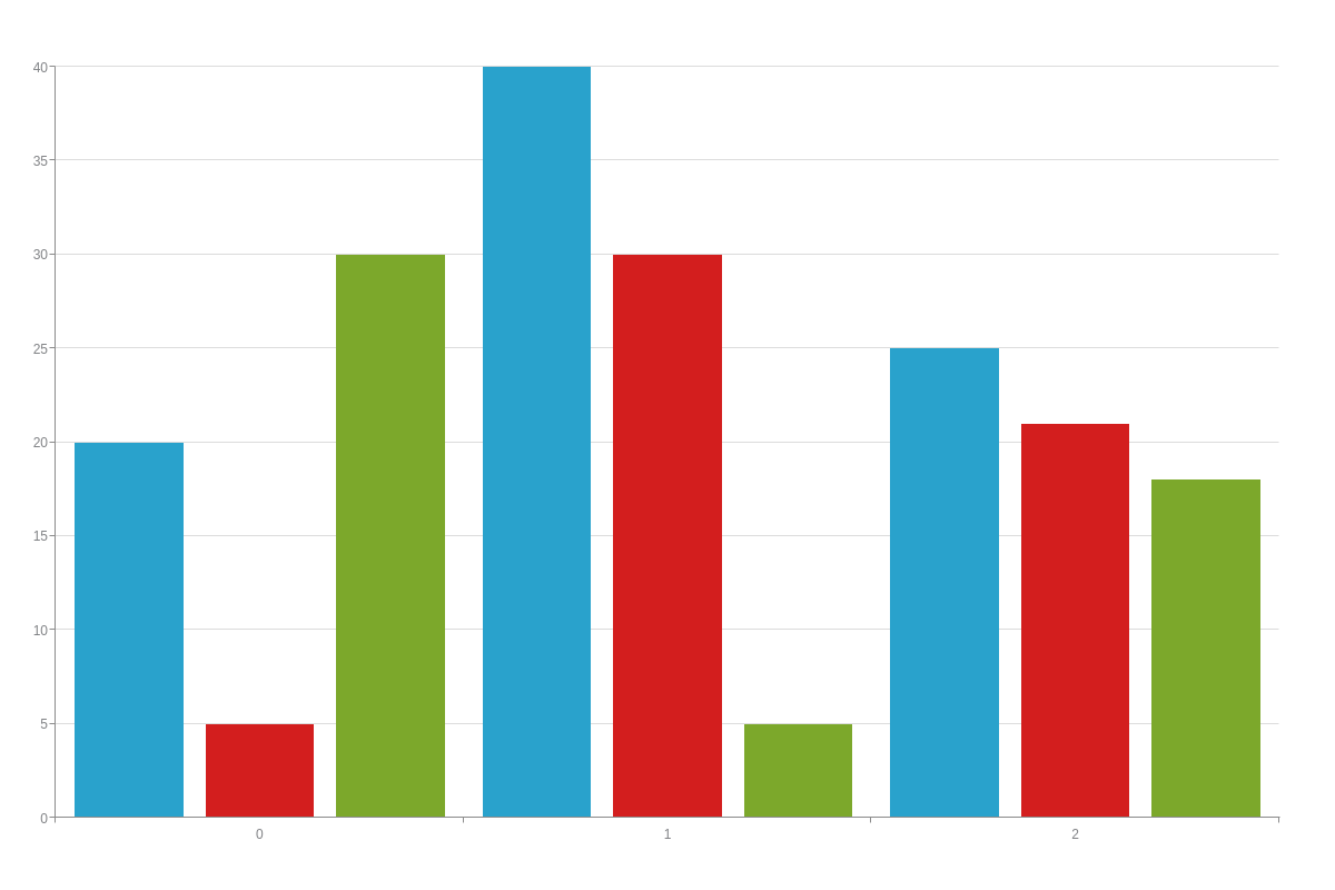
Column
Use the column attribute to set the position of a column within a grouped column/bar chart.
This attributes a fraction in string format.
The numerator represents the group to place the column in.
The denominator is the total number of groups.
{
  series:[
    {
      values:[20,40,25,50,15,45,33,34],
      backgroundColor: 'red',
      column: '1/2'
    },
    {
      values:[5,30,21,18,59,50,28,33],
      backgroundColor: 'green',
      column: '2/2'
    },
    {
      values:[30,5,18,21,33,41,29,15],
      backgroundColor: 'blue',
      column: '2/2'
    }
  ]
}
Cluster
Use the clustered attribute to set the entire plot to be placed within one key scale.
The clusterIndex attribute sets which key scale to place the plot in.
To offset the margin of the cluster, use clusterOffset.
These attributes can be used within the plot or series object.
{
  plot: {
    clustered: true,
    clusterOffset: 10,
  },
  series: [{
    clusterIndex: 0,
  }]
}
Key Width
Set the keyWidth attribute to true to use the value of barWidth as the size of the key scale.
{
  type: 'bar',
  plot: {
    keyWidth: true,
    barWidth: 0.3,
  }
}
Overlap
Use the barsOverlap attribute to set how much the bars in each plot index should overlap.
{
  type: 'bar',
  plot: {
    barsOverlap: 100,
  }
}
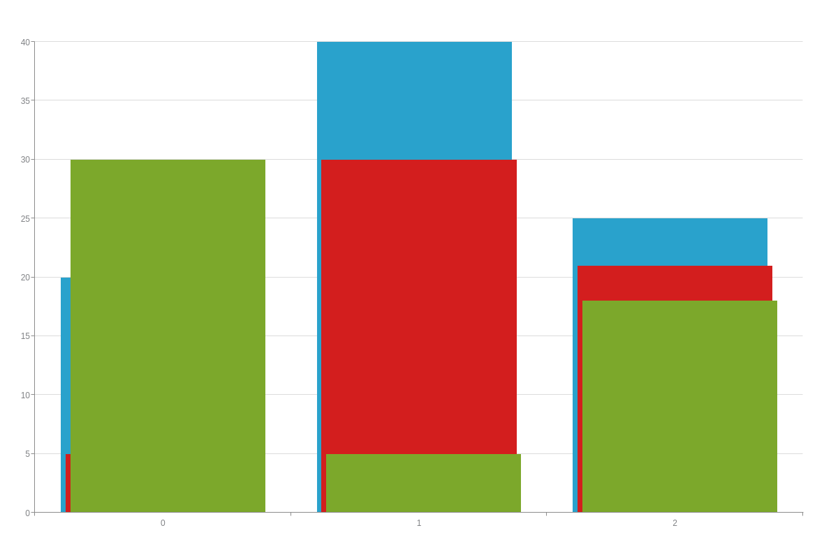
Group
Set the groupBars attribute to false to force bars to fully overlap.
{
  type: 'bar',
  plot: {
    groupBars: false, // defaults to true
  }
}
Show Zero
The showZero attributes renders zero values within series as 1px to visibly show zero values.
{
  type: 'bar',
  plot: {
    showZero: true,
  }
}
Space
Use the barSpace attribute to set the space between bars within a single plot.
Alternatively, the barSpaceLeft and barSpaceRight can be used to set the left and right space between bars.
{
  type: 'bar',
  plot: {
    barSpace: 20,
  }
}
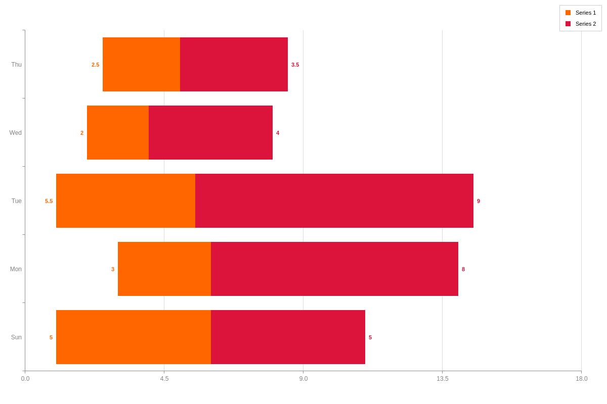
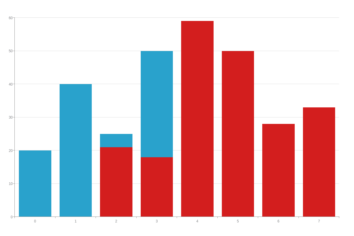
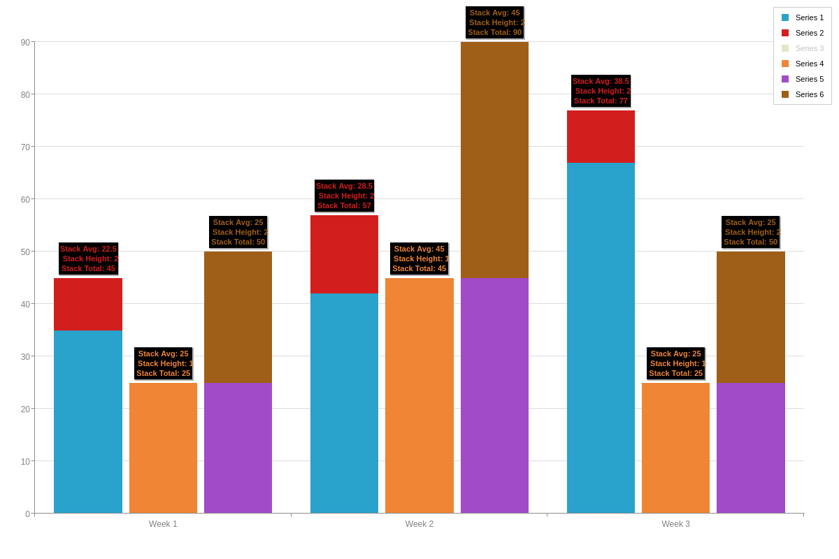
Stacked
The stacked attribute allows you to stack multiple datasets on top of each other. With this chart type, you can create a standard stacked bar or 100% stacked bar, as well as specify which datasets are sorted into which stacks.
Standard Stacked Bar Chart
In a standard stacked column or bar chart, the datasets are placed on top of each other so that the top of the column represents the sum total of all the stacked data.
To create standard stacks, add a stackedattribute to your plot object, and set the value to true. (By default, the value is set to false.) Optionally, you can add a stack-type attribute with a value of normal.
{
  type: 'bar',
  plot: {
    stacked: true,
    'stack-type': "normal" /* Optional specification */
  }
}
100% Stacked Bar Chart
In a 100% stacked column or bar chart, the stacks do not represent actual quantitative values. Instead, each data layer represents a percentage of the whole and each stack totals at 100%.
To create one, add a stackedattribute to your plot object, and set the value to true. For your stack-type attribute, set the value to 100%.
You'll also need to specify your minimum and maximum y-axis values. You can do so by creating a scale-y object and setting your min-value attribute to 0 and your max-value attribute to 100. Alternatively, you can add a values attribute and include your min and max value as string separated by colons- values: "0:100".
Note: Learn more about min/max scales with our Scales Tutorial.
{
  type: 'bar',
  plot: {
    stacked: true,
    'stack-type': "100%"
  },
  'scale-y': {
    'min-value':0,
    'max-value':100
  }
}
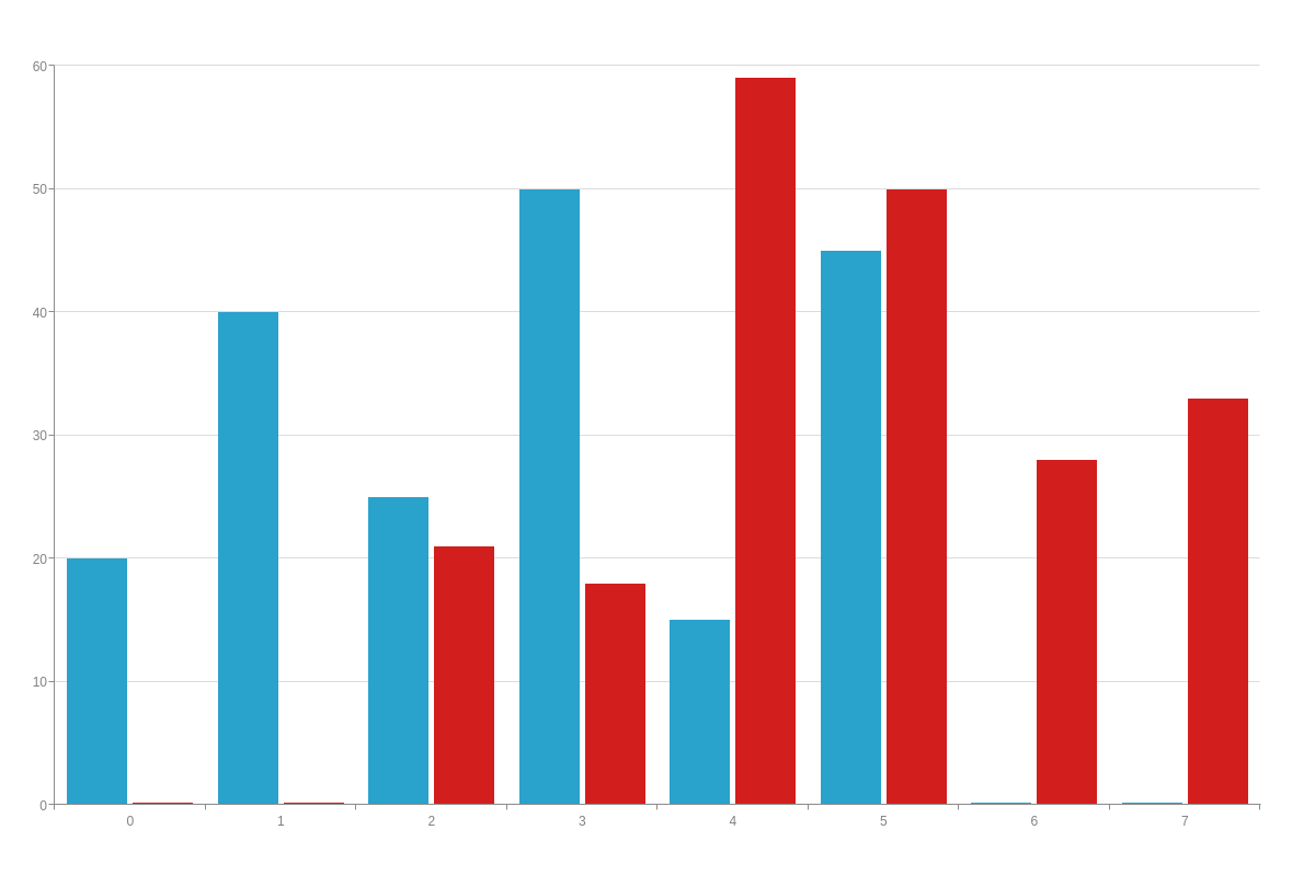
Additional Chart Stacking Options
You can also create multiple stacks for your column or bar chart. In your plot object, make sure your stacked attribute is set to true. In each dataset of your series array, add a stack attribute. For datasets you want included in the first stack, set the value to 1. For datasets you want included in the second stack, set the value to 2, and so on.
See the example chart below, where the first two datasets were assigned to the first stack and the third dataset was assigned to the second stack:
{
  type: 'bar',
  plot: {
    stacked: true,
  },
  series: [
    {
      values: [20,40,25,50,15,45,33,34],
      stack:1
    },
    {
      values: [5,30,21,18,59,50,28,33],
      stack:1
    },
    {
      values: [30,5,18,21,33,41,29,15],
      stack:2
    }
    ]
}
Stack Tokens
There are a couple tokens associated just to stacked bar charts for stack: height (%stack-length), width (#stack-average), and total (%stack-total).
Width
Use the barWidth attribute to set the width of the bars.
To set a max width on the bars, use the barMaxWidth.
{
  type: 'bar',
  plot: {
    barWidth: 10,
  }
}
Further Customization
After you’ve set up your basic chart, the next step is to customize and style it. This section goes over how to configure your scales, as well as how to style your bar fills, borders, corners, and hover states.
Scales
ZingChart’s default scales for both the x- and y-axis is a quantitative one, with the values starting at zero. Once your basic chart is set up, you’ll most likely want to modify your scale-x object, which corresponds to the horizontal axis on column charts and the vertical axis on horizontal bars.
Column charts generally have a category or time-series scale on their x-axis. Horizontal bar charts usually have a category scale. We explain how to set up both scale types below.
Note: Learn more about scales with our Scales Tutorial.
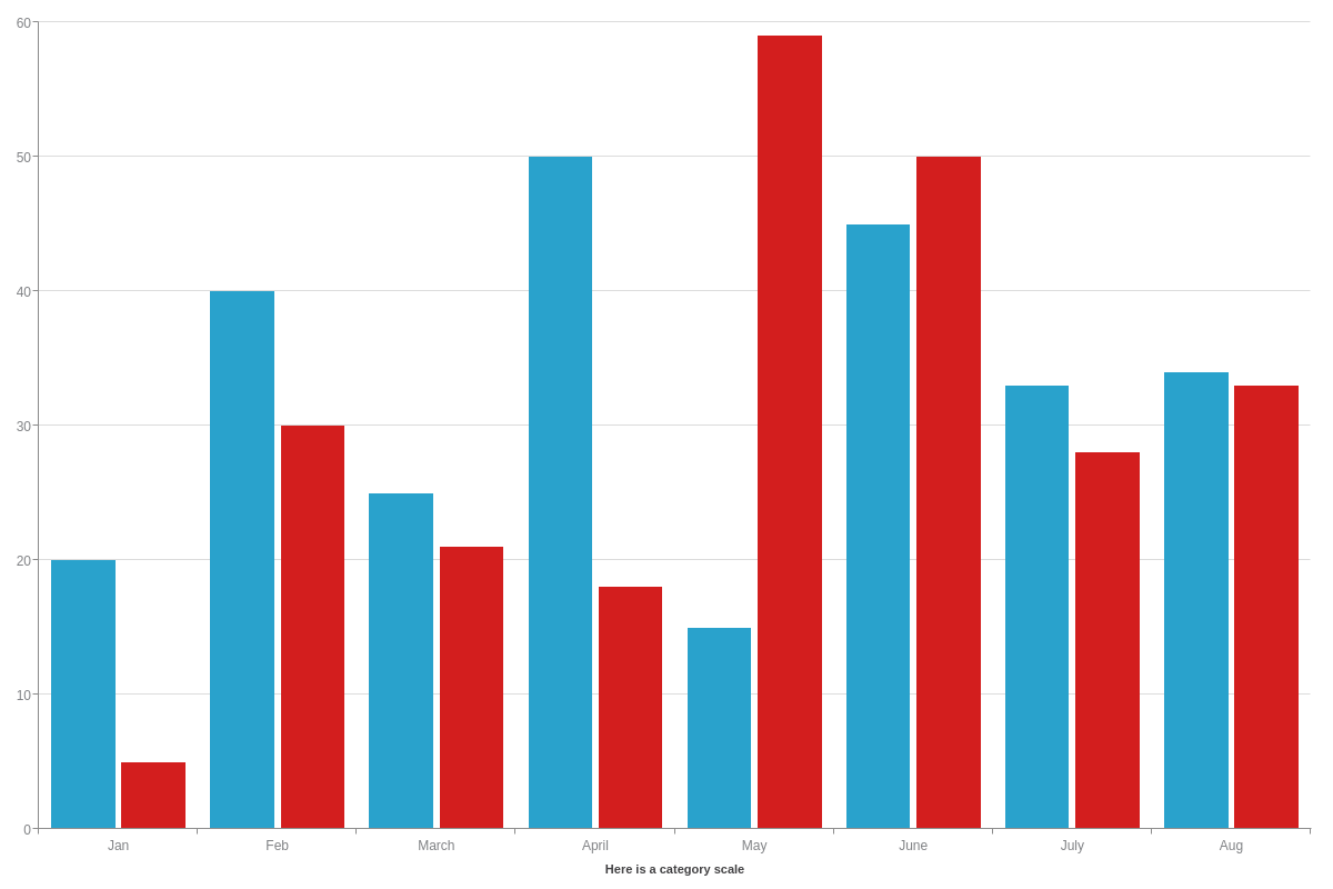
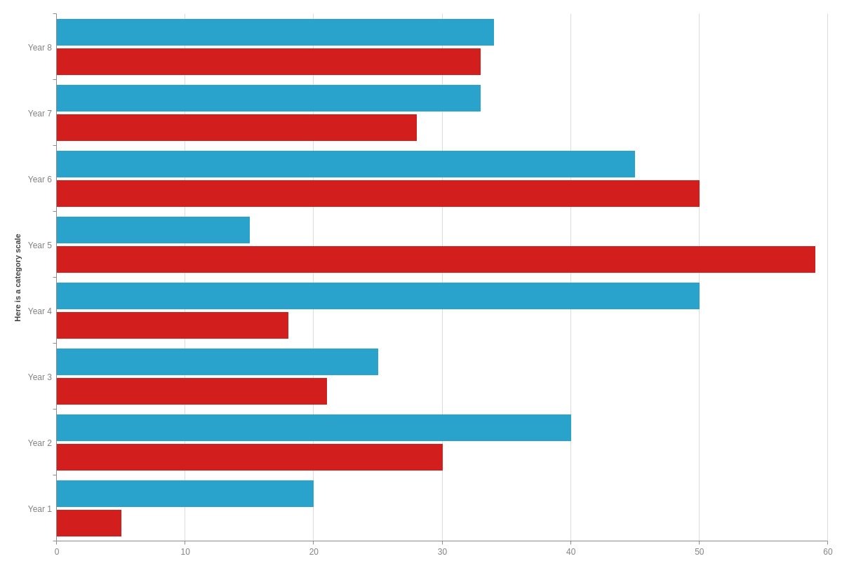
Category Scale
A category (or qualitative) scale can consist of words and/or numbers, such as time periods (months, years, dates), categories, names, etc. To add one to your chart, create a scale-x object and insert a labels array. In the array, you can include scale labels as string values separated by commas.
Note: Do not confuse a labels array with a label (no "s") object. The latter is to specify your scale title.
Set your margins to automatically adjust by creating a plotarea object. Inside, add an adjust-layout attribute, and set the value to true.
{
  type: 'bar',
  plotarea: {
    'adjust-layout': true
  },
  'scale-x': {
    label: { /* Scale Title */
      text: "Here is a category scale",
    },
    labels: [ "Jan", "Feb", "March", "April", "May", "June", "July", "Aug" ] /* Scale Labels */
  },
  series: [
    { values: [20,40,25,50,15,45,33,34]},
    { values: [5,30,21,18,59,50,28,33]}
    ]
}
{
  type: "hbar",
  plotarea: {
    'adjust-layout': true
  },
  'scale-x': {
    label: { /* Scale Title */
      text: "Here is a category scale",
    },
    labels: [ "Year 1", "Year 2", "Year 3", "Year 4", "Year 5", "Year 6", "Year 7", "Year 8" ] /* Scale Labels */
  },
  series: [
    { values: [20,40,25,50,15,45,33,34]},
    { values: [5,30,21,18,59,50,28,33]}
    ]
}
Time-Series Scale
A time-series scale is used to represent increments of time and can be formatted to display anything from years down to milliseconds. Create a scale-x object and add a min-value attribute, step attribute, and transform object inside it.
For the min-value and step, you’ll need to specify your minimum and step scale values in Unix time. Measured by the number of milliseconds that have elapsed since January 1, 1970, you can calculate your Unix timestamps with online conversion tools such as Epoch Converter.
Note: ZingChart accepts Unix time values in milliseconds, not seconds. To convert from seconds to milliseconds, multiply by 1000.
You can use the following shortcut terms for your step value: second, minute, hour, day, week, month, and year. (month and year are approximate values due to the varying lengths of different months and the presence of leap years, which the shortcut does not take into account.) The terms can be combined with any multiplier (e.g., 6hour will create a step size of six hours and 2week will create a step size of two weeks).
The transform object will then convert your Unix timestamps into a readable format. Insert a type attribute, and set the value to date. Next, add an all attribute. You can specify how you want your scale formatted by using our ZingChart tokens contained in a string.
Note: To ensure your time-series scale reads in UTC time (ZingChart currently defaults to local time), add a utc attribute, and set the value to true.
Set your margins to automatically adjust by creating a plotarea object. Insert an adjust-layout attribute, and set the value to true.
{
  type: 'bar',
  utc: true, /* Set to UTC time */
  plotarea: {
    'adjust-layout': true
  },
  'scale-x': {
    label: { /* Scale Title */
      text: "Here is a time-series scale",
    },
    'min-value':1420070400000, /* In Unix time */
    step: "day", /* In Unix time or with ZingChart shortcuts */
    transform: { /* Transform object. */
      type: "date", /* To convert your Unix timestamps to dates */
      all: "%M %d" /* To format your time-series labels */
    }
  },
  series: [
    { values: [20,40,25,50,15,45,33,34]},
    { values: [5,30,21,18,59,50,28,33]}
    ]
}

Styling
You can incorporate all kinds of styles into your charts. In this section, we go over how to change your bar fills, borders, and corners. We also explain how to set how your bars appear when you hover over them.
Note: For more styling options, browse our JSON Attributes/Syntax page.
Bar Fill
There are two ways to style your bar fills: the first is by styling series objects individually (more common), and the second is by styling nodes individually (better for single datasets).
To style your bar chart by objects, start in the series object of the series you want to style. To change your bar fill color, add a background-color attribute. For a single color fill, add one hexadecimal or RGB value. For a gradient (two color) fill, add two values separated by a space. To adjust your bar fill’s transparency levels, add an alpha attribute. Provide a value between 0-1, with zero being clear and one being solid. For decimal values, make sure to place a zero before your decimal point.
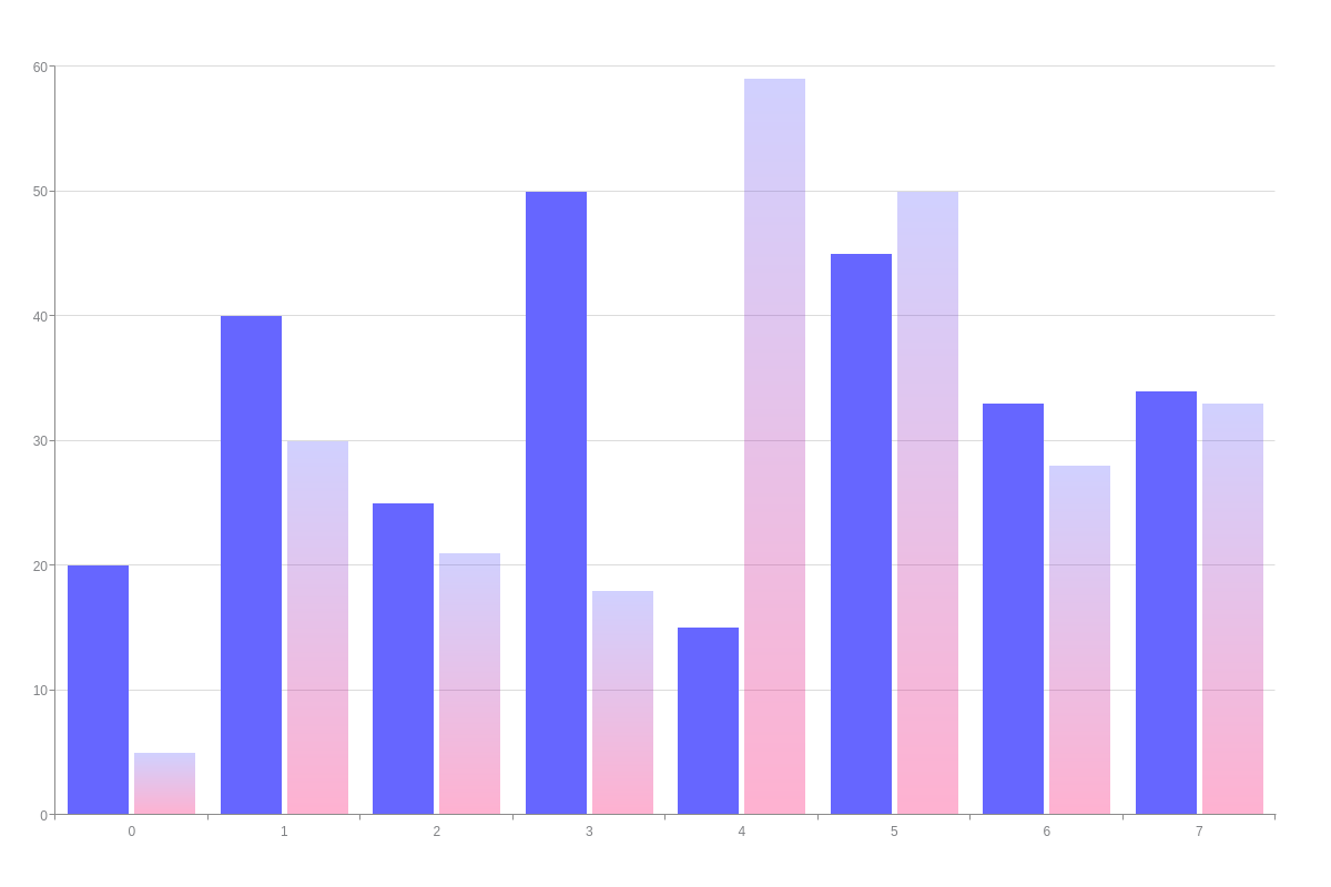
{
  type: 'bar',
  series: [
    {
      values: [20,40,25,50,15,45,33,34],
      'background-color': "#6666FF", /* Bar fill color (single) */
      alpha: 1, /* Transparency (solid) */
    },
    {
      values: [5,30,21,18,59,50,28,33],
      'background-color': "#6666FF #FF0066", /* Bar fill color (gradient) */
      alpha: 0.3 /* Transparency (more transparent) */
    }
  ]
}
When working with single dataset column or bar charts, you’ll likely want to customize your bar fills. However, you’ll find that specifying your colors by series (as in the above method) will not achieve the appearance that you want. For single dataset charts, what you want is to color your bar fills by node indexes.
To do this, add a plot object to your chart. Inside, add a styles array. In the array, provide your color values. Make sure your color values match up to the number of data elements you have in your dataset; otherwise, your bars will appear according to ZingChart’s default color scheme.
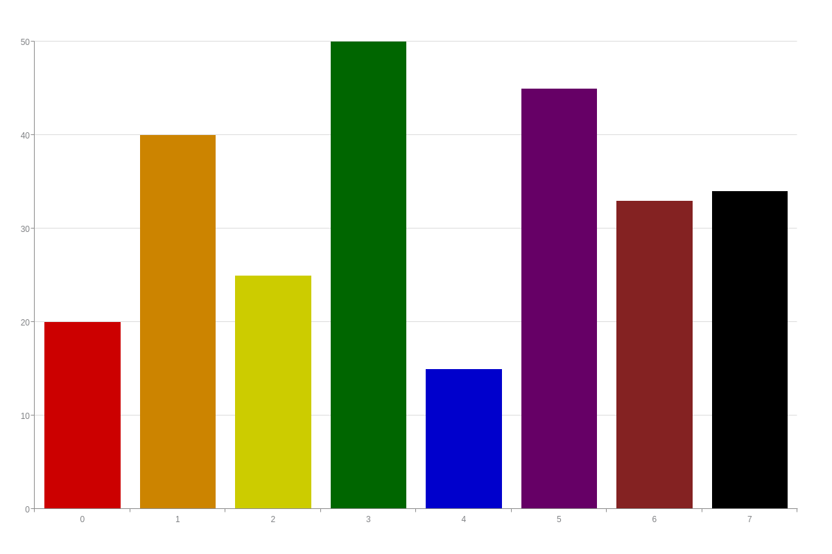
{
  type: 'bar',
  plot: {
    styles: [ "red", "orange", "yellow", "green", "blue", "purple", "brown", "black" ] /* Bar Fill by Node */
  },
  series: [
    {
      values: [20,40,25,50,15,45,33,34]
    }
  ]
}
Bar Borders
You can set the width, color, and style of your bar borders. Go to the chart data object of the plot you want your changes to apply to. To set your border width, add a border-width attribute, and provide a pixel value.
To set your border color, add a border-color attribute, and provide a hexadecimal or RGB value.
To set your border’s line style, add a line-style attribute. You can choose one of the following values: solid, dashed, or dotted.
Note: You can also apply border styles globally to affect all plots. To do so, create a plot object and insert your border attributes inside.
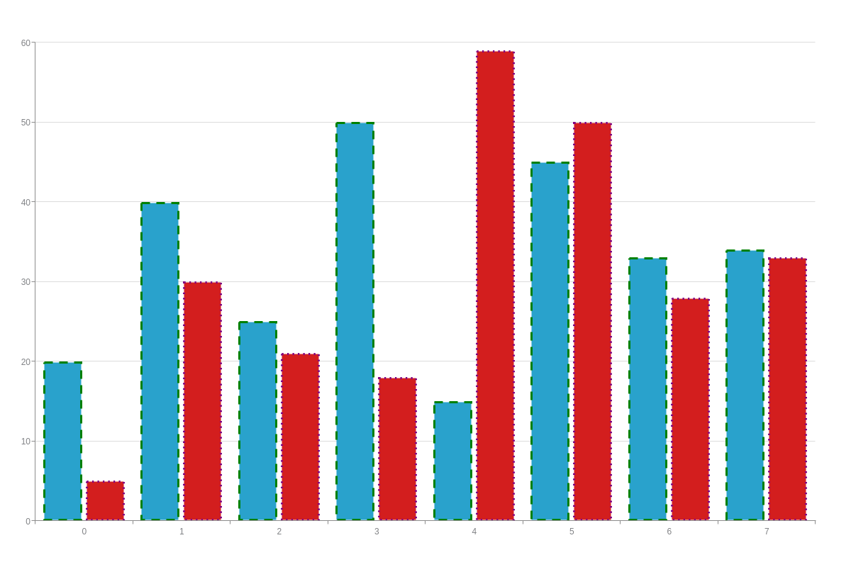
{
  type: 'bar',
  series: [
    {
      values: [20,40,25,50,15,45,33,34],
      'border-width':3, /* Border width */
      'border-color': "green", /* Border color */
      'line-style': "dashed"    /* Border style */
    },
    {
      values: [5,30,21,18,59,50,28,33],
      'border-width':3,
      'border-color': "purple",
      'line-style': "dotted"
    }
  ]
}
Rounded Corners
You can round the corners on your columns and bars. To do so, add a plot object to your chart. Inside, insert a border-radius attribute and provide a pixel value to indicate the desired level of rounding.
{
  type: 'bar',
  plot: {
    'border-radius': "9px", /* Rounded Corners */
  },
  series: [
    {
      values: [20,40,25,50,15,45,33,34]
    },
    {
      values: [5,30,21,18,59,50,28,33]
    }
  ]
}

Hover States
You can specify how you want your bar fills and borders to appear when you hover over them. In your chart data object, add a hover-state object. You can place any combination of bar fill and border attributes (see above sections) inside the object. Hover over the bars on the following chart to see how styling attributes can be used.
Note: You can also apply hover states globally to affect all plots. To do so, create a plot object. Inside, insert your hover-state object, and place your desired styling attributes inside it.
{
    type: 'bar',
    series: [
    {
      values: [20,40,25,50,15,45,33,34],
      'hover-state': { /* Hover object */
        'background-color': "yellow",
        'border-width':3,
        'border-color': "green",
        'line-style': "dashed"
      }
    },
    {
      values: [5,30,21,18,59,50,28,33],
      'hover-state': { /* Hover object */
        'background-color': "orange",
        'border-width':3,
        'border-color': "purple",
        'line-style': "dotted"
      }
    }
  ]
}