Area Charts
Overview
ZingChart supports three area chart types:
- Standard 2D
- 3D
- Vertical
These chart types can then be modified to appear:
- Segmented
- Splined
- Stepped
- Stacked
Note: See our Area Chart Gallery for inspiration on all the different area chart possibilities.
Area Chart Types
To specify your chart type, you need to use the type attribute. You then can choose to set the value to either a standard two-dimensional area chart (area), three-dimensional area chart (area3d), or vertical area chart (varea).
Note: Learn more about how to create 3D charts with our 3D Charts Tutorial.
Standard Area Chart
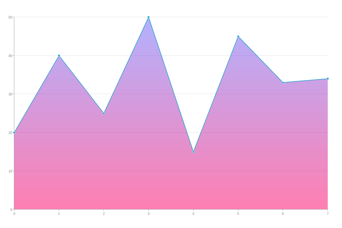
Our standard area chart is horizontally-oriented and specified by the area value. By default, data points are connected by segmented lines. They can display single or multiple datasets.
{
    type: "area"
  }
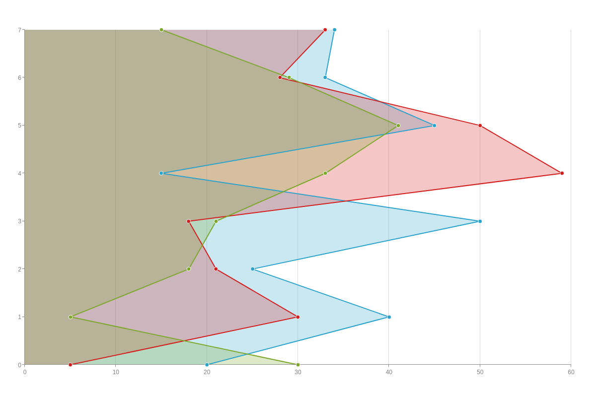
Vertical Area Chart
With vertical area charts, the axes are switched so that the x-axis runs vertically and the y-axis runs horizontally. This chart type is specified by the varea value.
{
    type: "varea",
  }
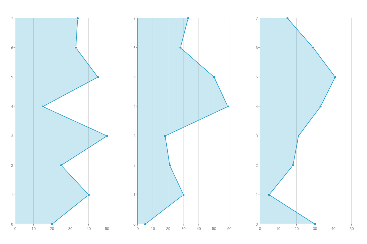
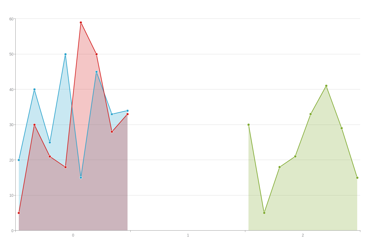
Trellis Area Chart
To view similar datasets in separate charts, create a graphset array and place each dataset in its own chart object.
Note: Our Adding Additional Charts page explains in greater detail how to create a graphset array, as well as how to insert multiple charts throughout your webpage.
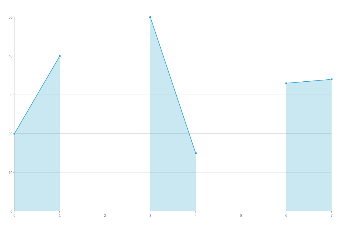
From our vertical area chart example above, the three datasets were separated to create a trellis chart of three smaller vertical charts:
{
    graphset: [
      {
        type: "varea",
        height: "100%",
        width: "33.33%",
        x: "0%",
        y: "0%",
        series: [
          { values: [20,40,25,50,15,45,33,34]}
        ]
      },
      {
        type: "varea",
        height: "100%",
        width: "33.33%",
        x: "33.33%",
        y: "0%",
        series: [
          { values: [5,30,21,18,59,50,28,33]}
        ]
      },
      {
        type:
        "varea",
        height: "100%",
        width: "33.33%",
        x: "66.66%",
        y: "0%",
        series: [
          { values: [30,5,18,21,33,41,29,15]}
        ]
      }
    ]
  }
Data
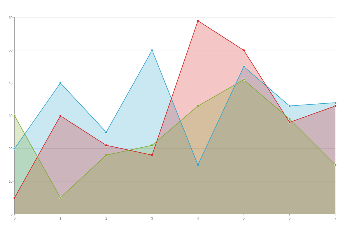
Area charts support series arrays containing single or multiple datasets, as well as arrays with null values and arrays of arrays.
Array
Arrays allow you to present consistent, linear data. Values are represented on the y-axis. (The corresponding x-axis values are automatically provided, with the default value starting at zero and increasing sequentially by one).
series: [
    { values: [y0, y1, y2, y3, ..., yN]},   /* Add a single dataset */
    { values: [y0, y1, y2, y3, ..., yN]},   /* or multiple datasets*/
    { values: [y0, y1, y2, y3, ..., yN]},
  ]
If you have missing data, you can use an array with null values (to show breaks) or an array of arrays (to continue over breaks).
Array with Null Values
Null values are useful for showing breaks or blanks in your plot. Sometimes, you'll have data that is unavailable and want to convey this in your area chart. In the example below, plot indices 2 and 5 have been replaced with null values.
{
    type: "area",
    series: [
      /* Plot indices 2 and 5 are unavailable */
      { values: [20,40,null,50,15,null,33,34]}
    ]
  }
Array of Arrays
Sometimes, you'll have missing data but still want to display a continuous line. An array of arrays is useful because it allows you to specify your corresponding x-axis values.
In the example below, the data points for plot indices 2 and 5 are unavailable. Unlike an array with null values, the line bridges over those missing points to convey a seamless line.
{
  type: "area",
    series: [
    /* Plot indices 2 and 5 are unavailable */
      { values: [[0,20],[1,40],[3,50],[4,15],[6,33],[7,34]]}
    ]
  }
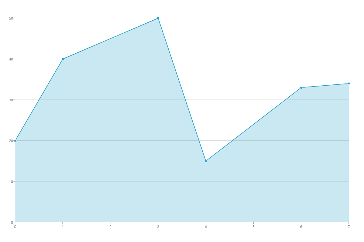
Chart-Specific Properties
Our area charts can be further modified with the aspect and stacked attributes to create spline, stepped, and stacked charts.
The following demo illustrates the different options available for the area chart modifications discussed below:
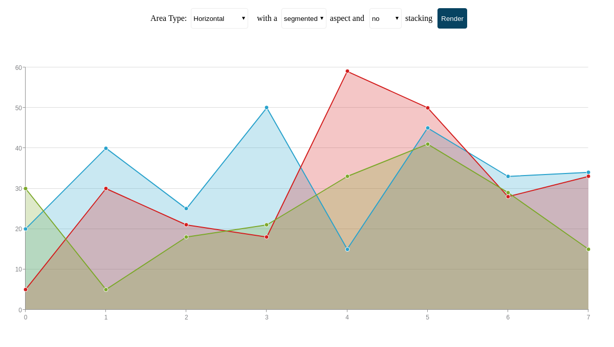
Aspect
Aspects can be applied globally to affect all plots or locally to affect specific plots. The aspect value options for area charts are:
| Value | Description |
|---|---|
segmented (default) |
Data points are connected by straight lines. Since it is the default aspect, specifying its type is optional. |
spline |
Data points are connected by gently curving lines |
stepped |
Data is depicted as a series of stepped horizontal or vertical lines. This aspect is useful for emphasizing differences, comparisons, and sudden changes in data. |
To apply aspects globally, create a plot object and insert your aspect attribute.
plot: { /* Plot object */
  aspect: "segmented", /* "spline" | "stepped" */
  stacked: false /* or true */
}
To apply aspects locally, add them to the chart data object you want the change to apply to.
series: [
  { /* Chart data object */
    aspect: "segmented," /* "spline" | "stepped" */
    values: [y0, y1, y2, y3, ..., yN]
  }
]
Note: If you specify an aspect value in the plot object and an aspect value in a chart data object, the latter will overwrite the former.
Connect Nulls
To connect null points rather than having a break in your plot, set connectNulls to true.
{
    type: 'area',
    plot: {
      connectNulls: true,
    },
  }

Contour On Top
Use the contourOnTop attribute to set whether the contour lines are drawn on top of area plots of hidden by the next area plot on top of it.
When set to true, contour lines are all visible above the shaded regions of the area chart.
{
    type: 'area',
    plot: {
      contourOnTop: false,  // default is true
    },
  }
Cluster
Use the clustered attribute to set the entire plot to be placed within one key scale.
The clusterIndex attribute sets which key scale to place the plot in.
To offset the margin of the cluster, use clusterOffset.
These attributes can be used within the plot or series object.
{
  plot: {
    clustered: true,
    clusterOffset: 10,
  },
  series: [{
    clusterIndex: 0,
  }]
}
Midpoint
Use the midPoint attribute to whether a node is wrapped before and after its position.
By default, tooltip is triggered before and after the node when hovering over the series line.
However, setting midPoint to false will trigger the tooltip for the node only on or after the node.
{
  plot: {
    midPoint: false,
  }
}

Segment Trackers
The segmentTrackers attribute sets whether tooltips are activated on the lines.
Setting the attribute to false will only enable tooltips on the markers.
{
  plot: {
    segmentTrackers: false, // true by default
  }
}

Stacked
The stacked attribute allows you to stack multiple datasets on top of each other. With this chart type, you can create a standard stacked bar or 100% stacked bar, as well as specify which datasets are sorted into which stacks.
Standard Stacked Area Chart
With this type, datasets are stacked on top of each other so that the top line represents the sum total of all of the data plotted. To create standard stacks, add the stacked attribute to your plot object and set the value to true.
{
  type: "area",
  plot: {
    stacked: true,
    'stack-type': "normal" /* Optional declaration. */
  }
}
Note: Since this is the default stacked chart type, you do not have to include the stack-type attribute (although you can).
100% Stacked Area Chart
Instead of showing the actual values for each of your datasets, a 100% stacked area chart will represent your data as a percentage of the whole. The top line will rest at 100 on the y-axis, with each dataset occupying its relative percentage area below it.
First, add the stacked attribute to your plot object and set the value to true. Then, add a stack-type attribute with a value of 100%.
You'll also need to specify your minimum and maximum y-axis values. You can do so by creating a scale-y object and setting your min-value attribute to 0 and your max-value attribute to 100. Alternatively, you can add a values attribute and include your min and max value as string separated by colons- values: "0:100".
Note: Learn more about min/max scales with our Scales Tutorial.
{
  type: "area",
  plot: {
    stacked: true,
    'stack-type': "100%"
  },
  'scale-y': {
    'min-value': 0,
    'max-value': 100
  }
}
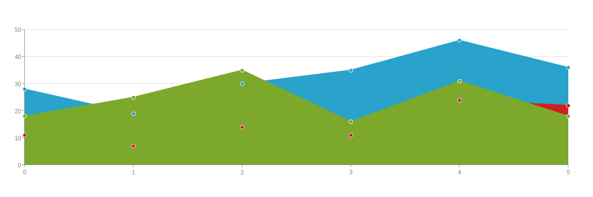
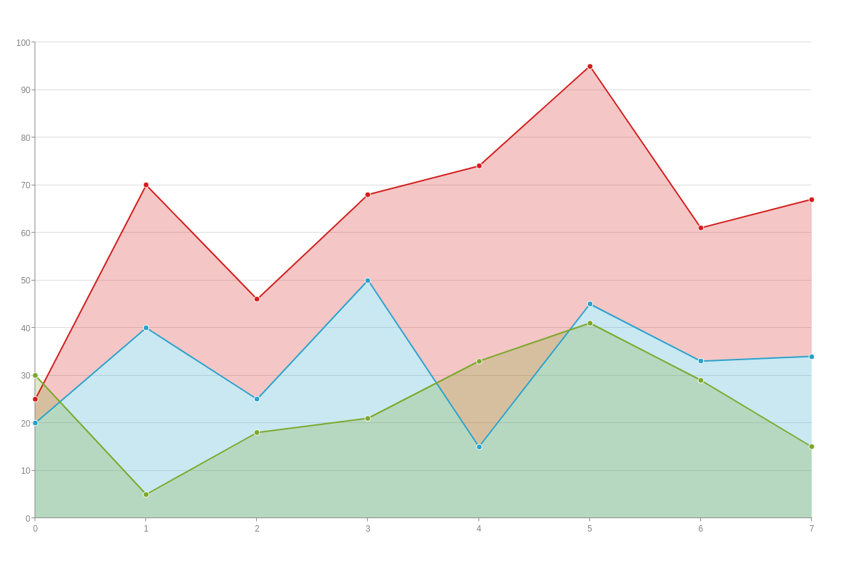
Additional Chart Stacking Options
You can also separate your datasets into one or more stacks. To do so, add a stack attribute to each of your chart data objects. For datasets you want included in the first stack, set the value to 1; for datasets you want included in the second stack, set the value to 2; and so on.
Note: Creating multiple stacks in an area chart may be limited in its usefulness. (See our example below, where the stacks overlap each other, making it difficult to make sense of the data.) In this case, a bar chart may better represent your data.
{
  type: "area",
  plot: {
    stacked: true
  },
  series: [
    {
      values: [20,40,25,50,15,45,33,34],
      stack: 1
    },
    {
      values: [5,30,21,18,59,50,28,33],
      stack: 1
    },
    {
      values: [30,5,18,21,33,41,29,15],
      stack: 2
    }
  ]
}
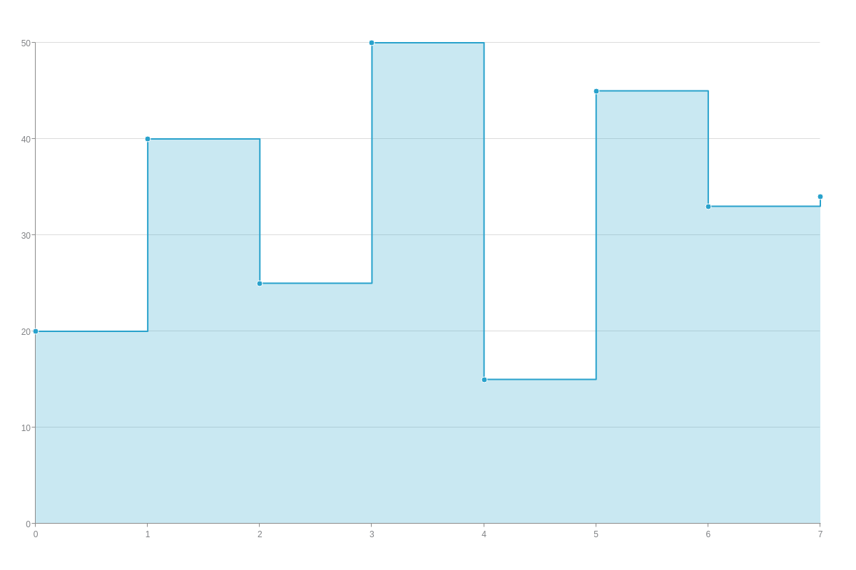
Step Start
Use the stepStart attribute to set where a step should occur relative to two nodes.
The available options are 'after', 'before', 'middle'.
{
  plot: {
    stepStart: 'after', // 'middle' by default
  }
}
Further Customization
Once you have your basic chart, you can customize and style it to fit your data visualization needs. This section explains how to add a category or time-series scale to your area chart, as well as how to style your lines, markers, and backgrounds (the shaded regions below your lines).
Scales
The default scales for both the x-axis and the y-axis is a quantitative (or numeric) one, with the value starting at zero. Users often want to modify their horizontal axis to display a category or time-series scale, which we explain how to do below.
Note: Learn more about scales with our Scales Tutorial.
Note: While scale modification changes in the examples below are made to the x-axis (scale-x object), the same changes can be made to the y-axis (scale-y object) as well.
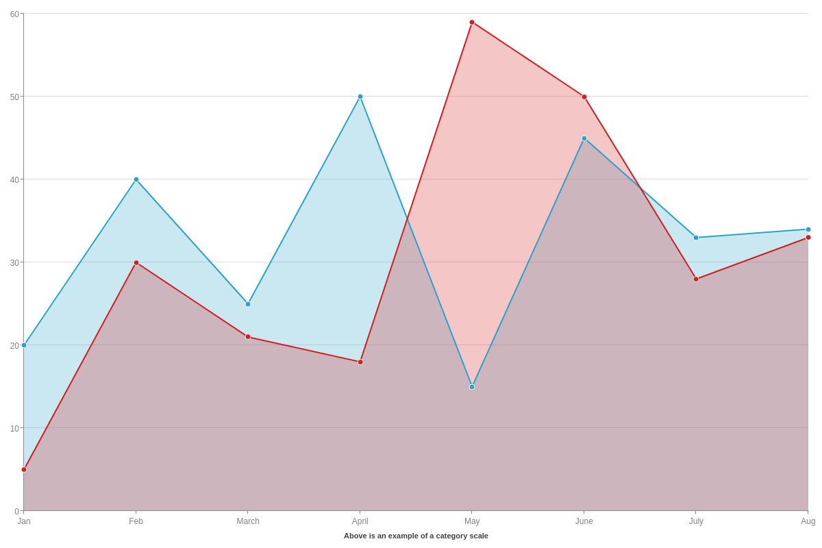
Category Scale
A category (or qualitative) scale can consist of words and/or numbers, such as time periods (months, years, dates), categories, names, etc. To add one to your chart, create a scale-x object and insert a labels array. In the array, you can include scale labels such as:
labels: [ "Jan", "Feb", "March", "April", "May", "June" ]
labels: [2000, 2002, 2004, 2006, 2008, 2010]
labels: [ "Q1", "Q2", "Q3", "Q4" ]
Note: Be careful not to confuse the labels array, which adds scale labels, with the label object, which allows you to specify your scale title.
You can set your margins to automatically adjust, helping to ensure all your scale labels fit comfortably within your chart. Create a plotarea object. Add an adjust-layout attribute, and set the value to true.
{
  type: "area",
  plotarea: {
    'adjust-layout': true /* For automatic margin adjustment. */
  },
};
Time-Series Scale
A time-series scale is used to represent increments of time and can be formatted to display anything from years down to milliseconds. Create a scale-x object and add a min-value attribute, step attribute, and transform object inside it.
For min-value and step, you'll need to specify your minimum and step scale values in Unix time. Unix time (also known as Epoch time) is measured by the number of milliseconds that have elapsed since January 1, 1970, UTC time. To calculate your timestamps, you can use an online conversion tool such as Epoch Converter.
Note: Make sure to provide your Unix time in milliseconds. You can convert seconds to milliseconds by multiplying by 1000.
The transform object will convert your Unix timestamps into a more readable date and/or time. In the object, add a type attribute and set the value to date. Next, add an all attribute. You can specify how you want your time-series scale formatted by using our tokens.
Note: To ensure your time-series scale reads in UTC time (ZingChart currently defaults to local time), add a utc attribute, and set the value to true.
You can set your margins to automatically adjust, helping to ensure all your scale labels fit comfortably within your chart. Create a plotarea object and add an adjust-layout attribute with the value set to true.
{
  type: "area",
  utc: true, /* Force UTC time. */
  plotarea: {
    'adjust-layout': true /* For automatic margin adjustment. */
  },
  'scale-x': {
    label: { /* Add a scale title with a label object. */
      text: "Above is an example of a time-series scale",
    },
    'min-value':1420070400000, /* Unix timestamp for Jan 1, 2015. */
    step: "day",
    transform: { /* Converts your Unix timestamp to a human readable format. */
      type: "date", /* Set your transform type to "date". */
      all: "%m.%d.%y" /* Specify your date/time format, using tokens. */
    }
  },
  series: [
    { values: [20,40,25,50,15,45,33,34]},
    { values: [5,30,21,18,59,50,28,33]},
  ]
};

Styling
You can add all kinds of styles to your area chart. We discuss some of the basics here, specifically on how to style your lines, markers, and backgrounds.
Note: For more styling options, see our JSON Attributes/Syntax page.
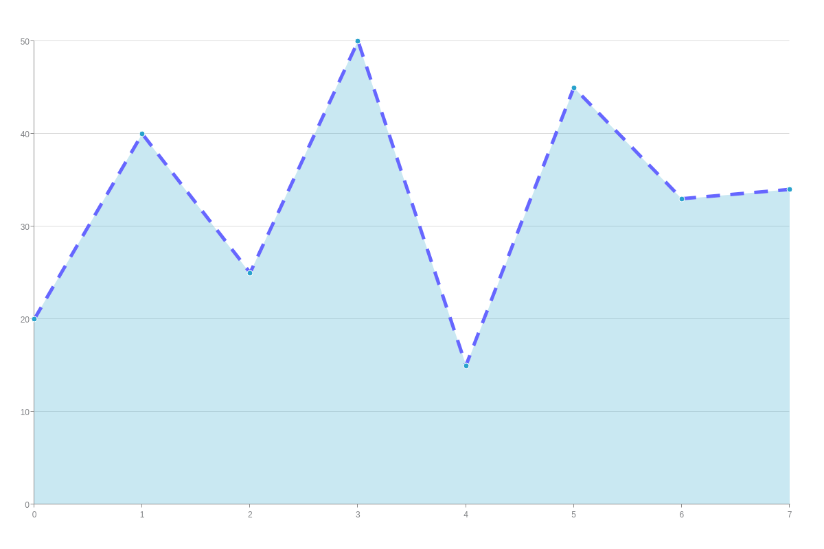
Line Color, Style, and Width
Start in the chart data object of the plot you want to style. To specify your line color, add a line-color attribute and provide your color as a hexadecimal or RGB value.
To change your line style, add a line-style attribute, and then specify your choice of solid (default), dashed, or dotted line. You can also change your line's width by inserting a line-width attribute and providing a pixel value.
{
  type: "area",
  series: [
    {
      values: [20,40,25,50,15,45,33,34],
      'line-color': "#6666FF", /* hexadecimal or RGB value */
      'line-style': "dashed", /* "solid" | "dotted" */
      'line-width': 5 /* in pixels */
    }
  ]
};
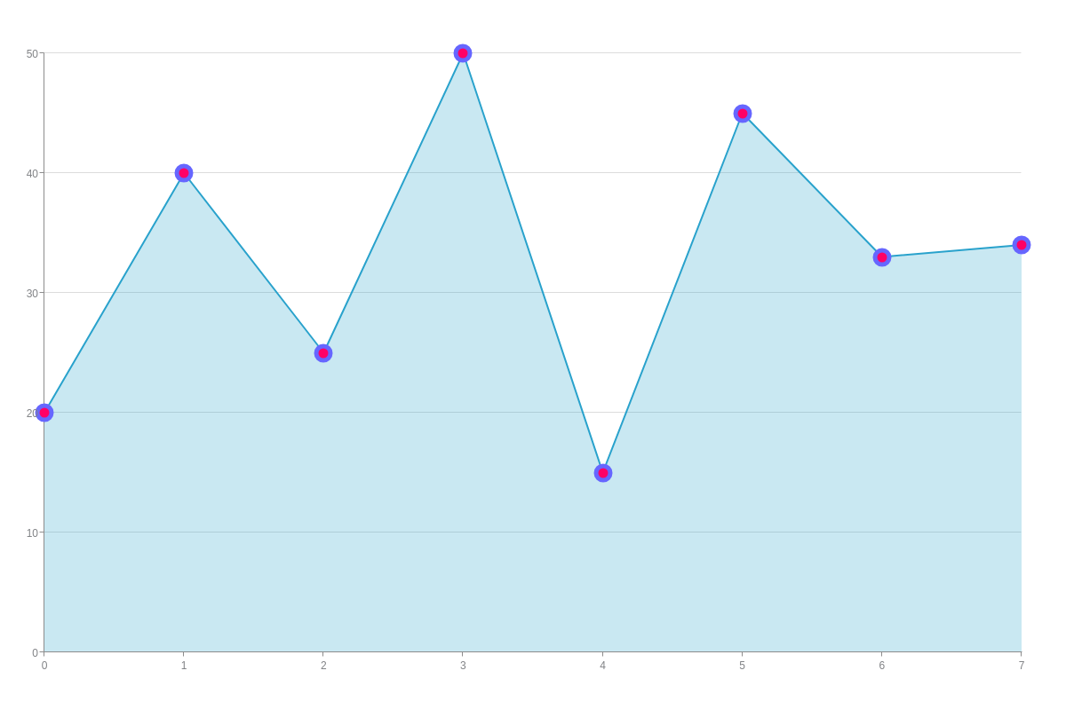
Marker Color, Size, and Width
To enable markers, add a marker object to the chart data object of the plot you want your changes to apply to. Modify your marker's fill color by adding a background-color attribute and specifying your fill size with a size attribute.
For border color, use a border-color attribute and specify your border width with a border-width attribute.
Note: Learn more about markers with our Markers Tutorial.
{
  type: "area",
  series: [
    {
      values: [20,40,25,50,15,45,33,34],
      marker: { /* Marker object */
        'background-color': "#FF0066", /* hexadecimal or RGB value */
        'size': 8, /* in pixels */
        'border-color': "#6666FF", /* hexadecimal or RBG value */
        'border-width':5 /* in pixels */
      }
    }
  ]
};
Background Color, Transparency, and Active Area
To change the background color of the shaded region below each plot line, add a background-color attribute to your chart data object. For a single color, add one hexadecimal or RGB value. For a gradient (two color) background, add two values separated by a space. You can adjust your color's transparency by adding an alpha-area attribute. Transparency ranges from 0 (clear) to 1 (solid). Provide a value between 0-1, making sure to insert a zero before your decimal point.
You can also extend your tooltip's activation area to the shaded region below your line. (By default, tooltips activate when you hover over the marker only.) Add an active-area attribute, and set the value to true.
{
  type: "area",
  plot: {
    'active-area': true /* Extends the tooltip's active area to the shaded region */
  },
  series: [
    {
      values: [20,40,25,50,15,45,33,34],
      'background-color': "#6666FF #FF0066", /* Single color or gradient (2 colors) */
      'alpha-area':0.5, /* Shaded region transparency */
    }
  ]
};