Gauge Charts
Note: See our Gauge Chart Gallery for inspiration on all the different gauge chart possibilities.
Gauge Chart Type
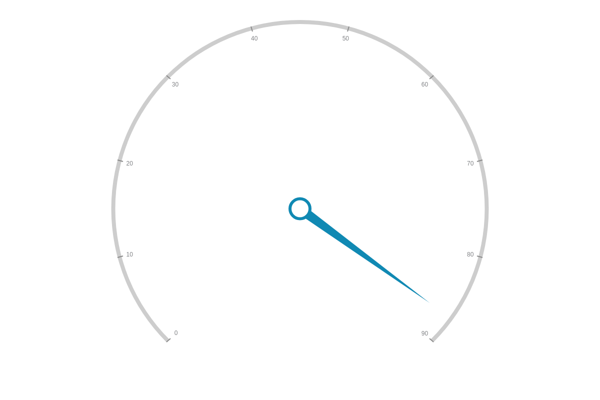
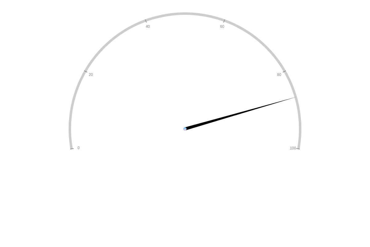
Add a type attribute to your chart object and set the value to gauge. Without further modification, a basic angular gauge chart with a single data value looks like this:
{
  type: "gauge",
}
Data
To enter data into the gauge chart, use the series array. Each object in the series array requires a values array to function properly.
Data values are displayed through your gauge chart's needle indicators. Assign a single value per gauge needle. You can include one or more needles per chart.
{
series: [
    { values: [needle1]},
    { values: [needle2]},
    ...
    { values: [needleN]},
]
}
Chart-Specific Properties
Once you have your basic gauge chart, customize the appearance of your angular gauge's radial scale, needle indicator(s), pivot point, and outer ring.
Radial Scale
Angular gauge charts differ from line charts, bar charts, and other x/y-axis charts in that they are set on a radial scale (scale-r). With this chart type, you can specify the range you want your gauge to span, as well as the minimum, maximum, and step scale values.
Create a scale-r object. Inside, add an aperture attribute. The default value is 270 degrees, but you can specify any scale range value that you prefer. Next, add a values attribute. Provide your min/max/step values in a single string separated by colons.
{
  'scale-r': {
    aperture: 200,     //Specify your scale range.
    values: "0:100:20" //Provide min/max/step scale values.
  }
}
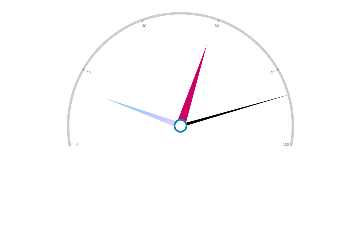
Needle Indicator
Your gauge chart's needle (sometimes referred to as a dial) indicates where your data value falls on your scale. You can modify the width, length, and color of your needle. Apply changes globally by placing the following attributes in a plot object or locally by placing them in the applicable series object.
Use the csize and size attributes to specify your needle's width and length, respectively. You can provide your values as percentages or pixels.
Specify your needle's color with the background-color attribute. Provide a hexadecimal or RGB color value.
{
  series: [
    {
      values: [87],
      csize: "5%",     //Needle Width
      size: "100%",    //Needle Length
      'background-color': "#000000"  //Needle Color
    }
  ]
}
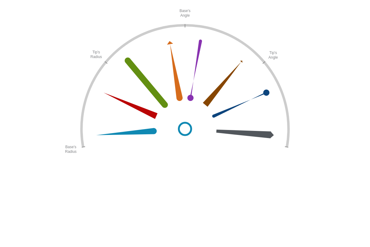
You can also modify the shape of your gauge needle with the indicator attribute. This allows you to display a curved or flat base, rounded or pointed tip, and/or needle that is offset from the gauge's center. Provide your indicator values in an array in the following format:
{
  series: [
    {
      indicator: [R-Base, R-Tip, A-Base, A-Tip, Offset]
    }
  ]
}
Inside the array, each term corresponds to the following part of the needle indicator:
| Indicator Section | What to Do | What to Provide |
|---|---|---|
| R-Base | Specify your base’s radius (i.e., size). | Provide a pixel value. A positive value will create a rounded base. A negative value will create a flat base. |
| R-Tip | Specify your tip’s radius (i.e., size). | Provide a pixel value. A positive value will create a rounded tip. A negative value will create a pointed tip. |
| A-Base | Specify your base’s angle. | Provide a (positive) angle value. With a rounded base, you can further shape it into a ball. (It has no effect on a flat base.) |
| A-Tip | Specify your tip’s angle | Provide a (positive) angle value. With a rounded tip, you can further shape it into a ball. With a pointed tip, you can further modify its pointed appearance. |
| Offset | Specify your needle’s placement in relation to the center of your gauge. | Provide a decimal or percentage value. |
Some of the various needle indicator types that can be created are displayed in the chart below:
{
  series: [
    {
      indicator: [10,0,0,0,0.3],
    }
  ]
}
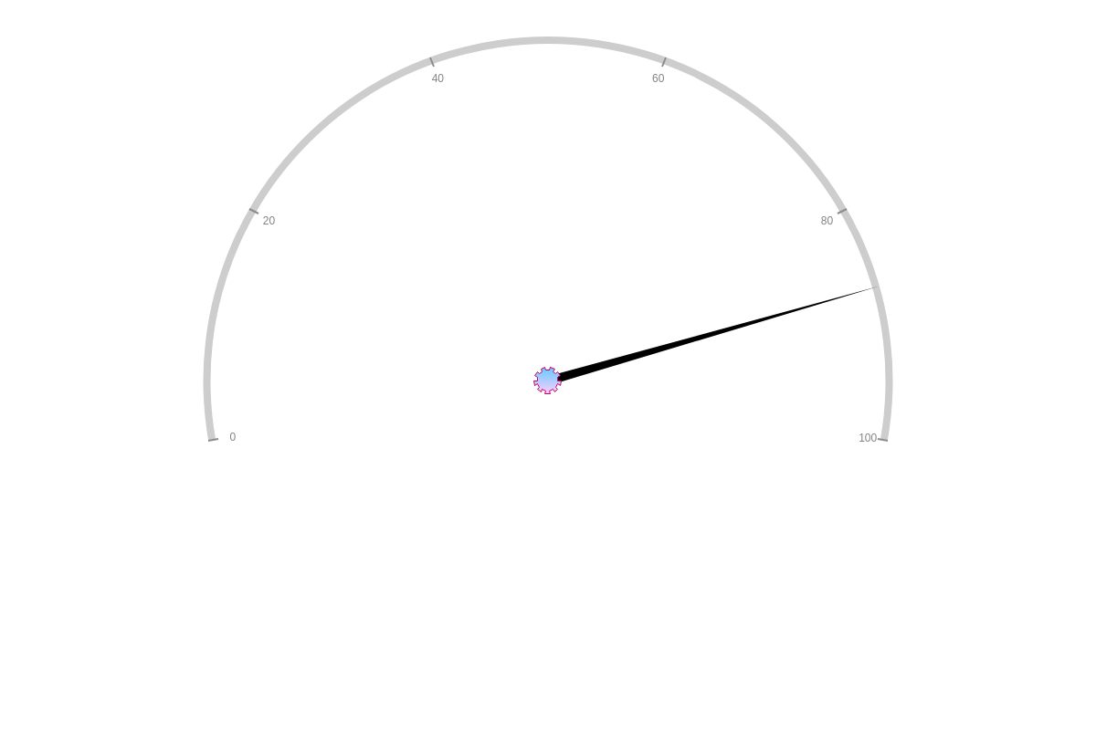
Pivot Point
You can add a pivot point to your gauge chart. In your scale-r object, add a center object. You'll need to specify your pivot point's size, color, and border using the size, background-color, border-color, and/or border-widthattributes.
{
  'scale-r': {
    aperture:200,
    values: "0:100:20",
    center: {  //Pivot Point
      size:5,
      'background-color': "#66CCFF #FFCCFF",
      'border-color': "none"
    }
  }
}
You can also modify your pivot point's shape. Based on ZingChart Shapes and Markers, you'll want to specify your marker shape with a type attribute. You can then style your marker with attributes such as size, background-color, border-color, and border-width.
{
  'scale-r': {
    center: {  //Pivot Point
      type: "gear9",   //Specify your marker shape.
      size:10,
        'background-color': "#66CCFF #FFCCFF",
        'border-color': "#CC0066",
        'border-width': "0.5",
    }
  }
}
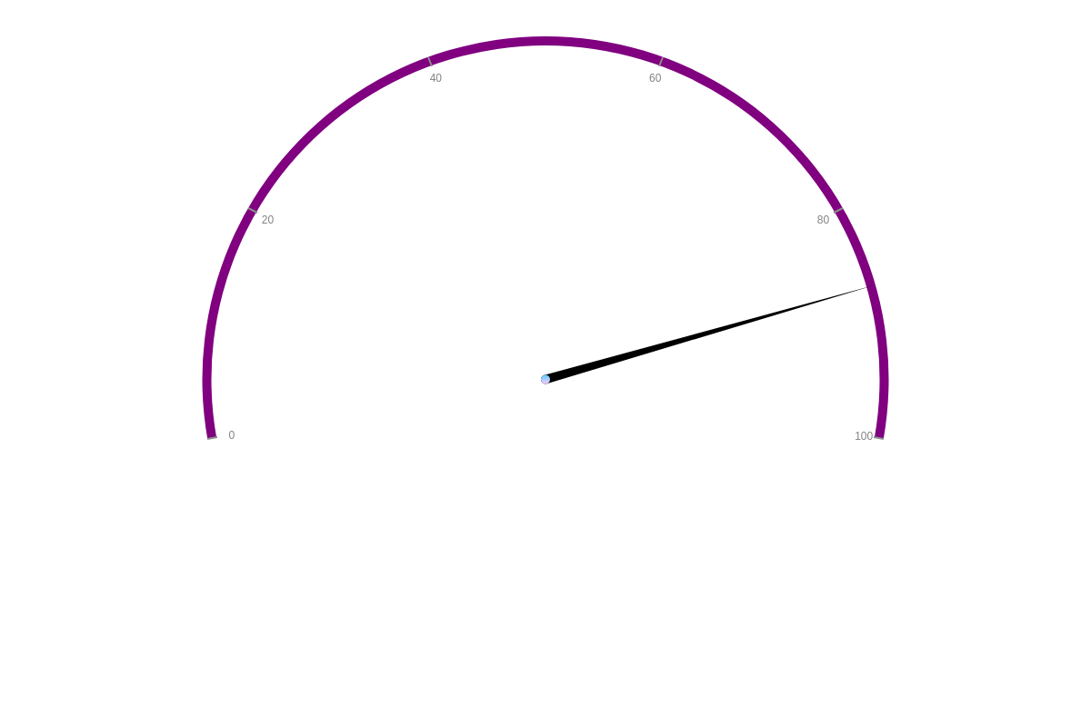
Gauge Ring
You can add a ring to your gauge chart. In your scale-r object, add a ring object. You'll need to specify your gauge ring's size and color using the size and background-color attributes.
{
  'scale-r': {
    ring: {  //Gauge Ring
      size:10,
      'background-color': "purple"
    }
  }
}
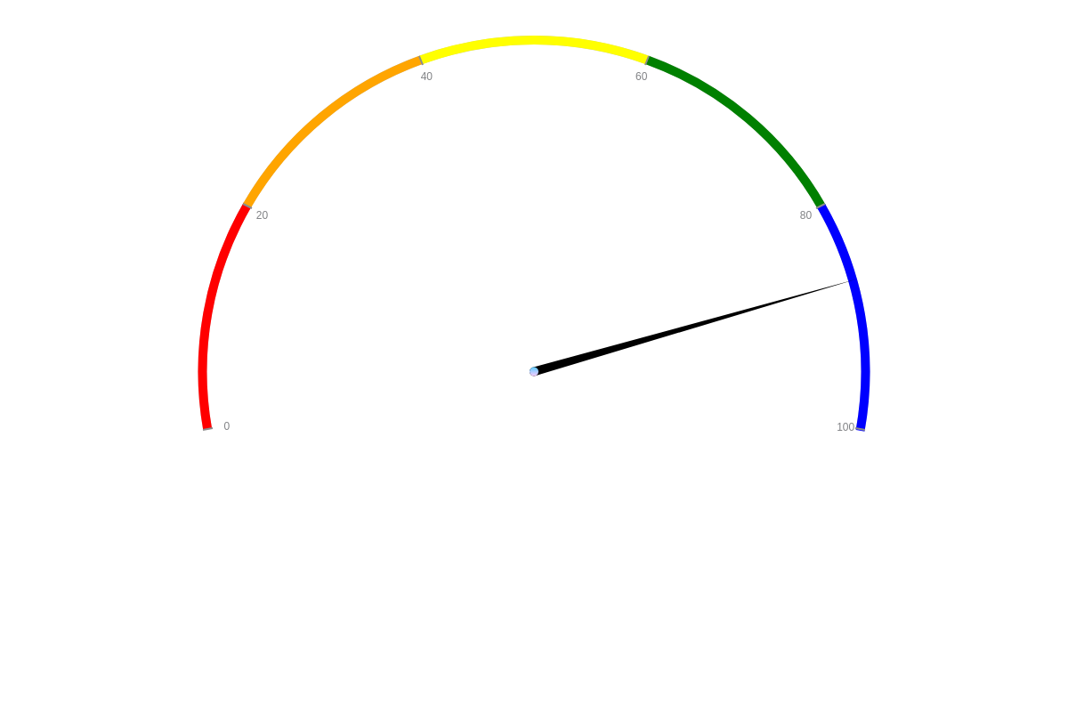
You can use rules and tokens to apply custom styling to your gauge chart's ring. Add a rules array to your ring object. In the array, you'll create individual objects for each of your rules. You'll need to specify your rule's criteria when using the rule attribute. You'll then specify what happens when the rule is met.
Note: For more in-depth information on incorporating logic rules into your JavaScript charts, see our ZingChart Rules page. For more on using shortcut tokens, see our ZingChart Tokens page.
Note: Your rules can only apply custom styles within the confines of your scale, specifically your minimum, maximum, and step scale values. This means that if your gauge's scale ranges from 0 to 100, with a step size of 20, your ring color can only be set between ranges such as 0-20, 20-60, 80-100, etc. You could not set ranges such as 0-15, 11-31, or 25-50.
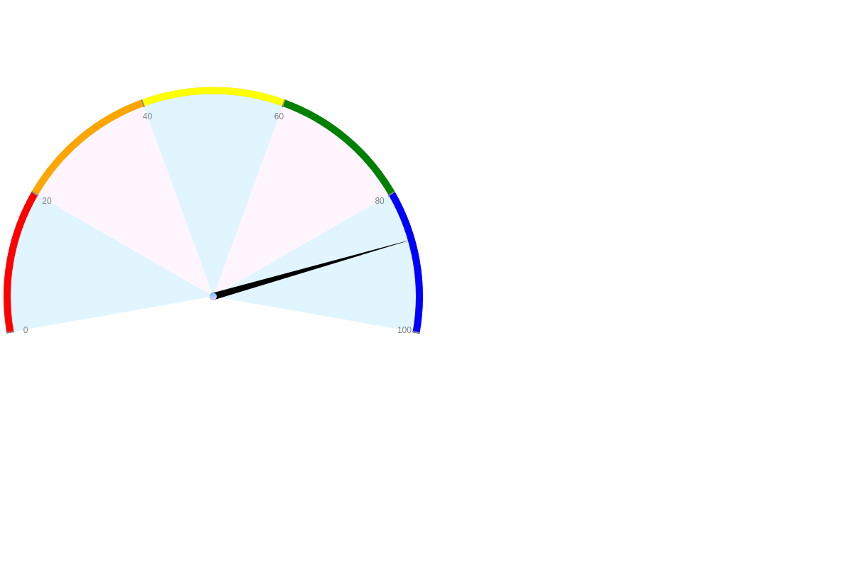
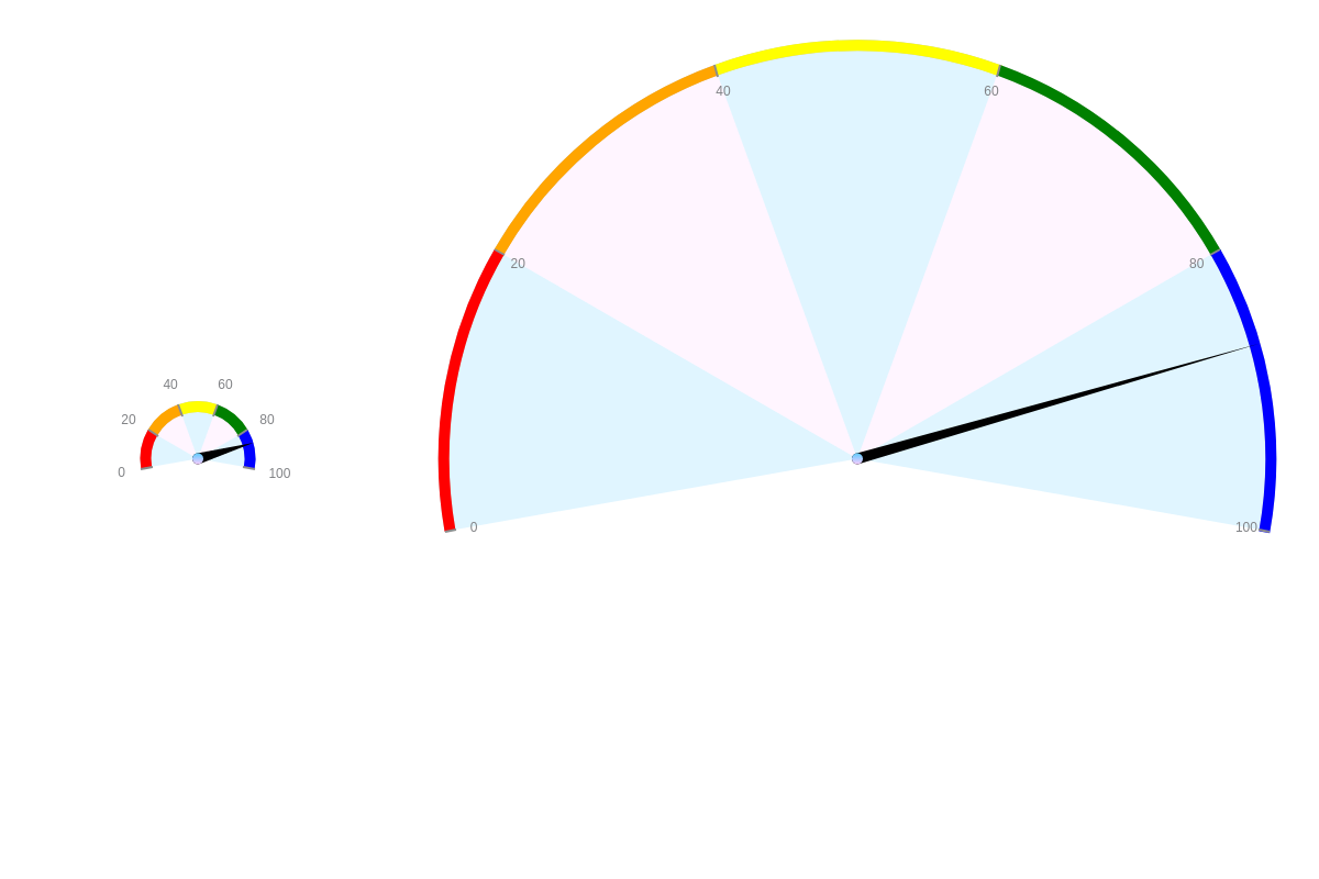
In the below example, rules were used to color sections of the ring by scale value, changing it from red to orange to yellow to green to blue:
{
    ring: {  //Ring with Rules
      size:10,
      rules: [
        {
          rule: "%v >= 0 && %v <= 20",
          'background-color': "red"
        },
        {
          rule: "%v >= 20 && %v <= 40",
          'background-color': "orange"
        }
        // shortened for brevity- click on gauge demo below for full configuration
      ]
    }

}
Further Customization
The following sections explain how to format and style your scale labels; add multiple scales; incorporate scale markers; set your background color; adjust your gauge's size factor; style your major and minor tick marks; and include value boxes, tooltips, and animation.
Scale Labels
Once you've set up your angular gauge's scale, you can format and style your scale labels. You can also adjust their placement and angle.
Note: Learn more about labels with our Labels Tutorial.
Label Formatting
Use a labels array in your scale-r object to specify your gauge's scale labels. In the array, each label should be contained in quotes separated by a comma. You can create any combination of numbers and words.
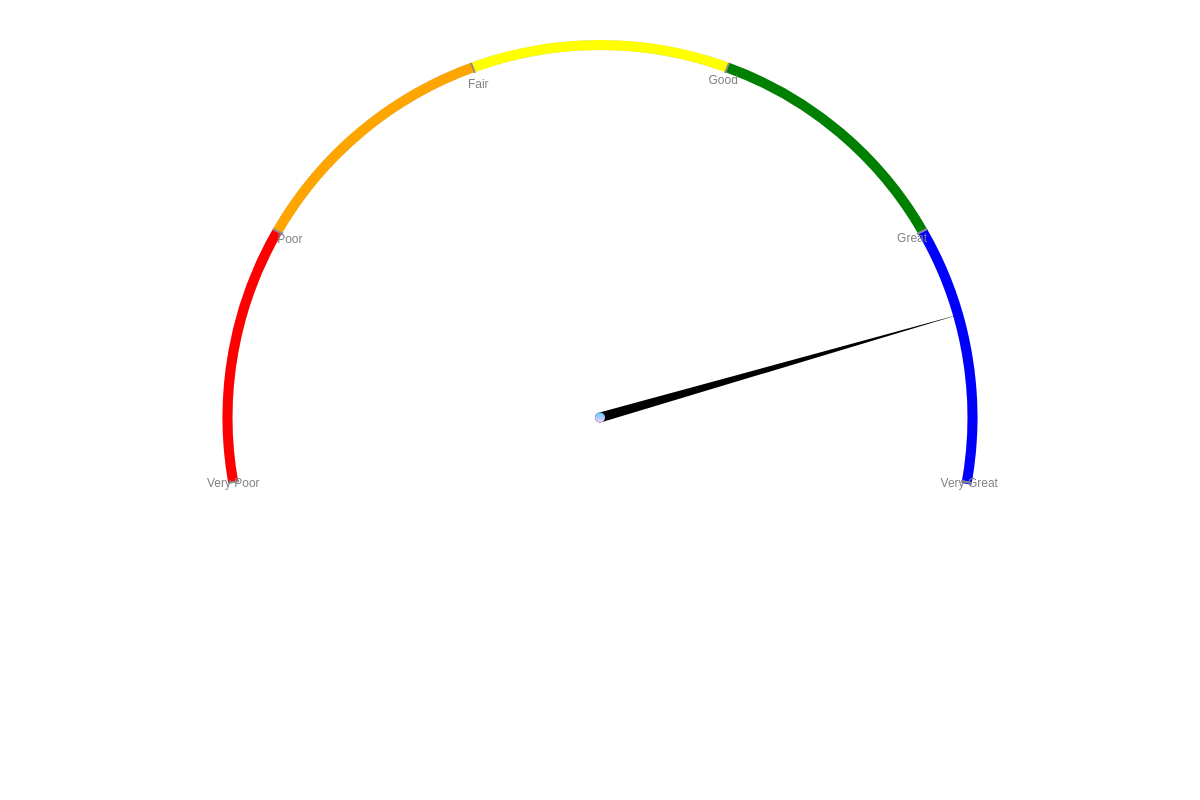
{
  'scale-r': {
    labels: [ "Very Poor", "Poor", "Fair", "Good", "Great", "Very Great" ]  //Scale Labels
  }
}
Label Styling
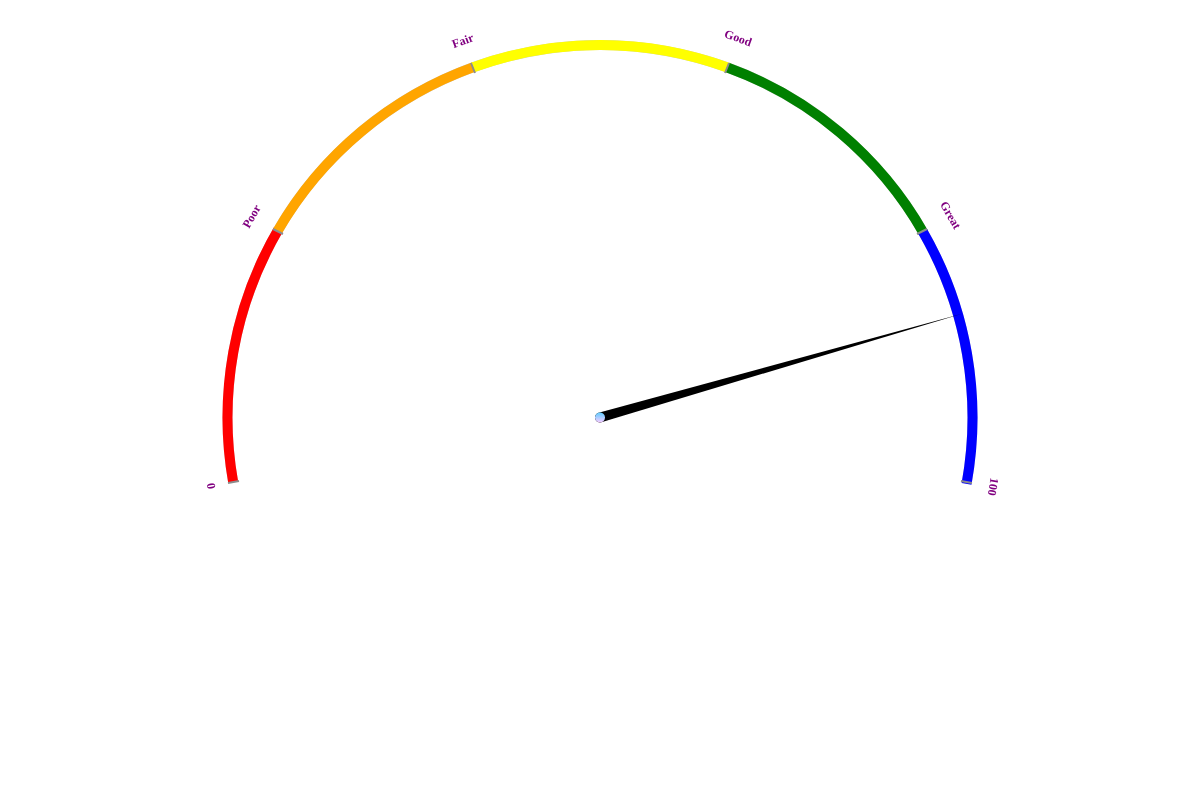
Next, you can style your scale labels. In the scale-r object, add an item object. Place all your label styling attributes inside. You can use common styling attributes, such as font-color, font-family, font-size, font-weight, and font-style.
You can also specify your label placement. By default, they are placed inside your gauge. To move them further inward or outward, add an offset-r attribute. Provide a negative (to move inward) or positive (to move outward) value.
Finally, you can angle your scale labels so that they wrap around your gauge. Add an angle attribute and set the value to auto.
{
  'scale-r': {
    labels: [ "0", "Poor", "Fair", "Good", "Great", "100" ],  //Scale Labels
    item: {    //Scale Label Styling
      'font-color': "purple",
      'font-family': "Georgia, serif",
      'font-size':12,
      'font-weight': "bold",     //or "normal"
      'font-style': "normal",    //or "italic"
      'offset-r': 0,    //To adjust the placement of your scale labels.
      angle: "auto"    //To adjust the angle of your scale labels.
    }
  }
}
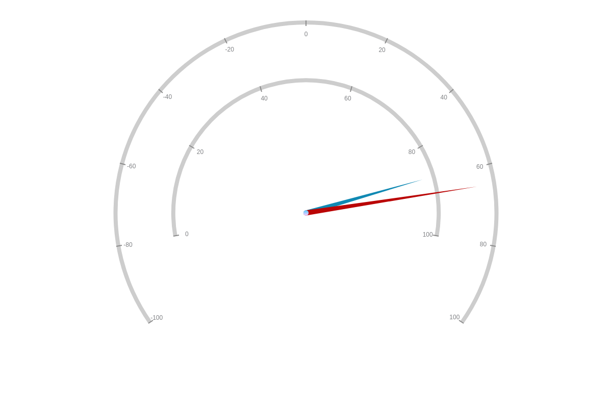
Multiple Scales
You can incorporate multiple scales into your angular gauge chart. To do so, you need to create a scale-2 (or scale-3, scale-4, etc.) and scale-r-2 (or scale-r-3, scale-r-4, etc.) object for each new scale.
In your scale-2 object, you can use the size-factor (decimal or percentage value), offset-x (pixel value relative to x-axis), and/or offset-y(pixel value relative to y-axis) attributes.
In your scale-r-2 object, make sure to set your gauge chart's range and min/max/step with the aperture and values attributes. Also make sure to style your pivot point (center object) and adjust your background's transparency levels (alpha attribute inside gauge object).
You also need to specify which scale your needle value will plot against. In each series object, add a scales attribute. Provide your relevant scale values (e.g., scale-2,scale-r-2). Without specification, your data will chart to your first default scale.
Note: Learn more about scales with our Scales Tutorial.
{
  scale: {
    'size-factor':0.7   //Provide a decimal or percentage value.
  },
  'scale-2': {
    'size-factor':1
  },
  'scale-r': { //Default Scale
    aperture:200,     //Provide your gauge chart's range.
    values: "0:100:20",    //Provide your min/max/step.
    center: {
      size:5,
      'background-color': "#66CCFF #FFCCFF",
      'border-color': "none"
    }
  },
  'scale-r-2': { //Additional Scale
    aperture:250,
    values: "-100:100:20",
    center: {
      size:5,
      'background-color': "#66CCFF #FFCCFF",
      'border-color': "none"
    },
    guide: {
      alpha:0     //Make sure your larger scale's background is set to transparent.
    }
  },
  series: [
    {
      values: [87],
      csize: "5%",
      size: "90%"
    },
    {
      values: [65],
      scales: "scale-2,scale-r-2", //Specify which scale your data should plot to.
      csize: "5%",
      size: "90%"
    }
  ]
}
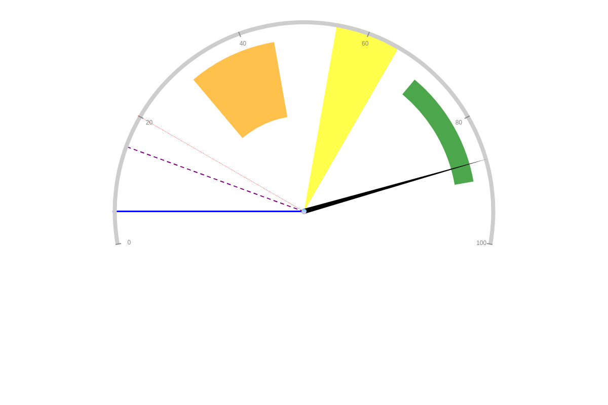
Scale Markers
Scale markers can be used in conjunction with your gauge ring or on their own. They are useful for highlighting specific ranges on your chart and, unlike the ring, they are not limited to your scale's min, max, and step.
In your scale-r object, add a markers array. Place each marker inside an individual object. First, specify your desired scale marker type. Add a type attribute, and provide a value of line or area.
Next, specify your marker's range. Add a range array. For a line scale marker, provide the value you want your line to fall on (e.g., [5]). For an area scale marker, provide your starting and ending values (e.g., [30,45]). You can then style your markers.
Note: Learn more about markers with our Markers Tutorial. See more marker styling options with our scale-r markers JSON Configuration page.
{
  'scale-r': {
    markers: [ //Scale Markers
      { //Line Marker 1
        type: "line",
        range: [5],
        'line-color': "blue",
        'line-width':3,
        'line-style': "solid",
        alpha:1
      }
  }
}
Background Color
Specify your gauge chart's background color(s) by adding a guide object to your scale-r object. You can display a single or two-color background. Add a background-color attribute, and provide your color value(s).
You can also adjust your transparency levels with an alpha attribute. Provide a value between 0 (transparent) and 1 (opaque), and make sure that your decimal mark is preceded by a zero.
{
  'scale-r': {
    guide: { //Specify your gauge chart's background color(s).
      'background-color': "#66CCFF #FFCCFF",
      alpha:0.2
    }
  }
}
Size Factor
You can specify your gauge chart's size factor. Create a scale object, and add a size-factor attribute. Provide your value as a decimal number or percentage. You can provide values both greater or less then 1.0 or 100%.
{
  "scale": {
    "size-factor": "30%" //Modify your gauge chart size.
  }
}
In the chart below, compare the first gauge. which is sized at 30% (or 0.3), to the second gauge, which is sized at 101% (or 1.01).
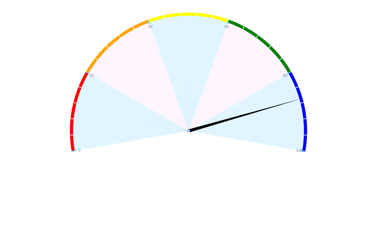
Tick Marks
Customize the color, line type, width, length, and placement of your tick marks. In your scale-r object, create a tick object. To specify your tick mark color, add a line-color attribute and provide a hexadecimal or RGB color value.
To change your line type, add a line-style attribute. Your tick marks can display as a solid (default), dotted, or dashed line.
To change the size of your tick marks, use the line-width (for width) and size (for length) attributes. Provide pixel values.
To change your tick mark placement, add a placement attribute. They can be placed outside (outer), inside (inner), or over the axis line (cross).
{
  'scale-r': {
    tick: {  //Tick Markers
      'line-color': "#66CCFF",
      'line-style': "solid", //solid, dashed, or dotted
      'line-width':3,
      size:15,
      placement: "inner" //outer, inner, or cross
    }
  }
}

Minor Tick Marks
In between your regular tick marks, you can add minor tick marks. To do so, you need to first add a minor-ticks attribute to your scale-r object. Specify the number of minor tick marks you want between your major tick marks.
Next, create a minor-tick object where you place your styling attributes. You can style your minor tick marks with the same attributes as major tick marks.
{
  'scale-r': {
    'minor-ticks':4,  //Specify the NUMBER of minor tick marks.
    'minor-tick': {    //And then STYLE your minor tick markers.
      'line-color': "#FFFFFF",
      'line-style': "solid", //solid, dashed, or dotted
      'line-width':2,
      size:10,
      placement: "inner" //outer, inner, or cross
    }
  }
}

Value Boxes
Value boxes are not visible by default. You can include them by placing a value-box object inside your plot object. On an angular gauge chart, your value box(es) can be placed at the center, tip, or edge using a placement attribute.
Note: Learn more about value boxes with our Value Boxes Tutorial. To see more styling options for value boxes, browse our Value Boxes JSON Attributes/Syntax page for a list of available attributes.
{
  plot: {
    'value-box': { //Value Boxes
      placement: "center",  //Specify placement at "center", "tip", or "edge".
      text: "%v",
      'font-color': "blue"
    }
  },
}

Tooltips
Tooltips are automatically visible on gauge charts. Their visibility can be turned on or off, depending on user preference. Create a tooltip object and add a visible attribute. Set the value to true or false.
You can also customize your tooltip text. Add a text attribute, and place your desired text or tokens inside a string. The tokens most commonly used with this gauge charts are: %v (node value) and %t (plot text).
Note: See our JavaScript Tokens page for more information on tokens. For more tooltip styling options, see our tooltips JSON Attributes/Syntax page.
{
  tooltip: { //Tooltips
    text: "%t - %v%",
    'font-color': "black",
    'font-family': "Georgia",
    'background-color': "white",
    alpha:0.7,
    'border-color': "none"
  }
}
Animation
In your plot object, add an animation object. Inside, place your animation-related attributes. You must specify your desired animation effect with the effect attribute. Further customize your animation with the delay, method, sequence, and speed attributes.
Note: Learn more about animation with our Animation page.
{
  plot: {
    animation: { //Animation object
      effect:2,
      method:3,
      sequence:1,
      speed:3000
    }
  }
}
