Scatter Charts
Overview
ZingChart supports two scatter chart types:
- Standard
- Horizontal
These chart types can then be modified to display:
- Trendlines
- Custom Markers
Note: See our Scatter Chart Gallery for inspiration on all the different scatter chart possibilities.
Scatter Chart Types
Create a standard, horizontally-oriented, or trellis scatter chart.
Scatter Chart
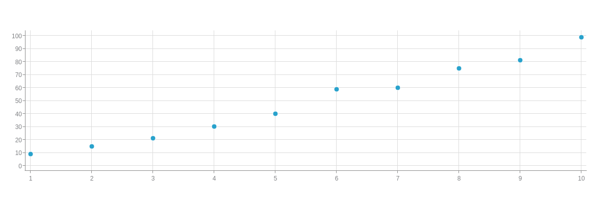
Add a type attribute to your chart object and set the chart type to scatter. Without further modification, a scatter chart with a single dataset looks like this:
{
  type: "scatter",
}
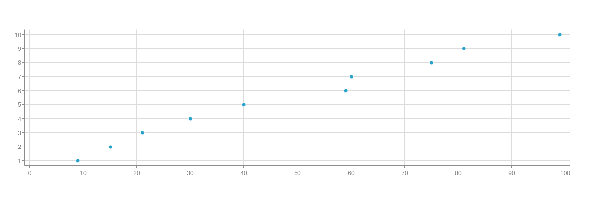
Horizontal Scatter Chart
A horizontal scatter chart is specified by the hscatter value. With this chart type, the axes are switched so that the x-axis runs vertically and the y-axis runs horizontally. They are especially useful when working with our horizontal mixed charts.
{
  type: "hscatter",
}
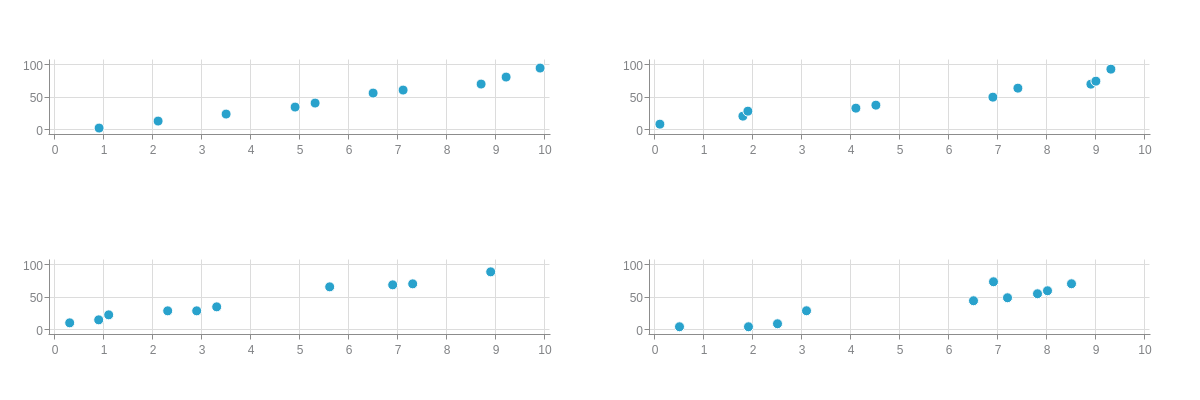
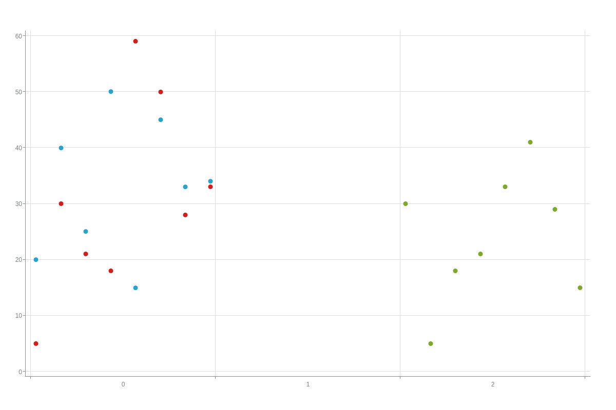
Trellis Scatter Chart
To create a trellis scatter chart, create a graphset array and place each dataset in its own chart object. You can adjust the spacing between your axis line(s) and plotted data using the offset-start and offset-end attributes. Simply add them to your scale-x and/or scale-y objects (discussed further in Scales section below), and provide a pixel value.
Note: Our Adding Additional Charts page explains in greater detail how to create a graphset array, as well as how to insert multiple charts throughout your webpage.
{ //shortened for brevity- click on following scatter trellis chart demo for full configuration
  graphset: [
    {
      type: "scatter",
      height: "50%",
      width: "50%",
      x: "0%",
      y: "0%",
      'scale-x': {
        'offset-start':5,   //To adjust the spacing between your axis line and beginning plotted data.
        'offset-end':5,     //To adjust the spacing between your ending plotted data and axis line.
        values: "0:10:1"   //To set your minimum, maximum, and step scale values.
      },
      'scale-y': {
        'offset-start':5,
        'offset-end':5,
        values: "0:100:50"
      },
    },
    {
      type: "scatter",
      height: "50%",
      width: "50%",
      x: "50%",
      y: "0%",
      'scale-x': {
        'offset-start':5,
        'offset-end':5,
        values: "0:10:1"
      },
      'scale-y': {
        'offset-start':5,
        'offset-end':5,
        values: "0:100:50"
      },
    },
  ]
}
Data
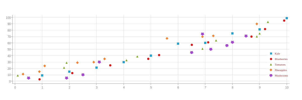
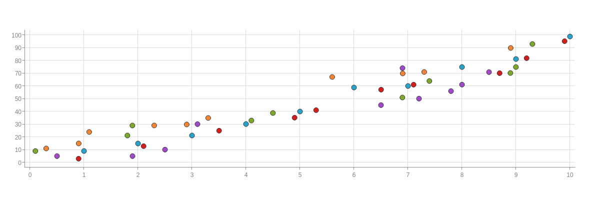
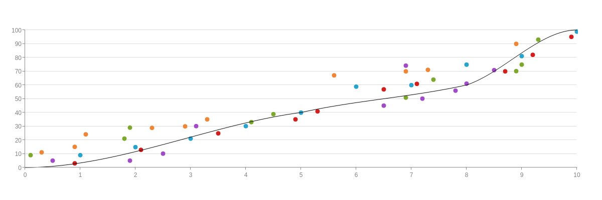
Scatter charts support single or multiple datasets, all contained inside the series array. Each dataset is configured as an array of arrays where users specify both their x- and y-axis values. The scatter chart displayed below contains five datasets.
Note: You can also chart time-series data, which must be provided in Unix time in milliseconds. (To convert your dates into Unix time, you can use online conversion tools such as Epoch Converter.) See our Time-Series Scale section further below for a scatter chart with time-series scale and data example.
{ //shortened for brevity- click on following scatter chart demo for full configuration
  series: [
    {
      values: [
        [1,9],
        [2,15],
        [3,21],
      ]
    },
    {
      values: [
        [0.9,3],
        [2.1,13],
        [3.5,25],
      ]
    },
  ]
}

Chart-Specific Properties
Once you've set up your chart's type and series data, you can next select your desired markers or incorporate a trendline to further clarify your scatter chart's data.
Cluster
Use the clustered attribute to set the entire plot to be placed within one key scale.
The clusterIndex attribute sets which key scale to place the plot in.
To offset the margin of the cluster, use clusterOffset.
These attributes can be used within the plot or series object.
{
  plot: {
    clustered: true,
    clusterOffset: 10,
  },
  series: [{
    clusterIndex: 0,
  }]
}
Markers
Marker customization is useful for differentiating your datasets or adding emphasis to a particular one. We provide our own ZingChart markers for you to choose from, and also provide the functionality for you to create your own scatter chart markers.
Note: Scatter chart markers can also be used as an alternative to ZingChart Shapes within your plot area. While shapes are positioned using percentages or pixels, scatter chart markers are positioned using x- and y-axis coordinates, which allows for more precise positioning.
ZingChart Markers
Create a marker object, add a type attribute, and specify your marker type. To apply globally, make your changes inside a plot object. To apply locally, make your changes inside of your desired series data object.
{
  plot: {
    marker: {
      type: "square"   /*specify your marker type globally
    }
  },
  series: [
    { /*specify your marker type locally in individual series objects/*
      //marker: {
        //type: "square"
      //}
    }
  ]
}
ZingChart has over thirty different marker types, which you can toggle through in the following chart:
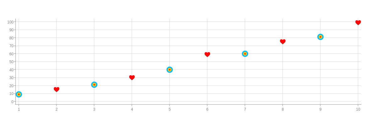
Custom Markers
You can also create your own custom markers. To do so, you'll need to add a background-image attribute to your markerobject and provide an image link to your custom marker contained in quotes.
You'll also need to add the following styling attributes:background-color (set to none), border-color (set to none), background-repeat (set to no-repeat), and shadow (set to false). You can also adjust the size of your markers by adding a size attribute.
Note: For more customization options, see our Markers JSON Attributes/Syntax page.
{
  series: [
    {
      marker: {
        'background-image': "https://www.zingchart.com/resources/target.png", //Provide an image link for custom markers.
        'background-color': "none",
        'border-color': "none",
        'background-repeat': "no-repeat",
        shadow: false,
        size: 12
      }
    }
  ]
}
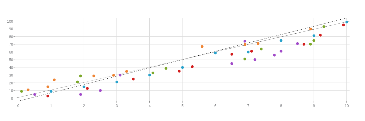
Trendlines
We provide users the functionality to incorporate trendlines into their scatter charts. There are two ways to add them: with a markers array or by creating a mixed scatter/line chart.
markers Array
Add a markers array to your scale-x and/or scale-y objects. In the array, create an object. You'll need to add a type attribute and set the value to line. You'll also need to add a range array, where you'll specify the beginning and ending points for your trendline. While a trendline can be drawn based on a visual estimate, you can also use your own functions or formulas to calculate your start and stop values.
Note: For more styling options, refer to our scale-x markers and scale-y markers JSON Configuration pages.
{
  'scale-x': {
    markers: [
      {
        type: "line",
        range: [0,10],
        'line-style': "dashed"
      }
    ]
  },
  'scale-y': {
    markers: [
      {
        type: "line",
          range: [0,100],
          'line-style': "dotted"
      }
    ]
  },
}
Mixed Scatter/Line Chart
You can also add a trendline by creating a mixed scatter/line chart. With a scatter/line mixed chart, the advantage is that you can use the aspect attribute to specify your line type (e.g., to make a curved trendline with our spline value). You can also turn off the visibility of your line chart markers by adding a marker object, adding a visible attribute, and setting the value to false. Style your trendline using line styling attributes such as: line-width, line-style (solid, dotted, or dashed), and line-color.
Note: Read our Mixed Charts page for more detailed information on how to put together this chart type.
{ //shortened for brevity- click on following line/scatter mixed chart demo for full configuration
  type: "mixed",
  series: [
    {
      type: "scatter",
    },
    {
      type: "scatter",
    },
    {
      type: "line",
      aspect: "spline",
      marker: {
        visible: false
      },
      'line-width': 1,
      'line-style': "solid",
      'line-color': "black",
    }
  ]
}
Further Customization
You can next configure your scatter chart's scales, style your markers, and customize the appearance of your value boxes, tooltips, and legend.
Scales
Scatter charts generally have quantitative scales on both axes. Linear, logarithmic, and time-series scales are the most common, and we explain the basics on setting up those scale types below.
Note: Learn more about scales with our Scales Tutorial.
Note: The following sections show scale configuration on the more commonly used axis (logarithmic scale on the y-axis (scale-y object), time-series scale on the x-axis (scale-x object)). However, you can generally make the same changes to either axis.
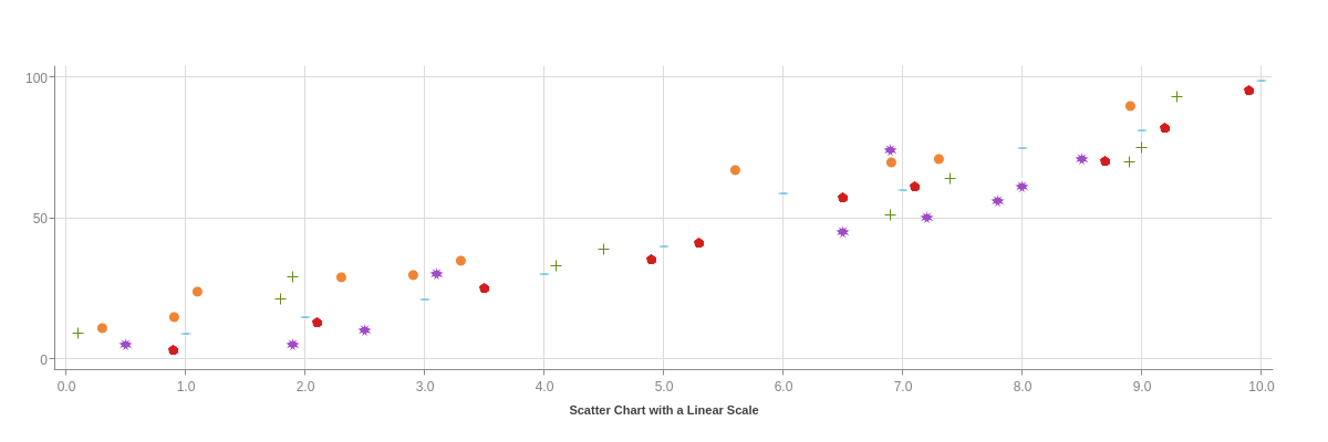
Linear Scale
Linear scales are ZingChart's default scale type. Your starting (or minimum), ending (or maximum), and step scale values are automatically calculated based on the data you provide. You can specify what you want your minimum, maximum, and step scale values to be by adding a values attribute to your scale-x and/or scale-y object. Provide your min/max/step inside a string separated by colons.
{
  'scale-x': {
    values: "0:10:1",    //To specify your minimum, maximum, and step scale values.
    decimals:1
  },
  'scale-y': {
    values: "0:100:50",
  },
}
Logarithmic Scale
Logarithmic scales are also commonly used with scatter charts, typically on the y-axis (scale-y object). This scale type is useful when working with very large data ranges. Create one by adding a progression attribute to your scale object and setting the value to log. Next, add a log-base attribute. Your base value can be Math.E (Euler's number, i.e., the base of natural logarithms) or 10.
{
  'scale-y': {
    progression: "log",
    'log-base':10,
    'thousands-separator': ", "
  },
}

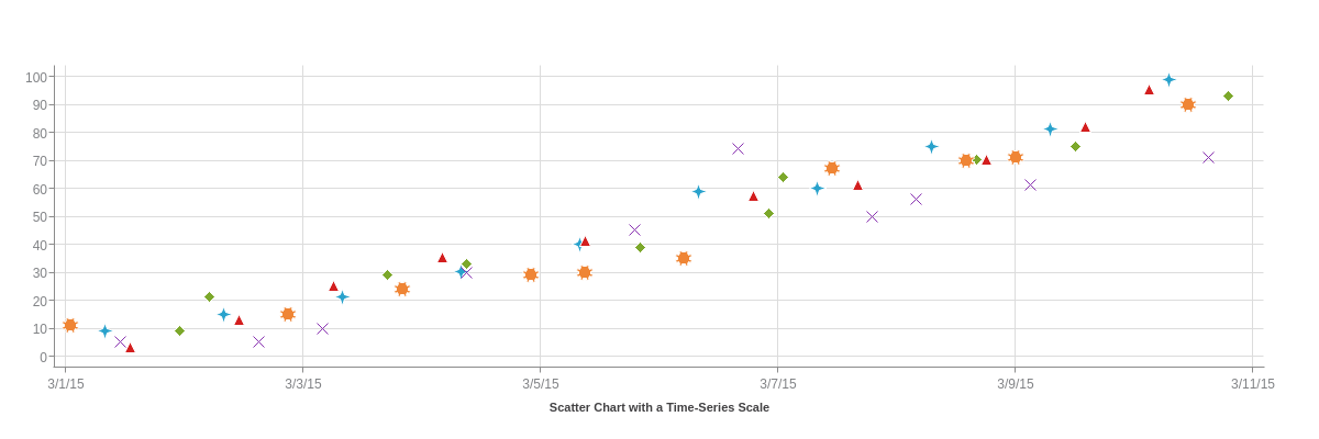
Time-Series Scale
Time-series scales are typically displayed on the x-axis (scale-x object) on scatter charts. This scale type is used to display increments of time, which can range from milliseconds to years. To create one, add a min-value attribute, step attribute, and transform object to your scale object.
For the min-value and step, you'll need to specify your minimum and step scale values in Unix time, in milliseconds. (You can calculate your Unix timestamps with online conversion tools such as Epoch Converter.)
Note: Make sure to provide your Unix time in milliseconds. You can convert seconds to milliseconds by multiplying by 1000.
The transform object will then convert your Unix timestamps into a readable format. Insert a type attribute, and set the value to date. Next, add an all attribute. You can specify how you want your scale formatted by using our ZingChart tokens contained in a string.
Note: To ensure your time-series scale reads in UTC time (ZingChart currently defaults to local time), add a utc attribute, and set the value to true.
{
  utc: true,
  timezone: -8,
  'scale-x': {
    'min-value':1425196800000,
    step: "2day",
    transform: {
      type: "date",
      all: "%m/%d/%y"
    }
  },
}
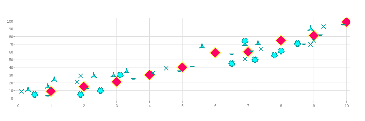
Marker Styling
You can style your scatter chart's markers by modifying their color, size, width, and more. In your marker object, use styling attributes such as background-color and size to modify your marker fill's color and size. You can also modify your border's color and width with the border-color and border-width attributes. Apply these changes globally in your plot object or locally in the appropriate series object.
Note: Our markers are based on ZingChart Shapes, so refer to that page for marker-specific styling.
{
  plot: {
    marker: { //Apply marker styling globally.
      'background-color': "#00FFFF",
      size:7,
      'border-color': "#009999",
      'border-width':2,
      'line-color': "#009999",
      'line-width':2,
    }
  },
  series:[
      {
        marker: {  //Apply marker styling locally.
        type: "diamond",
        'background-color': "#FF0066",
        size:15,
        'border-color': "#FFFF66",
        'border-width':3
        }
      },
  ]
}
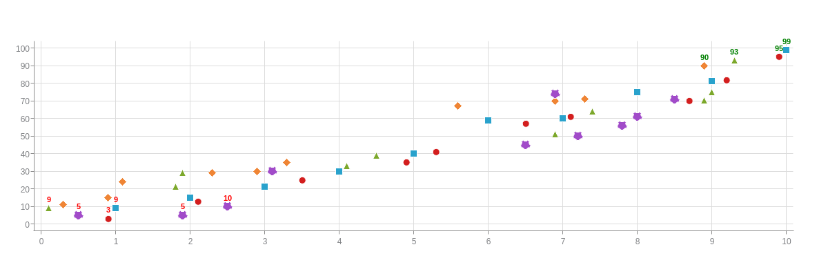
Value Boxes
Value boxes are not visible on scatter charts by default. To include them in your chart, add a value-box object to your plot object. You can style and format them, as well as incorporate rules to force certain value boxes to show under certain conditions (e.g., to highlight outliers, notable data points, or minimum/maximum values).
Note: Read more on rules and tokens in our Logic Rules and JavaScript Tokens tutorials. Browse our JSON Attributes/Syntax page for Value Boxes for further customization options.
In the example chart below, rules were used to display values greater than or equal to 90 and less than or equal to 10.
{
  plot: {
    'value-box': {
      rules: [
        {
          rule: "%v >= 90",
          'font-color': "green"
        },
        {
          rule: "%v >10 && %v < 90",
          visible: false
        },
        {
          rule: "%v <= 10",
          'font-color': "red"
        }
      ]
    }
  },
}
Tooltips
To enable and style tooltips, add a tooltip object to your chart object. You can turn their visibility on or off with a visible attribute. Set the value to true (default) or false.
Specify what text appears with a text attribute. Place your desired text inside a string. ZingChart tokens, such as %v and %t, can be used here. Style your tooltips (font, background, borders) with attributes such as font-color, font-family, background-color, border-color, border-width, and more.
Note: See our Tooltips JSON Attributes/Syntax page for a full list of styling options.
{
  tooltip: {
    text: "%t: %v",
    'font-color': "black",
    'font-family': "Georgia, serif",
    'background-color': "white",
    'border-color': "black",
    'border-width':2
  },
}
Legend
Include a legend in your scatter chart by adding a legend object to your chart object. Not only do legends help users better understand your chart data, it allows them to interact with that data. You can toggle plots on and off by clicking on the legend marker that a plot is associated with (see our example chart below).
Specify the layout and position of your legend using the layout and position attributes; style your text within an item object; and style your legend markers within a marker object.
Note: See our page on ZingChart Legends, as well as our Legends JSON Attributes/Syntax page for more information.
{
  legend: {
    layout: "5x1",
    position: "97% 73%",
    item: {
      'font-color': "brown",
      'font-family': "Georgia"
    },
    'background-color': "white",
    alpha: 0.5,
    'border-color': "none",
    shadow: false,
    marker: {
      type: "inherit"
    }
  },
}