Tooltips
Overview
Tooltips are the labels that appear when users hover over data points on your chart. They generally appear across all ZingChart charts by default, and can display any combination of data values, text, and/or tokens. ZingChart supports standard tooltips, sticky tooltips, fixed tooltips, and HTML tooltips. We also support legend tooltips, x-axis tooltips, and y-axis tooltips. Refer to the Tooltips JSON Attributes/Syntax page for a full list of attribute options.
Note: Chart Tooltips are distinguished from value boxes (fixed labels) and crosshairs (interactive hover labels). They are also not the same thing as dynamic labels which, while similar in appearance to fixed tooltips, are actually standalone labels that utilize tokens.
Formatting
Default Tooltips
Tooltips are visible by default, and they appear when users hover over the data points (or node values) on your chart. Hover over the markers in the following chart to see the tooltips display the corresponding node values.
Note: Sometimes you'll want to turn off the visibility of your tooltips. A common reason is when users add interactive crosshairs to their chart. In the plot object, create a tooltip object. Add a visible attribute, and set the value to false.
{
  type: "area",
  series: [{
    values: [
      35, 42, 67, 89, 25, 34, 67, 85, 30, 33,
      34, 100, 25, 15, 28, 55, 59, 13, 14, 15,
      20, 21, 56, 45, 34, 23, 12, 88, 99, 70,
      65, 87, 56, 35, 45, 78, 67, 87, 67, 89,
      57, 85, 36, 75, 76, 97, 87, 88, 56, 78, 36
    ]
  }]
}
Text and Tokens
To add custom tooltip text, add a text attribute to the tooltip object. You can provide any combination of alphanumeric characters and/or ZingChart tokens. For a full list of available tokens, see our ZingChart Tokens Tutorial.
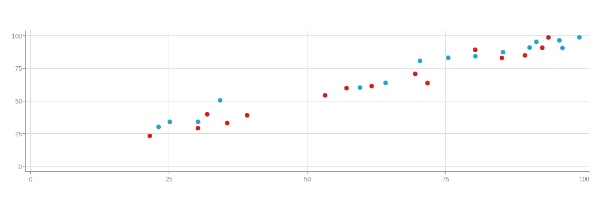
{
  type: "scatter",
  plot: {
    tooltip: {
      text: "On %t, node %node-index is positioned at %kt (X) and %vt (Y)."
    }
  },
  'scale-x': {
    values: "0:100:25"
  },
  'scale-y': {
    values: "0:100:25"
  },
  series: [{
    values: [
      [23.1, 30.3],
      [25.1, 34.3],
      [30.2, 34.2],
      [34.2, 50.5],
      [59.5, 60.5],
      [64.1, 64.2],
      [70.3, 80.9],
      [75.4, 83.4],
      [80.3, 84.3],
      [85.3, 87.5],
      [90.1, 91.2],
      [91.3, 95.3],
      [95.5, 96.5],
      [96.1, 90.5],
      [99.1, 99.1]
    ],
    text: "Blue"
  }, {
    values: [
      [21.5, 23.5],
      [30.2, 29.3],
      [31.9, 39.9],
      [35.5, 33.3],
      [39.1, 39.1],
      [53.2, 54.3],
      [57.1, 60.1],
      [61.6, 61.7],
      [69.5, 70.9],
      [71.7, 63.7],
      [80.3, 89.4],
      [85.1, 83.1],
      [89.3, 84.9],
      [92.4, 90.8],
      [93.5, 98.7]
    ],
    text: "Red"
  }]
}
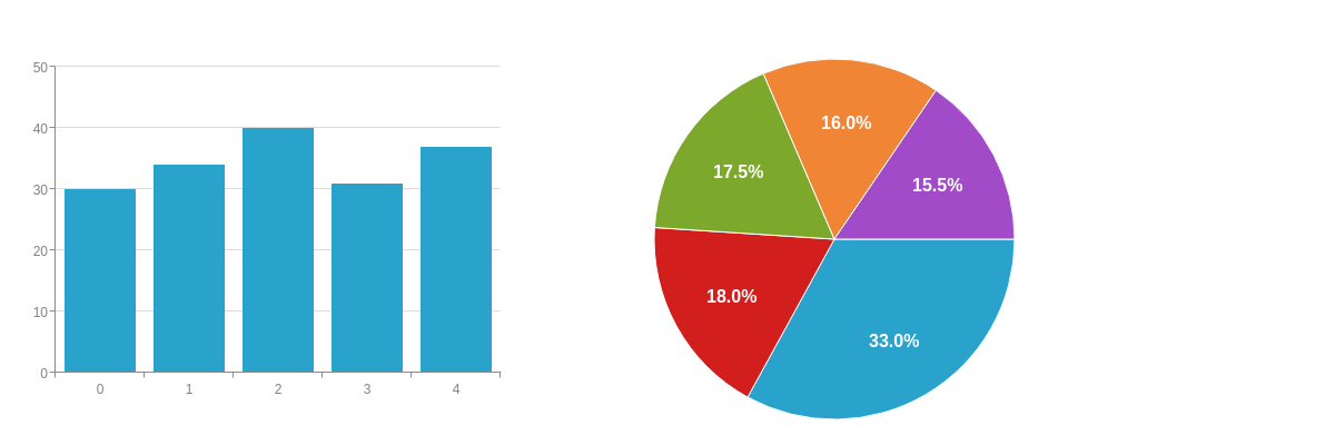
Placement
By default, tooltips follow the movement of the user's mouse cursor. Using the placement attribute allows you to specify where tooltips are fixed relative to their node values. The following options are available for these chart types.
| Chart Type | Placement Options |
|---|---|
| Area, Bar, Bubble, Line, and Scatter Charts | node:top, node:bottom, node:left, node:right, and node:center |
| Pie Charts | node:center and node:out |
In the following chart, the bar chart's placement is set to node:top and the pie chart's placement is set to node:out.
Note: You can fine-tune the placement with the offset-x and/or offset-y attribute(s). Provide a pixel value. The only exception is when the placement is set to node-out on pie charts. Since it is a radius value, use the offset-r attribute to fine-tune the placement.
{
  layout: "1x2",
  graphset: [{
    type: 'bar',
    plot: {
      tooltip: {
        placement: "node:top" //"node:top", "node:bottom", "node:left", "node:right", and "node:center"
      }
    },
    'scale-y': {
      values: "0:50:10"
    },
    series: [{
      values: [30, 34, 40, 31, 37]
    }]
  }, {
    type: 'pie',
    plot: {
      tooltip: {
        placement: "node:out" //"node:center" and "node:out"
      }
    },
    series: [{
      values: [64]
    }, {
      values: [35]
    }, {
      values: [34]
    }, {
      values: [31]
    }, {
      values: [30]
    }]
  }]
}
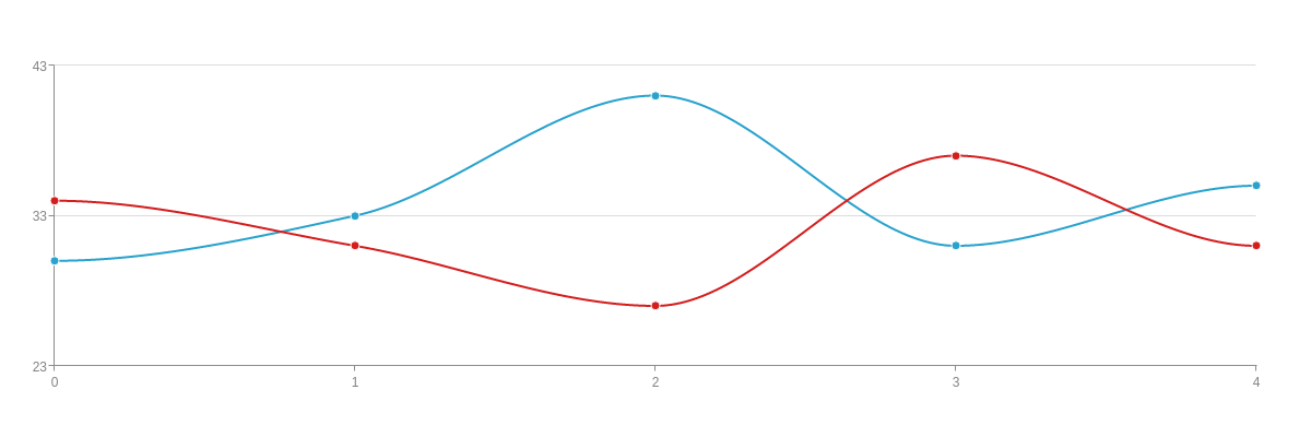
Styling
Font Styling
When styling the tooltip text, use attributes such as font-color, font-family, font-size, font-weight (normal or bold), and font-style (normal or italic) in the tooltip object. See the Tooltips JSON Attributes/Syntax page for more styling options.
{
  type: "line",
  plot: {
    aspect: "spline",
    tooltip: {
      text: "%t: %v Sales",
      'font-color': "white",
      'font-family': "Georgia",
      'font-size': 20,
      'font-weight': "bold",
      'font-style': "normal"
    }
  },
  'scale-y': {
    values: "23:43:10"
  },
  series: [{
    values: [30, 33, 41, 31, 35],
    text: "Blue"
  }, {
    values: [34, 31, 27, 37, 31],
    text: "Red"
  }]
}
Box Styling
When styling the "box" around your tooltips (the background color, borders, padding, callout arrows), use attributes such as background-color, border-width, border-color, line-style (solid, dotted, dashed, or dashdot), border-radius, padding, and callout in the tooltip object. See the Tooltips JSON Attributes/Syntax page for more styling options.

{
  type: "line",
  plot: {
    aspect: "spline",
    tooltip: {
      text: "%t: %v Sales",
      'background-color': "pink",
      'border-width': 1,
      'border-color': "black",
      'line-style': "dashdot",
      'border-radius': "9px",
      padding: "30%",
      callout: true
    }
  },
  'scale-y': {
    values: "23:43:10"
  },
  series: [{
    values: [30, 33, 41, 31, 35],
    text: "Blue"
  }, {
    values: [34, 31, 27, 37, 31],
    text: "Red"
  }]
}
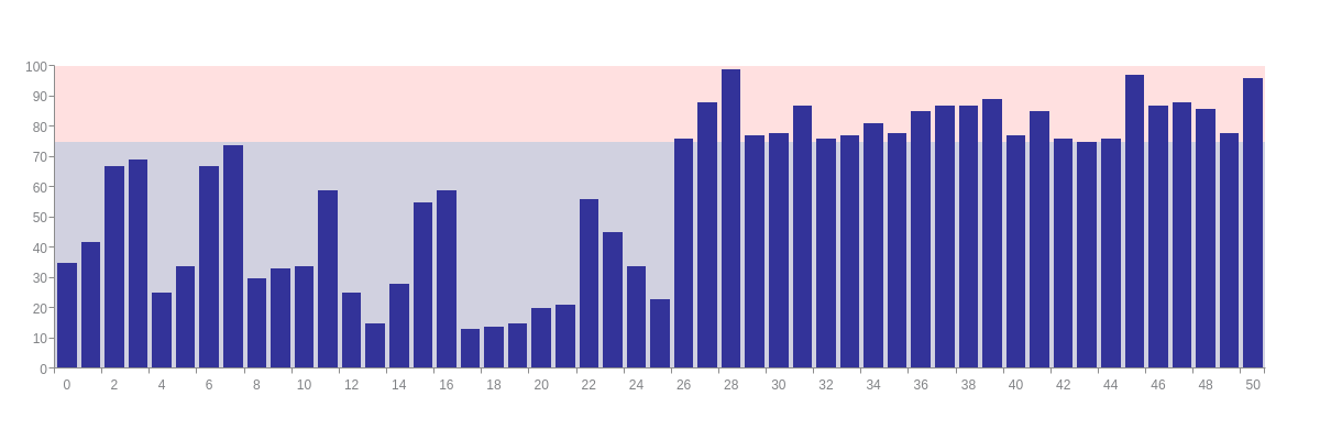
Incorporating Rules
You can use logic rules to specify the formatting and styling of your tooltips based on certain conditions. To get started, create a rules array. Inside the array, create an object for each new rule. Each object must specify the rule (rule attribute) and what happens when the rule is met (the applicable attributes). Refer to our Logic Rules Tutorial and ZingChart Tokens Tutorial for more information.
In the following chart, the rules dictate that data values less than 75 appear purple while values greater than or equal to 75 appear red. Note that attributes that are specific to that rule (the text and background color) are placed in the applicable rules object. Attributes that apply across all tooltips are placed in the general tooltip object.
{
  type: 'bar',
  plot: {
    'background-color': "#333399",
    tooltip: {
      rules: [{ //Rule 1
        rule: "%v < 75",
        text: "%v is<br>less than 75.",
        'background-color': "#666699"
      }, { //Rule 2
        rule: "%v >= 75",
        text: "%v is<br>in the red.",
        'font-weight': "bold",
        'background-color': "#ff9999"
      }],
      'font-color': "black",
      'font-family': "Georgia",
      'font-size': 12,
      alpha: 0.5,
      'border-color': "#333399",
      'border-width': 1,
      padding: "20%",
      'border-radius': "9px"
    }
  },
  'scale-y': {
    guide: {
      visible: false
    },
    markers: [{
      type: "area",
      range: [0, 75],
      'background-color': "#666699",
      alpha: 0.3
    }, {
      type: "area",
      range: [75, 100],
      'background-color': "#ff9999",
      alpha: 0.3
    }]
  },
  series: [{
    values: [
      35, 42, 67, 69, 25, 34, 67, 74, 30, 33,
      34, 59, 25, 15, 28, 55, 59, 13, 14, 15,
      20, 21, 56, 45, 34, 23, 76, 88, 99, 77,
      78, 87, 76, 77, 81, 78, 85, 87, 87, 89,
      77, 85, 76, 75, 76, 97, 87, 88, 86, 78, 96
    ]
  }]
}
Tooltip Types
In addition to standard tooltips, you can create custom sticky tooltips, fixed tooltips, and HTML tooltips. You can also create tooltips that appear when you hover over items on the legend or x- and y-axis scales.
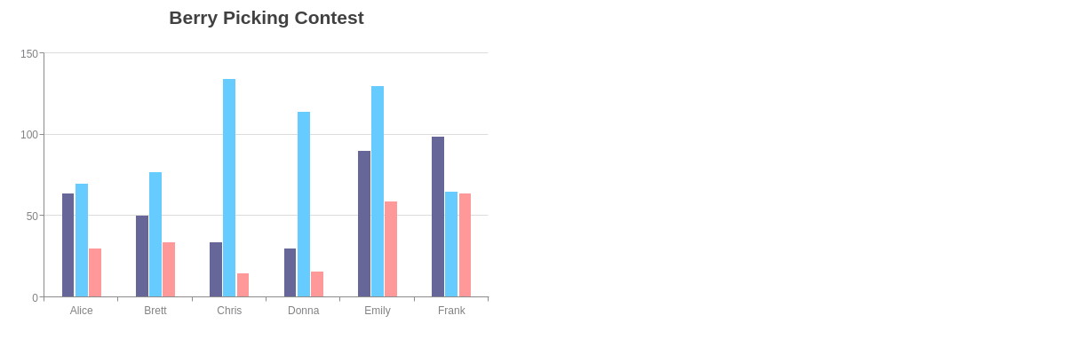
Standard Tooltips
Our standard tooltips appear like so, and can be formatted and styled as discussed in the above sections.
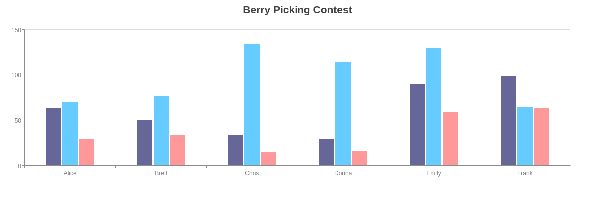
{
  type: 'bar',
  title: {
    text: "Berry Picking Contest"
  },
  plot: {
    'bars-space-left': "25%",
    'bars-space-right': "25%",
    tooltip: {
      text: "%kl picked<br>%v %t.",
      placement: "node:top",
      padding: "10%",
      'border-radius': "5px"
    }
  },
  'scale-x': {
    labels: [ "Alice", "Brett", "Chris", "Donna", "Emily", "Frank" ]
  },
  'scale-y': {
    values: "0:150:50"
  },
  series: [{
    values: [64, 50, 34, 30, 90, 99],
    'background-color': "#666699",
    text: "blackberries"
  }, {
    values: [70, 77, 134, 114, 130, 65],
    'background-color': "#66ccff",
    text: "blueberries"
  }, {
    values: [30, 34, 15, 16, 59, 64],
    'background-color': "#ff9999",
    text: "cloudberries"
  }]
}
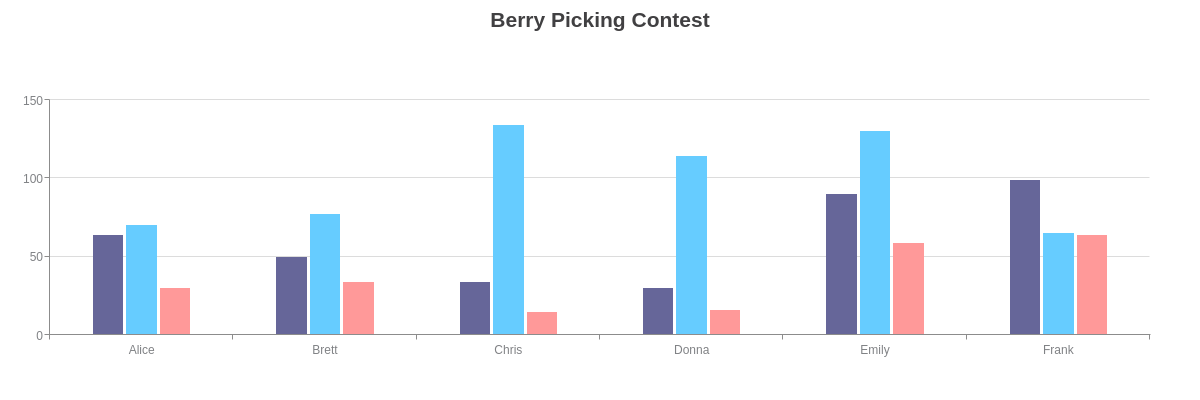
Sticky Tooltips
Sticky tooltips stay visible on the screen for a longer period of time. It is a useful feature because it allows the user more time to interact with what's contained in your tooltips (information, tables, links) and is often used with fixed and/or HTML tooltips. In the tooltip object, add a sticky attribute and set the value to true. Next, add a timeout attribute, and provide a value in milliseconds. To keep tooltips "stickied" on the screen for 5 seconds, for example, provide a value of 5000.

{
  type: 'bar',
  title: {
    text: "Berry Picking Contest"
  },
  plot: {
    'bars-space-left': "25%",
    'bars-space-right': "25%",
    tooltip: {
      text: "%kl picked<br>%v %t.",
      placement: "node:top",
      padding: "10%",
      'border-radius': "5px",
      sticky: true, //Set to true.
      timeout: 5000 //Provide value in milliseconds.
    }
  },
  'scale-x': {
    labels: [ "Alice", "Brett", "Chris", "Donna", "Emily", "Frank" ]
  },
  'scale-y': {
    values: "0:150:50"
  },
  series: [{
    values: [64, 50, 34, 30, 90, 99],
    'background-color': "#666699",
    text: "blackberries"
  }, {
    values: [70, 77, 134, 114, 130, 65],
    'background-color': "#66ccff",
    text: "blueberries"
  }, {
    values: [30, 34, 15, 16, 59, 64],
    'background-color': "#ff9999",
    text: "cloudberries"
  }]
}
Fixed Tooltips
Fixed tooltips allow you to "fix" or place the tooltips at a specified location. They are generally used with sticky tooltips so that the tooltips appear and stay at the assigned area of your chart for a designated period of time. To specify where your tooltips will appear, add x and y attributes to the tooltip object. Provide percentage values. In the following chart, the fixed tooltips appear below the title.
{
  type: 'bar',
  title: {
    text: "Berry Picking Contest"
  },
  plotarea: {
    'margin-top': "25%"
  },
  plot: {
    'bars-space-left': "25%",
    'bars-space-right': "25%",
    tooltip: {
      text: "%kl picked %v %t.",
      padding: "10%",
      'border-radius': "5px",
      sticky: true,
      timeout: 10000,
      x: "37%", //Specify x position.
      y: "12%" //Specify y position.
    }
  },
  'scale-x': {
    labels: [ "Alice", "Brett", "Chris", "Donna", "Emily", "Frank" ]
  },
  'scale-y': {
    values: "0:150:50"
  },
  series: [{
    values: [64, 50, 34, 30, 90, 99],
    'background-color': "#666699",
    text: "blackberries"
  }, {
    values: [70, 77, 134, 114, 130, 65],
    'background-color': "#66ccff",
    text: "blueberries"
  }, {
    values: [30, 34, 15, 16, 59, 64],
    'background-color': "#ff9999",
    text: "cloudberries"
  }]
}
Note that fixed labels are not the same thing as dynamic labels. While both are fixed to a specific area of the chart and can utilize tokens, dynamic labels are standalone labels and created via a labels array. See the example chart with dynamic labels below.
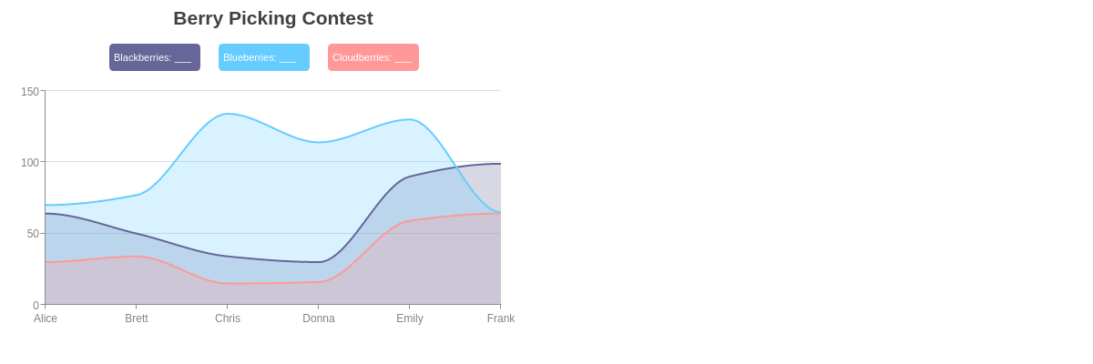
{
  type: "area",
  title: {
    text: "Berry Picking Contest"
  },
  plotarea: {
    'margin-top': "25%"
  },
  labels: [{ //Dynamic Labels
    text: "Blackberries: %plot-0-value",
    'default-value': "___",
    'text-align': "left",
    'background-color': "#666699",
    'font-color': "white",
    padding: "5%",
    'border-radius': "5px",
    height: "30px",
    width: "100px",
    x: "20%",
    y: "12%"
  }, {
    text: "Blueberries: %plot-1-value",
    'default-value': "___",
    'text-align': "left",
    'background-color': "#66ccff",
    'font-color': "white",
    padding: "5%",
    'border-radius': "5px",
    height: "30px",
    width: "100px",
    x: "40%",
    y: "12%"
  }, {
    text: "Cloudberries: %plot-2-value",
    'default-value': "___",
    'text-align': "left",
    'background-color': "#ff9999",
    'font-color': "white",
    padding: "5%",
    'border-radius': "5px",
    height: "30px",
    width: "100px",
    x: "60%",
    y: "12%"
  }],
  'crosshair-x': {
    'plot-label': {
      visible: false
    }
  },
  plot: {
    aspect: "spline",
    marker: {
      visible: false
    },
    tooltip: {
      visible: false
    }
  },
  'scale-x': {
    labels: [ "Alice", "Brett", "Chris", "Donna", "Emily", "Frank" ]
  },
  'scale-y': {
    values: "0:150:50"
  },
  series: [{
    values: [64, 50, 34, 30, 90, 99],
    text: "Blackberries",
    'line-color': "#666699",
    'background-color': "#666699"
  }, {
    values: [70, 77, 134, 114, 130, 65],
    text: "Blueberries",
    'line-color': "#66ccff",
    'background-color': "#66ccff",
  }, {
    values: [30, 34, 15, 16, 59, 64],
    'line-color': "#ff9999",
    'background-color': "#ff9999",
  }]
}
HTML Tooltips
HTML tooltips allow you to incorporate HTML markup into your tooltips. This means you can display tables, images, and more. In the tooltip object, add an html-mode attribute. Set the value to true. Then in the text attribute, provide your HTML markup. Remember that you can incorporate tokens such as %v, %t, and %kl, as well as create your own custom tokens (%data-_____). Refer to the ZingChart Tokens Tutorial for more information.

{
  type: 'bar',
  title: {
    'text': 'Berry Picking Contest'
  },
  plot: {
    'bars-space-left': '25%',
    'bars-space-right': '25%',
    tooltip: { //HTML Tooltips
      text: "<table border='1'><tr><td colspan=2><strong>%kl</strong></td></tr><tr><td style='width:100px'>%data-photo</td><td style='width:100px'><em>%kl</em> picked %v %t in this year's berry picking contest.</td></tr></table>",
      'html-mode': true
    }
  },
  'scale-x': {
    labels: [ 'Alice', 'Brett', 'Chris', 'Donna', 'Emily', 'Frank' ]
  },
  'scale-y': {
    values: '0:150:50'
  },
  series: [{
    values: [64, 50, 34, 30, 90, 99],
    'background-color': '#666699',
    text: 'blackberries',
    'data-photo': '<img src="https://www.zingchart.com/images/blackberry.jpg" height="80" width="100">'
  }, {
    values: [70, 77, 134, 114, 130, 65],
    'background-color': '#66ccff',
    text: 'blueberries',
    'data-photo': '<img src="https://www.zingchart.com/images/blueberry.jpg" height="80" width="100">'
  }, {
    values: [30, 34, 15, 16, 59, 64],
    'background-color': '#ff9999',
    text: 'cloudberries',
    'data-photo': '<img src="https://www.zingchart.com/images/cloudberry.jpg" height="80" width="100">'
  }]
}
Legend Tooltips
In your legend object, create a tooltip object. Add a text attribute. You can use tokens such as %plot-text or %plot-description. In the following chart, hover over the legend items to see the tooltips. Note that you can incorporate sticky and fixed tooltip features in legend tooltips.
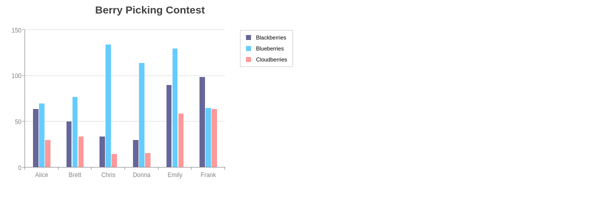
{
  type: 'bar',
  title: {
    text: "Berry Picking Contest"
  },
  legend: {
    x: "80%",
    y: "15%",
    tooltip: { //Legend Tooltips
      text: "%plot-text %plot-description",
      'font-color': "gray",
      'font-family': "Georgia",
      'background-color': "white",
      'border-color': "gray",
      'border-width': 2,
      'line-style': "dashdot",
      padding: "5%",
      'wrap-text': true,
      width: "17%",
      height: "43%",
      //with sticky tooltip feature
      sticky: true,
      timeout: 30000,
      //and fixed tooltip feature
      x: "80%",
      y: "39%"
    }
  },
  plotarea: {
    'margin-right': "25%"
  },
  plot: {
    'bars-space-left': "25%",
    'bars-space-right': "25%",
    tooltip: {
      visible: false
    }
  },
  'scale-x': {
    labels: [ "Alice", "Brett", "Chris", "Donna", "Emily", "Frank" ]
  },
  'scale-y': {
    values: "0:150:50"
  },
  series: [{
    values: [64, 50, 34, 30, 90, 99],
    'background-color': "#666699",
    text: "Blackberries",
    description: "are composed of many tiny berries, which are known as drupes. They grow in the wild and are also cultivated commercially."
  }, {
    values: [70, 77, 134, 114, 130, 65],
    'background-color': "#66ccff",
    text: "Blueberries",
    description: "are high in antioxidants. They are one of the most popular berry types in the United States and pair well with Greek yogurt."
  }, {
    values: [30, 34, 15, 16, 59, 64],
    'background-color': "#ff9999",
    text: "Cloudberries",
    description: "are unique in coloring, ranging from amber to red. They grow where it is cold, and are considered delicacies in Norway and Finland."
  }]
}
Scale Tooltips
In your scale-x and/or scale-y object(s), create a tooltip object. Add a text attribute. You can provide any combination of text and the %scale-value (or %v) token. In the following chart, hover over the scale labels to see the tooltips. Note that you can incorporate sticky and fixed tooltip features in legend tooltips.
{
  type: 'bar',
  title: {
    text: "Berry Picking Contest"
  },
  plot: {
    'bars-space-left': "25%",
    'bars-space-right': "25%",
    tooltip: {
      visible: false
    }
  },
  'scale-x': {
    labels: [ "Alice", "Brett", "Chris", "Donna", "Emily", "Frank" ],
    tooltip: { //X-Axis Tooltips
      text: "%v picked<br>blackberries,<br>blueberries, and<br>cloudberries.",
      'font-color': "gray",
      'font-family': "Georgia",
      'background-color': "white",
      'border-color': "gray",
      'border-width': 1,
      'line-style': "dotted",
      padding: "15%",
      //with sticky tooltip feature
      sticky: true,
      timeout: 30000,
      //and fixed tooltip feature
      x: "75%",
      y: "5%"
    }
  },
  'scale-y': {
    values: "0:150:50",
    tooltip: { //Y-Axis Tooltips
      text: "%v<br>berries",
      'font-color': "gray",
      'font-family': "Georgia",
      'background-color': "white",
      'border-color': "gray",
      'border-width': 1,
      'line-style': "dashed",
      padding: "5%"
    }
  },
  series: [{
    values: [64, 50, 34, 30, 90, 99],
    'background-color': "#666699",
    text: "Blackberries"
  }, {
    values: [70, 77, 134, 114, 130, 65],
    'background-color': "#66ccff",
    text: "Blueberries"
  }, {
    values: [30, 34, 15, 16, 59, 64],
    'background-color': "#ff9999",
    text: "Cloudberries"
  }]
}
Summary
Tooltips appear when you hover over a chart node or shape, and usually display the value of that node. ZingChart tooltips can be fully customized to display any data you wish and can be extensively styled.
For a full list of tooltip attributes, see the JSON configuration page.