Scale Configuration
Overview
Chart scale configuration is an integral part of data visualization. This document goes over the different scale types, how to format the scales, the different elements (or parts) of a scale, and how to incorporate secondary and blended scales. Refer to the scaleX and scaleY JSON pages for a full list of objects and attributes.
Scale Types
ZingChart currently supports linear, category, time-series, and logarithmic scales on the x- and/or y-axes.
Linear Scale
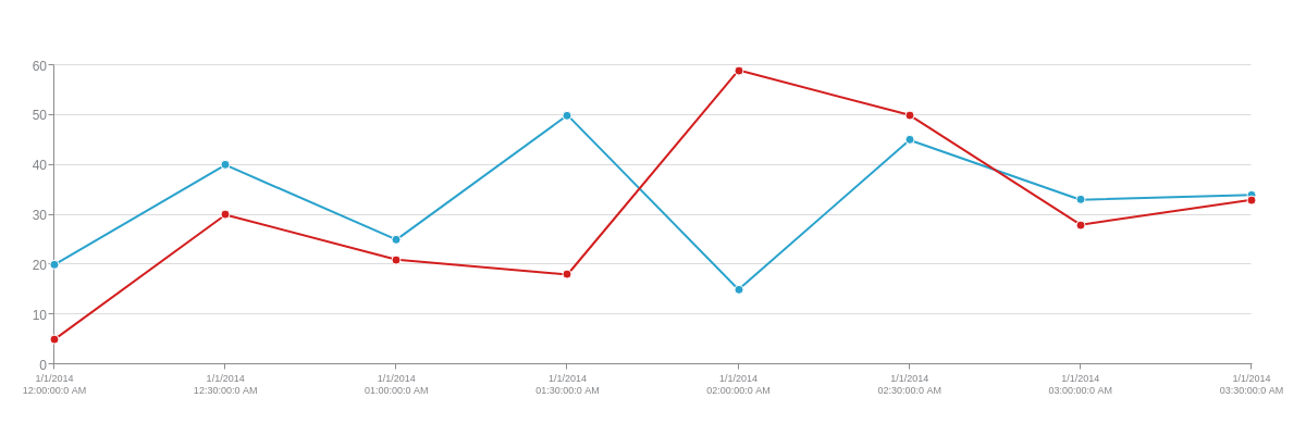
Linear scales (also known as arithmetic scales) are our default scale type. The starting (minimum) values for both axes is zero. On the x-axis, the scale values increase sequentially by one. On the y-axis, the scale automatically calculates the ending (maximum) and step scale values based on the size of your data. Without further formatting, the default scales of a simple array chart appear like this.
{
  type: "line",
  series: [
    {
      values: [20,40,25,50,15,45,33,34]
    },
    {
      values: [5,30,21,18,59,50,28,33]
    }
  ]
}
While ZingChart automatically calculates the minimum, maximum, and step scale values, you can specify the exact values using the values attribute or the min-value, max-value, and step attributes. You can also format the scale values to display as currencies, percentages, short units, scientific notation, and more using the format and other attributes. See the following chart and the Scale Formatting section for more information.
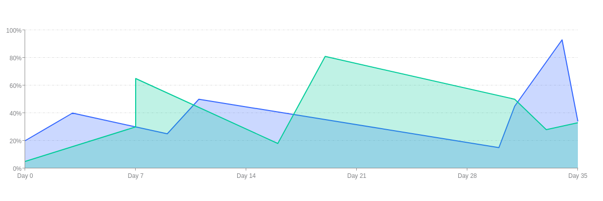
{
  type: "area",
  'scale-x': {
    values: "0:35:7",
    format: "Day %v"
  },
  'scale-y': {
    values: "0:100:20",
    format: "%v%",
    guide: {
      'line-style': "dashdot"
    }
  },
  plot: {
    'contour-on-top': false,
    marker: {
      visible: false
    }
  },
  series: [
    {
      values: [
        [0,20],
        [3,40],
        [9,25],
        [11,50],
        [30,15],
        [31,45],
        [34,93],
        [35,34]
      ],
      'line-color': "#3366ff",
      'background-color': "#3366ff"
    },
    {
      values: [
        [0,5],
        [7,30],
        [7,65],
        [16,18],
        [19,81],
        [31,50],
        [33,28],
        [35,33]
      ],
      'line-color': "#00cc99",
      'background-color': "#00cc99"
    }
  ]
}
Category Scale
Category scales (also known as qualitative scales) describe names, places, events, and more through the use of scale labels. There are two ways to create one:
- Add a
labelsarray in thescale-xand/orscale-yobject(s). - Alternatively: You can use a
valuesarray in thescale-xand/orscale-yobject(s).
The labels array is generally the preferred way to create category scale labels. Provide the scale labels you want displayed, using any combination of alphanumeric characters
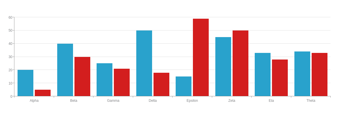
{
  type: 'bar',
  'scale-x': {
    labels: [ "Alpha", "Beta", "Gamma", "Delta", "Epsilon", "Zeta", "Eta", "Theta" ]
  },
  series: [
    {
      values: [20,40,25,50,15,45,33,34]
    },
    {
      values: [5,30,21,18,59,50,28,33]
    }
  ]
}
You can, alternatively, use a values array. The two array types are similar in that they create scale labels to the extent that the text is provided. They differ in that the values array also acts as a maximum scale value. The difference is best illustrated in the following chart:
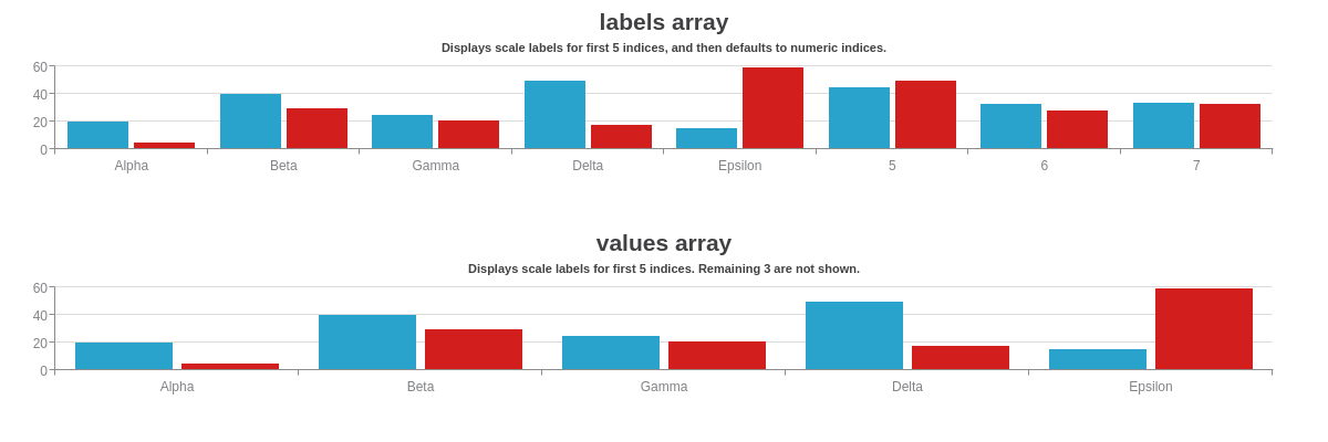
{
  graphset: [
    {
      type: 'bar',
      title: {
        text: "labels array"
      },
      subtitle: {
        text: "Displays scale labels for first 5 indices, and then defaults to numeric indices."
      },
      'scale-x': {
        labels: [ "Alpha", "Beta", "Gamma", "Delta", "Epsilon" ]
      },
      series: [
        {
          values: [20,40,25,50,15,45,33,34]
        },
        {
          values: [5,30,21,18,59,50,28,33]
        }
      ]
    },
    {
      type: 'bar',
      title: {
        text: "values array"
      },
      subtitle: {
        text: "Displays scale labels for first 5 indices. Remaining 3 are not shown."
      },
      'scale-x': {
        values: [ "Alpha", "Beta", "Gamma", "Delta", "Epsilon" ]
      },
      series: [
        {
          values: [20,40,25,50,15,45,33,34]
        },
        {
          values: [5,30,21,18,59,50,28,33]
        }
      ]
    }
  ]
}
Time-Series Scale
Time-series scales are used to display increments of time ranging from milliseconds to years. To create one, you need to:
- Add a
transformobject in thescale-xand/orscale-yobject(s). - Add a
utcattribute in the chart object. - Add a
timezoneattribute in the chart object.
The transform object is used to convert Unix timestamps into a more readable format. Add a type attribute and set the value to date. Next, add an all attribute and specify how you want the date formatted using ZingChart time-series tokens. Use the utc attribute to set the chart to UTC time. (ZingChart otherwise defaults to local time.) You can then use the timezone attribute to specify the timezone, or UTC offset value.
{
  type: "line",
  'scale-x': {
    'min-value':1388534400000,
    step: "30minute",
    transform: {
      type: "date",
      all: "%m/%d/%Y<br>%h:%i:%s:%q %A"
    },
    item: {
      'font-size':9
    }
  },
  utc: true,
  timezone: 0,
  series: [
    {
      values: [20,40,25,50,15,45,33,34]
    },
    {
      values: [5,30,21,18,59,50,28,33]
    }
  ]
}
ZingChart uses Unix time (also known as Epoch time), which is measured by the number of milliseconds that have elapsed since January 1, 1970, in Coordinated Universal Time (UTC). This is reflected in the default starting and step scale values, as you can see in the above chart. To specify your own starting and step scale values, use the min-value and step attributes in the applicable scale object. Provide the scale values in Unix time. To calculate the timestamps, you can use an online conversion tool such as Epoch Converter.
Note: ZingChart accepts Unix time values in milliseconds, not seconds. To convert from seconds to milliseconds, multiply by 1000.
We created the following shorthand values that you can use in lieu of timestamps when calculating your step. You can add a multiplier to any of these terms, e.g., 2hour, 3day or 4week.
| Step Value | Milliseconds |
|---|---|
| second | 1000 |
| minute | 60000 |
| hour | 3600000 |
| day | 86400000 |
| week | 604800000 |
| month (approximate) | 2629743000 |
| year (approximate) | 31556926000 |
The below stock chart uses a time-series scale and time-series array of array data. It also features interactive crosshairs and a zooming scrollbar.
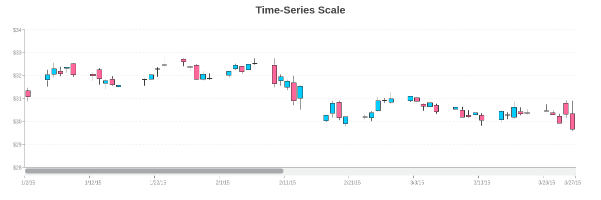
{
  type: "stock",
  title: {
    text: "Time-Series Scale"
  },
  utc: true,
  timezone:-5, //EST time
  'scale-x': {
    'min-value':1420232400000,
    step: "day",
    transform: {
      type: "date",
      all: "%m/%d/%y"
    },
    item: {
      'font-size':10
    },
    'max-items':10,
    zooming: true,
    'zoom-to-values': [1420232400000,1427490000000]
  },
  'scale-y': {
    values: "28:34:1",
    format: "$%v",
    item: {
      'font-size':10
    },
    guide: {
      'line-style': "dotted"
    }
  },
  'scroll-x': {

  },
  'crosshair-x': {
    'line-width': "100%",
    alpha:0.3,
    'plot-label': {
      text: "Open: $%open<br>High: $%high<br>Low: $%low<br>Close: $%close",
      decimals:2,
      multiple: true,
      placement: "node-top",
      'offset-y':-7,
    },
    'scale-label': {
      text: "%v",
      transform: {
        type: "date",
        all: "%D, %m/%d/%y"
      }
    }
  },
  plot: {
    aspect: "candlestick",
    tooltip: {
      visible: false
    },
    'trend-up': {
      'background-color': "#00ccff",
      'line-color': "#333333",
      'border-color': "#333333"
    },
    'trend-down': {
      'background-color': "#ff6699",
      'line-color': "#333333",
      'border-color': "#333333"
    }
  },
  series: [
    {
      values: [
        [1420232400000, [31.34,    31.46,    30.87,    31.06]], //01/02/15
        //Omitted for brevity.
        [1435698000000, [30.15,    30.90,    29.81,    30.81]], //06/30/15
      ]
    }
  ]
}
Logarithmic Scale
Logarithmic scales are used on charts with large data ranges. Each tick mark is based on the previous one that is multiplied by a value. To create one, you need to:
- Add a
progressionattribute in thescale-xand/orscale-yobject(s). - Add a
log-baseattribute in thescale-xand-orscale-yobject(s).
Set the progression attribute to log, which will change the scale type from linear to logarithmic. Use the log-base attribute to specify the base value. (ZingChart otherwise defaults to Math.E, i.e., Euler's number, the base of natural logarithms.)
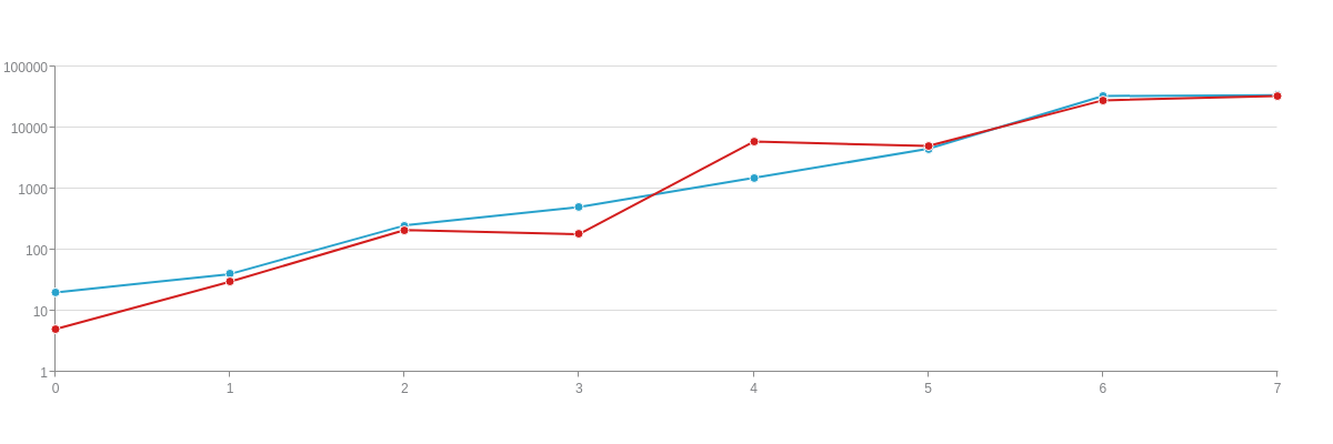
{
  type: "line",
  'scale-y': {
    progression: "log",
    'log-base': 10
  },
  series: [
    {
      values: [20,40,250,500,1500,4500,33000,34000]
    },
    {
      values: [5,30,210,180,5900,5000,28000,33000]
    }
  ]
}
The below line chart uses a logarithmic scale to illustrate the acceleration of two different rockets. Notice how the minor guides help to show the progression.
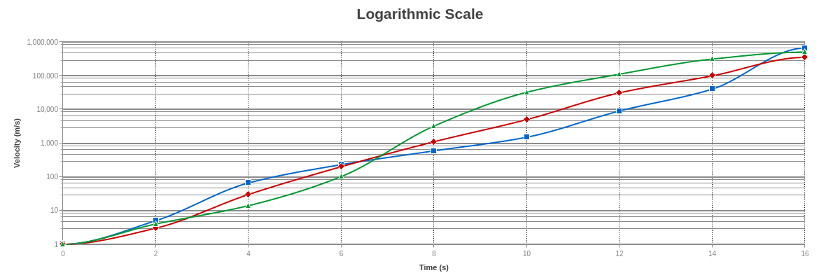
{
  type: "line",
  title: {
    text: "Logarithmic Scale"
  },
  'crosshair-x': {
    'plot-label': {
      text: "%t: %v m/s",
      'thousands-separator': ", ",
      'background-color': "white",
      'border-width': 1,
      'border-color': "gray",
      'border-radius': "5px",
      multiple: true
    },
    'scale-label': {
      text: "%v seconds",
      'font-color': "black",
      'background-color': "white",
      'border-width': 1,
      'border-color': "gray",
      'border-radius': "5px",
    },
    'line-color': "black",
    'line-width': 1
  },
  'scale-x': {
    values: "0:16:2",
    label: {
      text: "Time (s)"
    },
    item: {
      'font-size': 10
    },
    guide: {
      visible: true,
      'line-color': "black",
      'line-style': "dotted",
      alpha: 1
    }
  },
  'scale-y': {
    progression: "log",
    'log-base': 10,
    'thousands-separator': ", ",
    label: {
      text: "Velocity (m/s)"
    },
    item: {
      'font-size': 10
    },
    guide: {
      'line-style': "solid",
      'line-width': 2,
      'line-color': "gray",
      alpha: 0.9
    },
    'minor-ticks': 4,
    'minor-guide': {
      'line-style': "solid",
      'line-width': 1,
      'line-color': "gray",
      alpha: 0.9
    }
  },
  plot: {
    aspect: "spline",
    tooltip: {
      visible: false
    }
  },
  plotarea: {
    'margin-left': "dynamic",
    'margin-bottom': "dynamic"
  },
  series: [
    {
      values: [
        [0,0],
        [2,5],
        [4,66],
        [6,230],
        [8,590],
        [10,1500],
        [12,9000],
        [14,40000],
        [16,660000]
      ],
      text: "Rocket A",
      'line-color': "#0066cc",
      marker: {
        type: "square",
        'background-color': "#0066cc"
      },
      'guide-label': {
        'font-color': "#0066cc"
      }
    },
    {
      values: [
        [0,0],
        [2,3],
        [4,30],
        [6,200],
        [8,1100],
        [10,5000],
        [12,31000],
        [14,99000],
        [16,350000]
      ],
      text: "Rocket B",
      'line-color': "#cc0000",
      marker: {
        type: "diamond",
        'background-color': "#cc0000"
      },
      'guide-label': {
        'font-color': "#cc0000"
      }
    },
    {
      values: [
        [0,0],
        [2,4],
        [4,14],
        [6,102],
        [8,3200],
        [10,32200],
        [12,111000],
        [14,311000],
        [16,500000]
      ],
      text: "Rocket B",
      'line-color': "#009933",
      marker: {
        type: "triangle",
        'background-color': "#009933"
      },
      'guide-label': {
        'font-color': "#009933"
      }
    }
  ]
}
Scale Formatting
The scales can be formatted to start and end at specified values, and with specified intervals (or steps). You can format the scale values to display as currencies, percentages, short units, scientific notation, and more. This section goes over some of the most commonly used formatting attributes. Refer to the X-Axis Scale and Y-Axis Scale JSON pages for a comprehensive list.
Min/Max/Step
There are two ways to specify the minimum, maximum, and step scale values:
valuesattributemin-value,max-value, andstepattributes
With a values attribute, add it to the applicable scale object(s). Provide your minimum, maximum, and step scale values separated by colons in a single string. (You must provide the min and max. Step value is optional.)
Tip: Datasets don't always reveal an obvious step value, especially when the data range is very small or very large. To ensure a uniform step, you can calculate the appropriate value by subtracting the minimum value from the maximum value. Divide the result by the number of steps you want displayed on the scale. Use the result as your step scale value.
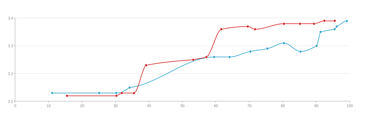
{
  type: "line",
  'scale-x': {
    values: "0:100:10" //Min/Max/Step
  },
  'scale-y': {
    values: "3.1:3.4:0.1" //Min/Max/Step
  },
  plot: {
    aspect: "spline",
    tooltip: {
      text: "X: %kt<br>Y: %vt",
      'text-align': "center",
      'font-color': "black",
      'background-color': "white",
      'border-width': 1,
      'border-color': "gray",
      'border-radius': "7px",
      alpha:0.5,
      padding: "7%"
    }
  },
  series: [
    {
      values: [
        [11.1,3.13],
        [25.1,3.13],
        [30.2,3.13],
        [34.2,3.15],
        [59.5,3.26],
        [64.1,3.26],
        [70.3,3.28],
        [75.4,3.29],
        [80.3,3.31],
        [85.3,3.28],
        [90.1,3.30],
        [91.3,3.35],
        [95.5,3.36],
        [96.1,3.37],
        [99.1,3.39]
      ]
    },
    {
      values: [
        [15.5,3.12],
        [30.2,3.12],
        [31.9,3.13],
        [35.5,3.13],
        [39.1,3.23],
        [53.2,3.25],
        [57.1,3.26],
        [61.6,3.36],
        [69.5,3.37],
        [71.7,3.36],
        [80.3,3.38],
        [85.1,3.38],
        [89.3,3.38],
        [92.4,3.39],
        [95.5,3.39]
      ]
    }
  ]
}
Alternatively, you can use individual attributes. In the scale object(s), specify the following: min-value, max-value, and/or step. You can use one, two, or all of the attributes. For each, provide the applicable value.
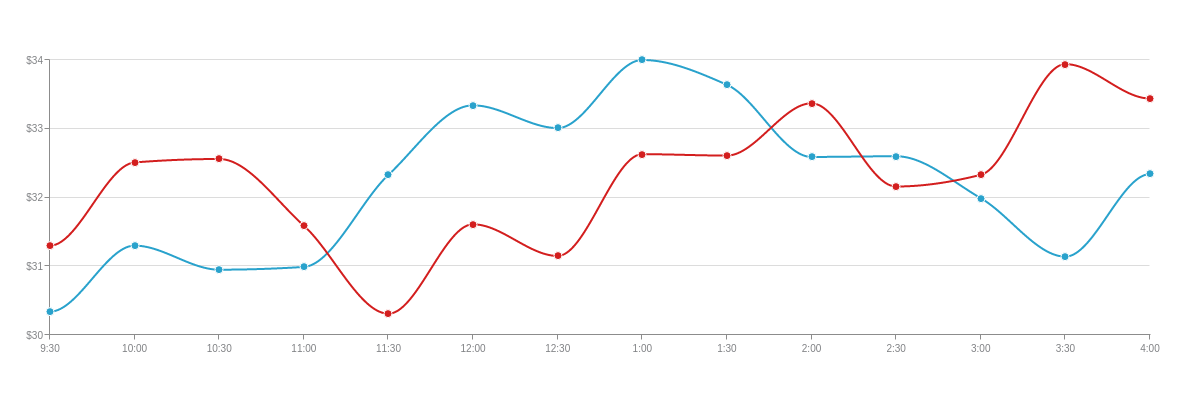
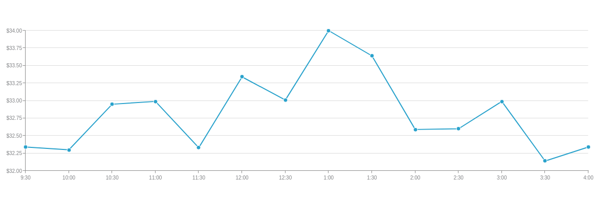
{
  type: "line",
  utc: true,
  timezone:-5, //EST time
  'scale-x': {
    'min-value': "1457101800000", //Min Value
    'max-value': "1457125200000", //Max Value
    step: "30minute", //Step Value
    transform: {
      type: "date",
      all: "%g:%i"
    },
    item: {
      'font-size':10
    },
    'max-items':14
  },
  'scale-y': {
    values: "30:34:1", //Min/Max/Step
    format: "$%v",
    item: {
      'font-size':10
    }
  },
  plot: {
    aspect: "spline",
    tooltip: {
      text: "$%v<br>at<br>%kv",
      decimals:2,
      'text-align': "center",
      'font-color': "black",
      'background-color': "white",
      'border-width': 1,
      'border-color': "gray",
      'border-radius': "7px",
      alpha:0.5,
      padding: "7%"
    }
  },
  series: [
    {
      values: [
        [1457101800000,30.34], //03/04/2016 at 9:30 a.m. EST
        [1457103600000,31.30], //10:00 a.m.
        [1457105400000,30.95], //10:30 a.m.
        [1457107200000,30.99], //11:00 a.m.
        [1457109000000,32.33], //11:30 a.m.
        [1457110800000,33.34], //12:00 p.m.
        [1457112600000,33.01], //12:30 p.m.
        [1457114400000,34], //1:00 p.m.
        [1457116200000,33.64], //1:30 p.m.
        [1457118000000,32.59], //2:00 p.m.
        [1457119800000,32.60], //2:30 p.m.
        [1457121600000,31.99], //3:00 p.m.
        [1457123400000,31.14], //3:30 p.m.
        [1457125200000,32.34], //4:00 p.m.
      ]
    },
    {
      values: [
        [1457101800000,31.30], //03/04/2016 at 9:30 a.m. EST
        [1457103600000,32.51], //10:00 a.m.
        [1457105400000,32.56], //10:30 a.m.
        [1457107200000,31.59], //11:00 a.m.
        [1457109000000,30.31], //11:30 a.m.
        [1457110800000,31.61], //12:00 p.m.
        [1457112600000,31.15], //12:30 p.m.
        [1457114400000,32.63], //1:00 p.m.
        [1457116200000,32.61], //1:30 p.m.
        [1457118000000,33.37], //2:00 p.m.
        [1457119800000,32.16], //2:30 p.m.
        [1457121600000,32.33], //3:00 p.m.
        [1457123400000,33.94], //3:30 p.m.
        [1457125200000,33.44], //4:00 p.m.
      ]
    }
  ]
}
Inverted Scales
To invert, or mirror, a scale, use the mirrored attribute.
Formatting of Scale Values
Use the format attribute and %scale-value (%v) token to format the scale values. The token can be combined with alphanumeric and/or special characters to display the scale values as currencies, percentages, and/or with custom text. See the y-axis scale. (For more on string interpolation, see the ZingChart Tokens Tutorial.)
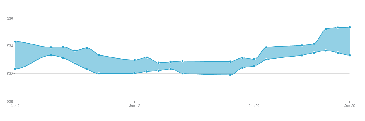
{
  type: "range",
  'scale-x': {
    'min-value':1420232400000,
    step: "day",
    transform: {
      type: "date",
      all: "%M %d"
    }
  },
  'scale-y': {
    values: "30:36:2",
    format: "$%v" //To format the scale values.
  },
  'crosshair-x': {
    'plot-label': {
      text: "High: $%node-max-value<br>Low: $%node-min-value"
    }
  },
  plot: {
    aspect: "spline",
    'line-width':2,
    tooltip: {
      visible: false
    }
  },
  series: [
    {
      values: [
        [1420232400000, [32.34, 34.31]], //01/02/15

        [1420491600000, [33.32, 33.90]], //01/05/15
        [1420578000000, [33.13, 33.93]], //01/06/15
        [1420664400000, [32.72, 33.67]], //01/07/15
        [1420750800000, [32.31, 33.85]], //01/08/15
        [1420837200000, [32.01, 33.34]], //01/09/15

        [1421096400000, [32.03, 32.98]], //01/12/15
        [1421182800000, [32.15, 33.16]], //01/13/15
        [1421269200000, [32.21, 32.79]], //01/14/15
        [1421355600000, [32.33, 32.84]], //01/15/15
        [1421442000000, [32.01, 32.90]], //01/16/15

        [1421787600000, [31.90, 32.86]], //01/20/15
        [1421874000000, [32.41, 33.14]], //01/21/15
        [1421960400000, [32.55, 33.04]], //01/22/15
        [1422046800000, [33.01, 33.90]], //01/23/15

        [1422306000000, [33.31, 34.03]], //01/26/15
        [1422392400000, [33.51, 34.15]], //01/27/15
        [1422478800000, [33.66, 35.21]], //01/28/15
        [1422565200000, [33.51, 35.33]], //01/29/15
        [1422651600000, [33.32, 35.35]], //01/30/15
      ]
    }
  ]
}
Number of Scale Values
Depending on the number and length, ZingChart automatically calculates the number of scale values to display on the scale. Use the items-overlap and max-items attributes to override and specify the maximum number of labels displayed. Most commonly used with time-series and category scales, the former allows values to overlap while the latter sets the maximum number of values displayed. See the x-axis scale.

{
  type: "range",
  'scale-x': {
    'min-value':1420232400000,
    step: "day",
    transform: {
      type: "date",
      all: "%M %d"
    },
    'items-overlap': true, //To allow scale labels to overlap.
    'max-items':8 //To set the number of scale labels displayed.
  },
  'scale-y': {
    values: "30:36:2",
    format: "$%v"
  },
  'crosshair-x': {
    'plot-label': {
      text: "High: $%node-max-value<br>Low: $%node-min-value"
    }
  },
  plot: {
    aspect: "spline",
    'line-width':2,
    tooltip: {
      visible: false
    }
  },
  series: [
    {
      values: [
        [1420232400000, [32.34, 34.31]], //01/02/15

        [1420491600000, [33.32, 33.90]], //01/05/15
        [1420578000000, [33.13, 33.93]], //01/06/15
        [1420664400000, [32.72, 33.67]], //01/07/15
        [1420750800000, [32.31, 33.85]], //01/08/15
        [1420837200000, [32.01, 33.34]], //01/09/15

        [1421096400000, [32.03, 32.98]], //01/12/15
        [1421182800000, [32.15, 33.16]], //01/13/15
        [1421269200000, [32.21, 32.79]], //01/14/15
        [1421355600000, [32.33, 32.84]], //01/15/15
        [1421442000000, [32.01, 32.90]], //01/16/15

        [1421787600000, [31.90, 32.86]], //01/20/15
        [1421874000000, [32.41, 33.14]], //01/21/15
        [1421960400000, [32.55, 33.04]], //01/22/15
        [1422046800000, [33.01, 33.90]], //01/23/15

        [1422306000000, [33.31, 34.03]], //01/26/15
        [1422392400000, [33.51, 34.15]], //01/27/15
        [1422478800000, [33.66, 35.21]], //01/28/15
        [1422565200000, [33.51, 35.33]], //01/29/15
        [1422651600000, [33.32, 35.35]], //01/30/15
      ]
    }
  ]
}
Decimal Places
Use the decimals attribute to specify the number of decimal places you want displayed on your scale. Note that longer values are automatically rounded to the last decimal place.
{
  type: "line",
  utc: true,
  timezone:-5, //EST time
  'scale-x': {
    'min-value': "1457101800000",
    'max-value': "1457125200000",
    step: "30minute",
    transform: {
      type: "date",
      all: "%g:%i"
    },
    'items-overlap': true,
    'max-items':14,
    item: {
      'font-size':10
    }
  },
  'scale-y': {
    values: "32:34:0.25",
    format: "$%v",
    decimals:2, //To set the number of decimal places displayed.
    item: {
      'font-size':10
    }
  },
  series: [
    {
      values: [
        [1457101800000,32.34], //03/04/2016 at 9:30 a.m. EST
        [1457103600000,32.30], //10:00 a.m.
        [1457105400000,32.95], //10:30 a.m.
        [1457107200000,32.99], //11:00 a.m.
        [1457109000000,32.33], //11:30 a.m.
        [1457110800000,33.34], //12:00 p.m.
        [1457112600000,33.01], //12:30 p.m.
        [1457114400000,34], //1:00 p.m.
        [1457116200000,33.64], //1:30 p.m.
        [1457118000000,32.59], //2:00 p.m.
        [1457119800000,32.60], //2:30 p.m.
        [1457121600000,32.99], //3:00 p.m.
        [1457123400000,32.14], //3:30 p.m.
        [1457125200000,32.34], //at 4:00 p.m.
      ]
    }
  ]
}
Decimal Mark
By default, the decimal mark appears as a period (.). To change the type, use the decimals-separator attribute. You can change the value to , , which appears as a decimal comma.
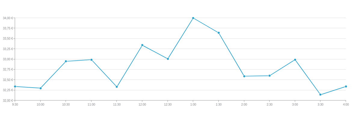
{
  type: "line",
  utc: true,
  timezone:-5, //EST time
  'scale-x': {
    'min-value': "1457101800000",
    'max-value': "1457125200000",
    step: "30minute",
    transform: {
      type: "date",
      all: "%g:%i"
    },
    'items-overlap': true,
    'max-items':14,
    item: {
      'font-size':10
    }
  },
  'scale-y': {
    values: "32:34:0.25",
    format: "%v €",
    decimals:2,
    'decimals-separator': ", ", //To set the decimal mark type.
    item: {
      'font-size':10
    }
  },
  series: [
    {
      values: [
        [1457101800000,32.34], //03/04/2016 at 9:30 a.m. EST
        [1457103600000,32.30], //10:00 a.m.
        [1457105400000,32.95], //10:30 a.m.
        [1457107200000,32.99], //11:00 a.m.
        [1457109000000,32.33], //11:30 a.m.
        [1457110800000,33.34], //12:00 p.m.
        [1457112600000,33.01], //12:30 p.m.
        [1457114400000,34], //1:00 p.m.
        [1457116200000,33.64], //1:30 p.m.
        [1457118000000,32.59], //2:00 p.m.
        [1457119800000,32.60], //2:30 p.m.
        [1457121600000,32.99], //3:00 p.m.
        [1457123400000,32.14], //3:30 p.m.
        [1457125200000,32.34], //at 4:00 p.m.
      ]
    }
  ]
}
Negation Sign
Use the negation attribute to specify whether the negation sign is placed inside or outside of the formatted scale value. Most commonly used with currency, you can set the value to standard (default) or currency.
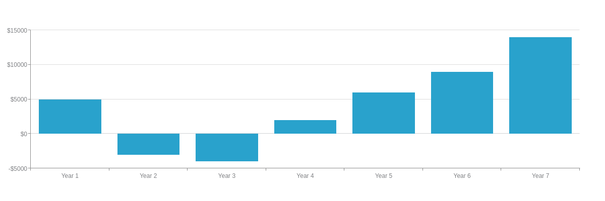
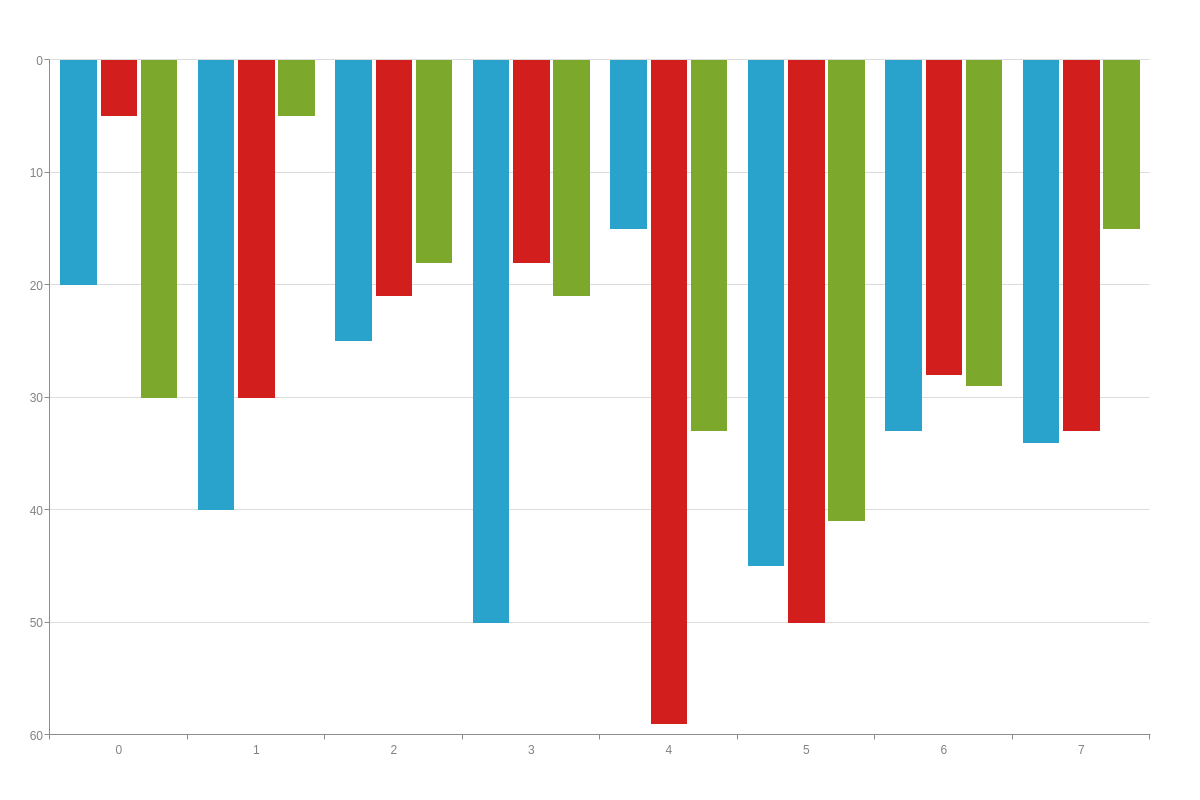
{
  type: 'bar',
  'scale-x': {
    labels: [ "Year 1", "Year 2", "Year 3", "Year 4", "Year 5", "Year 6", "Year 7" ]
  },
  'scale-y': {
    values: "-5000:15000:5000",
    format: "$%v",
    negation: "currency" //To change the placement of the negation sign.
  },
  plotarea: {
    'margin-left': "dynamic"
  },
  series: [
    {
      values: [5000,-3000,-4000,2000,6000,9000,14000]
    }
  ]
}
Thousands Separator
By default, values in the thousands or greater are not separated by any mark. To separate them, use the thousands-separator attribute. You can set the value to , (comma), . (period), or (space).
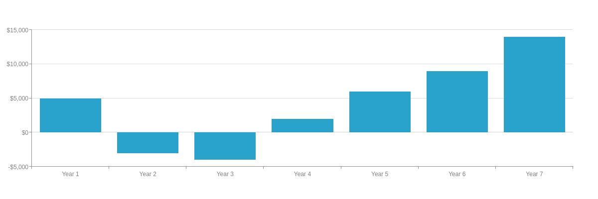
{
  type: 'bar',
  'scale-x': {
    labels: [ "Year 1", "Year 2", "Year 3", "Year 4", "Year 5", "Year 6", "Year 7" ]
  },
  'scale-y': {
    values: "-5000:15000:5000",
    format: "$%v",
    negation: "currency",
    'thousands-separator': ", " //To separate the thousands.
  },
  plotarea: {
    'margin-left': "dynamic"
  },
  series: [
    {
      values: [5000,-3000,-4000,2000,6000,9000,14000]
    }
  ]
}
Short Units
To display the scale values as short units, add the short attribute and set the value to true. ZingChart automatically shortens the values by the thousands, millions, or billions. To override, add a short-unit attribute and specify the short unit type you want displayed. See the following values. Note that short unit values are automatically rounded.
| Short Unit | Description |
|---|---|
| K or k | Thousands |
| M or m | Millions |
| B or b | Billions |
| KB or kb | Kilobyte (1024 bytes) |
| MB or mb | Megabyte (1024 kilobytes) |
| GB or gb | Gigabyte (1024 megabytes) |
| TB or tb | Terabyte (1024 gigabytes) |
| PB or pb | Petabyte (1024 terabytes) |
The below area chart uses short units that are set to the thousands.
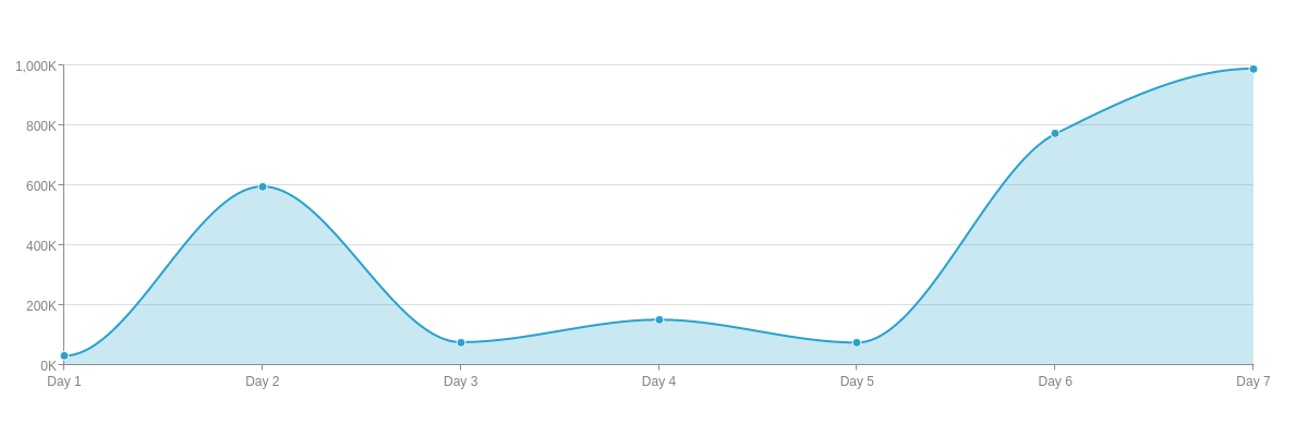
{
  type: "area",
  'scale-x': {
    labels: [ "Day 1", "Day 2", "Day 3", "Day 4", "Day 5", "Day 6", "Day 7" ]
  },
  'scale-y': {
    values: "0:1000000:200000",
    short: true, //To display scale values as short units.
    'short-unit': "K", //To set the short unit type.
    'thousands-separator': ", "
  },
  plot: {
    aspect: "spline"
  },
  plotarea: {
    'margin-left': "dynamic"
  },
  series: [
    {
      values: [31342,596061,76790,151630,75319,771421,989312]
    }
  ]
}
Scientific Notation
To display the scale values in scientific notation, add the exponent attribute and set the value to true. To specify the number of decimal places displayed, use the exponent-decimals attribute.

{
  type: "area",
  'scale-x': {
    labels: [ "Day 1", "Day 2", "Day 3", "Day 4", "Day 5", "Day 6", "Day 7" ]
  },
  'scale-y': {
    values: "0:1000000:200000",
    exponent: true, //To display scale values as scientific notation.
    'exponent-decimals':1, //To set the number of decimal places.
  },
  plot: {
    aspect: "spline"
  },
  plotarea: {
    'margin-left': "dynamic"
  },
  series: [
    {
      values: [31342,596061,76790,151630,75319,771421,989312]
    }
  ]
}
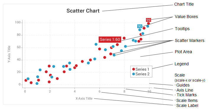
Scale Elements
The scales consist of multiple elements (or parts) that can be customized, styled, and turned on or off. Refer to the X-Axis Scale and Y-Axis Scale JSON pages for a full list of objects and attributes.
Scale Label
Use the label object to create and style the scale label. Add a text attribute to specify the scale label text. You can style the font, background, borders, and more. Refer to the scale label JSON pages for "scale-x" and "scale-y" for the full attribute list.
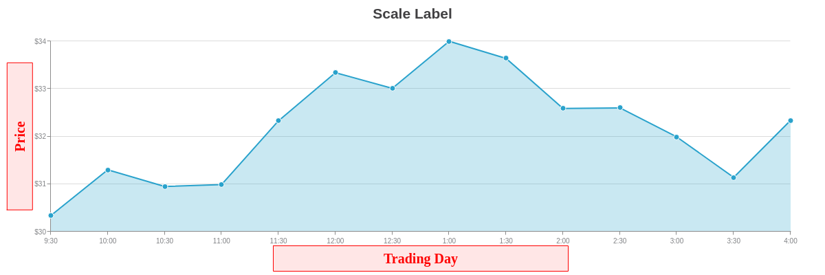
{
  type: "area",
  title: {
    text: "Scale Label"
  },
  'scale-x': {
    'min-value': "1457101800000",
    'max-value': "1457125200000",
    step: "30minute",
    transform: {
      type: "date",
      all: "%g:%i"
    },
    'items-overlap': true,
    'max-items':14,
    label: {
      text: "Trading Day",
      'font-size':20,
      'font-family': "Georgia",
      'font-color': "red",
      'border-width': 1,
      'border-color': "red",
      'background-color': "#ffe6e6",
      width: "40%"
    },
    item: {
      'font-size':10
    }
  },
  utc: true,
  timezone:-5, //EST time
  'scale-y': {
    values: "30:34:1",
    format: "$%v",
    label: {
      text: "Price",
      'font-size':20,
      'font-family': "Georgia",
      'font-color': "red",
      'border-width': 1,
      'border-color': "red",
      'background-color': "#ffe6e6",
      width: "20%"
    },
    item: {
      'font-size':10
    }
  },
  plotarea: {
    'margin-left': "dynamic",
    'margin-bottom': "dynamic"
  },
  series: [
    {
      values: [
        [1457101800000,30.34], //03/04/2016 at 9:30 a.m. EST
        [1457103600000,31.30], //10:00 a.m.
        [1457105400000,30.95], //10:30 a.m.
        [1457107200000,30.99], //11:00 a.m.
        [1457109000000,32.33], //11:30 a.m.
        [1457110800000,33.34], //12:00 p.m.
        [1457112600000,33.01], //12:30 p.m.
        [1457114400000,34], //1:00 p.m.
        [1457116200000,33.64], //1:30 p.m.
        [1457118000000,32.59], //2:00 p.m.
        [1457119800000,32.60], //2:30 p.m.
        [1457121600000,31.99], //3:00 p.m.
        [1457123400000,31.14], //3:30 p.m.
        [1457125200000,32.34], //4:00 p.m.
      ]
    }
  ]
}
Scale Items
Use the item object to style and further format the scale items, i.e., the scale values/labels. You can style the font, background, and borders, as well as set the maximum number of characters displayed, set the maximum width, allow for text wrapping, and much more. Refer to the scale item JSON pages for "scale-x" and "scale-y" for the full attribute list.
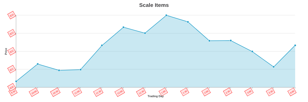
{
  type: "area",
  title: {
    text: "Scale Items"
  },
  'scale-x': {
    'min-value': "1457101800000",
    'max-value': "1457125200000",
    step: "30minute",
    transform: {
      type: "date",
      all: "%g:%i"
    },
    'items-overlap': true,
    'max-items':14,
    label: {
      text: "Trading Day"
    },
    item: {
      'font-size':10,
      'font-family': "Georgia",
      'font-color': "red",
      'border-width': 1,
      'border-color': "red",
      'background-color': "#ffe6e6",
      padding: "5%",
      angle:-30
    }
  },
  utc: true,
  timezone:-5, //EST time
  'scale-y': {
    values: "30:34:1",
    format: "$%v",
    label: {
      text: "Price"
    },
    item: {
      'font-size':10,
      'font-family': "Georgia",
      'font-color': "red",
      'border-width': 1,
      'border-color': "red",
      'background-color': "#ffe6e6",
      padding: "5%",
      angle:-30
    }
  },
  plotarea: {
    'margin-left': "dynamic",
    'margin-bottom': "dynamic"
  },
  series: [
    {
      values: [
        [1457101800000,30.34], //03/04/2016 at 9:30 a.m. EST
        [1457103600000,31.30], //10:00 a.m.
        [1457105400000,30.95], //10:30 a.m.
        [1457107200000,30.99], //11:00 a.m.
        [1457109000000,32.33], //11:30 a.m.
        [1457110800000,33.34], //12:00 p.m.
        [1457112600000,33.01], //12:30 p.m.
        [1457114400000,34], //1:00 p.m.
        [1457116200000,33.64], //1:30 p.m.
        [1457118000000,32.59], //2:00 p.m.
        [1457119800000,32.60], //2:30 p.m.
        [1457121600000,31.99], //3:00 p.m.
        [1457123400000,31.14], //3:30 p.m.
        [1457125200000,32.34], //4:00 p.m.
      ]
    }
  ]
}
Scale Tooltips
Use the tooltip object to add tooltips that appear when users hover over the scale items. (Note that scale tooltips are distinct from node tooltips.) Add a text attribute and specify the tooltip text you want to appear using the %scale-value (%v) token with any combination of alphanumeric and/or special characters. Refer to the scale tooltips JSON pages for "scale-x" and "scale-y" for the full attribute list.
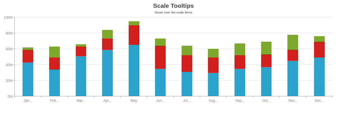
{
  type: 'bar',
  title: {
    text: "Scale Tooltips"
  },
  subtitle: {
    text: "Hover over the scale items",
    'font-weight': "normal"
  },
  'scale-x': {
    labels: [ "January", "February", "March", "April", "May", "June", "July", "August", "September", "October", "November", "December" ],
    item: {
      'max-chars':3
    },
    tooltip: {
      text: "%v 2016",
      'font-size':12,
      'font-family': "Georgia",
      'font-color': "red",
      'border-width': 1,
      'border-color': "red",
      'border-radius': "5px",
      'background-color': "#ffe6e6",
      padding: "10%"
    }
  },
  'scale-y': {
    values: "0:100:20",
    format: "%v%",
    tooltip: {
      text: "%v% of the goal was reached.",
      'font-size':12,
      'font-family': "Georgia",
      'font-color': "red",
      'border-width': 1,
      'border-color': "red",
      'border-radius': "5px",
      'background-color': "#ffe6e6",
      padding: "10%",
      width: "15%",
      'wrap-text': true
    }
  },
  plot: {
    stacked: true,
    'bar-width': "50%"
  },
  plotarea: {
    'margin-left': "dynamic"
  },
  series: [
    {
      values: [43,34,51,59,65,35,31,30,35,37,45,49]
    },
    {
      values: [16,15,12,14,25,29,21,19,17,16,14,20]
    },
    {
      values: [3,14,3,11,5,9,12,11,15,16,19,7]
    }
  ]
}
Axis Line
To style the x- and/or y-axis scale line, use line-related attributes such as line-color, line-width, and line-style in the applicable scale object. To change the axis line placement, add a placement attribute and set the value to opposite. Refer to the JSON pages for "scale-x" and "scale-y" for the full attribute list.
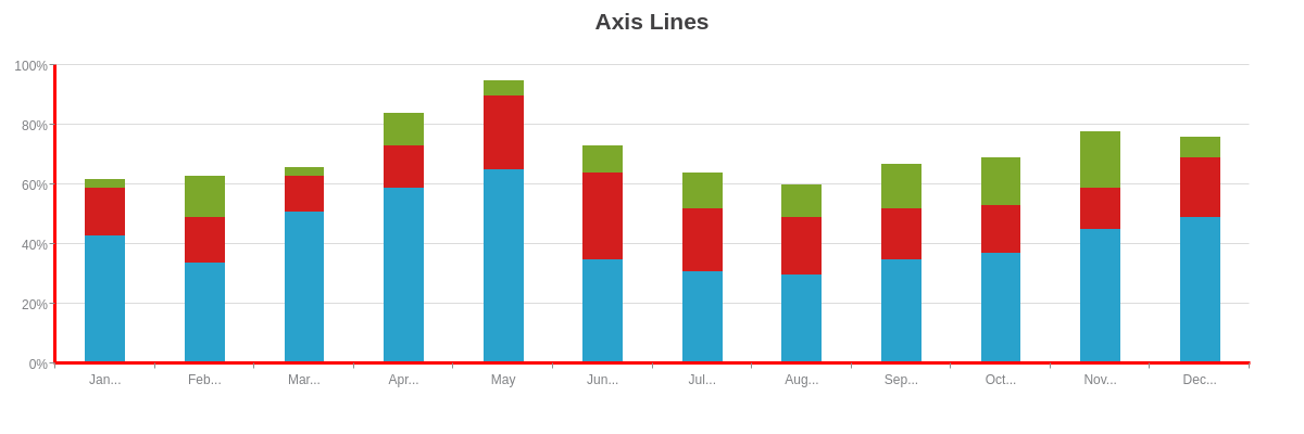
{
  type: 'bar',
  title: {
    text: "Axis Lines"
  },
  'scale-x': {
    labels: [ "January", "February", "March", "April", "May", "June", "July", "August", "September", "October", "November", "December" ],
    item: {
      'max-chars':3
    },
    'line-color': "red",
    'line-width':3,
    'line-style': "solid"
  },
  'scale-y': {
    values: "0:100:20",
    format: "%v%",
    'line-color': "red",
    'line-width':3,
    'line-style': "solid"
  },
  plot: {
    stacked: true,
    'bar-width': "50%"
  },
  plotarea: {
    'margin-left': "dynamic"
  },
  series: [
    {
      values: [43,34,51,59,65,35,31,30,35,37,45,49]
    },
    {
      values: [16,15,12,14,25,29,21,19,17,16,14,20]
    },
    {
      values: [3,14,3,11,5,9,12,11,15,16,19,7]
    }
  ]
}
Tick Marks
Use the tick object to style the tick marks. The number of tick marks that appear are dictated by the step scale value. You can style the color, width, length, placement, and more. Refer to the tick mark JSON pages for "scale-x" and "scale-y" for the full attribute list.
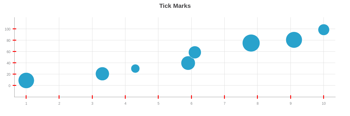
{
  type: "bubble",
  title: {
    text: "Tick Marks"
  },
  'scale-x': {
    tick: {
      'line-color': "red",
      'line-width':3,
      'line-style': "solid", //"solid", "dotted", "dashed", "dashdot"
      size:12,
      placement: "cross" //"inner", "outer", "cross"
    }
  },
  'scale-y': {
    tick: {
      'line-color': "red",
      'line-width':3,
      'line-style': "solid", //"solid", "dotted", "dashed", "dashdot"
      size:12,
      placement: "cross" //"inner", "outer", "cross"
    }
  },
  series: [
    {
      values: [
        [1,9,59],
        [3.3,21,30],
        [4.3,30,5],
        [5.9,40,35],
        [6.1,59,21],
        [7.8,75,85],
        [9.1,81,65],
        [10,99,12]
      ]
    }
  ]
}
Guides
Use the guide object to style the guides that appear in the plot area. Note that the number of guides is dependent on the number of tick marks. You can style the line color, width, style, and more. Refer to the scale guide JSON pages for "scale-x" and "scale-y" for the full attribute list.
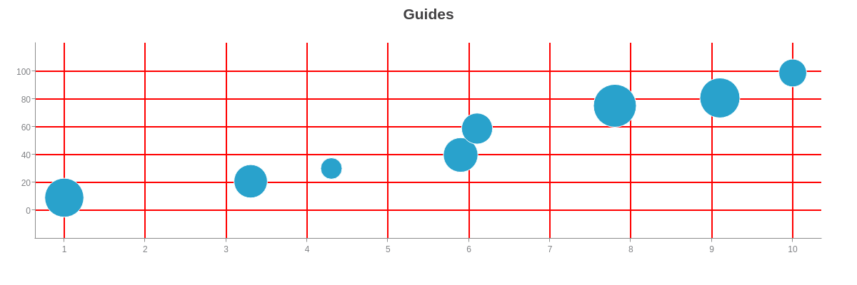
{
  type: "bubble",
  title: {
    text: "Guides"
  },
  'scale-x': {
    guide: {
      'line-color': "red",
      'line-width':2,
      'line-style': "solid" //"solid", "dotted", "dashed", "dashdot"
    }
  },
  'scale-y': {
    guide: {
      'line-color': "red",
      'line-width':2,
      'line-style': "solid" //"solid", "dotted", "dashed", "dashdot"
    }
  },
  series: [
    {
      values: [
        [1,9,59],
        [3.3,21,30],
        [4.3,30,5],
        [5.9,40,35],
        [6.1,59,21],
        [7.8,75,85],
        [9.1,81,65],
        [10,99,12]
      ]
    }
  ]
}
Minor Tick Marks
Use the minor-ticks attribute and minor-tick object to add and style minor tick marks. The minor-ticks attribute is required to specify the number of minor tick marks you want displayed between the regular tick marks. You can then style the minor tick marks in the minor-tick object. Refer to the minor tick mark JSON pages for "scale-x" and "scale-y" for the full attribute list.
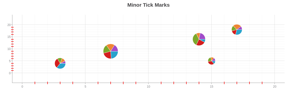
{
  type: "bubble-pie",
  title: {
    text: "Minor Tick Marks"
  },
  'scale-x': {
    values: "0:20:5",
    'minor-ticks':4,
    'minor-tick': {
      'line-color': "red",
      'line-width':2,
      'line-style': "solid",
      size:10,
      placement: "cross"
    }
  },
  'scale-y': {
    values: "0:20:5",
    'minor-ticks':4,
    'minor-tick': {
      'line-color': "red",
      'line-width':2,
      'line-style': "solid",
      size:10,
      placement: "cross"
    }
  },
  plot: {
    values: [
      [3,4,34],
      [7,9,101],
      [14,14,59],
      [15,5,15],
      [17,18,30]
    ]
  },
  series: [
    {'data-v': [15,37,7,3,14]},
    {'data-v': [13,34,21,7,8]},
    {'data-v': [6,30,31,5,8]},
    {'data-v': [5,29,9,3,13]},
    {'data-v': [3,25,19,3,5]}
  ]
}
Minor Guides
Use the minor-guide object to add and style minor guides. Note that the number of minor guides is dictated by the number of minor tick marks, so the minor-ticks attribute is required. You can then style the minor guides in the minor-guide object. Refer to the minor guide JSON pages for "scale-x" and "scale-y" for the full attribute list.
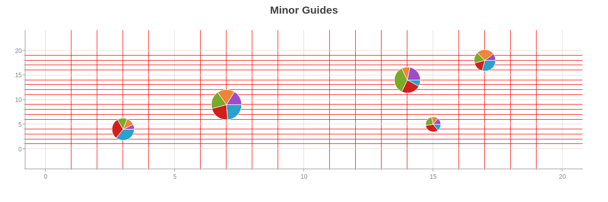
{
  type: "bubble-pie",
  title: {
    text: "Minor Guides"
  },
  'scale-x': {
    values: "0:20:5",
    'minor-ticks':4,
    'minor-guide': {
      'line-color': "red",
      'line-width':1,
      'line-style': "solid",
      alpha:1
    }
  },
  'scale-y': {
    values: "0:20:5",
    'minor-ticks':4,
    'minor-guide': {
      'line-color': "red",
      'line-width':1,
      'line-style': "solid",
      alpha:1
    }
  },
  plot: {
    values: [
      [3,4,34],
      [7,9,101],
      [14,14,59],
      [15,5,15],
      [17,18,30]
    ]
  },
  series: [
    {'data-v': [15,37,7,3,14]},
    {'data-v': [13,34,21,7,8]},
    {'data-v': [6,30,31,5,8]},
    {'data-v': [5,29,9,3,13]},
    {'data-v': [3,25,19,3,5]}
  ]
}
Reference Line
Use the ref-value attribute and ref-line object to add and style the reference line. Generally used to distinguish between positive and negative values, you can use the ref-value attribute to specify what value the reference line is drawn at. You can then style the reference line in the ref-line object. Refer to the reference line JSON pages for "scale-x" and "scale-y" for the full attribute list.
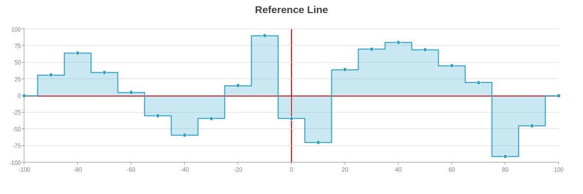
{
  type: "area",
  title: {
    text: "Reference Line"
  },
  'scale-x': {
    values: "-100:100:20",
    'ref-value':0,
    'ref-line': {
      visible: true,
      'line-color': "red",
      'line-width':2,
      'line-style': "solid"
    }
  },
  'scale-y': {
    values: "-100:100:25",
    'ref-value':0,
    'ref-line': {
      'line-color': "red",
      'line-width':2,
      'line-style': "solid"
    }
  },
  plot: {
    aspect: "stepped"
  },
  series: [
    {
      values: [
        [-100,0],
        [-90,31],
        [-80,64],
        [-70,35],
        [-60,5],
        [-50,-30],
        [-40,-59],
        [-30,-34],
        [-20,15],
        [-10,90],
        [0,-34],
        [10,-70],
        [20,39],
        [30,70],
        [40,80],
        [50,69],
        [60,45],
        [70,20],
        [80,-91],
        [90,-45],
        [100,0]
      ]
    }
  ]
}
Scale Markers
Use the markers array to create scale markers, which can appear as an area or line. Scale markers can be used on the x- and/or y-axis axis to highlight a band of data, draw a trendline, and more. In the array, create an object for each scale marker. In the object, you need to:
- Add a
typeattribute and set the value toareaorline. - Add a
rangearray. Line scale markers accept one or two values. Area scale markers accept two or four values. - Add a
value-rangeattribute and set the value totrueto accept scale values in lieu of scale indexes. - Add applicable styling attributes.
Refer to the scale markers JSON pages for "scale-x" and "scale-y" for the full attribute list. The below stepped area chart has four scale markers on the x-axis drawn with various ranges.
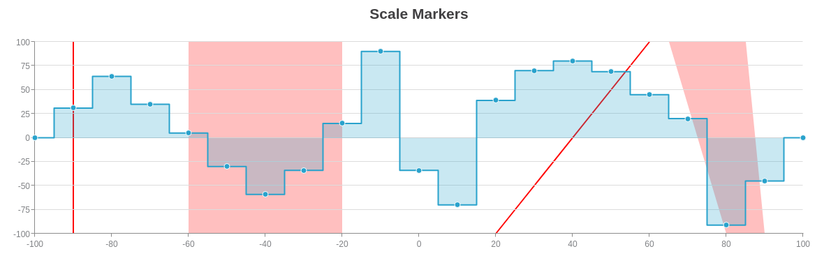
{
  type: "area",
  title: {
    text: "Scale Markers"
  },
  'scale-x': {
    values: "-100:100:20",
    markers: [
      {
        type: "line",
        range: [-90],
        'value-range': true,
        'line-color': "red",
        'line-width':2,
        'line-style': "solid",
        alpha:1
      },
      {
        type: "area",
        range: [-60,-20],
        'value-range': true,
        'background-color': "red"
      },
      {
        type: "line",
        range: [20,60],
        'value-range': true,
        'line-color': "red",
        'line-width':2,
        'line-style': "solid",
        alpha:1
      },
      {
        type: "area",
        range: [80,90,65,85],
        'value-range': true,
        'background-color': "red"
      },
    ]
  },
  'scale-y': {
    values: "-100:100:25"
  },
  plot: {
    aspect: "stepped"
  },
  series: [
    {
      values: [
        [-100,0],
        [-90,31],
        [-80,64],
        [-70,35],
        [-60,5],
        [-50,-30],
        [-40,-59],
        [-30,-34],
        [-20,15],
        [-10,90],
        [0,-34],
        [10,-70],
        [20,39],
        [30,70],
        [40,80],
        [50,69],
        [60,45],
        [70,20],
        [80,-91],
        [90,-45],
        [100,0]
      ]
    }
  ]
}
Additional Scales
ZingChart supports additional scales up to scale-x-9 and scale-y-9. Often used with our mixed chart type, you can chart different datasets to different scales. The additional scales can be placed on the same or opposite side of the first one. Our blended scales feature allows you to stick two scales onto the same axis line.
Secondary Scales
To add additional scales to your chart, you need to:
- Create additional scale object(s) in the graph object.
- Add a
scalesattribute to eachseriesobject.
In the below stock and volume chart, a second y-axis scale was created with the scale-y-2 object. Format and style the second scale as you would the first one. Then in each series object, add a scales attribute and specify which scales you want that dataset to chart to, e.g., scale-x,scale-y or scale-x,scale-y-2.
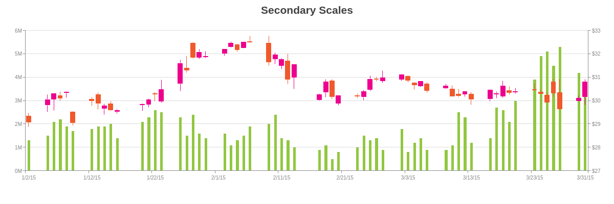
{
  type: "mixed",
  title: {
    text: "Secondary Scales"
  },
  'scale-x': {
    'min-value':1420232400000,
    step: "day",
    transform: {
      type: "date",
      all: "%m/%d/%y"
    },
    'items-overlap': true,
    'max-items':10,
    item: {
      'font-size':10
    }
  },
  'scale-y': {
    values: "0:6:1",
    format: "%vM",
    guide: {
      'line-style': "solid"
    },
    item: {
      'font-size':10
    }
  },
  'scale-y-2': {
    values: "27:33:1",
    format: "$%v",
    guide: {
      'line-style': "solid"
    },
    item: {
      'font-size':10
    }
  },
  'crosshair-x': {
    'plot-label': {
      multiple: true
    }
  },
  plot: {
    tooltip: {
      visible: false
    }
  },
  series: [
    {
      type: 'bar',
      scales: "scale-x,scale-y",
      'guide-label': {
        text: "Shares Sold: %vM",
        decimals:2
      },
      'background-color': "#91C740",
      'bar-width': "50%",
      values: [
        [1420232400000, 1.3],  //01/02/15
        //Omitted for brevity.
        [1427835600000, 3.3], //03/31/15
      ]
    },
    {
      type: "stock",
      scales: "scale-x,scale-y-2",
      aspect: "candlestick",
      'guide-label': {
        text: "Open: $%open<br>High: $%high<br>Low: $%low<br>Close: $%close",
        decimals:2
      },
      'trend-up': {
        'background-color': "#ED008E",
        'line-color': "#ED008E",
        'border-color': "#ED008E"
      },
      'trend-down': {
        'background-color': "#F0592B",
        'line-color': "#F0592B",
        'border-color': "#F0592B"
      },
      values: [
        [1420232400000, [29.34, 29.46,  28.87,  29.06]], //01/02/15
        //Omitted for brevity.
        [1427835600000, [30.15, 30.90,  29.81,  30.81]]  //03/31/15
      ]
    }
  ]
}
Grouped Scales
You can create grouped scales by using the offset-y attribute in the item object and the size attribute in the tick object
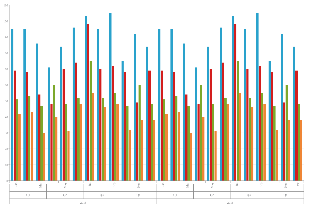
{
  graphset: [
    {
      globals: {
        'font-family': "Lucida Sans Unicode"
      },
      type: "vbar",
      plotarea: {
        margin: "dynamic"
      },
      scaleX: {
        values: [ "Jan", "Feb", "Mar", "Apr", "May", "Jun", "Jul", "Aug", "Sep", "Oct", "Nov", "Dec", "Jan", "Feb", "Mar", "Apr", "May", "Jun", "Jul", "Aug", "Sep", "Oct", "Nov", "Dec" ],
        item: {
          offsetY: -5,
          angle: 270
        },
        tick: {
          size: 10
        }
      },
      scaleX2: {
        values: [ "Q1", "Q2", "Q3", "Q4", "Q1", "Q2", "Q3", "Q4" ],
        placement: "default",
        tick: {
          size: 58,
          placement: "cross"
        },
        'itemsOverlap': true,
        item: {
          offsetY: -55
        }
      },
      scaleX3: {
        values: [ "2015", "2016" ],
        placement: "default",
        tick: {
          size: 20,
        },
        item: {
          offsetY: -15
        }
      },
      plot: {
        'bars-space-left': 0.15,
        'bars-space-right': 0.15
      },
      tooltip: {
        visible: false
      },
      'crosshair-x': {
        'line-width': "100%",
        alpha: 0.4,
      },
      series: [
        {
          values: [95,95,86,71,84,96,103,95,105,75,92,84,95,95,86,71,84,96,103,95,105,75,92,84],
          text: "Dell"
        },
        {
          values: [69,68,54,48,70,74,98,70,72,68,49,69,69,68,54,48,70,74,98,70,72,68,49,69],
          text: "Apple"
        },
        {
          values: [51,53,47,60,48,52,75,52,55,47,60,48,51,53,47,60,48,52,75,52,55,47,60,48],
          text: "Microsoft"
        },
        {
          values: [42,43,30,40,31,48,55,46,48,32,38,38,42,43,30,40,31,48,55,46,48,32,38,38],
           text: "Oracle"
        }
      ]
    }
  ]
}
Blended Scales
Blended scales allow you to "blend" or "stick" two scales onto the same axis line. In the secondary scale object, you need to:
- Add a
placementattribute and set the value todefault. - Add a
blendedattribute and set the value totrue. - Use the
offset-startandoffset-endattributes as needed to adjust the scale offsets. Provide percentage values.
In the below stock and volume chart, the second y-axis scale was blended onto the same axis line as the first one. The placement attribute is used to move the second scale to the same side as the first one. The blended attribute then "sticks" the second scale to the first. Finally, the offset attributes are used to modify the starting and ending offsets for each scale.
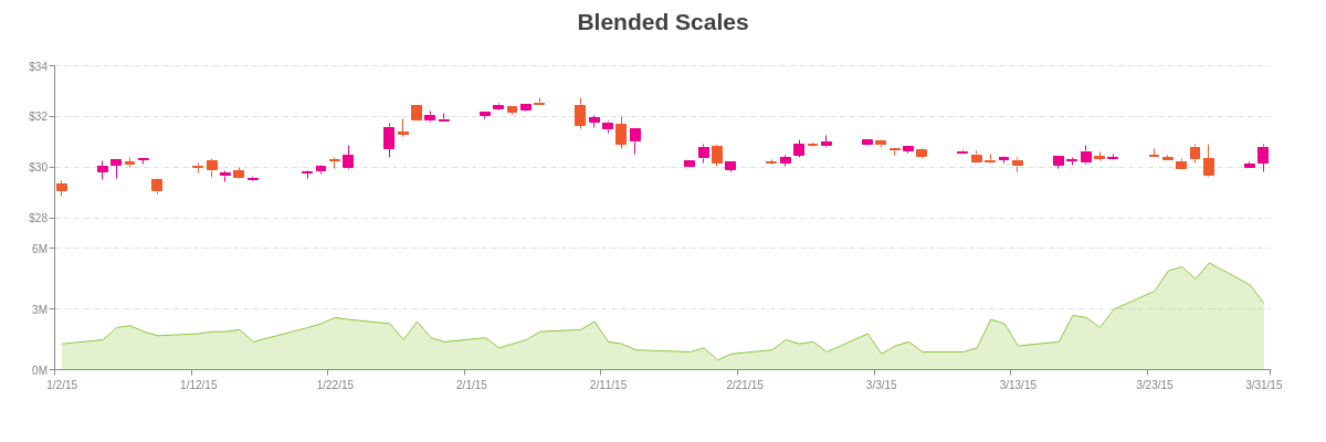
{
  type: "mixed",
  title: {
    text: "Blended Scales"
  },
  'scale-x': {
    'min-value':1420232400000,
    step: "day",
    transform: {
      type: "date",
      all: "%m/%d/%y"
    },
    'items-overlap': true,
    'max-items':10,
    item: {
      'font-size':10
    }
  },
  'scale-y': {
    'offset-end': "60%",
    values: "0:6:3",
    format: "%vM",
    guide: {
      'line-style': "dashdot"
    },
    item: {
      'font-size':10
    }
  },
  'scale-y-2': {
    placement: "default",
    blended: true,
    'offset-start': "50%",
    values: "28:34:2",
    format: "$%v",
    guide: {
      'line-style': "dashdot"
    },
    item: {
      'font-size':10
    }
  },
  'crosshair-x': {
    'plot-label': {
      multiple: true
    }
  },
  plot: {
    tooltip: {
      visible: false
    }
  },
  series: [
    {
      type: "area",
      scales: "scale-x,scale-y",
      'guide-label': {
        text: "Shares Sold: %vM",
        decimals:2
      },
      'background-color': "#91C740",
      'line-color': "#91C740",
      'line-width':1,
      marker: {
        visible: false
      },
      values: [
        [1420232400000, 1.3],  //01/02/15
        //Omitted for brevity.
        [1427835600000, 3.3], //03/31/15
      ]
    },
    {
      type: "stock",
      scales: "scale-x,scale-y-2",
      aspect: "candlestick",
      'guide-label': {
        text: "Open: $%open<br>High: $%high<br>Low: $%low<br>Close: $%close",
        decimals:2
      },
      'trend-up': {
        'background-color': "#ED008E",
        'line-color': "#ED008E",
        'border-color': "#ED008E"
      },
      'trend-down': {
        'background-color': "#F0592B",
        'line-color': "#F0592B",
        'border-color': "#F0592B"
      },
      values: [
        [1420232400000, [29.34, 29.46,  28.87,  29.06]], //01/02/15
        //Omitted for brevity.
        [1427835600000, [30.15, 30.90,  29.81,  30.81]]  //03/31/15
      ]
    }
  ]
}
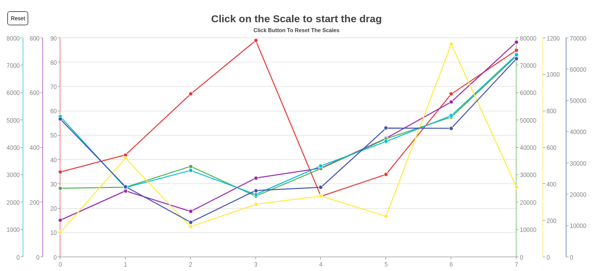
Scalable Y Axis
Whether you have a single y axis (scale) or multiple, ZingChart supports click-and-drag scaling with our scalable y axis module. To add the scalable y axis functionality, add the following code to your root chart object:
scalableYaxis: { // need this object
	scalable: true,
  chartid: 'myChart', // could get chartId in a more dynamic way if needed
}
Note: It also requires you to explicitly load the module: scalableyaxis.
If you have multiple scales, all of them will become scalable. Check out the demo below to see the scalable Y axis in action.
Styling
With multiple scales, you can style each scale object individually. Alternatively, you can apply the same styling to all of the scales on a particular axis. To style all of the x-axis scales, use the scale-x-n object. To style all of the y-axis scales, use the scale-y-n object. See the following chart, where global styling was applied to the two y-axis scales.
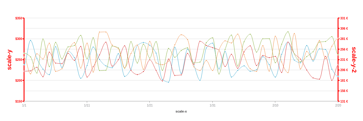
{
  type: "line",
  'scale-y-n': {
    'line-color': "red",
    'line-width':3,
    label: {
      'font-color': "red",
      'font-size':20,
    },
    item: {
      'font-color': "red",
      'font-size':10,
      'font-weight': "bold"
    },
    tick: {
      'line-color': "red",
      'line-width':3
    }
  },
  utc: true,
  timezone: 0,
  'scale-x': {
    'min-value': "1420146000000",
    step: "day",
    transform: {
      type: "date",
      all: "%m/%d"
    },
    label: {
      text: "scale-x"
    },
    item: {
      'font-size':10
    }
  },
  'scale-y': {
    values: "150:350:50",
    format: "$%v",
    label: {
      text: "scale-y"
    }
  },
  'scale-y-2': {
    values: "131:331:25",
    format: "%v €",
    label: {
      text: "scale-y-2"
    }
  },
  'crosshair-x': {
    'plot-label': {
      visible: false
    }
  },
  'crosshair-y': {
    type: "multiple"
  },
  plot: {
    aspect: "spline",
    'line-width':1,
    marker: {
      size:2
    },
    tooltip: {
      visible: false
    }
  },
  plotarea: {
    'margin-left': "dynamic",
    'margin-right': "dynamic"
  },
  series: [
    {
      scales: "scale-x,scale-y",
      values: [238.26,296.39,253.63,227.46,214.01,281.04,231.51,270.49,254.74,205.42,236.23,280.34,250.45,235.23,230.65,264.3,210.05,227.32,283.99,291.33,284.8,265.78,202.49,196.26,279.41,216.84,275.29,237.88,200.59,277.93,290.15,228.29,269.3,208.45,224.36,235.1,222.5,225.74,257.26,238.19,208.15,262.7,292.88,249.27,242.68,284.41,246.79,275.96,274.52,227.52,209.81,]
    },
    {
      scales: "scale-x,scale-y",
      values: [222.35,223.41,231.7,209.4,267.92,242.07,240.77,265.25,248.61,281.92,208.79,232.97,261.69,292.01,234.55,249.94,283.59,224.4,214.54,221.97,249.76,224.3,199.3,251.41,212.45,213.52,265.36,239.35,294.6,284.4,279.2,273.17,233.7,262.85,229.6,269.17,283.09,236.26,260.48,255.21,258.17,219.51,292.4,264.82,251.74,225.19,206.59,203.23,258.26,200.72,237.82]
    },
    {
      scales: "scale-x,scale-y-2",
      values: [246.56,238.11,199.58,280.72,214.71,272.44,233.76,261.87,265.12,289.71,233.56,283.31,204.81,205.74,263.88,259.66,209.87,274.01,223.61,268.21,235.23,274.51,205.89,258.19,237.23,253.15,259.47,223.6,225.23,271.84,283.98,197.06,255.95,290.45,215.97,274.32,292.5,249.58,281.24,281.72,224.02,268.25,297.91,244.88,226.25,238.71,250.47,273.18,275.2,286.43,242.59]
    },
    {
      scales: "scale-x,scale-y-2",
      values: [237.24,197.01,245.34,233.14,270.46,203.05,209.58,251.05,272.23,211.03,270.73,201.62,297.4,297.93,266.05,257.44,211.75,246.13,266.55,208.06,275.1,223.6,219.1,227.86,267.24,291.26,279.71,214.1,205.26,229.05,205.04,254.82,276.28,271.44,292.41,242.85,209.33,202.97,264.79,203.56,287.11,225.44,200.12,294.24,208.64,250.79,231.06,276.93,233.46,263.43,282.04]
    }
  ]
}
Summary
ZingChart scales, aka the chart axis/axes, allow you to mark the values of your chart along a line for ease of reading. Scales can be multiplied, up to 10 scales on either the x or y axis, and can be completely customized.
For a full list of scale attributes, see the JSON configuration page for: