Stock Charts
Overview
ZingChart supports two stock chart types:
- Candlestick
- Open-High-Low-Close (OHLC)
Note: See our Stock Chart Gallery for inspiration on all the different stock chart possibilities.
Stock Chart Types
ZingChart offers two stock chart types: candlestick charts and open-high-low-close (OHLC) charts. To specify your chart type, add a type attribute to your chart object and set the value to stock. Next, create a plot object. Inside, add an aspect attribute and set the value to candlestick (default) or whisker.
You can also create stock and volume charts using our mixed chart type and blended scales.
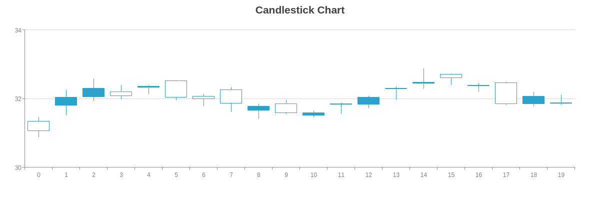
Candlestick Chart
The default stock chart type is the candlestick, specified by the candlestick value.
{
  type: "stock",
  plot: {
    aspect: "candlestick"
  }
}
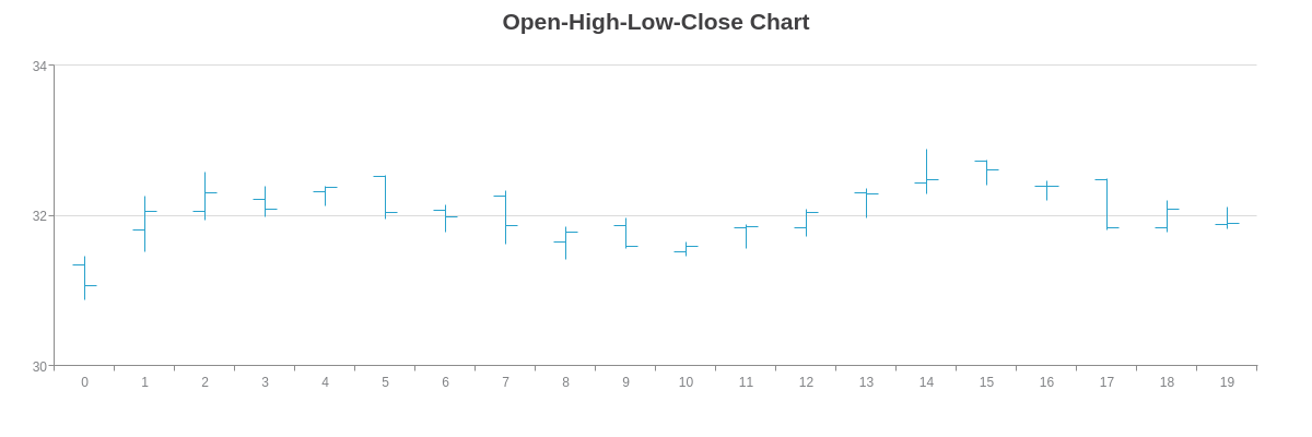
Open-High-Low-Close (OHLC) Chart
OHLC charts (also known as open-high-low-close charts) are specified with the whisker value.
{
  type: "stock",
  plot: {
    aspect: "whisker"
  },
}
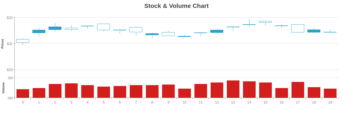
Stock and Volume Chart
ZingChart provides users the option to add a volume chart to accompany their stock data. Generally depicted as a bar or area chart, volume charts display the number of shares sold that trading day.
To create a stock and volume chart, use our mixed chart type. The stock chart portion can be your choice of candlestick or OHLC aspect. The volume chart portion can be your choice of area, bar, or line chart.
Next, create two scale-y objects (scale-y and scale-y-2). Assign scale-y to the stock chart and scale-y-2 to the volume chart using the scales attribute in your series objects. (The stock and volume charts will share the same scale-x.) In the scale-y-2 object, add a placement attribute and set the value to default.
Note: Refer to the X/Y-Axis Scales Tutorial for more information on multiple scales.
Finally, you'll want to blend the two y-axis scales together (secondary scale objects are separated from the first object by default). Add a blended attribute to the scale-y-2 object, and set the value to true. This will "stick" the scale to scale-y.
Use the offset-start and offset-end attributes to modify the starting and ending offsets for your scales. Provide percentage values. See the stock and volume chart example below:
{ //shortened for brevity- click on following Stock & Volume Chart demo for full configuration
  type: "mixed",
  'scale-y': { //for Stock Chart
    'offset-start': "35%", //to adjust scale offsets.
    }
  },
  'scale-y-2': { //for Volume Chart
    placement: "default", //to move scale to default (left) side.
    blended: true, //to bind the scale to "scale-y".
    'offset-end': "75%", //to adjust scale offsets.
  },
  series: [
    {
      type: "stock", //Stock Chart
      scales: "scale-x,scale-y", //to set applicable scales.
    },
    {
      type: 'bar', //Volume Chart
      scales: "scale-x,scale-y-2", //to set applicable scales.
    }
  ]
}
Data
Provide your stock chart data in the series array. ZingChart supports arrays (OHLC data only) and array of arrays (time-series and OHLC data).
OHLC Data Only
For OHLC values only, provide your data in the format seen below. Enclosed inside a basic array, these values are represented on the y-axis. The corresponding x-axis values are automatically provided, with the default value starting at zero and increasing sequentially by one. This data format is best when working with category scales.
series: [{
  values: [
    [open0, high0, low0, close0],
    [open1, high1, low1, close1],
    [open2, high2, low2, close2],
    ...,
    [openN, highN, lowN, closeN]
  ]
}]
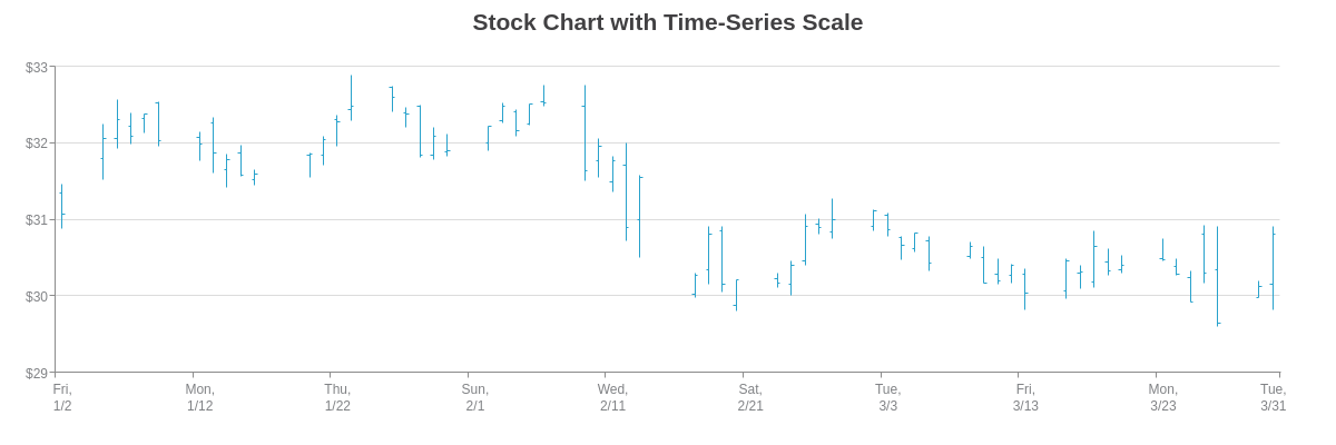
Time-Series and OHLC Data
With an array of arrays, you provide your OHLC values along with corresponding x-axis values. On stock charts, those x-axis values will most likely be provided as time-series data. The data must be provided as Unix timestamps in milliseconds. You can convert dates into Unix time using online conversion tools such as Epoch Converter. With your time-series data, you'll want to create a time-series scale, which is discussed further below.
series: [{
  values: [
    [timestamp0, [open0, high0, low0, close0]],
    [timestamp1, [open1, high1, low1, close1]],
    [timestamp2, [open2, high2, low2, close2]],
    ...,
    [timestampN, [openN, highN, lowN, closeN]],
  ]
}]
Further Customization
Once you've provided your stock chart type and data, you can configure your scales and style your data.
Scale Configuration
On stock charts, a quantitative scale is used on the y-axis to show stock prices. A category or time-series scale is used on the x-axis to represent the date range, which can span days, months, or years.
Note: Our Configuring Your Scales Tutorial provides more in-depth information on how to set up each scale type, and our JSON Attributes/Syntax pages for scale-x and scale-y provide a full list of attribute options.
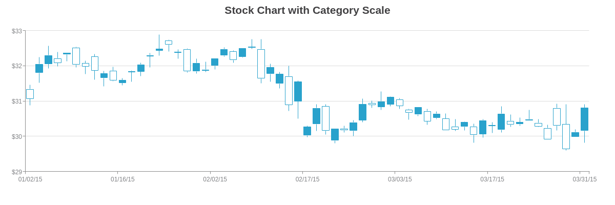
Category Scale
When working with only OHLC data, you'll want to use a category scale on the x-axis so that you can provide your stock price dates. Create a scale-x object, and add a labels array. Provide your labels as string values separated by commas.
You can also adjust the minimum, maximum, and step scale values on the y-axis. Create a scale-y object, and add a valuesattribute. Provide your min/max/step values inside a string separated by colons.
To format your labels, add a format attribute. Provide a value such as the $%v token, which displays scale values that are preceded by a dollar sign.
{ // shortened for brevity- click on following demo for full configuration
  'scale-x': {
    labels: [
      "01/02/15",
      "01/05/15", "01/06/15", "01/07/15", "01/08/15", "01/09/15",
      "01/12/15", "01/13/15", "01/14/15", "01/15/15", "01/16/15",
      "01/20/15", "01/21/15", "01/22/15", "01/23/15",
  },
  'scale-y': {
    values: "29:33:1",
    format: "$%v"
  },
}
Time-Series Scale
When working with both time-series and OHLC data, you'll need a corresponding time-series scale on the x-axis. Create a scale-x object, and add a min-value attribute, step attribute, and transform object. For the min-value and step, provide your scale values in Unix time in milliseconds.
In the transform object, add a type attribute and set the value to date. Next, add an all attribute and specify how you want your scale values formatted. You can use a combination of ZingChart tokens, alphanumeric, and special characters.
You can also adjust the minimum, maximum, and step scale values on the y-axis, as well as the formatted appearance. Create a scale-y object, and add a values attribute and format attribute. For the former, provide your min/max/step inside a string separated by colons. For the latter, provide a value such as $%v, which displays scale values that are preceded by a dollar sign.
{
  'scale-x': {
    'min-value': 1420232400000,
    step: "day",
    transform: {
      type: "date",
      all: "%D,<br>%m/%d"
    }
  },
  'scale-y': {
    values: "29:33:1",
    format: "$%v"
  },
}
Plot/Series Styling
Stock chart data can be styled according to whether the trading day saw a gain (trend-up), loss (trend-down), or no change (trend-equal). Make your changes via the plot object.
When working with candlestick charts, use the following styling attributes: background-color (the body section), border-color (the body border), and line-color (the high and low lines).
When working with open-high-low-close charts, use the line-color attribute. In the following chart, stock gains are red, losses are orange, and no change days are blue.
Note: By default on candlestick charts, trading days that saw a loss (closing price is less than opening price) have uncolored bodies. To specify no color in your charts, simply set the background-color value to none.
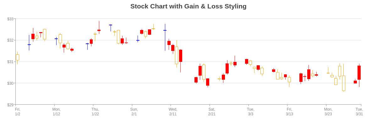
{
  plot: {
    aspect: "candlestick",
    'trend-up': { //Stock Gain
      'background-color': "red",
      'line-color': "red",
      'border-color': "red"
    },
    'trend-down': { //Stock Loss
      'background-color': "none",
      'line-color': "orange",
      'border-color': "orange"
    },
    'trend-equal': { //No gain or loss
      'background-color': "blue",
      'line-color': "blue",
      'border-color': "blue"
    }
  },
}
Tokens
ZingChart tokens are useful when customizing value boxes, tooltips, and crosshairs. You can see how they are used in the Crosshairs section below. Commonly used stock chart tokens include:
| Token | Description |
|---|---|
%open |
Opening price |
%high |
Highest price |
%low |
Lowest price |
%close |
Closing price |
%kl |
For category scale labels |
%kv |
For time-series scale labels |
Note: Refer to the ZingChart Tokens Tutorial for a full list of available tokens.
Interactive Charts
ZingChart supports interactive chart features such as crosshairs, zooming, scrollbars, and preview charts. They can be applied to stock charts as well as stock and volume charts.
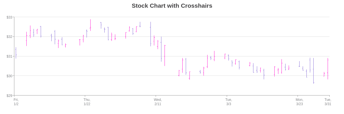
Stock Chart Crosshairs
To add crosshairs to a stock chart, create a crosshair-x object. Add a plot-label object where you can place attributes that you want applied to the plot labels. Add a scale-label object where you can place attributes that you want applied to the scale labels. To specify plot and/or scale label text, add a text attribute. You can provide a combination of tokens and text.
Note: For more attribute options, see the Crosshairs JSON Attributes/Syntax page.
Note: When working with crosshairs, it is best to disable tooltips, which always appear on stock charts by default. In your plot object, create a tooltip object. Add a visible attribute, and set the value to false.
{
  'crosshair-x': {
    'plot-label': {
      text: "Open: $%open<br>High: $%high<br>Low: $%low<br>Close: $%close",
      decimals: 2
    },
    'scale-label': {
      text: "%v",
      decimals: 2
    }
  },
}
Stock and Volume Chart Crosshairs
With a stock and volume chart, you'll need multiple plot labels (one to track the stock chart and another to track the volume chart). In the crosshair-x object, add a plot-label object and include a multiple attribute with the value set to true. Next, in each of your series objects, create a guide-label object. Use the text attribute to specify the desired text for each series.
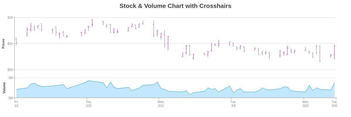
{
  'crosshair-x': {
    'plot-label': {
      multiple: true
    }
  },
  "series": [
    {
      "guide-label": { //create a "guide-label" object for each series object
        "text": "Open: $%open<br>High: $%high<br>Low: $%low<br>Close: $%close",
        "decimals": 2
    },
  ]
}
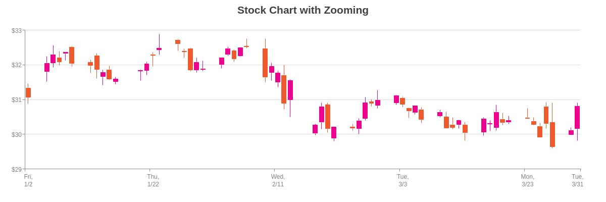
Stock Chart Zooming
Incorporate zooming into your stock chart by adding a zooming attribute to the scale-x and/or scale-y object(s). Set the value to true.
To zoom in on your stock chart, click and drag on the section you want enlarged. You can also zoom in by right-clicking to bring up the context menu. The menu items allow you to Zoom In, Zoom Out, or View All.
Note: The charts in the following zooming, scrollbar, and preview chart sections display their respective features on the x-axis only. However, incorporating them into the y-axis is also possible.
{
  'scale-x': {
    zooming: true
  },
}
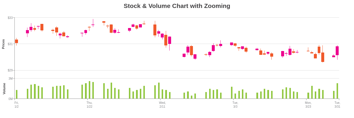
Stock and Volume Chart Zooming
Similarly, in a stock and volume chart, add a zooming attribute to the scale-x object. Set the value to true.
{
  'scale-x': {
    zooming: true
  },
}
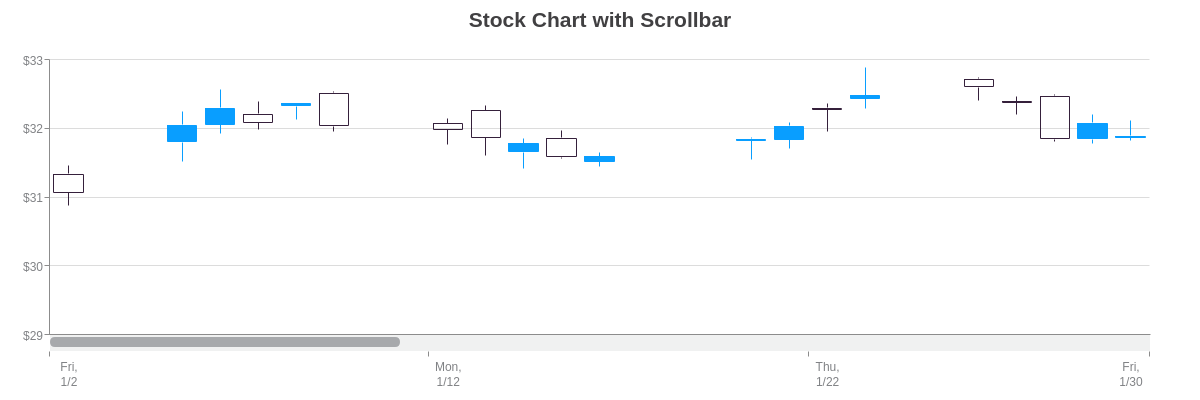
Stock Chart Scrollbar
To add a scrollbar to your stock chart, make sure that the zooming attribute is set to true in the scale-x object. Next, in the same object, add a zoom-to-values array. Provide your starting and ending values separated by a comma (e.g., 'zoom-to-values': [1420232400000, 1422651600000]). Finally, create a scroll-x object.
Note: To style the scrollbar (the bars and handles), browse our Scrollbar JSON Attributes/Syntax page.
{
  'scale-x': {
    zooming: true,
    'zoom-to-values': [1420232400000, 1422651600000]
  },
  'scroll-x': {
  },
}
Stock and Volume Chart Scrollbar
The same steps apply when creating a scrollbar for a stock and volume chart. Make sure that the zooming attribute is set to true in the scale-x object. Add a zooming-to-values array in the same object. Finally, create a scroll-x object.
{
  'scale-x': {
    zooming: true,
    'zoom-to-values': [1420232400000, 1422651600000]
  },
  'scroll-x': {},
}

Stock Chart Preview Chart
In lieu of a scrollbar, you can display a preview chart, which is essentially a simplified version of your stock chart. To add a preview chart, first make sure that the zooming attribute is set to true in the scale-x object. Create a preview object.
Note: You can add a zoom-to-values array, which will specify the starting and ending values for your preview chart handles (e.g., 'zoom-to-values': [1421787600000, 1426280400000]). For preview charts, this array is optional.
Where stock charts differ from some of our other chart types is in how it appears in the preview chart. Instead of a candlestick or OHLC chart, it appears as an area or line chart. You can style the "chart" portion of the preview feature by creating another preview object, which is placed in the plot (or applicable series) object. In the object, you can specify the preview chart type (area (default) or line) and adjust the line-color, line-width, background-color, alpha, alpha-area, and more.
*Note: For more styling options, browse our Preview JSON Attributes/Syntax page.

{
  plot: {
    preview: {  //to style the "chart" portion of your preview chart.
      type: "area", //"area" (default) or "line"
      'line-color': "purple",
      'line-width': 1,
      'line-style': "dashdot",
      'background-color': "yellow",
      alpha: 0.9,
      'alpha-area': 0.3
    }
  },
  'scale-x': {
    zooming: true,
    'zoom-to-values': [1421787600000, 1426280400000]
  },
  preview: {}, //to enable a preview chart
}
Stock and Volume Preview Chart
To create a preview chart for a stock and volume chart, follow the same steps as above. The only part that differs is the placement of the preview object for styling (the one unique to stock charts). Instead of in the plot object, place it in the series object of your stock chart. See the following chart:
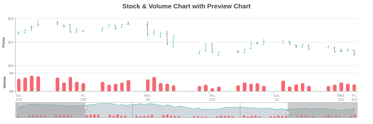
{
  type: "mixed",
  'scale-x': {
    zooming: true,
    'zoom-to-values': [1421787600000, 1426280400000]
  },
  preview: {},
  series: [
    {
      type: "stock",
      preview: {  //to style the "chart" portion of your preview chart.
        type: "area",
        'line-color': "#00AAA0",
        'background-color': "#1E435D"
      },
    },
    {
      type: 'bar',
    }
  ]
}